Workshop: Data, Mapping, and Research Justice

coopen_banner_data-300x300

I’ll be teaching my workshop on data and mapping again this February 2017 with Allied Media Projects/ Co.Open.

During the 4-week course we will journey through the entire mapping process; from paper survey to digital database, basic map visualizations, and finally analysis. We will be working with free and open source software (LibreOffice, QGIS, Inkscape, etc.).

Check out some of the past course projects:

Wednesday nights in February (4 weeks long) 6-9pm

Sign up at store.alliedmedia.org

Map: Detroit Neighborhood Markets “Blue-lining” 1932

Screen Shot 2017-01-10 at 7.18.59 PM.png

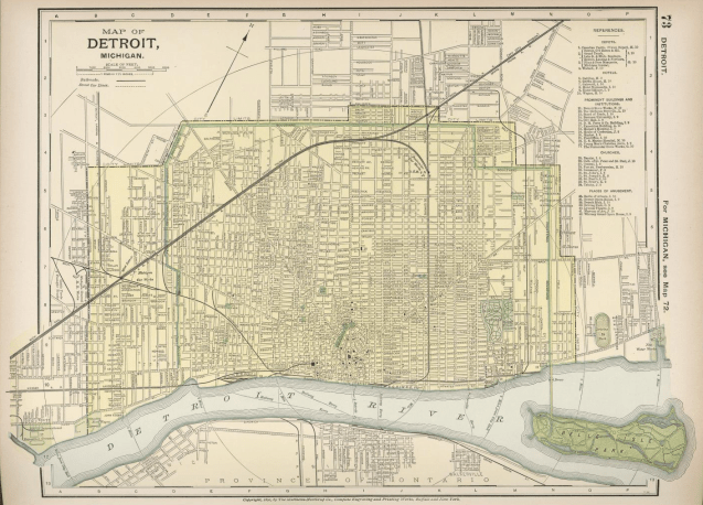
This map is one among 35 other cities profiled in a market survey by the Advertising department of the Curtis publishing Company, called: “City Markets: A Study of Thirty-Five Cities.” The primary market assessment conducted here was based on circulation of newspapers and magazines, but included auto sales, consumer goods, and transportation spending.

The report notes that the 1932 maps are improved from earlier versions as “homogeneous residential areas” have their own boundaries rather than conventional or municipal boundaries. The map also has similarities with the well-known “redlining” maps, but in this case it is “blue-lining”:

“[…] manager was instructed to conduct circulation work in the better residential areas (colored red and yellow on the Survey map). He was forbidden to do work in areas colored blue (for the most part with foreign-speaking or colored residents).

In 1932, Detroit’s Black Bottom and Paradise Valley match the South-North grouping of blue areas that reach from the riverfront almost to Detroit’s northern border of 8 Mile Rd. Notable red areas that stand out are Indian Village, Rosedale Park, Palmer Park, Dexter-Linwood, as well as outside of the Detroit border in the Grosse Pointes, Royal Oak/Pleasant Ridge, and Birmingham.


Map: De Lery’s Plan of Detroit 1749

Screen Shot 2017-01-10 at 8.18.05 PM.png

Many people have seen Bellin’s map of Fort Detroit from 1764, but fewer people know that Bellin’s map was based on Gaspard-Joseph Chaussegros de Lery’s survey in 1749. Huron Creek really stands out as a significant landmark.

This version of De Lery’s map appears in “History of Wayne County and the city of Detroit, Michigan” edited by Clarence and M. Agnes Burton.

Map: Environmental Justice in Detroit

Screen Shot 2017-01-09 at 9.16.10 AM.png
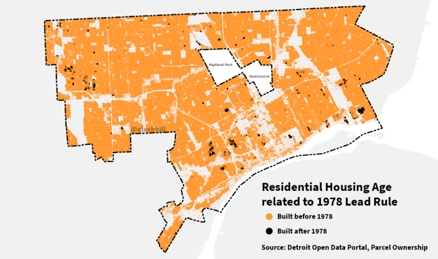
The EPA has developed a handy tool called EJSCREEN to explore data related to environmental justice around the country. Data from EPA and other sources are pulled together and can be examined side-by-side. In the image example the maps are comparing “linguistic isolation” and the EPA’s cancer risk index.

Map: Detroit Eastside Evolution 1876-1925

eastside_detroit_1876-1925

Thanks to images posted by member of DetroitYes these images show the evolution of the Eastside of Detroit from rural and uninhabited to at one point becoming home to the Detroit Municipal Airport in 1925. The one piece that never changes is the location of Windmill Point Lighthouse.

Another interesting change to watch is the changes to the Conner Creek from a wide-mouthed creek to a diagonal waterway until it was finally covered over to serve as a covered sewer drain.

The most evident change between 1876 and 1925 is a natural and flowing landscape to a rigid, grid of a growing major city.

Map: Detroit is Full of Old Housing

pre-1978-residential-2

Housing in Detroit is often discussed in terms of its absence or dilapidation. It’s no wonder that Detroit’s housing stock has suffered over the decades of job loss, disinvestment, and discrimination. When nearly 40% of residents live below the poverty line, investing in housing comes secondary to food, water, heat, etc. The vast majority of the city (93%) was built before 1978 when the Lead Rule banning lead in paint was adopted.

The city saw a housing boom during and after World War II when thousands of people migrated to Detroit for good paying jobs which at the time made up one-sixth of all employment in the country. Currently, 62% of residential housing was built before 1950 in Detroit.

Internationally, housing has been shown to be a critical component of good health. Whether it is providing a cement floor and tin roof to families in Haiti or ensuring routine maintenance in Brooklyn public housing, the structures that we live in contribute greatly to our physical health and overall well-being. The Housing for Health initiative provides a guide and toolkit to ensure nine specific healthy home practices to create healthier communities.

Map: Residences of Employees of Penberthy Injector Company Explosion 1901

Klug diss (1993), p. 105.jpg

A previous hand drawn map by Dr. Thomas Klug was featured here and he promptly shared another hand drawn map that he published as part of his dissertation “The Roots of Open Shop: Employers, Trade Unions, and Craft Labor Markets in Detroit 1859-1907.”

His map specifically tracks workers at the Penberthy Injector Company where an explosion in 1901 was noted as the second worst industrial accident in Detroit. Klug found that the local newspapers often published the names and addresses of the workers killed or injured in the explosion, which he was able to use to test the degree of integration in Detroit’s labor market by associating workers with factories.

“Map 1 displays this linkage. The names and addresses for 102 employees of Penberthy Injector Company can be confirmed. Each one is shown with an “x” on the map. As indicated, the residences of the company’s employees were scattered throughout Detroit, covering both the west and east sides of the city. One exception is the Woodward Avenue corridor. The area around Woodward, starting from the edge of the downtown business district and continuing past the city limits, was a showcase for elegant mansions and comfortable middle-class homes and apartment buildings. For that reason not many employees of the Penberthy Injector Company lived in the Woodward corridor.”

Map: Wealth Divides in Metro Detroit

screen-shot-2016-12-23-at-1-27-18-pm

CityLab covered a recent project by the Esri mapping company looking at the persistent problem of income disparities within cities; Wealth Divides. For Detroit, there isn’t much to report as median income is $25,764 and 40% of people live in poverty. It’s about the regional disparities and inequalities in Detroit.

I was surprised to see broad similarities across the region where the majority of households generate less than $70,000 per year. There is only one Census Tract in Detroit where household income breaks $100,000. Beyond the city limits income only changes in the Grosse Pointes to the East, Dearborn Heights to the West, and Royal Oak to the North. All three of those areas are anomalies surrounded by areas of lower income.


Map: Blue Beacons at Wayne State University 1971

screen-shot-2016-12-21-at-8-02-22-am

This map accompanied the Field Notes IV by the Detroit Geographical Expedition led by Bob Colenutt in 1971. The blue beacon safety sites had become a point of contention with the Cass-Trumbull community.

“The unofficial policy appears to one of protecting University property, including the students, from the community people. In this sense, the community becomes the enemy–the human element under surveillance. Thus the presence of the WSU police is not for the benefit of the community but is strictly for the benefit of the University.”

In the past the WSU police were in contention with the community. More recently, the WSU police department has expanded patrols into neighborhoods around the campus as a service to areas where students live. The WSU police have been lauded for their efforts to reduce overall crime in the Midtown area during revitalization efforts.


Map: Detroit Traffica Island Picnic Spot

traffica-island-picnic.jpg

Similar to roads knots, there exist odd shaped and often lush park-style spaces in between the expressways. The Detroit Area Rambling Network calls these “traffic islands” with a beautifully hand drawn map of the I-75 and M-8 (Davison) interchange. The invisible in-betweens perhaps new opportunities to see cities in a new light.

Map: Metro Detroit Plant Closings and Layoffs 2001 – 2004

plant-closings-detroit

This map accompanied a series of reports by Good Jobs First and highlight the on-going challenges of metro Detroit industry, job access, and opportunity.

Good Jobs First has since produced a string of increasingly sophisticated studies, using Esri products in-house or with partners. The largest is The Geography of Incentives: Economic Development and Land Use in Michigan. Funded by the Charles Stewart Mott Foundation, it maps 4,000 deals in seven metro areas and sorts the deals through the lens of Myron Orfield’s community typology and other criteria. In a state hard hit by the decline of manufacturing, the most damaging images involve job loss as well as creation: it is the first time incentives have been geographically juxtaposed against plant closings and mass layoffs (as officially notified under the federal WARN Act). For the state’s most generous subsidy, the maps of the largest metro areas like Detroit, Michigan, show very few deals going to the central city or the densest inner-ring suburbs, even though those areas have suffered the vast majority of shutdowns. For some, the images conjure up redlining, the practice of geographic discrimination that banks and insurance companies have been accused of.

Map: Home Range of the Detroit Pheasant

pheasant_range_map.png

For the last few years I’ve been thinking about Detroit’s most interesting bird around Thanksgiving time. Living near Brush St. and I-94, my dog and I would regularly see a male pheasant patrolling the vacant lots next to the expressway. This year I started working on the Eastside and on an almost weekly basis came across a pheasant flying in front of my car along Ferry St. before Mt. Elliott.

I started scrapping any and all online media that mentioned pheasant sightings in Detroit and included the data from WDET’s crowdsourcing (read more on the history of Detroit pheasants here too). For the analysis I had 109 sightings of roughly 300 pheasants in Detroit between 2002 and 2016. Some sightings were likely the same pheasant seen over and over again while others were just a lone bird out looking for food beyond its normal range.

Using inverse distance weighting (IDW), I was able to build a rough idea of the Detroit pheasant habitat. The Eastside, specifically Elmwood Cemetary, is the central home of the Detroit pheasants even though they are often claimed by North Corktown as their neighborhood bird. In the map below you can see that the pheasant range maps very closely with more vacant spaces. I assume the range of the Detroit pheasant will become more limited as Brush Park is redeveloped, in-fill development completes in Midtown, and The Villages continue to be built up.

pheasant_vacant_map.png


Map: Neighborhoods Selected for Major Investment 2017

rfp-map

This is the first set of neighborhoods selected for a $1.6 million investment in 2017. The projects will build off of the City’s “20 Minute Neighborhood” strategy and will be focused on developing community driven neighborhood framework plans.

  • Southwest Detroit/ West Vernor Corridor (Council District 6)
  • Northwest Detroit/Grand River Corridor (Council District 1)
  • Islandview/Greater Villages (Council District 5)
  • Rosa Parks- Clairmount (Council District 5)

Read more. . .

Map: New Detroit – A Decade of Progress 1967-1977


This is a map comes from the report by New Detroit Inc.: a decade of progress 1967-1977. The map displays all of their partners, beneficiaries, and efforts since 1967. It shows their widespread impact (and the Detroit northwesternly pattern) as well as map design flaws that might obscure the organizations full impact.

The report was broken down into core categories:

  • Public Safety and Justice
  • Minority Economic Development
  • Health and Action Against Drug Abuse

The final page of the report shows pictures of their presidents and chairmen over the last 10 years, with only one African-American member.

Map: Detroit’s North End 2014

Screen Shot 2016-11-27 at 10.41.40 PM.png

In 2014, the New York Times took a data-driven look at Detroit’s storied North End as a juxtaposition of the newly promised redevelopment and the enormous challenges that the city faces. At the edge of Midtown and New Center, the North End will likely see expanded investment.

There are many reasons to be hopeful and cynical about the North End from new initiatives at Vanguard CDC, the recently relocated Detroit Animal Care and Control (DACC) paired with brand new facilities for the Michigan Humane Society, and everything happening on Oakland Avenue from ONE Mile to the Oakland Avenue Urban Farm. The flip side is that cheap real estate has been snapped up by a handful of land speculators and the hope of “transit-oriented development” (TOD) related to the M1-Rail streetcar has displaced some while driving up prices for others.

Map: South Detroit Mobility

mapzen-southdetroit

Mapzen has developed a new tool to explore transportation networks around the world. In good fun they tweeted out a map looking at transit in “South Detroit” if you were looking for a midnight train going anywhere. Better known as locally as Windsor, trains in South Detroit aren’t really available (even from the New Center Amtrak station).

Screen Shot 2016-11-21 at 7.32.22 AM.png

Map: Presidential Campaign Stops in Detroit 2016


2016-campaign

The Presidential election brought a strong focus on the State of Michigan and the cities of Flint and Detroit specifically. The City of Detroit became a rallying point for both candidates, but for very different reasons. Hillary Clinton first came to Detroit for a campaign fundraiser in January 2016. Donald Trump’s first campaign visit was during the Republican debate at the Fox Theater in March 2016.

The candidates continued to return to Detroit for speaking engagements and campaign stops, but their geographical focus was quite different. The Trump campaign spent most of its time Downtown for exclusive events, while the Clinton campaign often made multi-stop tours of different neighborhoods in Detroit. Both campaigns neglected the Eastside where there are higher vacancy rates and lower incomes.

Map: Gerrymandered Detroit

screen-shot-2016-11-14-at-7-55-06-am

In the entire state of Michigan, the City of Detroit includes the most gerrymandered congressional districts by scores assigned by the Washington Post. However, the scoring relied on “compactness” which may not always be the best measure of gerrymandering.

“The compactness of a district, measured using the ratio of the district area to the area of a circle with the same perimeter, can serve as a useful proxy for how gerrymandered the district is. The map below colors Congressional districts according to their compactness, for states with at least three districts.”

Across the whole United States, Michigan’s 14th congressional district ranks high and well above the state average.