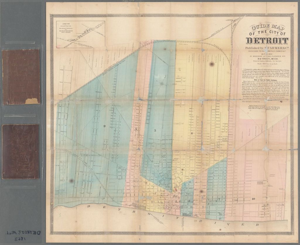
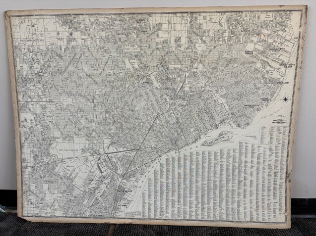
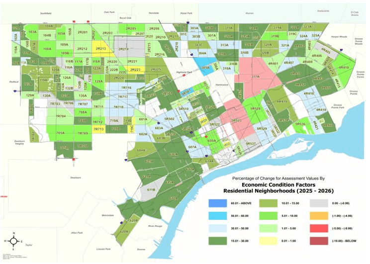
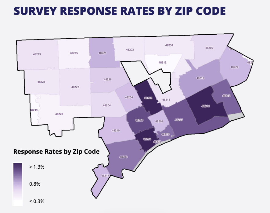
This post will be both a soapbox and a rant. Recently, Mayor Mary Sheffield’s transition team led by HR&A Advisors published the results of their large-scale survey of residents and the priorities they would like to see from the incoming mayoral administration. All of the marketing copy includes language that all of Detroit’s “39 ZIP Codes” were canvassed in order to arrive at these numbers. Detroit does not have 39 ZIP Codes within its borders. Over time nearby ZIP Codes have encroached into Detroit’s border as a result of population loss and there are a number of administrative-only ZIP Codes, such as the Renaissance Center exclusive, 48243. The city’s own map of survey responses perfectly shows how there are only 28 ZIP Code areas that physically exist geographically.
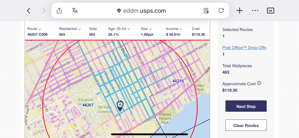
I have a regular set of slides where to remind people that ZIP Codes, yes all caps acronym that stands for Zone Improvement Plan (ZIP) Codes are routes created for delivering mail by the US Postal Service (USPS). These routes include the only floating ZIP Code in the United States, 48222 best known as the J.W. Westcott II tug that delivers mail to the passing lake freighters traveling down the Detroit River.
ZIP Codes are delivery routes, squiggly paths across a place. ZIP Codes are not bounded polygons or shapes. The shapes that we’ve come to know as ZIP Codes are actually creations of the US Census Bureau, not USPS. For the sake of data literacy, the Census recognized that people more easily knew their five-digit ZIP Code rather than their 11-digit Census Tract code. The Census takes the mail delivery routes from USPS and generates ZIP Code Tabulation Areas (ZCTA) in order to link the Census survey data to these well-known areas. ZIP Code has become ubiquitous in sharing information, linking life expectancy, and tracking change – for better or worse. I’ve lamented the misaligned boundaries of ZIP Codes compared to literally any other geographic place.
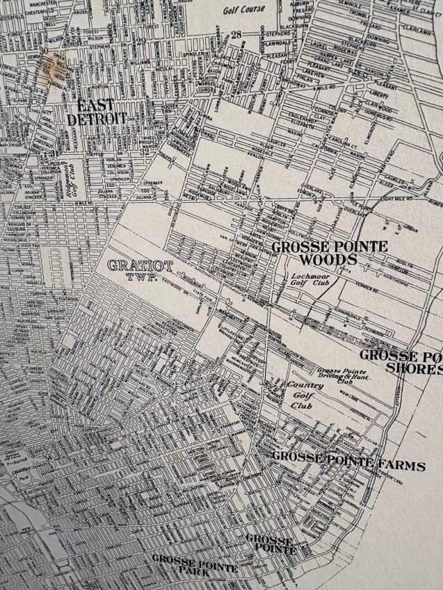
Since ZIP Codes are mail delivery routes, they change fairly regularly. It’s true that ZIP Codes in Detroit have remained relatively stable since the 1950s with nearly identical numbers back to 1946. For the most part these areas have remained untouched. Yet, when mapping the city the issue arises that half of 48203 is Highland Park, 48212 is mostly Hamtramck, 48236 includes the Grosse Pointes, and the section of 48239 in Detroit only covers Rouge Park. The US Census data for these areas are incomplete or over-representative if the ZIP Code is cropped to the Detroit border. Personally, I typically omit 48236 and 48239 with a not “insufficient data.” There are other odd ZIP Codes that exist randomly in space, 48232 is located near the salt mines, but has no boundary. 48231 in Downtown and 48244 in Southwest Detroit are similarly only existing as a point location.
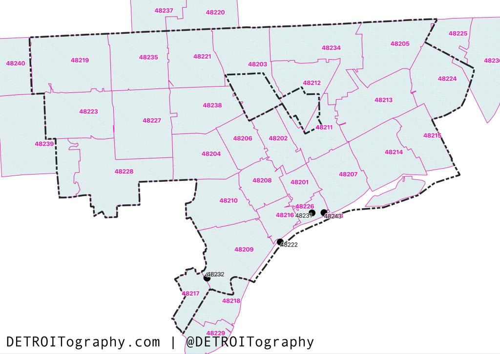
The City’s Open Data Portal includes a dataset with 39 ZIP Codes, which I assume simply includes any ZIP Code that intersects the city boundary. The result has anchored Mayor Sheffield’s community framework press coverage, but incorrectly includes Ferndale, Royal Oak, Harper Woods, River Rouge, Ecourse, and Redford simply because a sliver of their ZIP Codes have crept across the Detroit border. At best, Detroit has 28 reliable ZIP Code areas that can easily be canvassed and tracked with Detroit residents. This matters because it informs the data we talk about and the people represented by numbers that influence policy choices. Now is a time for critical thinking and clarity.