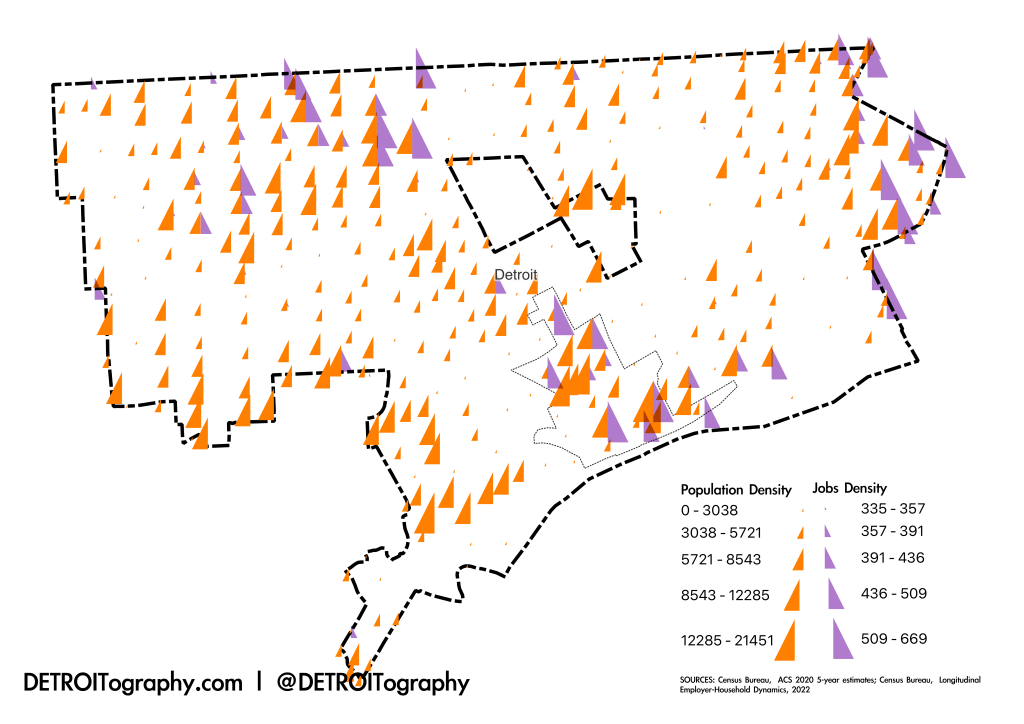
In Detroit, the spatial mismatch of people to jobs and opportunity is stark. It gets all the more stark when just 30% of available jobs in Detroit are held by Detroiters (Census Bureau, LEHD). The healthcare, education, and government sectors anchor Detroit employment which is why Detroit’s three main hospital zones highlight with jobs: in Greater Downtown with the Detroit Medical Center in Midtown along with Wayne State University, in Northwest Detroit where Sinai-Grace is located, and along the Eastside border with St. John’s Hospital and a number of skilled nursing facilities.
The Opportunity Index by Kirwan Institute showed this same mismatch nearly a decade ago and included an update for the Kresge Foundation. Opportunity had improved in Greater Downtown and worsened in Detroit’s neighborhoods between 2000 and 2010. The more recent Opportunity Atlas from Opportunity Insights, Harvard, and Brown Universities built off of Raj Chetty’s research into: “Which neighborhoods in America offer children the best chance to rise out of poverty?“
I also made this map because sometimes we think we have a good grasp on the geographic distribution of people or jobs or pheasants in Detroit, but I always need to see the data on a map to be sure.

Hi Alex: I I enjoyed seeing this map which brought back memories. Back in the mid-1990, when I was the Planning Director at SMART, we geocoded where working-aged Detroiters lived along with businesses that tended to employ bus riders (retail, service, etc.). We significantly changed our service based on the data, and most of the rerouting/expansion was because of what we saw on the maps. Ridership rose over five years from 25,000/day to almost 35,000. Those maps were one of the reasons Brooks Paterson supported the first SMART milage election. I really enjoy your emails.
>
Thanks for this map! Ever since working for the census (primarily in the neighborhoods directly west of Grosse Pointe), I wondered what the population counts of the east and west sides were. If taking to 2020 census numbers into account (though, I think the official count is much lower than the true total), I’d venture to say the west side has at least twice the population of the east side. So I’d guessimate the west has around 450,000, while the east has about 200,000 (that total may be high, considering the blight). I’d like to hear you alls thoughts. Thanks
Pingback: Mapping Educational Attainment and Opportunity in Detroit 2026 | DETROITography