Map: Arsenal of Health in Detroit 2020

arsenal-of-health

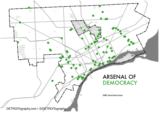
During both World War efforts, Detroit’s factories and their manufacturing might was flipped from automobile production to support for the war effort. During World War II, at least 110 factories in Detroit retooled to produce parts for aircraft, tanks, and weapons.
arsenal-of-democracy

Recently, the news media (Crains, Free Press, Detroit News) have reached back into history in an attempt to compare the Coronavirus global pandemic to a war effort. There are serious issues with comparing a public health response to a war, but today is all about the geography.

Detroit no longer has an arsenal from which to pull. There are no longer over 100 factories within the city limits. The auto industry’s operations are no longer are located in Detroit. The reverse prohibition trend in Detroit has led to the city’s strongest response as Detroit-based breweries and distilleries have started mass producing hand sanitizer rather than beer or spirits. Detroit’s industrial sewing ecosystem has also taken on the task of making face shields, gowns, and masks.
Screen Shot 2020-04-09 at 2.11.00 PM

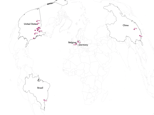
GM’s effort is largely focused at their China and Indiana facilities with a handful of metro Detroit suppliers involved. Ford is split between a South Dakota facility and a supplier in Plymouth, MI making that has already made 1 million face shields. Dow (Midland, MI headquartered) has marshaled their global reach to produce hand sanitizer.

Indicative of Detroit’s decline, global industry (specifically the auto industry) largely functions outside of the city in suburban factories, southern facilities, or where a lower cost workforce resides. Shout out to Detroit businesses shifting focus to address much needed supplies:

  • Detroit Bus Company
  • Detroit City Distillery
  • Two James Distillery
  • Eastern Market Brewing Co.
  • Atwater Brewery
  • Detroit Denim
  • Pingree Detroit


COVID Community Vulnerability Map for Detroit

Screen Shot 2020-04-08 at 9.45.03 AMThe healthcare data firm Jvion, which utilizes artificial intelligence (AI) approaches in predictive analytics and machine learning, has create a vulnerabilty map based on 30 million de-identified patient records. The patient data was then modeled against respiratory viruses similar to COVID.

Map: Targeting Potential Areas of High Risk for Coronavirus in Detroit

COVID-SVI-2020

The “why Detroit” question has continued to be asked pointedly and lamented by others. If you look at a lot of data for the city, you will be no stranger to large numbers, overwhelming burdens, and unfortunate top rates for bad indicators.

I’ve lamented the “food desert” term in my work and found it to truly be an expression of the compound burden faced by many Detroiters that lack opportunity and live daily with high degrees of social vulnerability. The Centers for Disease Control (CDC) developed an index based on multiple Census data points in order to identify high risk areas in order to plan for environmental crisis. I’ve found that it works very well for non-environmental crises as well.

In this map, you can see there is a fair degree of overlap between dense areas with COVID-19 cases and high risk areas (very socially vulnerable: no car, low income, etc.) or areas with a large percentage of senior citizens (at greater risk of death from COVID-19).

This is not a perfect measure, but does provide a snapshot into geographies of vulnerability when considering where there might need to be additional outreach, for example, to seniors on the Lower Eastside, communities in Southwest Detroit, or Near Westside due to high risk or high vulnerability.


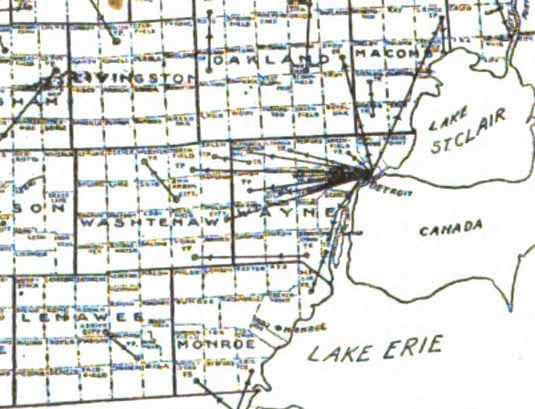
Map: Diphtheria Contagion from Detroit 1892

Screen Shot 2020-03-31 at 9.19.35 PM

Detroit is no stranger to excessive contagion.

The cholera epidemics of 1832 and 1834 led the city to develop a sewerage (yes that is the correct term) system that most comprised of cementing over historic rivers and creeks (i.e. Connors Creek). Cholera was found to spread when human waste was dumped into the river and collected along the wharfs that no longer jut out from the riverfront.

The 1918 spanish flu pandemic led to mass support for investment in the public health system with additional funding for the Herman Kiefer Health Complex, which opened in 1919. The complex was shuttered in 2013 and has since been sold to a developer in 2015.

The map above is from the [Michigan] State Board of Health – Report of Secretary, 1893 showing:

[…] instances where diphtheria was reported to have been carried from one locality to another; the lines connect the localities, and the arrow-heads indicate the direction of movement in each case. […]

It will be noted that in 1892 Detroit was the greatest source of contagium. The evidence in this map bears upon statements made later in this article, that “The evidence of the spread of diphtheria from cities is conclusive, etc.”

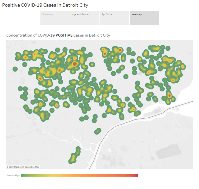
Map: Detroit Coronavirus Cases Heatmap 2020

Positive StoryThis map was downloaded from the City of Detroit Coronavirus webpage on 03/29/20 after the latest 3pm update by the State of Michigan Department of Health and Human Services (MDHHS).

The City of Detroit’s coronavirus data are being tracked with a Tableau dashboard that include a heatmap of individual cases that I assume map on to individual patient addresses.

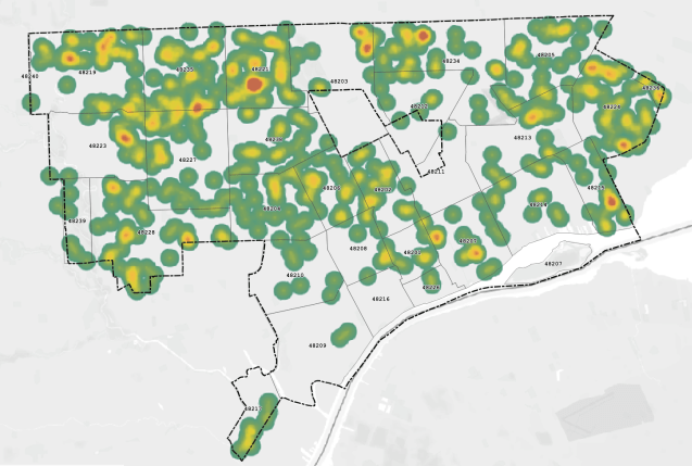
The map, as many have already noted, follows population density patterns in Northwest and Far Eastside Detroit, however there is a major gap in Southwest Detroit. From past work on asthma medication management I wouldn’t be surprised if similar issues of care access, documentation concern, and language barriers are exacerbating coronavirus impacts in Southwest Detroit where a major risk factor – air pollution – is also prevalent.

EDIT: Map with geographic references.

Screen Shot 2020-04-03 at 9.11.51 AM

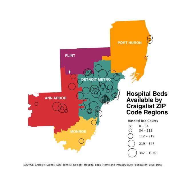
Map: Detroit Metro Hospital Beds by Craigslist ZIP Code Regions 2020

craigslist-hospital-bedsI’ve been exploring the geography of hospitals and health care resources during the COVID-19 outbreak. Reporting information at county level isn’t ideal because the patient who lives in Macomb then went to the Henry Ford Hospital in Detroit. Similarly, a patient living in Detroit decided to go to a Beaumont Hospital in Oakland County.

In the absence of detailed data on patients and human mobility I immediately thought of John Nelson’s project to generate zones based on Craigslist Economic Zones based on ZIP Codes. These seemed a potentially better indicator of patient region than County or the often used Hospital Referral Regions (HRR) developed by the Dartmouth Health Atlas, which represent health care markets based on tertiary care. In the case of metro Detroit, the HRR cuts off at Detroit’s western border and it has been well documented that Detroiters travel for resources towards the northwesternly.

John Nelson liked my suggestion too, read more about how he combined hospital beds by Craigslist Zones.

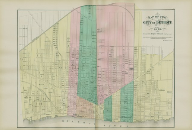
Map of the City of Detroit 1873

1873-detroit-map

I’m always surprised when I find a historical map that I haven’t yet shared. This map from 1873 is a great reminder that whether it is the 1800s or present day, all maps rely on good data sources and often some data wrangling, compiling, and cleaning.

This map data in particular was compiled by Eugene Robinson, who was a city surveyor for the Library of Congress and began work on this map in 1871. The map was produced and printed by the Calvert Lithographing (and Engraving) Company.

Map: Existing Solar Arrays in Detroit via Google Imagery 2018

Screen Shot 2020-02-28 at 11.00.51 PM

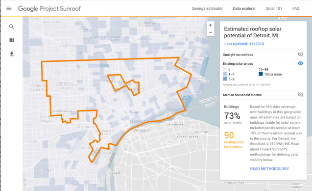
Google’s Project Sunroof has found that Detroit has nearly 200,000 roofs (or about 73% of roofs) that have capacity for solar with an estimate of 3 million megawatts of electricity generated each year. Google combed it’s imagery data collected between 09/2014 — 06/2015 for this analysis.

It seems wild to think that there are that many solar arrays in Detroit, but also that there could be so many more!

Map: Detroit’s Hotel Fort Wayne in City Directory 1928

FullSizeRender
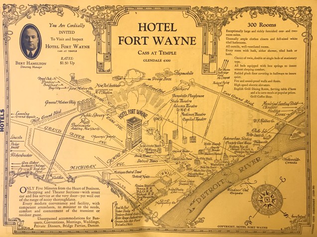
This advertisement for the now vacant Hotel Fort Wayne (hello Ilitch family, please redevelop!) was included in the 1928 City Directory. It’s is interesting to see the various places called out as city highlights of the time.
My eye was first drawn to how active the riverfront was with multiple ferry companies and water transportation opportunities, including two river crossing options for Windsor and Walkerville.
I was similarly drawn to the prominence of Grand Boulevard which would have been one of the city’s crowning achievements in that time period. The “New Art Institute” is prominent on the map along with all of the motor companies (although I’d never heard of “Hupmobile” – Hupp Motor Company).
Thanks for finding and sharing Bill McGraw!

Detroit Expressway Assignment Coding Map 1955

Screen Shot 2019-12-18 at 9.16.16 AM.png

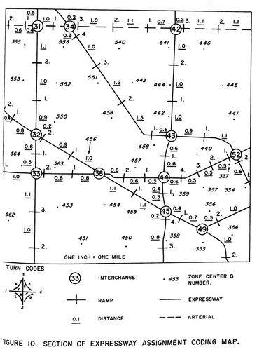
I stumbled across this hand drawn map and found it fascinating. It’s really interesting to think about the breakdown of planning an expressway from its ramps, interchanges, trip directions, construction sections, etc. If you couldn’t guess the area pictured is Northwest Detroit. I assume this coding has lived on until today, but haven’t verified yet.

Map: New Chrysler City Project 1986

Screen Shot 2019-11-05 at 9.13.36 PM

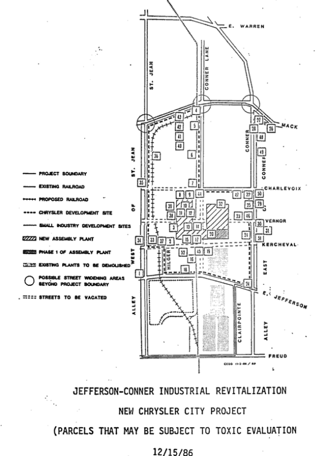
As Fiat Chrysler Automotive (FCA) finishes its recent expansion adjacent to their existing facility, including swallowing up a roadway and increasing toxic emissions on the Eastside, I happened across the original 1986 plans for what was then deemed an industrial “revitalization” for a new Chrysler plant.

The full plan is called the Jefferson-Conner Industrial Revitalization Project. The map included here represents all of the existing buildings and businesses that may be subject to toxic evaluation (i.e. removal of underground tanks at gas stations, etc.). The existing plant in faded gray was demolished.

Map: Metro Detroit Sidewalk and Crosswalk Data

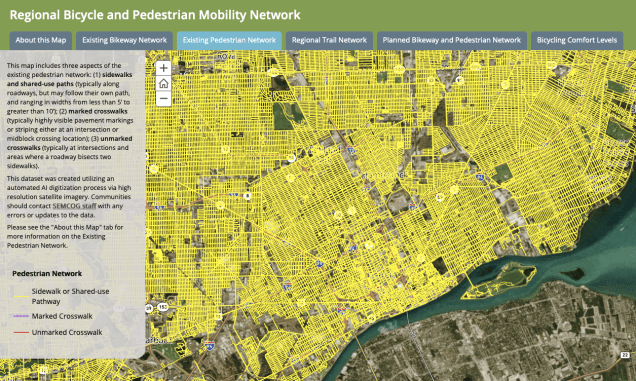
Screen Shot 2019-10-28 at 9.46.02 AMSEMCOG has purchased data for sidewalks throughout the Detroit region. The dataset was created using automated AI digitization of high resolution satellite imagery.

The data do not capture condition or quality of sidewalks, but at least now we have a sense of availability and connection.

Map: Desire Lines Across Detroit 2010

desire-lines-detroit

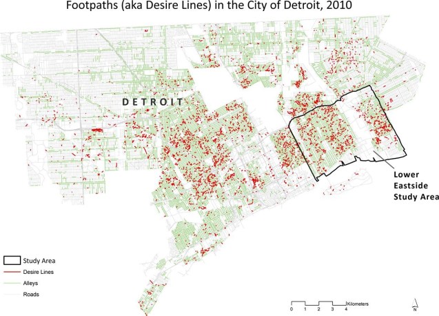
I’ve mapped “desire lines” in the Cass Corridor, but always balked at taking the effort citywide. Now I don’t have to and can shout out the work of Alec Foster and Joshua Newell who found 5,680 footpaths totaling over 150 miles in the city. In there recently published study:

“Informal footpaths known as desire lines crisscross the city of Detroit and are visible from space. Despite their prevalence, especially in postindustrial cities, no comprehensive study of desire lines exists for any urban area.”

They recommend working with residents to preserve desire lines and footpaths and note that in their study area of the Lower Eastside, nearly 70% of all desire lines disappeared in just 6 years.

HT @DetroitGreenways

Map: Coffee Shop Shifts in Detroit 2017 – 2019

coffeedensity2019-v2.png

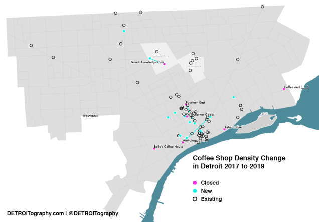
In 2015 I wanted to see how coffee shops in Detroit might relate to research on Starbucks and gentrification. I tracked on-going changes in the coffee landscape in 2017. Now there are more changes in coffee, but it’s more a consolidation than citywide growth. There are a few upcoming neighborhood coffee venues planned, such as Morningside Cafe.

Neighborhoods adjacent to the 7.2 square mile Downtown-Midtown investment zone are seeing expansion and new coffee shops opening up adding to existing density of coffee options. However, neighborhoods a bit further out are starting to lose their coffee shops where there was no change between 2015 to 2017. Most notably Ashe Coffee’s attempt in Rivertown was a flop and the rarely open Coffee and (_____) closed its doors in Jefferson Chalmers. Will Leather Goods (former Tomboy Market) hosted a coffee bar, but everything is closing down to make way for another pizza restaurant in Detroit. In the same period between 2017 to 2019, Nandi Knowledge Cafe relocated off of Woodward to a space near Hope Village, Fourteen East Cafe is in an active move into the new Mike Ilitch School of Business, and Anthology Coffee moved to Eastern Market after the Ponyride building was sold in Corktown.

A standout from the 2019 tracking effort was the return of Biggby to Detroit with a stand-alone brick and mortar on Livernois Avenue.

EDIT 10/21/19: Completely forgot that Ponyride sold their building and therefore Anthology Coffee made the move to Eastern Market. Thanks to Kate Abbey-Lambertz for catching it. Map and content updated.


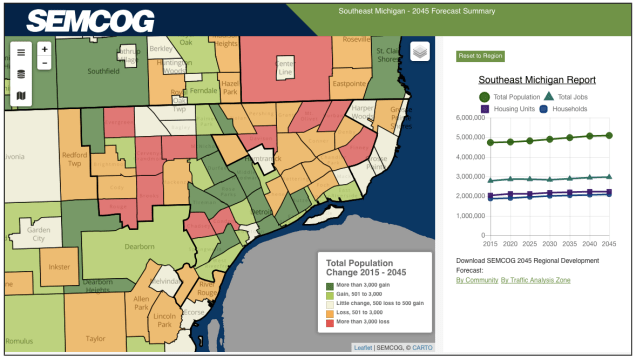
Map: Detroit Population Forecast 2045

Screen Shot 2019-10-16 at 9.57.10 AM.png

Across the Metro Detroit region, SEMCOG predicts population increases. However, the many areas in the City of Detroit are predicted to see significant population loss by 2045. With already record population loss, these predictions make for a difficult road ahead for the city still struggling to ensure basic services in every neighborhood.


Map: Auto Emissions in Metro Detroit 2017

Screen Shot 2019-10-10 at 10.50.27 PM.png

The New York Times completed an analysis of driving emissions from the CO2 estimates generated by Boston University’s Database of Road Transportation Emissions.

As the New York Times writes:

“Emissions from driving in the Detroit metro area grew faster than population between 1990 and 2017, which means emissions per person have increased.”

Similar models that we’ve posted about previously have shown the detriment of our auto-centric regional transportation networks, especially around expressways and arterial roads and related to greenhouse gas emissions.

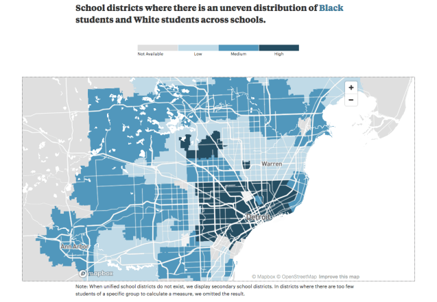
Map: School Segregation in Metro Detroit 2015-16

Screen Shot 2019-10-06 at 10.26.37 PM

This map from the ProPublica “Miseducation” project stood out to me because the donut rings of the past have been recreated with inner ring regional suburbs having low segregation as African American residents have left Detroit for different school districts. Yet the next ring shows where school and likely community integration have slowed or stopped (i.e. Birmingham).

Map: Accidents involving Detroit Public School Children in 1935

Screen Shot 2019-09-19 at 10.55.53 PM

This map from the Detroit Traffic Survey 1936-1937 reminds me of the similar map from 1968 map highlighting areas where commuters run over black children and more recent map of children’s traffic fatalities within a 10 year timeframe. The report reads:

“Intersections adjacent to schools are guarded by patrol boys, police officers, and traffic signals, for a period of time immediately before the opening of school at 8:00 or 8:30 in the morning, during noon recesses approximately between 12:00 noon and 1:00 P.M., and again at the close of school shortly after 3:00 P.M. As appears in Figure 89, there are peaks in the injury and fatality curves at these times resulting, of course, from the fact that in spite of supervision given, the exposure of children to traffic is great in comparison with exposure during the hours in which school is in session.”

Screen Shot 2019-09-24 at 11.31.21 PM