Detroit has the potential to anchor a future climate change haven as people migrate away from the a dry and scalding West or a flooded South and East. The city, like many in the Rust Belt, is heavily industrial and has a legacy of not maintaining the cleanliness and ecology of the coastline. The city is also decades behind on infrastructure upgrades to roads, pipes, electrical, etc.
The greatest climate risk for the Great Lakes region is heavy rainfall which leads to flooding. The city and its neighbors have seen these impact already with poor drainage on expressways and a lack of green stormwater runoff infrastructure and too many parking lots. The data here comes from First Street Foundation Flood Model which is a national model that shows the risk of flooding at any location. As the data shows, flood risk varies across the city and the areas like Jefferson Chalmers and Southwest Detroit/Dearborn highlight on the map.
Detroit is more than just the city, it is also the bowtie cities of Hamtramck and Highland Park. Hamtramck often gets referenced as a sort of neighborhood of Detroit even when it exists as its own separate municipal entity. The City of Hamtramck is dense, multi-cultural, and provides numerous community assets to surrounding Detroit areas.
This map from the 2020 Hamtramck Master Plan shows the vibrancy and density of Hamtramck housing and commercial property.
How did you come to make this map? What is the story?
This is a long story but to make it short it goes back to an old fascination about Detroit and its electronic music scene when I was a teenager in the mid-1990s. I came across a fantastic documentary (Universal Techno if I remember correctly) on the French public TV channel Arte and at the time I had no internet, no computer at all, and I discovered all of a sudden Detroit, its unique urban scape, this sound (from the late 1970s onward), it was stunning, I was mesmerized. I was already looking at many things linked to cities, architecture, urbanism, mass transit networks. I read architecture magazines at the city public library because they were (and still are) way too expensive. Later, when I decided to design a transport system map as an exercise (an important one), this city came back to my mind as the first choice (cf point 4). It was also the only American city of which I had a streetmap paper copy in 2000, I had found in a defunct bookshop specialized in maps in Nantes.
What are you most proud of in the map? What stood out to you? What details do you enjoy about your map?
Its straightforwardness and strong coherence: the relationship between the lines on the map and their headways, as exposed underneath in a chart; everything is closely integrated, everything has a clear function. The map serves a double purpose: showing the network as well as depicting its offer (with its variation during the day or the week). Every important information is there and the map is still light, well “spaced out” as one might say for a book composition, I come from graphic design after all. I consider it is the clearest I’ve ever drawn so far.
What in your background has drawn you to maps?
I was quite a bookworm, I have a solid “paper” or “everything printed” background. Early on I discovered I enjoyed as much examining maps (all kind, from the topographic to the synthetic chart of a statistical atlas) as reading fiction, they had the same power to me, they open so many things as well as convey so much. So during my further studies in design, as soon as I could, I tried to conceive a map: it had to be a public transit system map, because of the kind of information it had to convey I wanted to deal with visually. The first map I’ve done properly on a computer, all vector, was Detroit’s―and here we are (slightly more than two decades later).
Aurélien Boyer-Moraes: I am binational French and Portuguese, living between Lisbon and France. I’ve designed official maps for several networks of French cities (most notable: Lyon métro-tram-trolleys, Dijon, Metz) as a freelancer for Attoma until 2016.
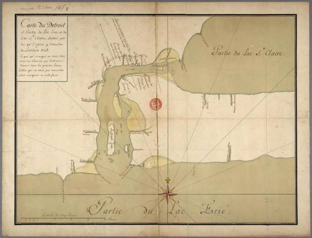
This map caught my eye because I had never seen it before. The French-Canadian Heritage Society of Michigan shared the map courtesy of the Bibliothèque et Archives Canada / Library and Archives of Canada, but the link is broken now.
I’ve posted just one other map from 1731 and this might be a copy of that map. Gaspard-Joseph Chaussegros de Léry was King Louis XV’s Chief Engineer of New France. He made many maps of the territory that included Detroit as a key military, trade, and transportation location. His other work included the Plan of Detroit (1749) among others.
This map is a copy, which was very common practice, of Henri-Louis Deschamps de Boishebert. de Boishebert was a military leader and commander during the French and Indian War across the territory of New France. He also created one of the very first maps of French ribbon farms in 1731.
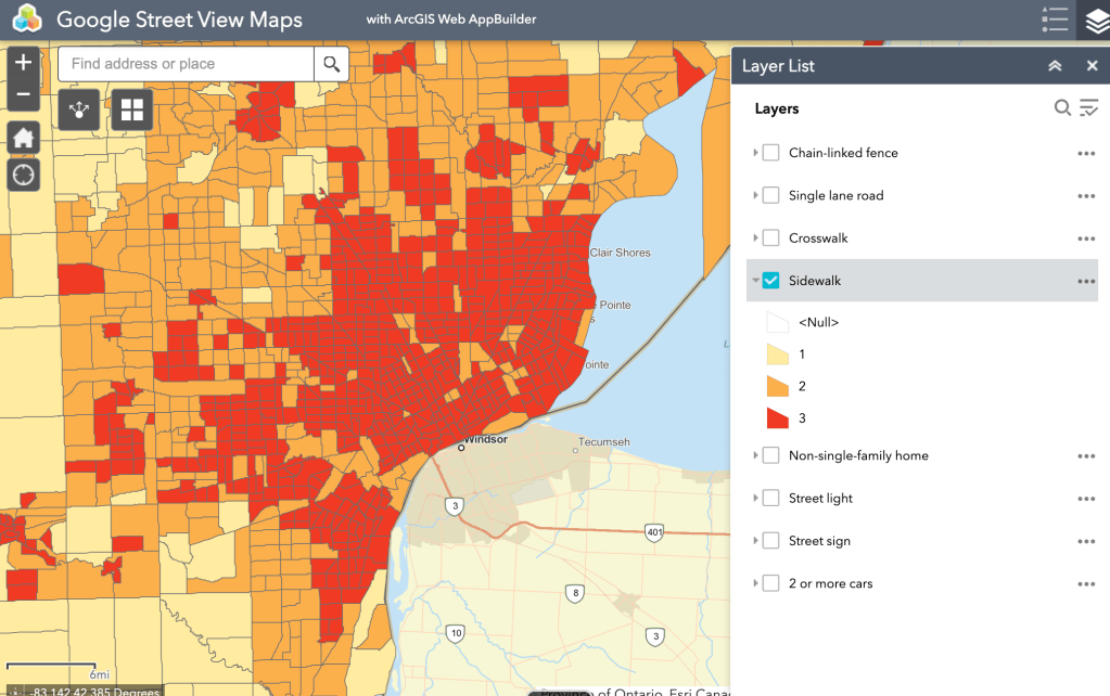
Researchers found that neighborhoods equipped with indicators of development like sidewalks or crosswalks were linked to reductions in obesity and high blood pressure. They also found that more road signs and street lights correlated with lower prevalence of high cholesterol and cancer, as well as reduced depression and smoking.
These findings are based on training a computer model to identify and label a series of features in the built environment. The study analyzed 164 million Google Street View images harvested from across the US. The images were then compared to socioeconomic and demographic data from the US Census and Centers for Disease Control and Prevention (CDC).
The project is exciting and novel with the potential to reduce time to assess built environment indicators, but a critical missing element that all too often haunts Detroit is the inability for databases and models to assess quality of assets in the built environment. A model may find sidewalks everywhere, but fails to categorize many Detroit sidewalks as impassable. Other computer models from MIT based on Google Street View (2014) oddly ranked streets full of cars as less safe than vacant lots with unsafe structures.
These maps based on Google Street View to categorize the built environment, as many data projects do, paint Detroit red. In this instance, the data in question is positive with Detroit presenting with more sidewalks and crosswalks – but with high rates of heart disease, pedestrian vehicle fatalities, and smoking it is hard to see the computer assisted value.
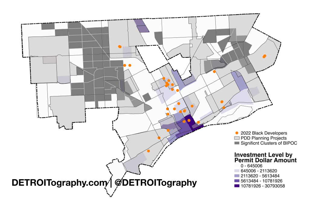
Detroit is a city on the move. New construction and real estate development has been on a break-neck pace that even a COVID slowdown can’t seem to stifle. As a result the important question of equitable opportunity is elevated. A major drawback for Black developers was in the State of Michigan’s “Michigan Strategic Fund” selected the Detroit Downtown Partnership with Bedrock Detroit overlooking all of the Black developers in Detroit that were pushed to submit applications.
Mayor Duggan’s 2023 State of the City address repeated mentions of many real estate projects led by 33 Black developers. It is hardly an exhaustive list of Black developers nor does it even encompass all of the projects they are working on, but it still provides an important marker for where equity is in the real estate equation. Other efforts like Capital Impact’s Equitable Development Initiative (EDI) has supported 56 BIPOC real estate developers, property managers, and investors. Building Community Value has trained 294 individuals interested in real estate in underserved neighborhoods with 85% BIPOC representation.
The Mayor’s list of Black developer projects is focused in the areas where development is already heavily invested in. The exciting piece is that Black developers are involved and benefiting in the higher stakes projects, but there are still numerous underserved neighborhoods waiting to see the same levels of investment as Downtown and Midtown.
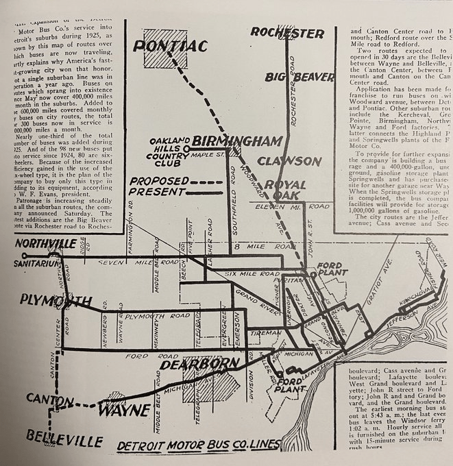
Detroit hasn’t always been a bus city (which I guess is still questionable based on current bus performance). David Gifford shared this map from Book 3, When Eastern Michigan Rode The Rails by Schramm, Henning and Andrews. In 1925, the Western suburbs really stand out with multiple bus lines stretching across Wayne County. There was similar heavy bus service in the Westside of Detroit, but not the Eastside. Based on the proposed Woodward line all the way to Pontiac I’m going to say there should have always been an elevated light rail built along M1.
The February 2023 ice storm decimated the already under-invested in infrastructure of DTE’s electric grid. Over 620,000 customers were impacted across Southeast Michigan and many still today have not had their power restored after 7 days of no power. Eric Lau of Michigan Daily created this timeline map of DTE outage data from their outage map’s API, Kubra Storm Center. In the last year DTE generated over $1 billion in profits and announced postponed maintenance in 2023 to it’s shareholders the same day that the ice storm hit.
When the Detroit Innovation District (DID) launched in 2015, there was very limited information as to what that meant and even less information on what new funding or resources would support said “innovation.” I just recently stumbled upon these analyses completed by Interface Studio that maybe proves the point that the groups pushing the DID didn’t have the plan fully fleshed out either. When it comes to innovation districts, Detroit’s was massive (4.4 sq mi vs. 1 or 2 sq mi) and the end recommendation was to focus on micro-districts within the DID.
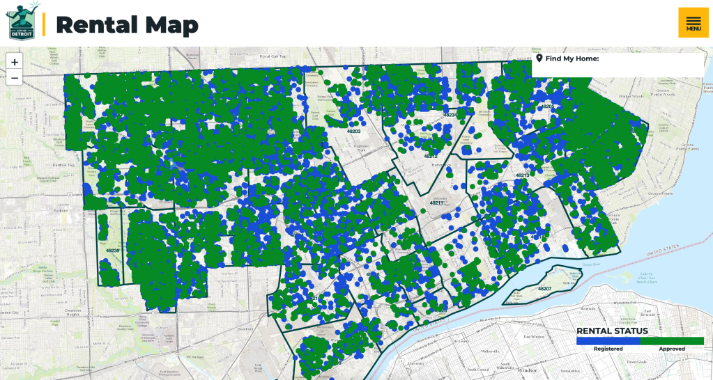
In an effort to improving living conditions and ensure all landlords were compliant with city ordinances, the City launched a mass hiring of building inspectors and ZIP code by ZIP code inspections of registered or suspected rental housing. Many advocates were concerned that this might lead to an inadvertent mass eviction crisis, but eviction is already too commonplace in Detroit. The effort has been very slow and difficult to manage, but has continued. Many tenants have been able to win court cases because delinquent landlords have been shown not to be compliant with city ordinances.
The improvement of housing in Detroit will require upgrades and assurances of safety and quality. This map helps keep track of where landlords have kept up with health and safety compliance or not.
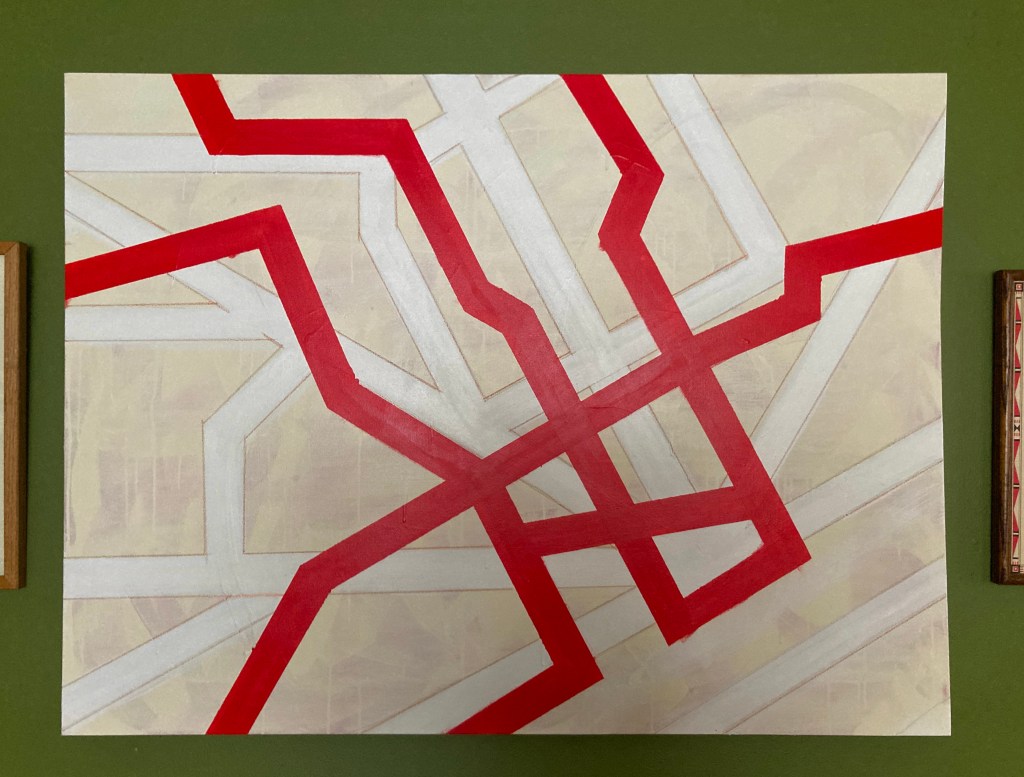
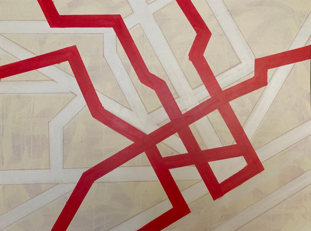
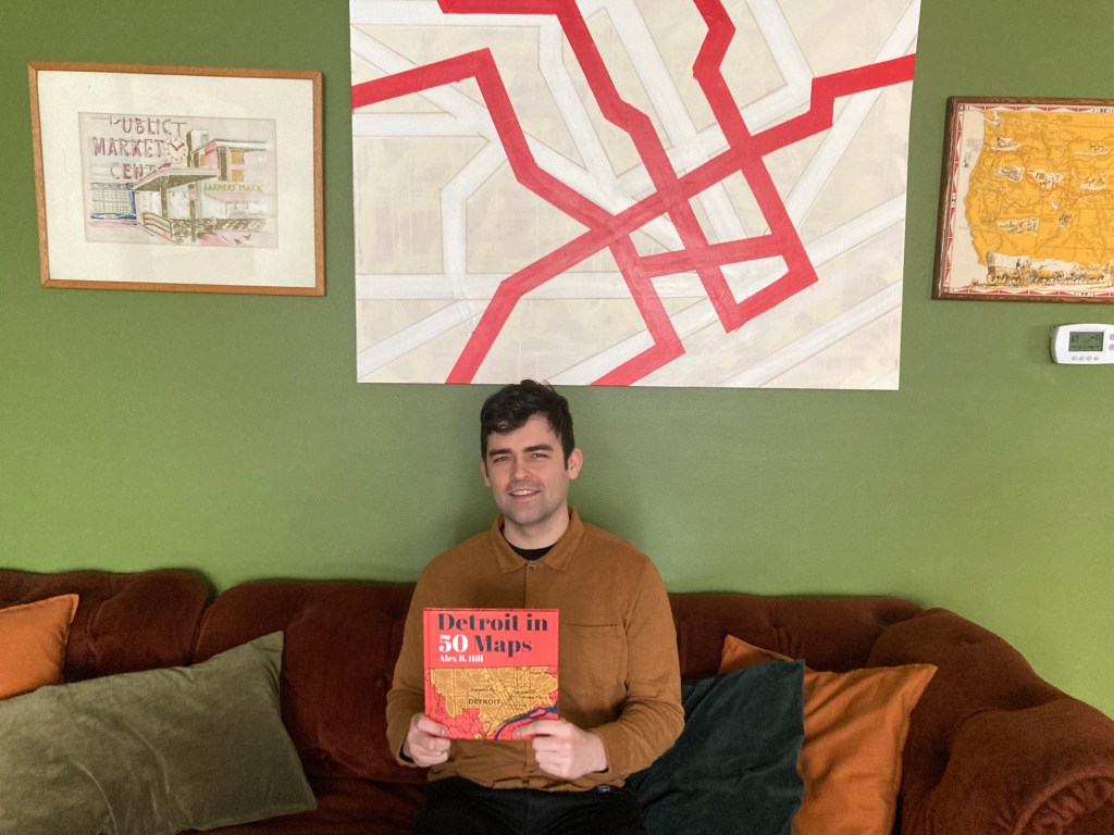
My map is an original 3ft x 4ft abstract painting that depicts major roads and highways across the greater downtown region of Detroit.
Where did you find/acquire the map?
I recently painted this map myself, using latex paint and pastels on canvas. I wanted a large, minimalist, geometric abstract piece of art to fill up a wall at home, so I decided to try and make one myself. I’m not an abstract artist, so as I thought about inspirations for a painting, I decided to utilize something I’m personally passionate about – a map of Detroit.
What made you hang it on your wall? What stood out to you? What details do you enjoy about the map?
I created the painting to hang on my wall, which influenced some of my design choices. I wanted to make a simple geometric abstract painting that could stand on its own, but also clearly resemble a map of Detroit for those familiar with the city. Rather than trying to accurately recreate a scale version of a Detroit street map, I chose to use abstract representations of some of the major surface roads, like the spoke roads, a few major mile roads and north-south thoroughfares, and some neighborhood arterials, in order to make a balanced composition of bold lines on the canvas.
I knew I also wanted a bold contrasting color on top of the muted neutral background, so I used a bright red to represent the freeways that cut through the city – the Lodge, Davison, I-75, 96, 94, and 375. The stark contrast in colors also suggests how out-of-place the urban freeways are compared to the city’s original spoke-and-grid surface roads.
What in your background has drawn you to maps?
I’ve always loved studying maps as a way to understand how cities function. I have a PhD in political science, which involved research on urban studies, such as how housing and industrial policy physically affects the people, communities, and therefore the maps of cities. Studying the history of Detroit in particular has also been a longtime passion of mine.
I also do film photography as a hobby, and I photograph historic architecture, signage, and streetscapes of different cities that I visit. I often plan driving routes for taking photos in cities by spending a lot of time on Google Maps, studying routes through neighborhoods to capture different types of architecture, businesses, and places that interest me.
I first took street photographs driving around Detroit when I was in high school in the suburbs, for a photo class. Since getting back into photography about 7 years ago, I’ve taken time to photograph Detroit a few times a year. I’ve gotten to spend a lot of time driving through different neighborhoods to get an understanding of the various roadways, buildings, businesses, housing stock, architecture, and rates of change over time throughout the city. This process of capturing photos of places throughout the city while driving and studying neighborhood maps has helped me get a better understanding of the city’s layout, the differences and uniqueness of various neighborhoods, and a greater appreciation for the history of Detroit.
The New York Times mapped tons of CO2 emissions per household for large cities across the country. In many cases the cities themselves were relatively low in CO2 emissions by households, but wealthier suburbs surrounding suburbs had extremely elevated rates of CO2 emissions based on home purchases, vacation travel, and energy costs.
In the spirit of the new year, I’ve mapped out locations where you can purchase home improvement supplies. It is important to note that there are very few national retailers located in Detroit, so as with many retail categories, home improvement and hardware options are very local and many have been around for decades. There is only one national hardware retailer, Home Depot, on W. 7 Mile Road and Meyers. Detroit housing has many quirks and specific needs as well, so you can find a number of specialty plumbers for those odd shaped fittings and more.
Plumbing retailers are somewhat distributed across the city, but paint specific stores are only in a few areas while general hardware stores exist in every corner of the city.
How did you come to make this map? What’s the story?
Since 2015 I’ve made several maps for the Rotterdam hostel Ani&Haakien and these maps grapped the attention of the nice people running Hostel Detroit. They contacted me through social media and we were able to make a deal where I could stay in the hostel for free for three weeks and get some dollars for food. This way I was able to work for a few hours a day and still have enough time to enjoy and explore the city, party a little bit and get inspiration to work on the map the next day.
What are you most proud of in the map? What stood out to you? What details do you enjoy about the map?
Of all the maps I made Detroit was definitely the biggest and most challenging one. It’s also the only one where I had the opportunity to use both sides of the paper which allowed me to make a zoom-in of the city center and highlight some of the cool places with little isometric illustrations.
What in your background has drawn you to maps?
I’ve always preferred exploring big cities above laying on the beach all day getting burned. Visiting these places I often stayed in hostels where I found maps that were interesting to me being a graphic designer/illustrator. Making maps forces you to work very precise but also leaves place to get creative and leave your own signature. Every big city has a different vibe that I try to incorporate in the project.
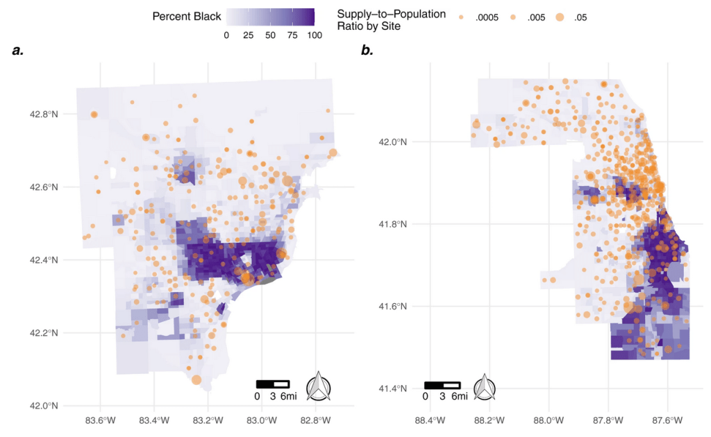
A recent journal article puts some analysis behind my observation in March 2021 that vaccine distribution sites were not equitably chosen or distributed to best serve Detroiters. I observed that vaccine sites reflected the historical and ongoing “retail redlining” where corporate retailers avoid predominantly Black neighborhoods and cities. (See also historical blue-lining)
The authors write:
[…] we find notable racial disparities in the organization of vaccine distribution in both locations. We find census tracts with a higher proportion of Black residents were served by noticeably fewer vaccine distribution sites compared to nearby tracts with fewer black residents in both Detroit (38% less, Fig. 4a) and Chicago (28% less, Fig. 4b).
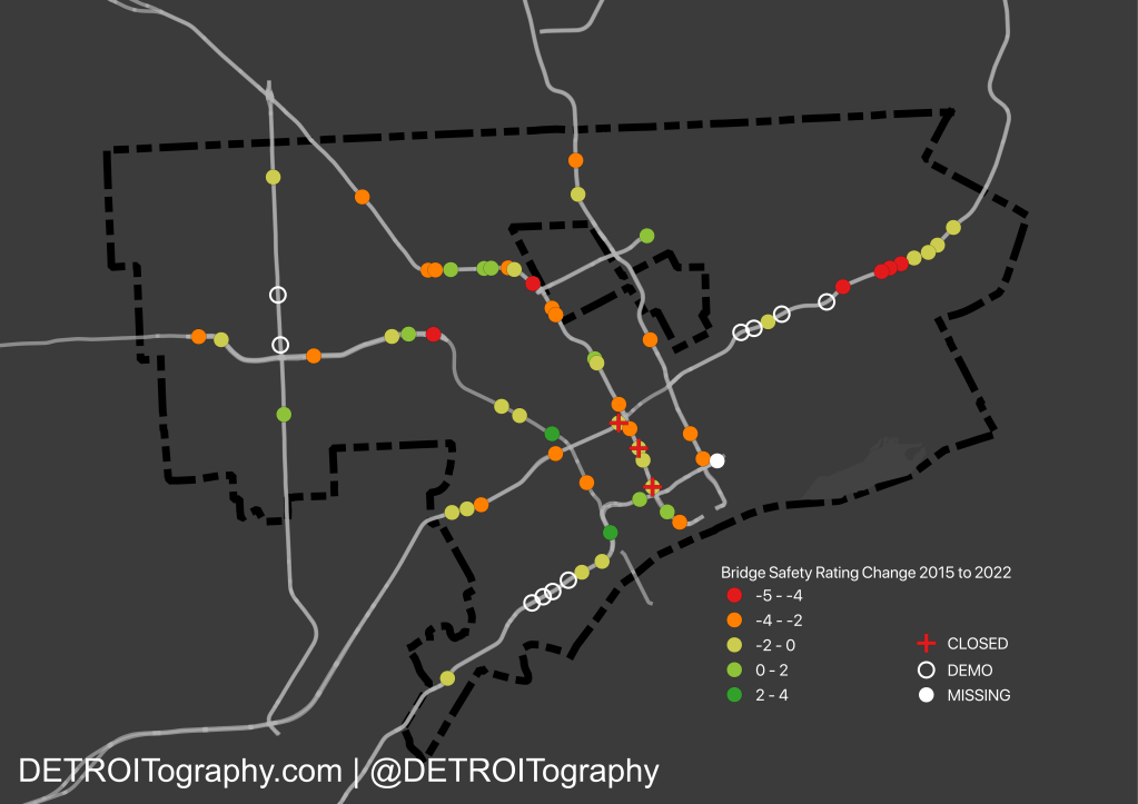
Pedestrian bridges and overall walkability infrastructure in Detroit is suffering even with new investment in a $27 million bridge, street repaving, speed humps installation, and streetscape improvements. Our collaborative research from 2016 gained popularity after a man fell through the collapsing concrete of the Spruce Street pedestrian bridge.
A team of WSU students surveyed all 71 pedestrian bridges in 2015, today there are 59 pedestrian bridges: 10 demolished, 3 closed, 1 not included in the MDOT dataset. The extensive construction for the new international bridge crossing has meant the removal of pedestrian bridges along I-75 as well as the widening of I-94. Many of those bridges were deemed unacceptable in 2015, but the resulting loss of access is significant to the communities nearby.
This map specifically shows where bridge ratings have gotten worse. The majority of I-94 pedestrian bridges are just continuing to fall into disrepair with no clear plans from MDOT for investment or improvement. Most concerning are the closures of pedestrian bridges near Detroit’s core. Access to amenities and jobs are critical when as many as 25% of Detroiters don’t have access to a car. A large number of bridges slipped into the orange category, just a few data points away from being too dangerous.
As a member of the Coalition for Property Tax Justice, which has been organizing against the $600 million overassessment of property values in Detroit that drove much of the tax foreclosure crisis, ReGrid (Loveland) created the Detroit Assessment Gauge tool. The tool compares the assessed value to the average property value from the US Census. The tool is meant to help homeowners check if they may have been overassessed.
A recently published audit performed by an independent accounting firm hired by the city found mismanagement and little to no standards at Detroit’s Assessor’s Office during those years.
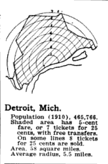
The concentric circles on this map caught my eye accompanied by an odd jagged edge. In 1916, Detroit was much smaller in size than it is today. The 1916 boundary line would fall roughly within this map, but that’s not what the outer boundary line represents here.
This map was one of 15 included in an infographic in volume 48, page 222 of the Electric Railway Journal. Detroit was included among Boston, San Francisco, and Washington D.C. along with Buffalo, Milwaukee, and Kansas City. The circles represent miles distance from the “traffic center” or the city.
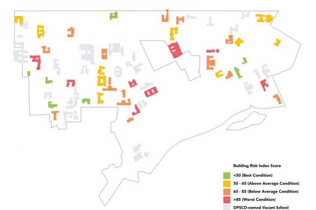
In 2020, the City of Detroit conducted a one-year study of vacant school buildings in collaboration with Interboro Partners, WJE, and BJH Advisors. In all 39 school buildings owned by the City were assessed along with 24 other buildings owned by DPSCD. The project was dubbed, “After School Detroit” not to be confused with actual after-school programming for children:
“The team observed the condition of the buildings inside and out, and took photos, measurements, and notes to document each space. The team also studied the characteristics of the surrounding neighborhoods, the local real estate market, and the historical significance of each school. The goal of the project was to explore the possibility of reusing historic vacant school buildings and to imagine new futures for these special places.”
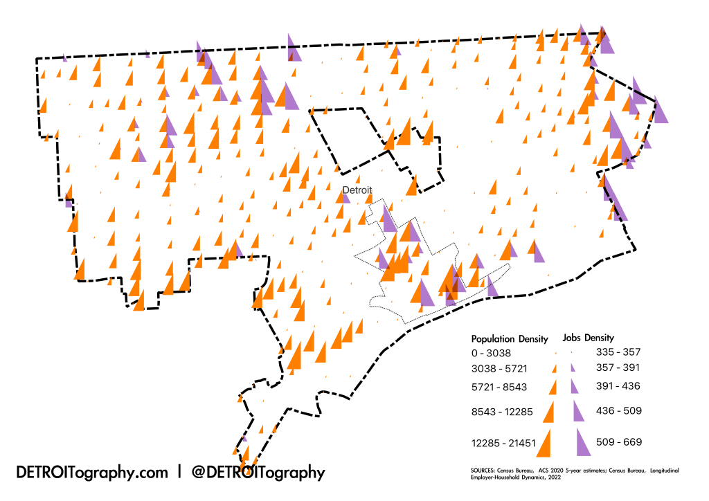
In Detroit, the spatial mismatch of people to jobs and opportunity is stark. It gets all the more stark when just 30% of available jobs in Detroit are held by Detroiters (Census Bureau, LEHD). The healthcare, education, and government sectors anchor Detroit employment which is why Detroit’s three main hospital zones highlight with jobs: in Greater Downtown with the Detroit Medical Center in Midtown along with Wayne State University, in Northwest Detroit where Sinai-Grace is located, and along the Eastside border with St. John’s Hospital and a number of skilled nursing facilities.
The Opportunity Index by Kirwan Institute showed this same mismatch nearly a decade ago and included an update for the Kresge Foundation. Opportunity had improved in Greater Downtown and worsened in Detroit’s neighborhoods between 2000 and 2010. The more recent Opportunity Atlas from Opportunity Insights, Harvard, and Brown Universities built off of Raj Chetty’s research into: “Which neighborhoods in America offer children the best chance to rise out of poverty?“
I also made this map because sometimes we think we have a good grasp on the geographic distribution of people or jobs or pheasants in Detroit, but I always need to see the data on a map to be sure.
Contact
Submit a map or just get in touch. Thanks for following!