This map was shared by the Detroit Historical Society and is an interesting look into the past. Some project names are even in the works today, like Lee Plaza. Big projects of this time period included: West Side Industrial, Medical Center, Elmwood, and University City (Wayne State).
The Detroit Housing Commission prepared this map in 1969 to highlight areas of low income housing, redevelopment, and code enforcement.
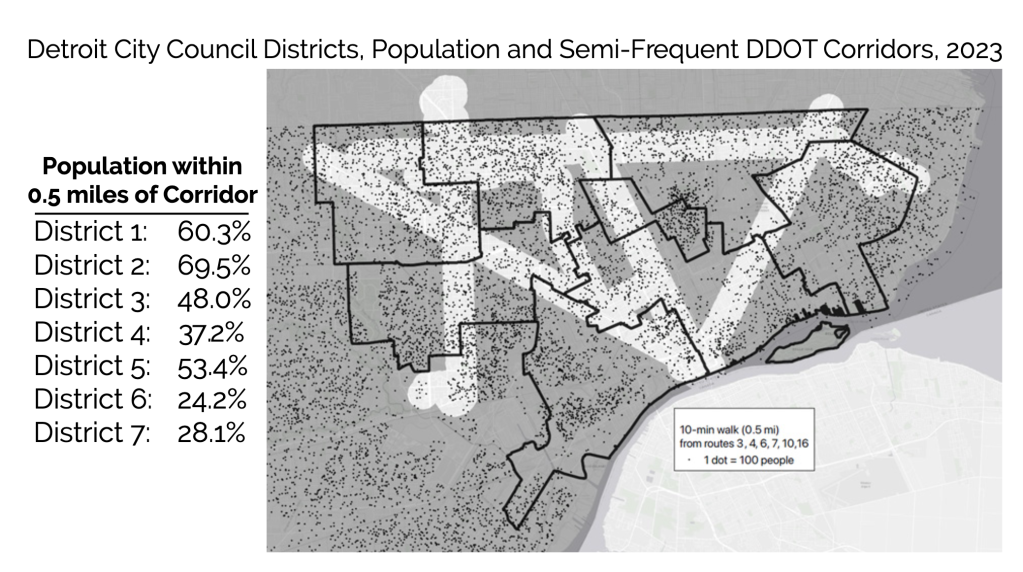
In the latest report from Transit Riders United (TRU), Save Our Service, they dig into the failure of DDOT and SMART to return to pre-pandemic levels of service compared to other cities.
The map below shows the current extent of semi-frequent DDOT service, running every 20 minutes during the day on weekdays. As seen, in four of the seven Detroit City Council districts, a majority of residents live more than one-half mile from these semi-frequent routes.
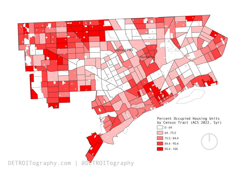
Understanding occupancy and vacancy in Detroit is a constant data battle. The known crises of low home mortgage origination, large-scale evictions, and property speculation make Detroiters unduly mobile having to secure housing by various means and face multiple barriers along the way.
The last subjective assessment of occupancy in Detroit came with the 2014 Motor City Mapping project, but relied on responses of surveyors. The City’s current in-house streetview imagery could be used to do the same, but might not capture indicators like utility turn-ons. The DLBA used to run a quarterly “occupancy index” model that included DTE account information to better assess occupancy, but as far as I have heard the data sharing agreement fell apart years ago.
The next best option is Census data on occupied housing units or USPS data on vacancy. I try to opt for the more positive data indicator with where people are in housing. We see a familiar pattern that maps onto the population dense clusters across the city.
Apple Music and Apple Maps made an effort to create a city guide with Detroit’s Most Essential Music Venues. While they captured many great spots with St. Andrew’s Hall, Marble Bar, Baker’s Keyboard Lounge, and many in Detroit’s entertainment district – there are many missing notable spots. I would suggest they need to add the Garden Theater, Chene Park/Aretha Franklin Amphitheater, Old Miami, and PJ’s Lager House. Apple has another guide to local Detroit spots that includes many of those missing from the “essential” list, so maybe I’m thinking too local?
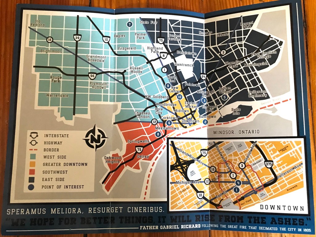
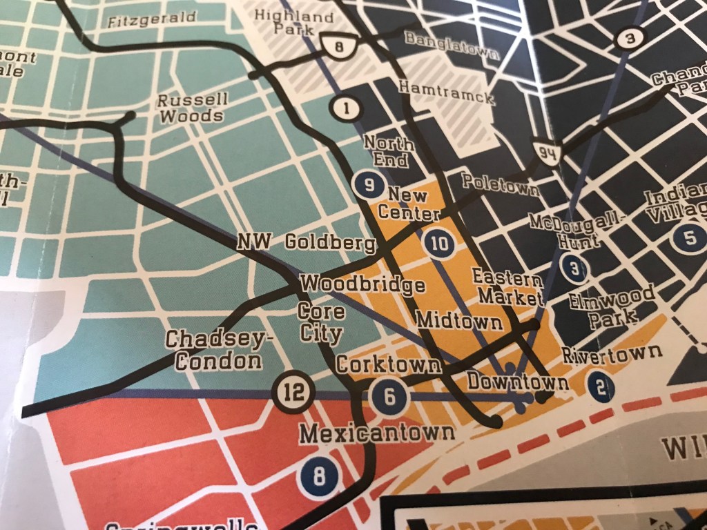
“A Map of Detroit, Michigan, USA.” Originally created in 2020 for Jeanette Pierce and Detroit Experience Factory, and updated for her organization, The City Institute, in 2022.
How did you come to make this map? What’s the story?
I have been working with Jeanette for years, first as a tour guide at DXF and then as a designer for all sorts of projects related to that organization and its successor, The City Institute. In addition to providing tours, DXF operated The Welcome Center downtown and handed out a number of helpful free print resources to the folks who would stop in. The map was created as both a promotional tool for their tours and to give a quick overview of notable points of interest to someone looking to explore the city. It also aimed to provide some brief history and information about each of those places.
What are you most proud of in the map? What stood out to you? What details do you enjoy about the map?
I’m most proud of how playful it is, visually speaking. We tried very hard to walk that line of functionality and aesthetics. We accepted the reality that paper maps are a novelty for most people and that the majority of them would end up navigating to their final destination on their phone, so we chose to keep it very simple in terms of details like street names. The result is a handy list you can glance at and get a quick sense of the general area, the proximity between places, and the broad route that you would need to travel to get there.
One of the details that I enjoy is the inclusion of so many of the neighborhood names and locations. To me, the act of naming a place gives the reader more of a feel of the area, even if they are a total stranger who doesn’t know anything else about it. A named place feels more real to people. And those individual neighborhoods are the lifeblood of any city because that’s where the majority of the residents actually live, so directly calling them out was a big priority for us.
What in your background has drawn you to maps?
I’m a big history buff and I love knowing how things work. I feel like you can really understand how a place has grown and see its inner workings on display on a map. You can look at the street patterns and directly relate them to waves of immigration into an area or to the migration out of them, to the openings and closings of entire industries, and so much more. You can see what the people living there prioritized, make inferences about what their local leaders envisioned for the next generation, and how those visions succeeded or failed. With the right context you can look into a place’s past, present, and future on a good map.
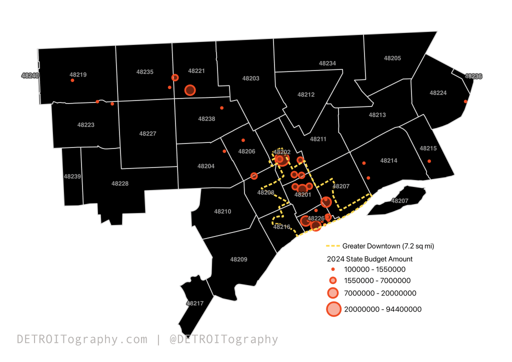
The news media have covered all the “grants” to Detroit and metro Detroit pet projects or pork barrel projects in the 2024 Michigan State Budget. If you know the monied interests and political relationships between Detroit and Lansing there isn’t much that comes as a surprise. The media often highlight 15 clearly Detroit projects, but overall there were 36 Detroit grants or notable line items totaling over $213 million. Almost half of that amount is from the literacy lawsuit settlement with students from Detroit Public Schools for $94.4 million (Gary B. vs, Whitmer).
Most of the grants (n=20) are $1.5 million or less. A handful are between $3 million, like those supporting the Detroit GOAL Line, Detroit Parent Network, and Global Detroit to $5 million for projects like the Fisher Building redevelopment as well as the same amount for the Fisher Body Plant No. 21. The Greektown streetscape and an unclear “Henry Ford Health Center” take the top dollar amount at $20 million. Other projects that were missed by the media include 3 grants to Motor City Blight Busters, Grandmont Rosedale Mixed Use Development, and the North Rosedale Community House.
This map is wild because the City of Detroit accepted more vacant land and structures from the old school district in exchange for unpaid electrical debt.
Since 2014, many of those properties remained vacant and unused as documented in the After School Detroit assessment conducted by Interboro Partners, WJE, and BJH in 2020. Maybe many of these sites will become solar farms as the Mayor has recently presented?
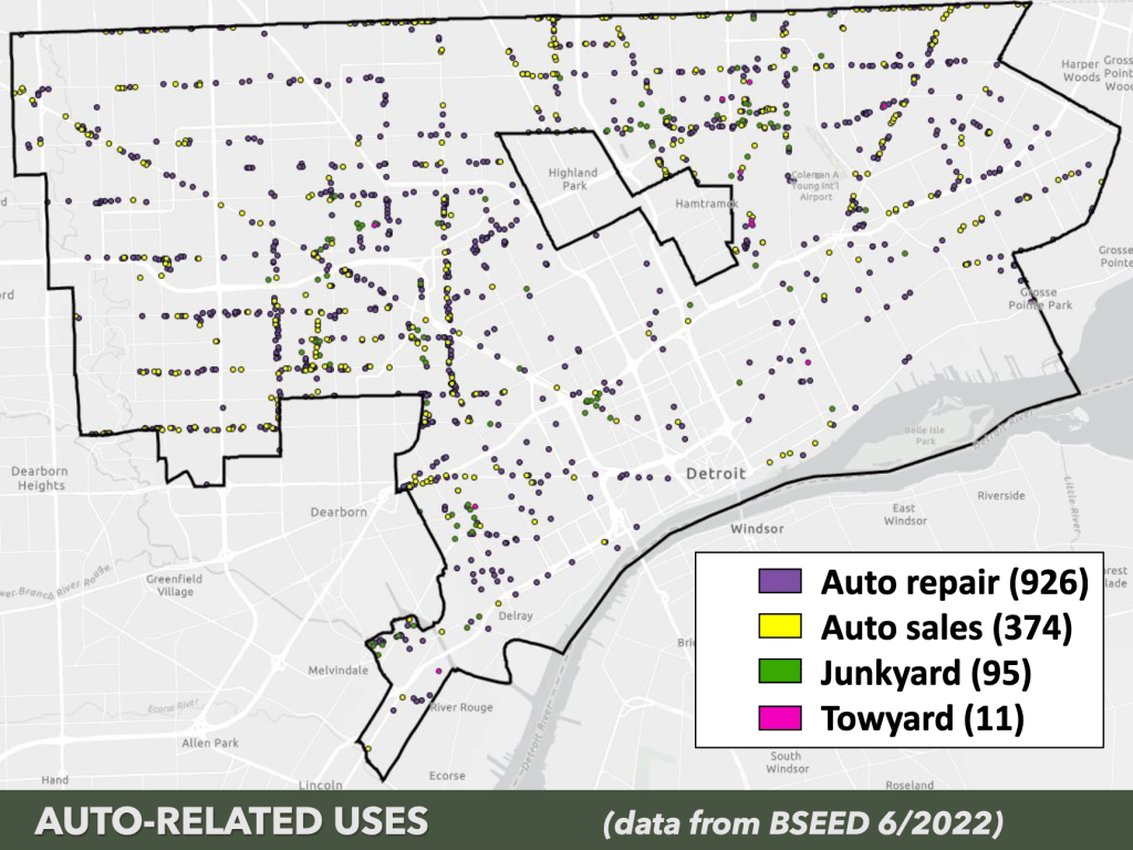
If you’ve been following on Twitter, I’ve been attempting to interrogate the Mayor’s recent data points that he listed in his Mackinac Policy Conference (MPC) 2023 speech. Specifically, he noted 452 auto/scrap yards (original tweet used incorrect 454 number) with very limited information on what that category meant. The number seemed absurdly high to me as well as other city staff that regularly work with data.
The journey took me from the Mayor’s speech to “point of interest” datasets with NAICS codes to a FOIA sent to EGLE only to have the EGLE social media team actually be most helpful. In the end the source and dataset are still mysteries, however I was able to track down the presentation given to the City Planning Commission based on BSEED data in June 2022.
The map categories list 1,406 sites, which are majority “auto repair” sites not scrap or junkyards. However, the city’s Law Department and the resolution to change the zoning notes 1,548 sites in question. I’m still waiting for access to the dataset used and learning about its sourcing. I have yet to learn if this is the same dataset used to identify hardware and grocery stores.
The map is not the best, but the data is beyond significant. The Fair Housing Center worked with UM researchers to analyze housing discrimination in the Detroit metropolitan region. The article Residential Racial and Socioeconomic Segregation as Predictors of Housing Discrimination in Detroit Metropolitan Area, found fewer complaints from Metropolitan Detroit areas with larger numbers of whites, homeowners, or higher median income levels as compared to neighborhoods with fewer of those characteristics. The article proves the fact that low-income renters of color experience the vast majority of housing discrimination in the Detroit region.
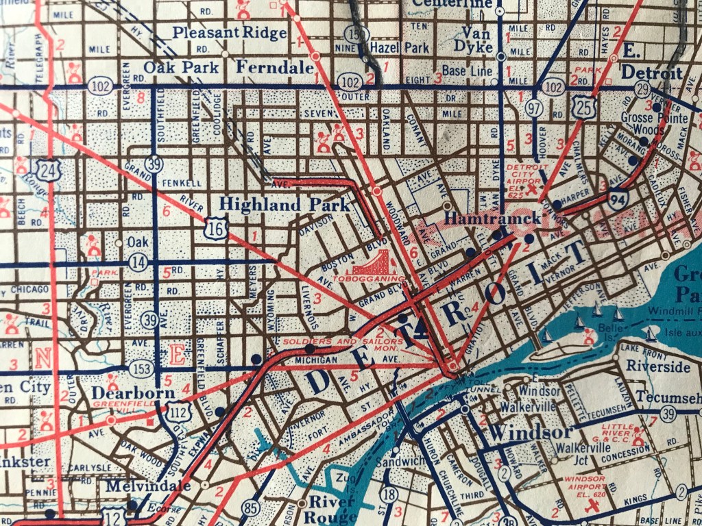
I shared this map on social media because of the odd tobogganing ramp placed somewhere between Henry Ford Hospital and Herman Kiefer.
The map comes from the 1955 Fifth Edition of the “Michigan Road Atlas Fishing and Hunting Guide” that includes boat launching sites and winter sports facilities.
I went back and checked the 1950 First Edition too and the tobogganing facility is there. The mystery is that in the 1950s I can only find mentions of tobogganing at Rouge Park, Balduck Park, Dorais Playground (Derby Hill), and a park in Redford. Anyone recall tobogganing in New Center during the 1950s?
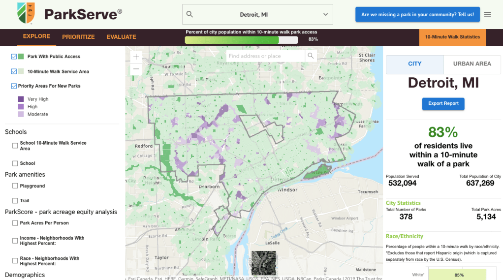
In the latest ParkServe scoring from the Trust for Public Land (TPL), Detroit dropped three places to 60th among the 100 largest cities.
Detroit scored (higher is better) 21 for acreage, 26 for investment, 49 for amenities and 72 for equity. So doing well in access and equity, which make the other low scoring categories more concerning.
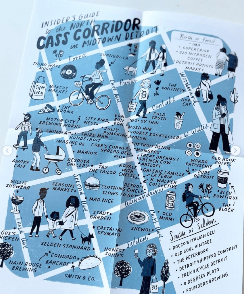
A map of Detroit’s Cass Corridor neighborhood. Created in Spring of 2023 as a collaboration with City Bird and Midtown, Inc.
How did you come to make this map? What’s the story?
Andy Linn, from City Bird, approached me about creating a map with the help of Midtown, Inc. that would highlight just how walkable Detroit’s Cass Corridor is. We all wanted this map to highlight all the great small businesses that make this neighborhood so special and accessible.
What are you most proud of in the map? What stood out to you? What details do you enjoy about the map?
I’m most proud of how much we worked into the map! Creating maps is a very difficult task so I was glad we were able to include all the locations we wanted while still having there be some design flair. My favorite part was creating the little people. I thought of all the interesting and inspiring people I know and see daily around here and used them as inspiration on the map. I love the little local easter eggs hidden throughout the map as well, if you know you know.
What in your background has drawn you to maps?
I’m an illustrator and have been creating maps for a long time. I love the storytelling aspect of them. These maps aren’t meant to be 100% functional. They are meant to tell a story and give you a sense of an area. You can learn so much about a neighborhood by just taking a quick glance at an illustrated map. Everyone has access to a smartphone nowadays so no one “needs” this map but it’s the storytelling component that makes it an important piece.
The G-word always invites controversy and confusion, but from the authors own work:
To assess gentrification, longitudinal analyses were performed to examine median household income, percentage with a college education, median housing value, median gross rent and employment level.
There are issues with assessing geospatial phenomena using ZIP code level data, but these findings give pause and hopefully encourage a greater deep dive.
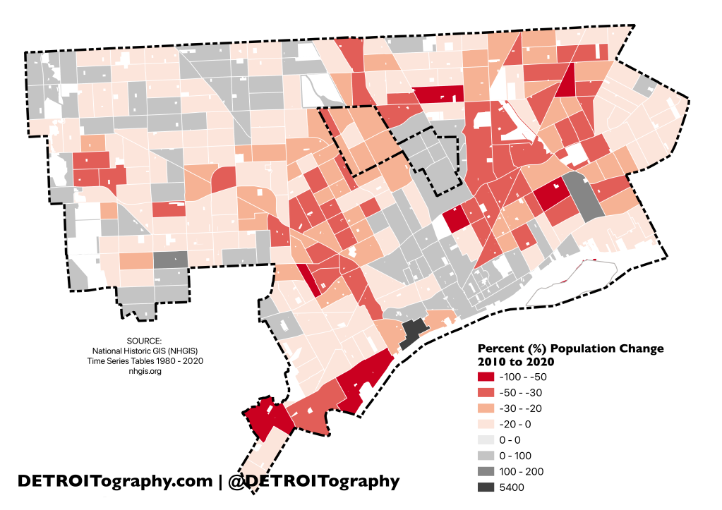
Sometimes I make a map because I’m unhappy with what exists out in the data-sphere already. This is an instance of that exact scenario. A local organization put out a map of population change between the decennial censuses (censi? censai?) using a poorly chosen color scheme and a misleading legend and data categories. What really stood out most was that there was 5,400% (WTF) increase in population somewhere in the city. I assumed it had to be an error or a mistake, but I also could not tell from the map where such a massive population increase occurred.
There was a single census tract in the Hubbard-Richard/Corktown/West Side Industrial area that gained significant population since 2010. I racked my brain for a long time trying to figure out why or what developments contributed to the area going from 4 people in 2010 to 220 in 2020. I had to reach back in time and recall that many of the empty warehouses were converted into lofts. The Hudson (2011) was one of the first with about 80 units, then The Coat Factory Lofts (2014) with 62 units, and most recently The Assembly (2019) with 32 units. Most of the units are one bedroom with a handful of two and three bedroom units. In all the 174 units house an estimated 240 people.
What had been a relatively empty industrial and warehouse square of the city now houses quite a few more people. New amenities like the West Riverfront park and even more housing are coming soon as Ford Motor Company redevelops the train station.
Ever since I saw the similarly named map of Manhattan, NYC in an Atlas of Radical Cartography I have wanted to recreate the concept for Detroit. The hardest part as usual was data collection or data access. Collecting data on surveillance and CCTV cameras would have taken forever, but was possible. One of the Data, Mapping, and Research Justice workshops that I ran tested data collection in the Cass Corridor, which had surprisingly few cameras. I randomly stumbled upon the CCTV data variable on Mapillary, which is an open source streetview platform. Submitted streetview images are scanned to extract multiple data points and cameras happen to be one. The data is not perfect, but is fairly reliable since the City of Detroit itself is capturing and submitting streetview imagery to Mapillary.
Now, Detroit is a city full of security and surveillance: Project Greenlight, Shotspotter, expansion of Automated License Plate Readers, etc. Wayne State University Police Chief Holt is quoted as saying, “Anywhere on campus, if you look up, I can see you.” The WSUPD managed the camera apparatus that was installed prior to the 2006 Super Bowl XL until the Detroit Police were able to take on the resource via their $20 million Real Time Crime Center. WSUPD has at least 380 external cameras across campus properties.
The Gilbert/Bedrock/Quicken group has installed at least 850 cameras on the properties that they own, manage, or ones just wish to own like American Coney Island and 1515 Broadway. The offending entity turned out to be Compuware security, but many if not all major Downtown companies have been sharing and collaborating on surveillance for many years.
In all I found 2,943 surveillance cameras in the Greater Downtown 7.2 sq mi area. The best I could do was find a route that encounters at least 41 cameras within 25 feet of the route. The route starts in New Center Commons on Third Street and ends up at Hart Plaza, which is full of cameras. Once you reach the Central Business District it is impossible not to be captured on camera or possibly surveilled.
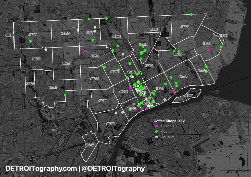
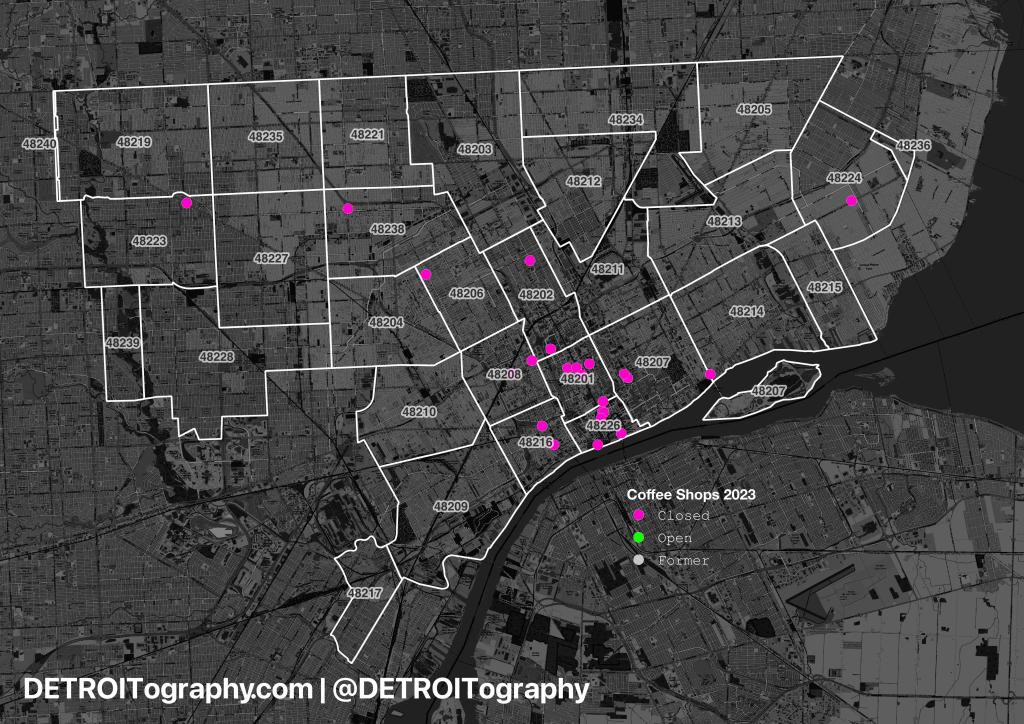
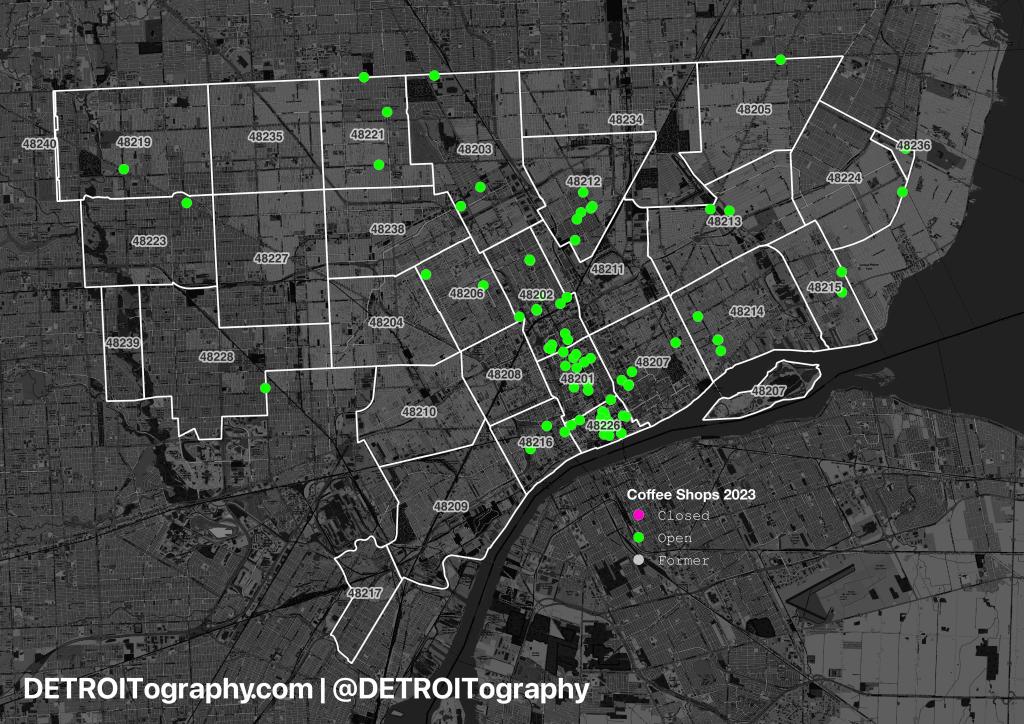
In the last few years, Detroit lost some staples of the city’s coffee and gathering spaces, including:
Avalon Bakery (original location)
Astro Coffee
Bikes and Coffee
Great Lakes Coffee
Starbucks (Midtown)
3 Tim Hortons locations
Despite all the closings (n=21), the city is only down by one coffee shop overall from 84 to 83 coffee shops. Since 2021 there have been 20 new coffee shops or pop-ups launched. The focus for coffee remains Downtown and Midtown, but the neighborhoods remain under-served by third places (not home, not work).
Other staples got new life as renewed coffee shops:
Detroit Rosa (former A Public Square, former Towne Hall Caffe)
SPKRBOX (former Urban Bean Co.)
Red Hook – Midtown (former Great Lakes Coffee)
Still more moved to grow in new locations:
Anthology relocated to Eastern Market
Cairo Coffee moved into Spotlite Detroit space
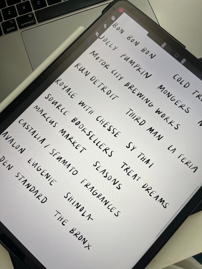
Avalon moved in to share space with Jolly Pumpkin
Gathering spaces in Detroit are a hot commodity and not easy to come by, so the loss of just one is usually a substantial hit to the community. A handful of new baristas are trying their hand at pop-up coffee and we can’t wait until they have some physical space:
Last week I shared that DDOT was creating a new map and entirely new bus routes for the city. DDOT Reimagined now has an excellent StoryMap that includes a map slider to compare existing and reimagined routes.
The site contains feedback, draft proposals, bus route specific changes, and a place to provide your own feedback. Help DDOT Reimagine transportation in the city and submit your comments!
Yet, the coney dog’s popularity has spun up a number of regional coney island chains: National, Leo’s, and Kerby’s. Many suburban metro Detroiters have a preference and meet their friends and family at the local coney island restaurant. National is more Macomb County territory while Kerby’s is very north-central in its locations. Leo’s is by far the most ubiquitous and readily available coney island spot in the region.
As with many community amenities like grocery stores, taco restaurants, and retail, Detroit gets passed over time and time again. Detroit doesn’t need chains or national brands. Detroiters make a way with no way. Coneys are no different. The city has the greatest density and all independent establishments.
This map is part of the DDOT Reimagined effort to create an all new transit map for the city that better serves the city.
Ridership remains high on the city’s major commercial corridors and most heavy along Woodward. Hopefully we will see a significant investment in transit that modernizes and makes DDOT the reliable and frequent service that Detroiters deserve.
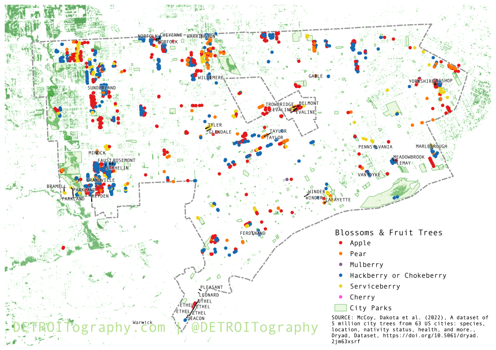
I mapped Detroit’s fall colors and have often been asked where to find fruit trees. Spring seems the perfect time to locate blossoms like Pear and Cherry trees while also highlighting some other fruit tree clusters.
The map noticeably has no Cherry trees, which I think is an error with the dataset. However, as far as I know, only Belle Isle has Cherry trees. The streets are labeled on the map where there are multiple fruit trees. Detroit has a wide distribution of Apple and Pear, but also some dense clusters of Hackberry or Chokeberry.
There is an interesting spatial pattern where neighborhoods further from downtown have more fruit trees as well as the line of fruit trees that mark the city’s Westside. I’m again very thankful that Dr. Dakota McCoy and team have created this cleaned up dataset from disparate tree sources.
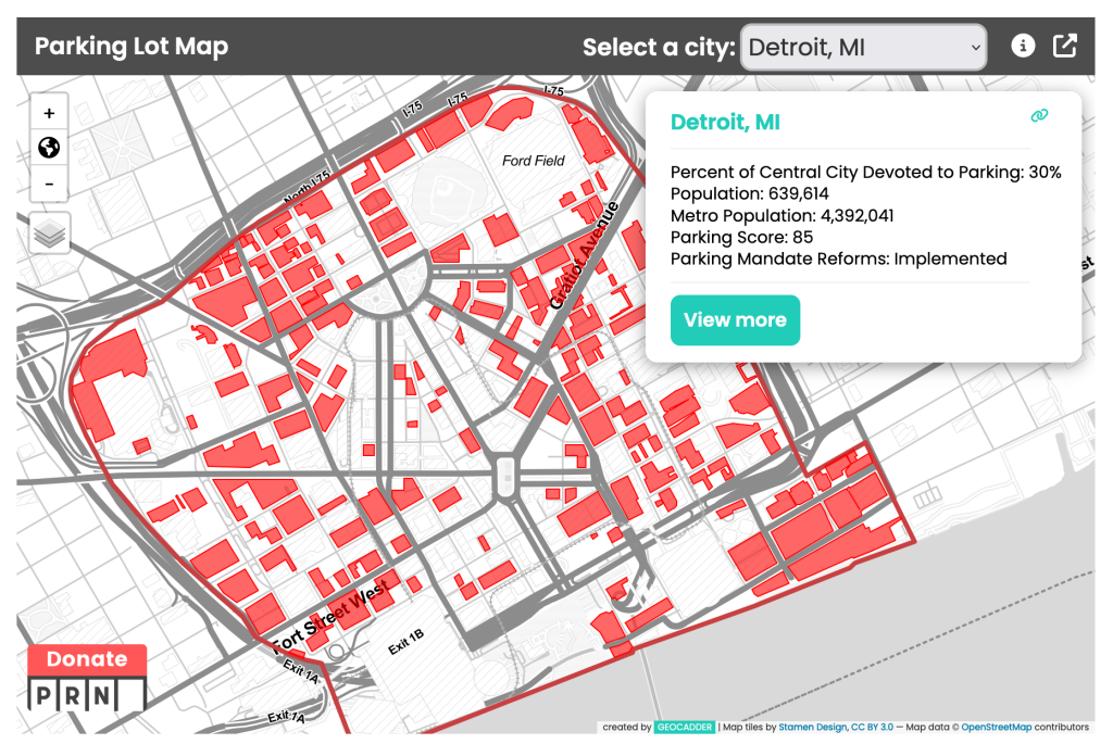
Visually, Detroit’s central business district (CBD) looks to be all parking. The Parking Reform Network (PRN) found that 30% of the CBD is devoted to parking. The absurdity of a car-centric city has harmed Detroiters far more often than supported the growth and vitality of the city.
Contact
Submit a map or just get in touch. Thanks for following!