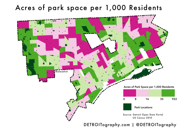
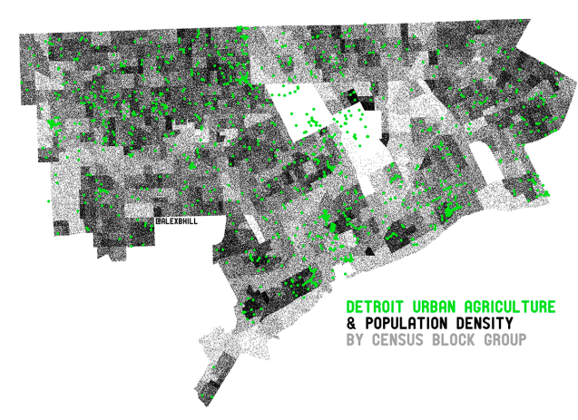
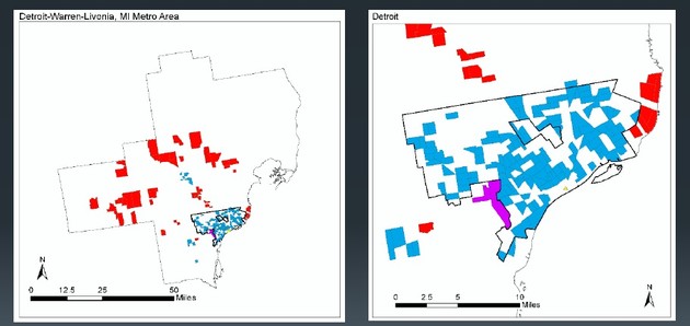
A while back I saw this analysis completed by the WNYC Data News team on park access and wanted to recreate it for Detroit.
There has been a lot of change with parks over the years from the near closing of 50+ parks during Mayor Bing’s time, to an influx of funding to keep them open, then the widespread adoption of parks by community groups, now the new parks master plan, and $11.7 million being dedicated to 40 smaller neighborhood parks this summer.
The map was created by giving every census tract a half-mile buffer and then calculating how many acres of park space fell within those extended boundaries for each census tract. Those acres were then matched to the number of residents living within each census tract.
Some of Detroit’s more populated areas have much smaller parks. With more people and smaller park spaces that leaves fewer acres per person. Many people in the city benefit from Detroit’s many large parks, however the key missing variable here is safety/crime in parks as well as community perceptions of using park space for leisure or physical activity.

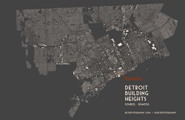
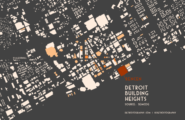

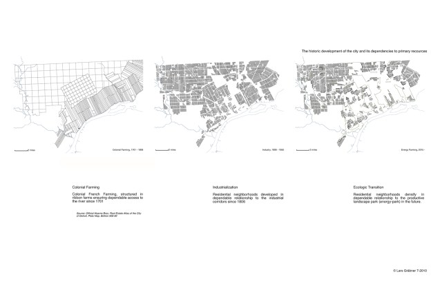
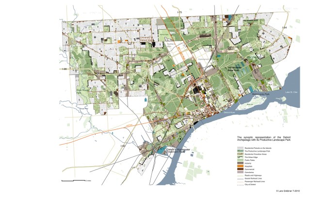
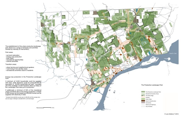

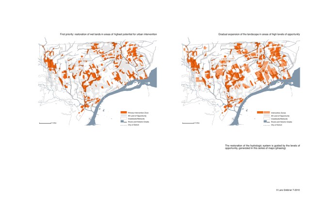 In 2010, Lars Gräbner of
 In 2010, Lars Gräbner of