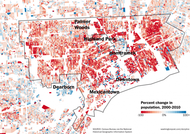
This map ran as part of a 2014 Washington Post piece featuring 6 maps that show people abandoning Detroit. Now we are more than halfway through the next decade and Downtown is reporting population growth while investments have increased in some neighborhoods and others are still in great need.
The most important story that this map tells is that not everyone’s Detroit story is the same. The people and their experiences change in the small distance between blocks.
