This map comes via the Detroit Historical Society and was part of Detroit’s bid in 1963 to host the 1968 Olympics under Mayor Cavanagh. is interesting to compare with the recent Free Press article asking a similar question and ending with: “Maybe it’s time for a joint Detroit-Windsor Olympic bid.”
Author Archives: Alex B. Hill
Map: Packard Plant Redesign with Gratiot Streetcar
Upgrades at the Packard Plant have been slowly moving forward as could only be the case with a hulking shell of a former manufacturing giant, once considered the most advanced in the world. The new owner of the Packard Plant held a “Reanimate the Ruins” contest for ideas to redevelop the site. Nadau Lavergne Architects submitted the winning design and it appears to include another streetcar/ light rail along Gratiot Avenue.
Will Detroit’s growing group of multi-millionaires bring “public” transit to the city?
Map: Detroit Innovation District
Detroit, like many other “recovering” cities, has marked out an “innovation district” to push the city forward. The district contains many other self-described “innovation” boundaries, but this appears to be the main thrust for the future of the city where a zone encompassing all of Detroit’s major institutions, universities, businesses, etc.However, the city said it was taking a hands off approach to the district and there are no new tax incentives.
The “innovation district” is limited to Greater Downtown, which again highlights the need for more jobs for Detroiters. Bridge Magazine recently covered the need to create jobs outside of Downtown, which would be greatly alleviated by public transit that gets people Downtown along with more low-skilled and entry level jobs. The new Regional Transit Authority (RTA) has made access to jobs a priority and the city launched Motor City Match to encourage intra-Detroit business connections.
Innovation that is people-centered: better transit and more jobs for Detroit!
Map: Detroit High Incidence Homicide Clusters 1970
Source: Rose, H. M. & MacClain, P. D. (1990). Race, Place, and Risk: Black Homicide in Urban America. New York, NY: SUNY Press.
Map: Renters and Owners in Detroit 2013
From CityLab:
A map by the journalist and web developer Ken Schwencke shows just how much the rental market now dominates U.S. cities, even those traditionally defined by high rates of homeownership. “Where the Renters Are” plots 2013 American Community Survey data on who’s renting (red dots) and who’s owning (blue dots) across the country’s census tracts. The dots, each of which represents 25 housing units, are randomly placed within tracts.
Event: #Maptime Detroit – Interactive Webmapping

WHEN: August 8th, 2015
WHERE: Grand River Workplace, 19120 Grand River
WHAT: We’ll be learning the basics of web mapping!
Using HTML, CSS, and Javascript, you’ll learn how to:
- Create GeoJSON data: take existing data and convert it, or create your own with geojson.io
- Create & customize a basic slippy map on a web page, using Leaflet.
- Bring your GeoJSON data into the map: style it and make it interactive.
- Publish your interactive map on the web so anyone can see it
You’ll need:
- A laptop. That’s it!
Beginners are encouraged, and be sure bring your laptop
View on Meetup
Workshop: Data, Mapping, and Research Justice
I’ll be teaching the workshop on data and making maps again in August with Allied Media Projects Co.Open. We’ll be doing some data collection and analysis of the changes in the Cass Corridor.
Monday nights in August (4 weeks) 6-9pm
Sign up by July 31st! store.alliedmedia.org
Map: Housing Reinvestment Areas 1997
I’m not sure there has ever been a Detroit development plan that did not focus on Downtown or “core” areas of the city. Under Mayor Dennis Archer this plan could be seen as the pre-Detroit Works Project where community groups were brought together to plan future uses in the city’s 10 neighborhood clusters.
Map: 76 Detroit Parks to be Decommissioned
After pouring over parks data last summer, I had found that 112 parks had been left without any clear plan whether that was community adoption, city mowing, or other. There has been rumor that “51 parks will be decommissioned,” but no word yet on which ones or what that actually means.
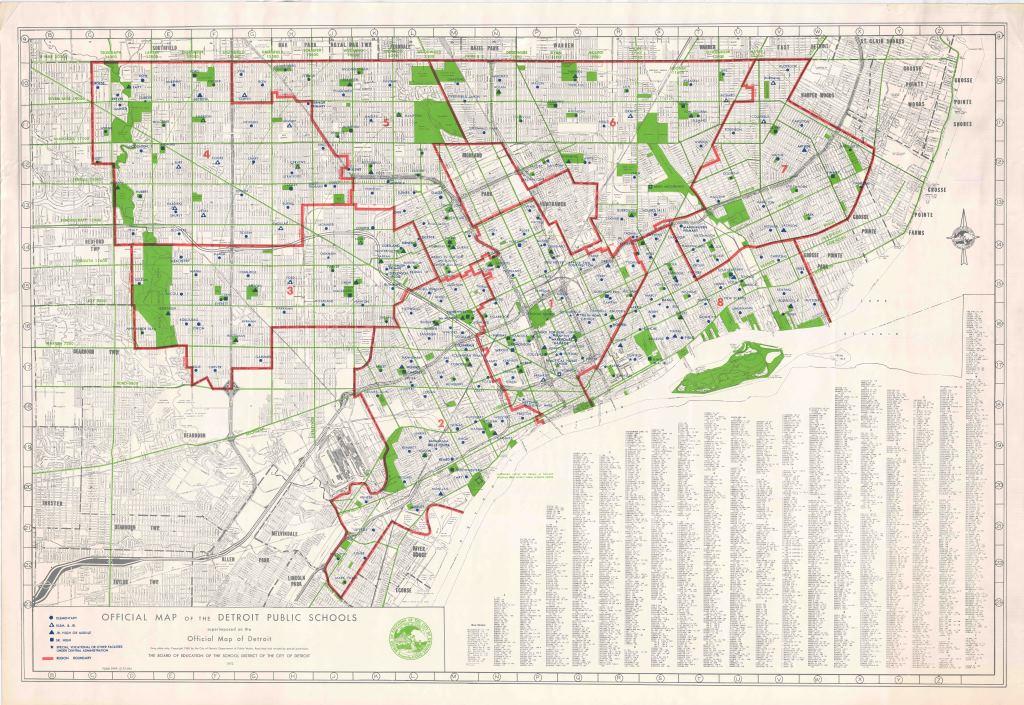
“Though the city would not release a park decommission list to Bridge, a draft of a map from Dick’s department listing more than 60 ghost parks that are either decommissioned or on their way to being decommissioned has circulated among Detroit’s park observers.” – Bill McGraw, Bridge Magazine
In a draft map that is part of the new “parks master plan” 76 parks have been given the designation of “land use opportunity parks.”
- Stone Memorial School or “Stone Pool” is already known to have been promised to DTE Energy
- Redmond Plaza sometimes called “needle park” has been fenced off since the construction began on Selden Standard
- Wick Park might become a parking lot for the new CCNDC affordable housing apartments (link)
- Cass Park was almost handed over to Olympia Development (Illitch) last year (link)
Does this mean the city will sell park land to be developed? Will these be targeted for non-motorized transit oriented development (TOD)? Is there any accompanying data on people served by the green space. It seems odd that the city would give up green space in the rapidly developing inner ring around Midtown/Downtown.
At the same time the city is pushing out a lot of positive press on parks. Things have definitely improved, but there are still more questions than answers.
- Shhh! Detroit’s little-known success story: Its parks are getting better (or rather just passing for normal)
- Post-bankruptcy all Detroit city parks getting makeovers (except the above 76?)
UPDATE 07/28/15 from the General Services Department (GSD):
The General Services and Parks and Recreation Departments are in the process of updating our 2006 Strategic Master Plan, which kicked off with two citywide public meetings this winter. As the title suggests, the mapping exercise above pictures an early draft of several parks that offer opportunities for broader public use beyond recreation (such as carbon buffers, more natural landscapes, or even urban farms). While these ideas are still in early planning stages, all the parks listed on the map (other than those mentioned in the post as sold) will remain public land and many are planned for improvements. Once GSD and DPRD have a more robust draft of our plan update, this will be released to the public for review and feedback before going to City Council. At this stage, calling parks on this list “decommissioned” is incorrect and sends the wrong message to the citizens of Detroit.
Map: TechTown Detroit District Plans 2014
The evolution of TechTown has been slow, but steady. The goal has been to create an entire district of placemaking, creative endeavors, and exciting new research. Sasaki Associates, along with Midtown Detroit Inc. and U3 Ventures want to create 2 public plazas along 2nd Avenue and reduce surface parking lots from 27% to 6% within the TechTown District. 
There is a wealth of people and ideas in the area already with Henry Ford HQ, Wayne State’s new iBio medical research building completing construction, and the College for Creative Studies (CCS) existing work in the Argonaut Building. Wayne State has a 2020 vision to strengthen the campus along the Woodward Corridor, Henry Ford is investing in the area adjacent to TechTown, and Midtown Detroit Inc. recently finished a competition to improve the bridge underpasses (viaducts) in the area. The TechTown District would be a major connector between Midtown and New Center and would solidify connections between some of Detroit’s core institutions.
The Future Geographers of Detroit Haven’t Yet Made a Map
Students @BoggsSchool met with special guest @alexbhill this week about how to visualize data pic.twitter.com/jCeehEp7Y1
— DetroitFutureSchools (@DFS_tweets) May 29, 2015
In May, I had the honor and privilege to collaborate with the Detroit Future Schools program at the Boggs School to present a series of activities about data visualization. Our main goal was to visualize and understand patterns and relationships.
I ran the mapping activity where 2nd and 3rd graders identified where they lived, how far that was from school, and if they had any classmates who lived nearby. Many of the students didn’t realize they had a classmate who lived very close or similarly, how far some of their classmates lived from the school.
My favorite response to the map was:
“That doesn’t even look like Detroit.”
It is all too easy to get wrapped up in data, boundary lines, and “accurate” depictions of reality. Children can quickly remind us that everyone sees the world a little bit differently and we need more opportunities to share different views. The students may not have made their own map yet, but they already had great understandings of the power of place.
Map: Where Are the Jobs in Detroit?
From Washington Post:
His project, which draws on Census data reported by employers, is modeled off Dustin Cable’s well-known racial dot map that mapped every person in the country.
For Detroit, this project demonstrates the extreme job loss that has plagued the city for half of a century. Auto manufacturing has fled for cheaper labor, firms leave out of fear (racial, crime, etc.), and general decline has not fostered a strong jobs climate.
It is somewhat easy to make out the jobless edges of Detroit, while the areas just outside the city limits have greater job density. Downtown, Midtown, and New Center (Henry Ford Hospital, Detroit Public Schools HQ) are awash with education, medical, and professional jobs. Some manufacturing jobs can be seen following the linear city model along major expressways. Otherwise jobs in the city are spotty. This is a visual representation of the difficulties that James Robertson faced, walking 21 miles roundtrip to work a low paying job in the suburbs.
View the entire interactive project from Robert Manduca
Map: Children’s Traffic Fatalities in Detroit 2004 – 2014
In rethinking the Detroit Geographic Expedition and Institute’s (DGEI) maps on “where black children get run over” and “citywide patterns of child traffic deaths and injuries” it became apparent to me that the pattern was partially due to the distribution of children in Detroit (map). For example Southwest has a higher density of children and also more traffic fatalities of children. However, there are some anomalies, such as the higher numbers on North-South streets in the Lower Eastside, on John R. North of Highland Park, and on Conner near the City Airport.
Detroit is known its high infant mortality rate, high rates of gun violence, and poor education system that all contribute to a harsh environment for children. How do we better protect the children in our neighborhoods from cars?
Map: Detroit Master Plan, Neighborhoods and Housing 2004
This is an interesting map in more ways than just its pastel color choices. The year 2004 was 10 years ago now, pre-Detroit Future City plan, pre-revitalization craze. Notice there are key areas in brown that represent neighborhoods slated for revitalization efforts with no apparent rhyme or reason. Neighborhoods marked with a red star for “redevelopment” appear to be Brush Park, Eastern Market, East Riverfront, East English Village, and Morningside – many of the same focal neighborhoods today. What stands out as something that has been accomplished are all the loft conversions.
This map is another great reminder that nothing happens in a vacuum, redevelopment has a long trajectory. The best example here is Brush Park where the city has been acquiring land, moving residents off that land, to the point today where Mayor Duggan awards redevelopment of Brush Park to Bedrock Real Estate.
Map: Detroit and Vicinity 1910
It is always fascinating to try to imagine early versions of Detroit where there was nothing beyond the border besides open land and dense forests. I always try to imagine if Detroit had grown on both sides of the river what that would have meant for the number of river crossings. Why was there never an additional bridge from Belle Isle to Canada (boat traffic)?
Map: Detroit Greenways Map 2014
Construction of the expressways destroyed neighborhoods and disconnected communities, the ambitious plan of the Detroit Greenways Coalition and its many partners seeks to build a new infrastructure that will reconnect neighborhoods and offer alternative transportation in Detroit. The Dequindre Cut project is moving along very well and Conner Creek Greenway has only a few small segments to finish.
If only public transit groups had similar vision, Detroiters may soon have a range of new ways to get from point A to B.
Map: Detroit Parks 1948
The Detroit Historical Society shared this map of parks in 1948, however it also includes a number of parkways too. Grand Boulevard and Oakman Boulevard are the longest and most prominent parkways, but you can see a number of smaller parkways as well around the Boston-Edison and Arden Park neighborhoods, the brick-paved Pallister St., as well as what looks like all streets of Grandmont-Rosedale.
Map: Detroit Regional Cartogram 2010
Members of the Detroit Geographic Expedition and Institute (DGEI) examined population in a cartogram of Southeast Michigan in 1970. I partially recreated the cartogram looking at just Wayne County population numbers from 2010. The map helps to demonstrate Detroit’s prominence and population among other regional municipalities. Although this map shows population, another interesting application could be looking at regional municipalities by power and influence when it comes to policy and decision-making. Detroit may still be the largest city, but now holds political sway for different reasons.
Map: Detroit Public Schools 1972
Yet another great archived map from the Detroit Historical Society. In this map you can see how Detroit evolved and grew with a higher density of schools in the older parts of the city (Greater Downtown) and more spread out schools in the annexed areas/ suburbs that later joined the city.
Map: Woodward Streetcar Lines Rerouting 1915

The Woodward Line Rerouting map comes from the “Report on Detroit Street Railway Traffic and Proposed Subway” in 1915 (Barclay, Parsons & Klapp). The Woodward lines saw significantly increase utilization between 1904 (12,990,027 passengers) and 1914 (47,457,294 passengers) and the congestion Downtown where all the routes terminated impeded efficient movement of people in and out of Downtown.
The report includes comparisons of other rapid transit systems and what might be best for Detroit as the population was estimated to reach 1,000,000 by the 1920 Census. An underground subway along Woodward like New York’s was deemed unwarranted due to the city’s size and high expense of subway construction. It was also noted that New York didn’t have the same extensive suburban residences as Detroit which made the subway more effective. Chicago’s elevated rail was seen as more feasible for Detroit.
Map: Children’s Neighborhoods in Detroit

When the Skillman Foundation launched the “Good Neighborhoods” Initiative in 2006 they focused on the areas of Detroit that had high numbers of children and high rates of poverty. I assume that they utilized 2000 Census data and wanted to check if there was any significant shift. While I did not run a test of statistical significance of Detroit’s child population, it is a very simple analysis to see that there are still large populations of children (absolute numbers) in the “good neighborhoods.” The Far Eastside and University District areas are the only that appear to have high numbers of children that are not within a Skillman Good Neighborhood.


