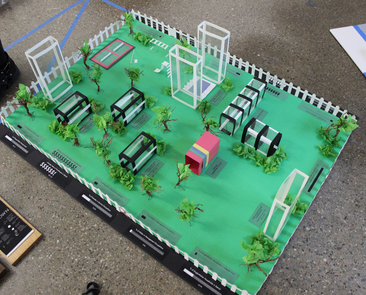
5 Detroit Neighborhood Maps from CCS Students

These map projects were all completed back in the Winter of 2013 Visual Communications course, but I keep coming back to some of them for their great visual representations of data and design. Whether it is the visualization of Hamtramck or the “Midtown Consciousness” network mapping, there are great connections to be made between social cause activists, data researchers, urban planners, and artists/ designers.

Hamtramck by Jared Gentz (can’t talk about Detroit without mentioning it)

Screen Shot 2015-10-05 at 12.31.25 PM

Midtown by Alex Reicher

Screen Shot 2015-10-05 at 12.27.39 PM

 Midtown by Paul Snyder

Screen Shot 2015-10-05 at 12.29.06 PM

Belle Isle by Melissa Dupont (not a neighborhood)

Screen Shot 2015-10-05 at 12.30.16 PM

Lafayette Park by Cody Barnaby

Screen Shot 2015-10-05 at 12.43.17 PM

All photos by Colleen Hill

Map in Action: Nick Cave takes Detroit

IMG_0188In a historic citywide art and dance series, Nick Cave took Detroit by storm. The map room at the exhibit hosted at the Cranbrook Art Museum demonstrates the range of Nick Cave’s work and the impact of his efforts across the city. Photoshoots, community workshops, dance labs, education programs, and community performances – Nick Cave did it all in the city that gave him a place to dream and create.

Nick Cave presents an excellent example of artistic work, typically cloistered inside exhibit halls limited to those with the time and mobility, that is presented for the people to see, touch, and experience in their neighborhoods and community spaces.

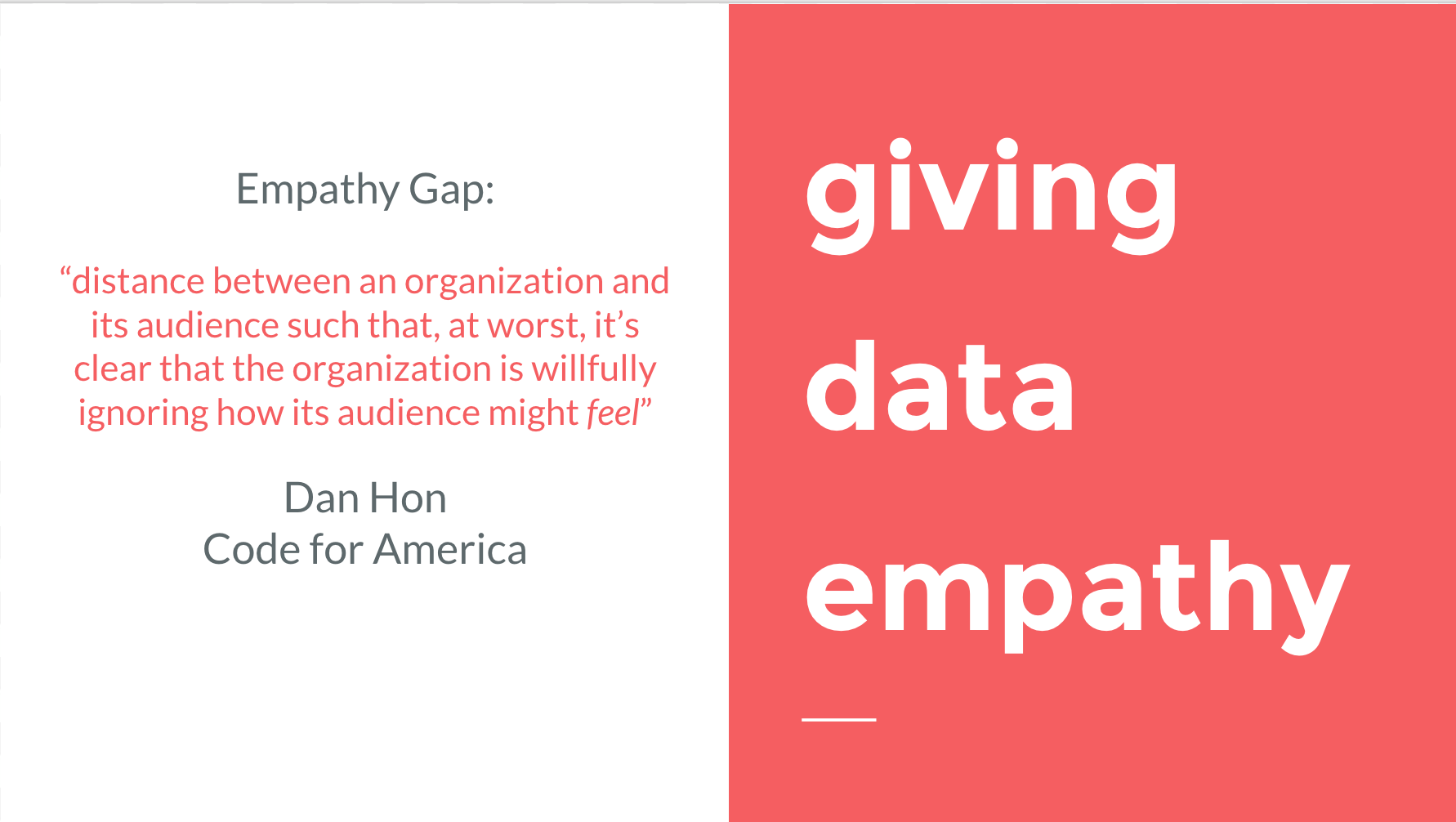
detroit: giving data empathy

I am constantly thinking about how to make maps and data more focused on people, their stories, and the impacts that those numbers represent. It is a constant battle working with data and numbers every day and one that is most often overlooked by organizations that are focused on utilizing big data and attempting to turn a city around. Earlier this year I spoke to a group of public administration and policy students on Data and Detroit: The Need for People Centered Innovation. This is the content of a recent talk that I gave at the launch of Open Data Windsor-Essex.

Detroit has recently become overwhelmed with people interested in its problems and the data that accompanies those problems: $18 billion in debt; 380,032 blighted properties; 70,500 foreclosures; 8,000 occupied homes headed to the property auction, evictions imminent.

big big big

Big numbers, big data, and big problems.

There is a growing set of psychological research that demonstrates how big data is dehumanizing: companies hide behind algorithms, numbers associated with mass atrocities don’t spur action, and we have become detached from the people who represent those numbers.

Open data is a critical movement that is a must-have for anyone who hopes to impact people’s lives with data, the next step of that movement is to join data with empathy for people-centered innovation.

“open civic data isn’t just nice to have, it is a must have.” 

  • Beth Niblock, City of Detroit CIO (Techonomy Detroit 2015)

Detroit’s bankruptcy, warranted or not, threw Detroit’s data in full view of the national media. Where did the bulk of the deficit come from? Where were the biggest cuts going to happen? How many retirees would lose their pensions? How many people don’t pay their taxes? How many overdue bills does Detroit have?

Once the media jumped on the Detroit bankruptcy wagon, the related problems began cascading through the headlines. At the fore was Detroit’s “Hurricane without Water” – a man made crisis of epic proportions, the Wayne County Property Auction. Year after year the county auctions homes the majority of which fail to be paid for and thus return to the auction in following years. It actually cost the county more money to run the auction than the revenue that it generates. That all goes without mentioning the thousands of Detroit residents who face potential eviction from their homes as a result of subprime lending, improper management, worthless landlords, or compounding issues from Detroit’s history of mismanagement.

It is fairly easy to find data about Detroit and create seemingly beautiful visualizations of its problems, but the data in and of itself doesn’t tell a story and doesn’t give full context as to how these big problems impact people.

data ≠ solution

Screen Shot 2015-10-08 at 10.27.45 AM

Some have tried to say that Detroit has been operating from an information deficit, however I would argue that the main problem was that no one was utilizing or analyzing the data that existed, which in many cases meant that the data wasn’t even being collected. Those hoping to create the solutions weren’t using all of the available tools. 

Simply beginning to collect that data and share it on an open platform is an important step, but is not a solution in and of itself. Open data is a baby step among many as we move towards more accountability in government, non-profits, and other sectors.

Detroit’s water crisis is a perfect example of the downfall of data. The city knew that it had 150,000 outstanding water bills that totaled over $118 million. The city quickly developed a plan, hired a contractor, and began shutting off people’s water for non-payment. The first round of shutoffs started without any notice or communication. Some people who had even kept up their water bills faced shutoffs because the contractors were just shutting off entire streets.

After national and international backlash the city attempted to better communicate the problem, but again largely failed as water affordability was still non-existent. Overall, 25,000 people signed up for water payment plans, but due to the continued unaffordability only about 300 remained active.

In a city where there is 20% unemployment, 40% living below the poverty line, and a 50% jobless rate – I’d really like to know what the City of Detroit thought was going to happen. Punitive measures against the poor represent the greatest failure of a city and the misuse of readily available data. If you can fund contractors to shut off water, then you can fund canvassers to go door-to-door with information about assistance programs, etc.

What are the people’s needs (user needs)? An empathetic service would ground itself in the concrete needs of concrete people. Lauren Hood at Techonomy 2015 reminded the audience full of tech leaders, startup CEOs, and other innovators that they can’t hope to impact Detroit by talking about tech without the people who would most benefit from those innovations.

“There’s no one here that actually represents the people we are trying to impact.”

  • Lauren Hood, Director Live6 (Techonomy Detroit 2015)

We’ve come to think that the next app, data aggregator, or web map (line up the buzzwords: big data, information age, government-as-a-platform, transparency, crowdfunding, open data, civic tech) will change the world – but it is people who change the world with data, not vice versa. We must learn to prioritize people and their needs as we push open data. Data is often about fast responses and short timeframes for launch. Prioritizing people takes more effort and more time, but we must refocus or we will be lost among the tabular data.

numbers don’t motivate

Screen Shot 2015-10-08 at 10.27.55 AM

In 2007, I was engaged in efforts to raise awareness about the genocide in Darfur. It was easy to get people involved on college campuses for a while, but issue fatigue quickly took hold.

There were 3 million people displaced; 300,000 killed – This became a common theme in my undergraduate studies in international relations. I was regularly engaged with the work of international nonprofits and NGOs, many of which had mastered the art of fundraising based on a single tragic picture rather than big numbers. Constantly listing the 6 to 7 figure numbers associated with tragedy quickly wears down any personal or institutional resolve, but that doesn’t mean we ignore the numbers.

If I look at the mass I will never act. If I look at the one, I will.”

  • Mother Theresa

Big numbers don’t motivate action, they have the completely opposite effect. We become “numbed by numbers.” The recent New York Times piece on “How Syrians Are Dying” is a good example with one person representing one pixelated dot on the screen.  

a single man killed is a misfortune, a million is a statistic.

  • Frenchman, not Stalin (qtd. by Charles J. Rolo, The Atlantic Bookshelf)

The big numbers that we have in Detroit continue to build and are constantly repeated, but not much has changed (i.e. foreclosure crisis). Thinking about the “big numbers numbing effect,” it is no wonder that we have gotten lost along the way especially as leadership pushes “revitalization” often without engaging or asking people what they need in their neighborhood.

giving data empathy

Screen Shot 2015-10-08 at 10.30.03 AM

Nothing is more important than giving data context. Spreadsheets are great for compiling, but not very helpful in understanding data or being persuaded by it. The majority of data that we see isn’t shared in raw form for that very reason. We often see data in dashboards, infographics, and other visuals.

“a picture is worth 1,000 data points”

Typical economic theory relies on the assumption that humans are inherently logical decision-makers, but the reality is that we are more strongly influenced by emotion resulting in reflexive responses. Thankfully this often helps us be empathetic and act against our self-interest in order to help others.

As much as compiling databases is the current norm, it is beyond critical that we find a way to show the faces behind the numbers. The following are some examples of storytelling (with or without data) that could be examples moving forward where data and stories can work together to give a more full picture of a problem.

Two-thirds of Detroit residents have access to a car, but that data from the Census doesn’t encompass the difficulties associated with car ownership, insurance, maintenance, regularity of use, etc. It is no mystery that transportation in Detroit is in need of significant improvement. This most often comes in to play when discussing access to jobs, which are concentrated in suburbs without public transit. The highest estimates put Detroit’s jobless rate at 50% with 40% of people living below the poverty line.

Roughly 300,000 people in Detroit could be jobless, yet the story of “the walking man” captured the attention of thousands of people. The walking man, James Robertson, lived in Detroit and worked at a suburban factory. He took the bus where it was available, but ended up with a 21 mile roundtrip walk to get to work. The power of his story raised $350,000 and a new $35,000 car.

He noted that the money should go to the transit department, feared for his safety, and ended up moving to a new home in the suburbs. It wasn’t the big numbers that motivated people to act, but one person’s story.

Screen-Shot-2015-02-03-at-4.28.18-PM-1050x789

Because Someone Lives Here

Tax foreclosure is an entire industry of big data, big numbers that often don’t reflect life stories.

This year the Wayne County Treasurer identified 61,912 properties in Detroit for foreclosure in 2015. Loveland Technologies found that 35,669 of these properties (63%). People live here. Simply looking at the data with the enormous number of foreclosures or the amount of taxes due to the city is not enough.

The latest celebrity of urban theory, Richard Florida, who has plugged his controversial “creative class” as the savior of rustbelt urban cores has also noted that people must be the focus of our work in cities.

We can confer subsidies on places to improve their infrastructure, universities, and core institutions, or quality of life, but at the end of the day, people — not industries or even places — should be our biggest concern.

  • Richard Florida

If we aren’t using data to improve the lives of people then we are doing it all wrong.

conclusions

  • data is a critical tool for making change and impact
  • big numbers demonstrate size of problem, but not context or motivation
  • we must utilize a mixed methods approach with both numerical data and human stories
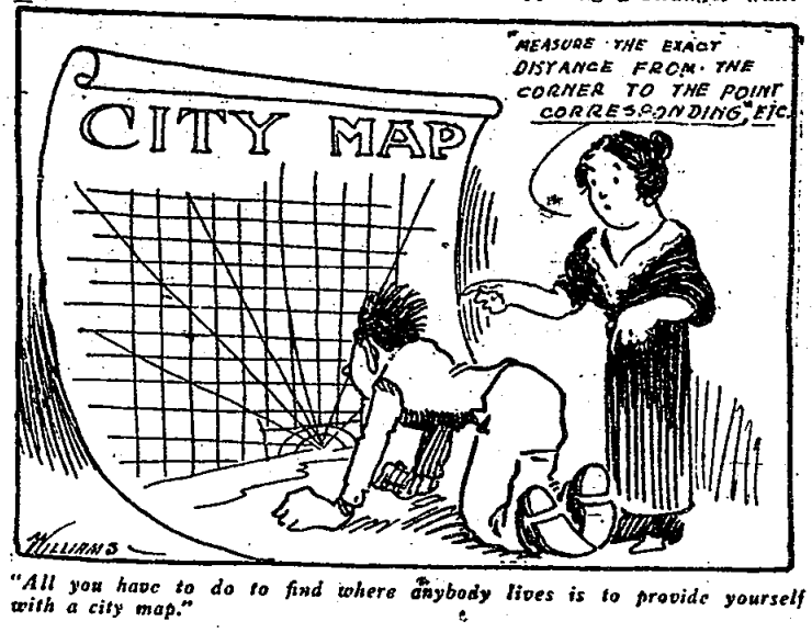
Map: 1920s House Renumbering as Viewed by a Northender

1920-free-renumbering

This gem from the Free Press comes from Paul Sewick.

Here is a fun excerpt from the article (read in full):

“One great trouble is that Detroit is a country town in everything but size. . . If a lot of people had their way they’d still be pasturing cows in Grand Circus park and the Campus would be a duck pond.”

On the renumbering:

“There’s a number every ten feet – 2, 4, 6, 8 . . . We’re the third lot from the corner. Somewhere on this lot there’s a point 100 feet from the corner – ten times ten feet – so they tag us 20.”

The Jefferson Problem:

Instead of taking Jefferson avenue as the base line street, and numbering north and south from it, they took the river bank as a base line. New at the foot of Woodward avenue it is several blocks below Jefferson. When you get way out on the east side, where there are no streets south of Jefferson, you’ve got to number from the river just the same, with the result that Steve’s 342, although he’s just off Jefferson.

Map: Tim Hortons in Detroit and Windsor

windsor-tim-hortons

I had the pleasure of keynoting the launch of Open Data Windsor Essex at Hackforge last night. The above map of Tim Hortons locations is by far the most important topic discussed (not really, but it was fun).

In recent years a handful of new Tim Hortons have opened across Detroit. We still have a ways to go before we can compete with the Tim Hortons saturation of Windsor.

Excited for more cross-border open data collaborations!

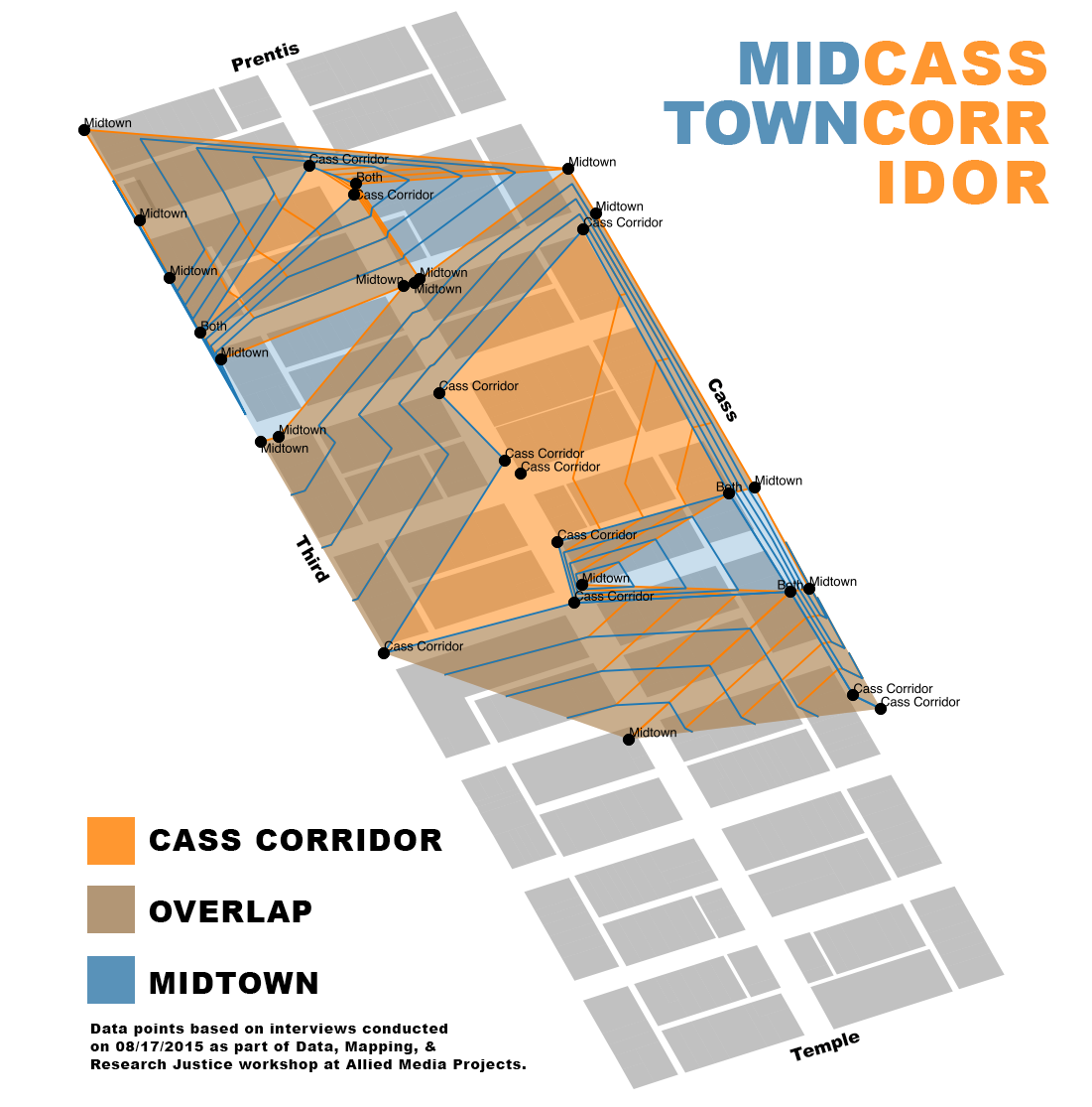
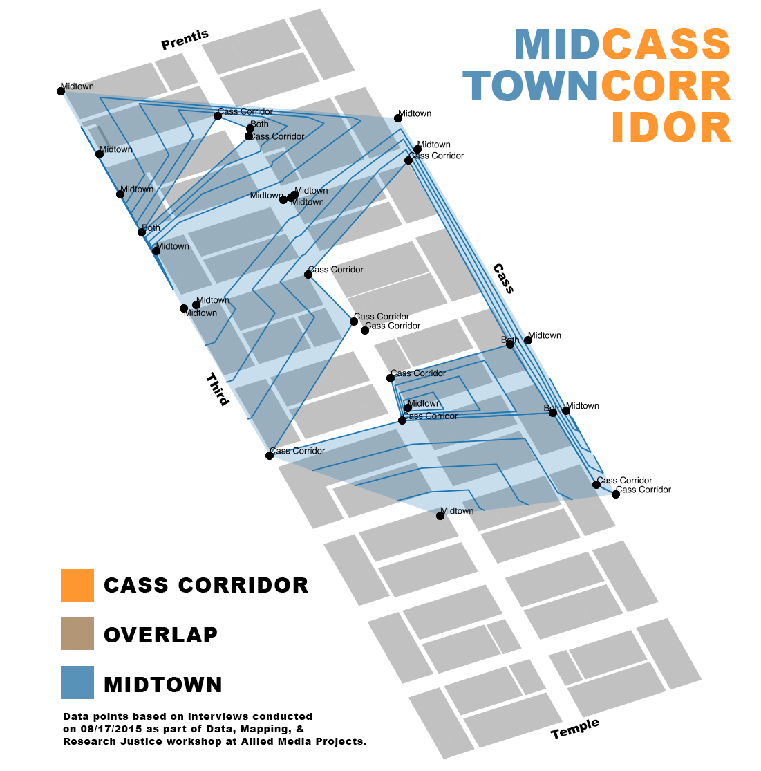
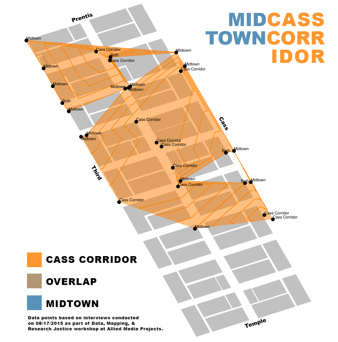
Map: Midtown or Cass Corridor? Responses from the streets of Detroit

midcassDuring the Data, Mapping, and Research Justice workshop offered in August, participants conducted their own data collection based on shared research questions about the Cass Corridor. One question in particular that was brought up was what different people called the area: Cass Corridor or Midtown.

In all 30 people were rapidly interviewed along Cass Avenue, 2nd, and Third Street. Sometimes the workshop participants’ data collection clipboards made people wary, but often the clipboards invited more questions making it easy to engage people on the street, at restaurants, and waiting for the bus. The participants didn’t make it further than Peterboro Street due to time limits in the data collection.

Cass Corridor 11
Both 3
Midtown 16

Midtown was the more commonly referenced placename, but overall the data gave a fairly even representation of the area. If anything the responses collected from people shows the well documented debate over the naming of neighborhoods and who has a right to name it.

One individual interviewed at MLK noted:

“They [white people] call it Midtown”

And what do you call it?

“Doesn’t matter, they call it Midtown”

Another individual who was looking for cans in trash bins was able to note how long each property had been vacant and when its redevelopment had started. He was glad to talk, but also unsure of the future of the area,

“I’m not prejudiced or anything, and somebody had to do something, but there isn’t anything happening here for people like me [black male]. It’s all gunna be high priced apartment for students and young [white] people.”

One of the greatest opportunities in Detroit is not land speculation, but rather the collection of stories. Countless stories seek to be told, to connect people to place, and to remember history as development rapidly changes the city. The Cass Corridor is a perfect example of such a place where stories need to be collected and remembered before Midtown forgets everything.

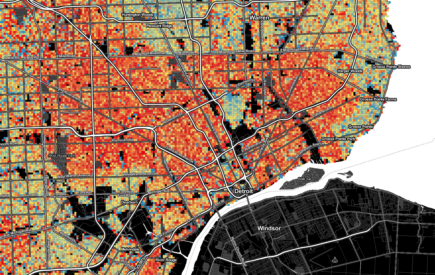
Map: Concentration of Obesity in Detroit

Screen Shot 2015-09-21 at 9.24.41 AM

Synthetic MicroData and RTI put together a new map to show the estimated percent concentration of obesity among the adult population in the US on a 250m grid.

Data used to create the concentration index were determined by dividing the population over 20 years old divided by population with BMI greater than 30.0, multiplied by 100.

Event: Data Discotech and Digital Justice

DataDiscoFinal

Allied Media is partnering with the Detroit Digital Justice Coalition and Detroit People’s Platform to present the first Data DiscoTech, September 19th, 11:00am – 3:00pm at the Samaritan Behavioral Center (5555 Conner St.). The event is free and open to the public!

DiscoTech” is short for “Discovering Technology.” The DiscoTech will offer interactive, multimedia workshops to demystify technology concepts related to open data and the City of Detroit’s Open Data Portal.

At the DiscoTech we will:

  • Demystify data.
  • Understand the risks of open data.
  • Understand how to use data in community organizing efforts.
  • Use data in creative ways.

Read more about the DiscoTech here. See you there!

Map: Eastern Market Detroit Land Use Plans 2005

EM-land-2005

In 2005, the University of Michigan Taubman College convened various design “charrettes” abotu different areas of the city. The 2005 focus, by invitation of the Greater Downtown Partnership, was on Eastern Market and this is the land use plan that came out of their work. The final plan was called “Eastern Market and Beyond: Detroit Design Charrette 2005.”

“The master plan depicts the proposed reconfigurations and interjections to the Eastern Market precinct to accommodate an urban agriculture theme in conjunction with a range of other public activity spaces, civic amenities, and landmark structures.”

I think the biggest standout is the large segment of residential to the east of the market where the Detroit Blight Authority (Pulte) partnered with Mayor Bing to raze a large swath of blighted buildings and vacant lots. The biggest missing piece is the lack of connection across Gratiot. For many residents living in Lafayette Park as well as the coop and condo developments south of the market, there is no easy connection besides the Dequindre Cut.

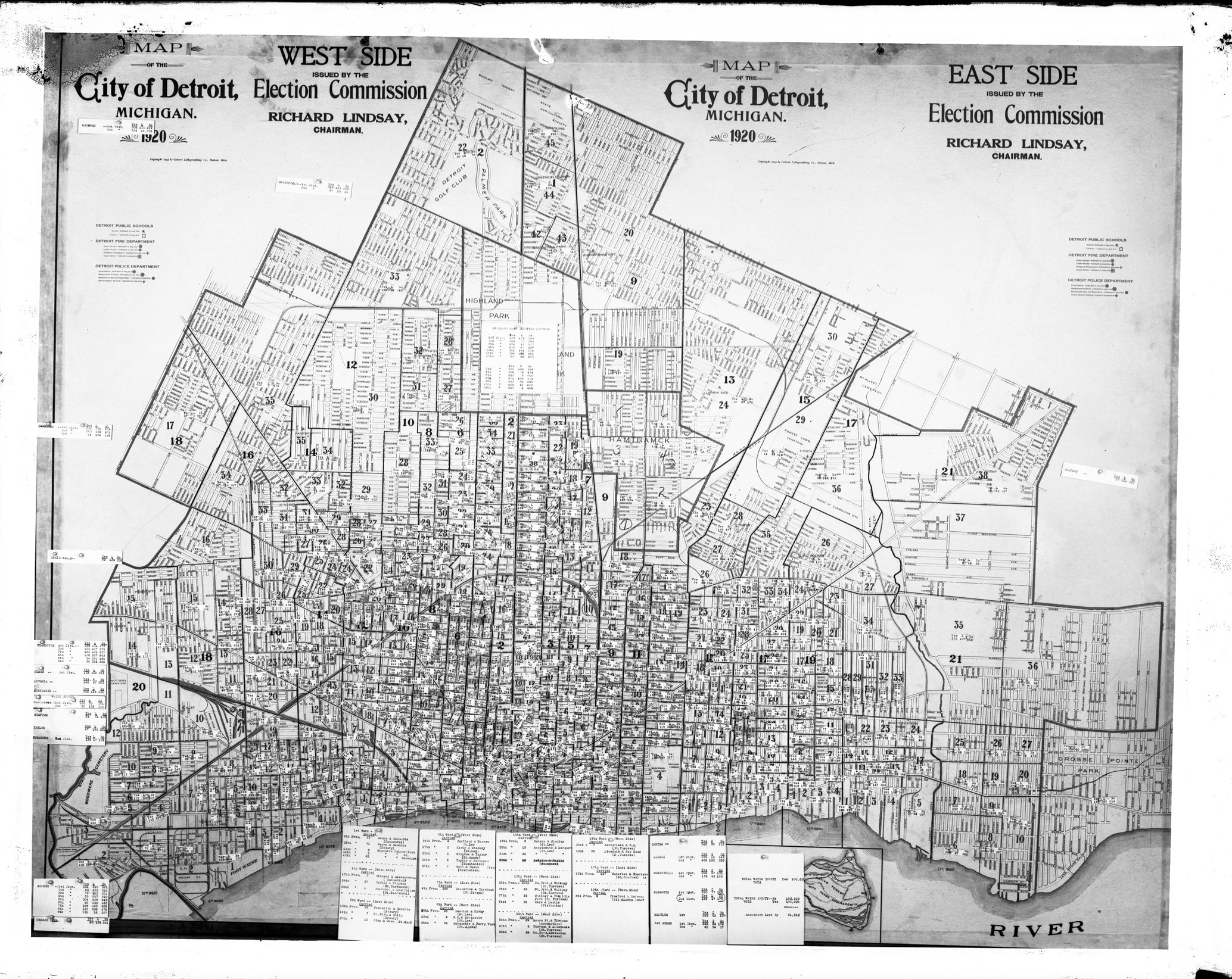
Map: Detroit Election Commission 1920

det-election-commission-1920

This map is among the Detroit Public Library Digital Collections. The election results are pinned to the map across the city and summarized for each Ward along the bottom.

1920 map of the city of Detroit, Michigan depicting voting districts; election results for other cities attached to map. Printed on map: “Map of the city of Detroit, Michigan, 1920; east side issued by the Election Commission, Richard Lindsay, chairman; west side issued by the Election Commission, Richard Lindsay, chairman; copyright 1919 by the Calvert Lithographing Co., Detroit, Mich.”

Map of Additions to Detroit City Limits 1884

SilasFarmer_AdditionsDetroit’s first cartographer, Silas Farmer included this map (pg. 35) in his book: “The history of Detroit and Michigan, or The Metropolis Illustrated” in 1884. He noted that the Cass and Brush Farms were the most prominent and most often mentioned because they represented the Eastern (Brush) and Western (Cass) borders of the city. The city had recently been unofficially expanded to reach to Mt. Elliott Avenue to the East and the edge of Porter Farm to the West.

Event: #Maptime Detroit – #MapLift

MapLiftOutlineLet’s get together and make maps for MapLift: http://nacis.org/maplift/

MapLift is an event to improve Wikipedia’s existing maps and add new ones.

Find a wikipedia article:

  1. with a map that needs updating/fixing (this neighborhood map of Detroit)
  2. that could use a map (like this article about the Detroit riverfront)

and come work on it with your fellow mappers at Loveland (1514 Washington Blvd)! We’ll have some pizza and refreshments, so come on down and let’s create/improve some source material for the free encyclopedia anyone can edit. (Feel free to get some OpenStreetMap editing/digitizing in as well!)

We’ll also be holding ‘office hours’: Got a question about a project you’re working on? Stuck on how to do something in QGIS/Mapbox Studio/ArcMap/CartoDB/Leaflet? Maptime Detroit organizers will be around to answer your questions.

This will be a casual meetup, no presentations, so come through anytime from 5-9p.

Data: 29,000 Parking Spaces in Detroit’s Woodward Corridor

M1-Parking-Map

Parking, parking everywhere. . .

“Street side metered parking on Woodward will be inaccessible during construction activities. Access to parking facilities will be maintained at all times during construction. There are 29,000 parking spaces located throughout the Woodward Corridor.”

This map and the “data” come from an email update sent by the M1 Rail project. It seems that they may have truncated the Woodward Corridor (not the Northend!) and skipped the new city pay-by-plate parking zones.

Map: Packard Plant Redesign with Gratiot Streetcar

URBAN_CONTEXT_PLAN- packardUpgrades at the Packard Plant have been slowly moving forward as could only be the case with a hulking shell of a former manufacturing giant, once considered the most advanced in the world. The new owner of the Packard Plant held a “Reanimate the Ruins” contest for ideas to redevelop the site. Nadau Lavergne Architects submitted the winning design and it appears to include another streetcar/ light rail along Gratiot Avenue.

Will Detroit’s growing group of multi-millionaires bring “public” transit to the city?

Map: Detroit Innovation District

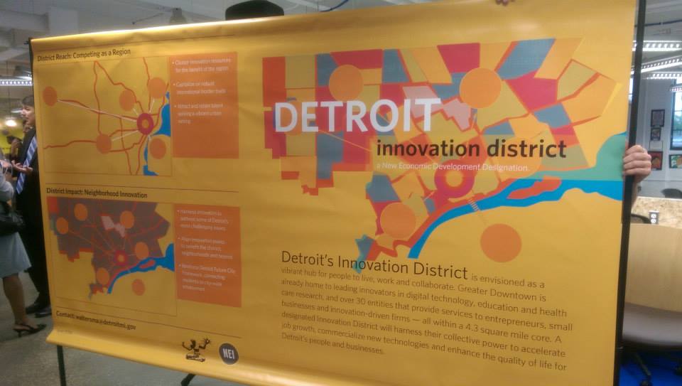
10366317_10152552743172754_1416881501636621597_nDetroit, like many other “recovering” cities, has marked out an “innovation district” to push the city forward. The district contains many other self-described “innovation” boundaries, but this appears to be the main thrust for the future of the city where a zone encompassing all of Detroit’s major institutions, universities, businesses, etc.However, the city said it was taking a hands off approach to the district and there are no new tax incentives.

The “innovation district” is limited to Greater Downtown, which again highlights the need for more jobs for Detroiters. Bridge Magazine recently covered the need to create jobs outside of Downtown, which would be greatly alleviated by public transit that gets people Downtown along with more low-skilled and entry level jobs.  The new Regional Transit Authority (RTA) has made access to jobs a priority and the city launched Motor City Match to encourage intra-Detroit business connections.

Innovation that is people-centered: better transit and more jobs for Detroit!

Map: Renters and Owners in Detroit 2013

detroit_rentersFrom CityLab:

A map by the journalist and web developer Ken Schwencke shows just how much the rental market now dominates U.S. cities, even those traditionally defined by high rates of homeownership. “Where the Renters Are” plots 2013 American Community Survey data on who’s renting (red dots) and who’s owning (blue dots) across the country’s census tracts. The dots, each of which represents 25 housing units, are randomly placed within tracts.

Event: #Maptime Detroit – Interactive Webmapping

maptimeDETROIT3

WHEN: August 8th, 2015

WHERE: Grand River Workplace, 19120 Grand River

WHAT: We’ll be learning the basics of web mapping!

Using HTML, CSS, and Javascript, you’ll learn how to:

  • Create GeoJSON data: take existing data and convert it, or create your own with geojson.io
  • Create & customize a basic slippy map on a web page, using Leaflet.
  • Bring your GeoJSON data into the map: style it and make it interactive.
  • Publish your interactive map on the web so anyone can see it

You’ll need:

  • A laptop. That’s it!

Beginners are encouraged, and be sure bring your laptop

View on Meetup

Map: Housing Reinvestment Areas 1997

Map A17 - Potential Housing Reinvestment Areas

I’m not sure there has ever been a Detroit development plan that did not focus on Downtown or “core” areas of the city. Under Mayor Dennis Archer this plan could be seen as the pre-Detroit Works Project where community groups were brought together to plan future uses in the city’s 10 neighborhood clusters.