 It is always fascinating to try to imagine early versions of Detroit where there was nothing beyond the border besides open land and dense forests. I always try to imagine if Detroit had grown on both sides of the river what that would have meant for the number of river crossings. Why was there never an additional bridge from Belle Isle to Canada (boat traffic)?
Author Archives: Alex B. Hill
Map: Detroit Greenways Map 2014
 Construction of the expressways destroyed neighborhoods and disconnected communities, the ambitious plan of the Detroit Greenways Coalition and its many partners seeks to build a new infrastructure that will reconnect neighborhoods and offer alternative transportation in Detroit. The Dequindre Cut project is moving along very well and Conner Creek Greenway has only a few small segments to finish.
If only public transit groups had similar vision, Detroiters may soon have a range of new ways to get from point A to B.
Map: Detroit Parks 1948

The Detroit Historical Society shared this map of parks in 1948, however it also includes a number of parkways too. Grand Boulevard and Oakman Boulevard are the longest and most prominent parkways, but you can see a number of smaller parkways as well around the Boston-Edison and Arden Park neighborhoods, the brick-paved Pallister St., as well as what looks like all streets of Grandmont-Rosedale.
Map: Detroit Regional Cartogram 2010
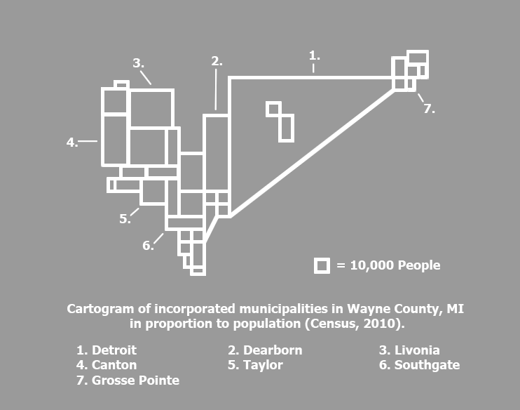 Members of the Detroit Geographic Expedition and Institute (DGEI) examined population in a cartogram of Southeast Michigan in 1970. I partially recreated the cartogram looking at just Wayne County population numbers from 2010. The map helps to demonstrate Detroit’s prominence and population among other regional municipalities. Although this map shows population, another interesting application could be looking at regional municipalities by power and influence when it comes to policy and decision-making. Detroit may still be the largest city, but now holds political sway for different reasons.
Map: Detroit Public Schools 1972
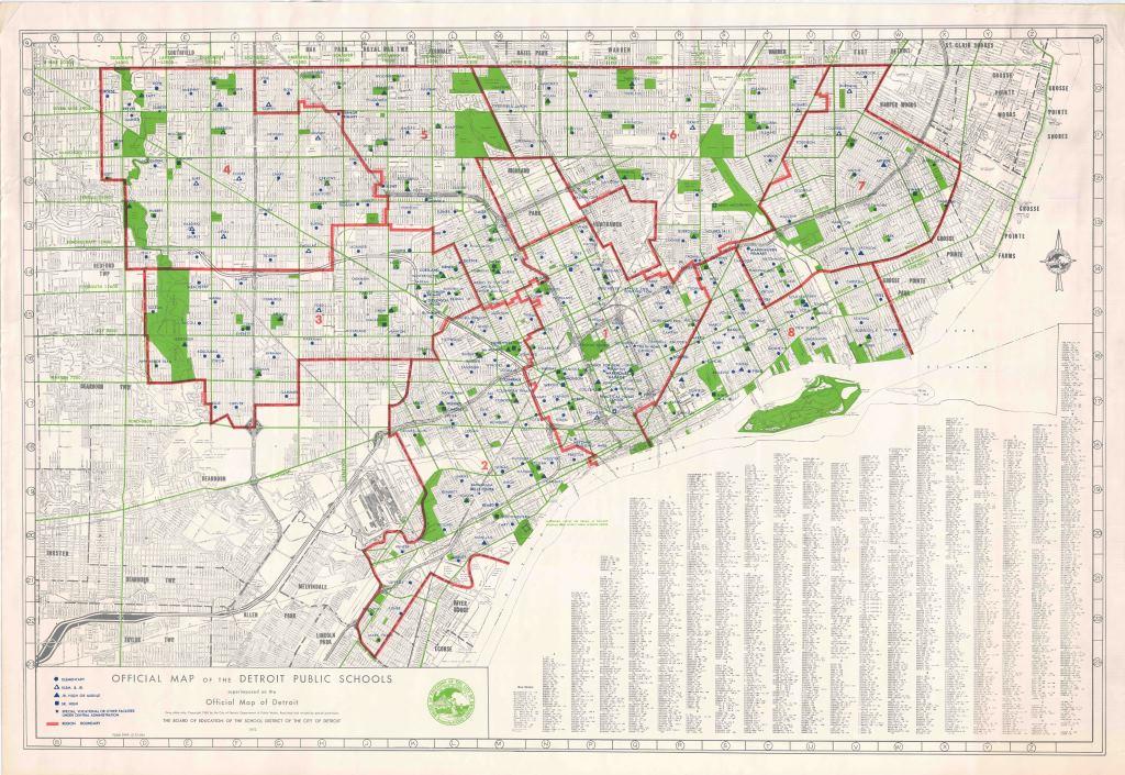
Yet another great archived map from the Detroit Historical Society. In this map you can see how Detroit evolved and grew with a higher density of schools in the older parts of the city (Greater Downtown) and more spread out schools in the annexed areas/ suburbs that later joined the city.
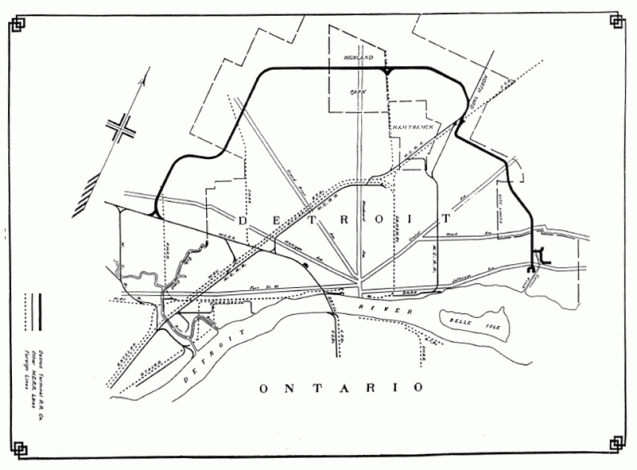
Map: Woodward Streetcar Lines Rerouting 1915

The Woodward Line Rerouting map comes from the “Report on Detroit Street Railway Traffic and Proposed Subway” in 1915 (Barclay, Parsons & Klapp). The Woodward lines saw significantly increase utilization between 1904 (12,990,027 passengers) and 1914 (47,457,294 passengers) and the congestion Downtown where all the routes terminated impeded efficient movement of people in and out of Downtown.
The report includes comparisons of other rapid transit systems and what might be best for Detroit as the population was estimated to reach 1,000,000 by the 1920 Census. An underground subway along Woodward like New York’s was deemed unwarranted due to the city’s size and high expense of subway construction. It was also noted that New York didn’t have the same extensive suburban residences as Detroit which made the subway more effective. Chicago’s elevated rail was seen as more feasible for Detroit.
Map: Children’s Neighborhoods in Detroit

When the Skillman Foundation launched the “Good Neighborhoods” Initiative in 2006 they focused on the areas of Detroit that had high numbers of children and high rates of poverty. I assume that they utilized 2000 Census data and wanted to check if there was any significant shift. While I did not run a test of statistical significance of Detroit’s child population, it is a very simple analysis to see that there are still large populations of children (absolute numbers) in the “good neighborhoods.” The Far Eastside and University District areas are the only that appear to have high numbers of children that are not within a Skillman Good Neighborhood.
Map: Detroit Terminal Railroad 1916
This map is from the New York Central Railroad Annual Report in 1916.
Detroit, like many major cities, had terminal (belt line) railroads to accommodate business. The Detroit Terminal Railroad (DTRR) was started in 1905 by local business owners in order to allow for expansion and access to rail. At the time (1905) all the good business locations were taken up along the major railroads. The construction of the railroad allowed for the continued expansion of industry into more “rural” areas.
Michigan Central Railroad, Grant Trunk, and Lake Shore & Michigan Southern Railway jointed purchased the DTRR after it was built. By 1914, the DTRR needed to add a second track to be able to handle the high level of industrial activity. The Chalmers Motor Company, Hudson Motor Company, Continential Motor Company, and the Ford Motor Company were the main industries on the rail line. Ford’s Highland Park plant was the largest user shipping out 100 freight cars with new automobiles every day.
The DTRR switched ownership many times and was operated by Conrail until 1981. Many of the vacant industrial areas of Detroit today would not have existed without the DTRR. Now the majority of the DTRR is being envisioned as an extension greenway loop that connects with the Dequindre Cut.
Map: Detroit Recommended Bike Routes 2010
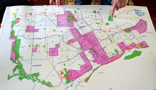
Bike Detroit has a map of “recommended bike routes.” Even though there are far fewer cars in Detroit than during its peak, riding your bicycle on certain roads can be extremely dangerous. Check out their recommended routes to plan your commute or cycling workout.
The map was made in 2010 and now there are significantly more bike lanes. The routes still might be helpful for longer rides and the best cross town routes to choose (routes colored blue on the map).
Map: Detroit’s Ubiquitous Places – Church and Liquor
Inspired by Nathan Yau’s work at FlowingData on pizza place geography and grocery store geography, I wanted to see how Detroit’s ubiquitous locations compared. Driving along Van Dyke where there was church after church (many abandoned) interspersed with liquor stores gave me the idea of examining which type of location dominated Detroit’s landscape.
 It takes forever to scrape the Michigan Liquor Control Commission (MLCC) website for active liquor licenses, so I relied on a 2012 dataset that I generated a while back. I then utilized data from Data Driven Detroit with Churches from 2011. The data is not perfect, but unless you have someone actively monitoring every liquor license and every church there is going to be significant change. Notably, the number of liquor licenses have been decreasing since 2009. The next step was to set up a grid that was generally half a square mile squares.
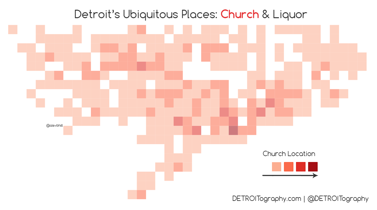 There are a lot of churches in Detroit and they come in all shapes and sizes from mega churches that cover an entire block to converted storefront churches and the smattering of beautiful historic churches large and small.
 There is a strong concentration of liquor licenses Downtown, which isn’t surprising with the density of restaurants and bars. However there are other notable areas that dot the city with a high number of liquor licenses.
 The result of overlaying this data is interesting in that there appears to be a sort of “church belt” that stretches from Downtown to Northwest while liquor stores dominate the areas in between. Churches are more spread out across Detroit and liquor stores tend to be located closer together. It is safe to say that Detroit residents likely live closer to a church than a liquor store, but depending on where you live there may be a near equal amount of each type of location.
Event: #Maptime Detroit – QGIS Intro
![]()
WHEN: June 13th, 2015
WHERE: Grand River Workplace, 19120 Grand River
WHAT: Hey y’all, at this next #maptimedet we are going to get into QGIS (formerly known as Quantum GIS). QGIS is free, open-source, and highly capable GIS software. If you’ve ever been curious about QGIS and want to learn more, or never even heard of it, join us! We are going to go through some of the basics of using the QGIS software, including adding data, projecting data, symbolizing and map design, and geoprocessing.
If you’ve been using QGIS for years, come and lend your expertise to help others get started and answer questions.
Look for more information, including how to download the software, to be posted soon.
Beginners are encouraged, and be sure bring your laptop
View on Meetup
Map: Arabic Speakers in Metro Detroit
It is well known that Metro Detroit has one of the largest Arab-American populations in the country and is often said to have the largest concentration of Arab immigrants outside of the Middle East.
CityLab highlighted different language variations from the Census’ 2011 Language Mapper that builds on questions of “language spoken at home.”
Map: Community Development Block Grant Allocations 1975 – 1982

This map was created and featured in “Race and Uneven Development” by Joe T. Darden, Richard C. Hill, June Thomas, and Richard Thomas.
“During the period from 1975 to 1982, funds the city spent in specific, identifiable areas constituted approximately 45 percent of all of the city’s CDBG [Community Development Block Grant] expenditures. […] As Map 5.3 illustrates, the city targeted many of the CDBG funds to the central business district, the riverfront, and the Central Functions area (Woodward Corridor), just as it proposed to do with economic development money.
If anything this map shows the long trajectory of development in Detroit. Since the 1970s funding was being allocated to the same areas that are seeing new changes and renewed focus today. History is a critical piece of understanding various issues in Detroit and most especially with development and funding.
Event: State of Detroit – Detroit’s Food Landscape
 The team at the Chicago Design Museum approached me to contribute some maps and data visualizations to their upcoming “State of Detroit” exhibit. It grew into a collaboration that built off of my research focus on food access in Detroit while also addressing some of the “Detroit is Empty” misconceptions.
 The installation has a cool sliding feature so you can view different map layers together.
Visit the exhibit from now until August 30th, 2015. More. . .
Map: Median Value of Owner-Occupied Housing 1960

From Doxiadis’ “Emergence and Growth of an Urban Region” Volume 2, this map utilized 1960s Census data.
The most important pattern to see in this map is the low value (and likely low quality) home values in what would have been Detroit’s minority neighborhoods in the “core city” area and Southwest, while the outer neighborhoods (notably Palmer Woods and Grandmont-Rosedale) were much more valuable and predominantly white.
Detroit Region Illustrated Map 1961

This beautifully illustrated map of the Detroit region appears in the 1961 Detroit Edison Company publication: “Growth: southeastern Michigan, a good place to grow.”
Regionalism can be beautiful!
Map Your Detroit!
 As always, we encourage people to create their own maps, use maps to tell their stories, and create their own knowledge. There are so many perspectives and angles that surveyors and Census data can never reveal.
Feel free to download the above template and submit your map HERE -> submit.detroitography.com
Map: Detroit Tree Canopy Cover 2008
 This map was part of the Detroit Environmental Agenda in 2013 from a team of partners working to improve the overall quality of life, health, and safety of Detroit’s environment and its people.
A few maps have focused on green space and crime reduction correlations. The Greening of Detroit is starting to share open data on where it completes tree plantings and recently the US Forest Service completed a comprehensive survey of all of Detroit’s street trees.
The Detroit Future City report calls for carbon forests around expressways, which I believe is beginning to be piloted, and the expansion of mixed use green space.
Map: Detroit Postwar Improvement Plan 1944
 From the Detroit Historical Society:
“We typically think of urban renewal project happening in the 1950s and ‘60s, but in Detroit plans were already underway in 1944 for postwar improvements. It addresses everything from traffic engineering to swimming pools.”
Map: City of Detroit Present and Future Blight 1960

From Doxiadis’ “Emergence and Growth of an Urban Region” Volume 2, this map utilized 1960s Census data.
“Of the 352,680 residential structures in the City of Detroit, about 50,000 are blighted. By 1975, when the city’s present renewal program will have been implemented, an additional 113,720 residential structures occupying 11,136 acres of land are expected to be blighted. By that time 238,000 more people will be living in blighted areas. Fig 44. indicates the extent of this problem in order to show the blighted and deteroriating neighborhoods in Detroit which are not presently affected by the city’s urban renewal program.”
A critical connection should be drawn between the above mapped areas and areas that were cataloged as blight in the 2009 Detroit Residential Property Survey (DRPS) and the 2013 Motor City Mapping (MCM).
Now we see many of these 1960 blighted areas, labeled blight and cleared, in the midst of redevelopment. Blight has a long trajectory that we cannot forget started somewhere. People have been mapping blight in Detroit for decades and blight has affected the development of the city for just as long.
Map: National Geographic Rethinks Detroit

National Geographic‘s recent three part coverage of Detroit titled “Taking Back Detroit” (who took it the first time? second time, third?) includes this map under Part 2: Rethinking Detroit. The map is a nice visual display of the city’s densely populated areas (dark brown/ maroon) vs. more vacant areas (green).
Follow the link for closer looks at: Sherwood Forest, Woodbridge, Burbank (?), Brightmoor, and NorHam neighborhoods.

Many neighborhoods along Detroit’s perimeter are as densely populated as the city’s wealthier suburbs. This analysis at the block level shows the range from neighborhoods that are thriving to those that have more vacant lots—and to areas reverting to nature, known as “urban prairie.”
SOURCES: NOAH URBAN, DATA DRIVEN DETROIT; LOVELAND TECHNOLOGIES; DETROIT LAND BANK AUTHORITY; SOUTHEAST MICHIGAN COUNCIL OF GOVERNMENTS; COMMUNITY DEVELOPMENT ADVOCATES OF DETROIT; MOTOR CITY MAPPING; OPENSTREETMAP; U.S. CENSUS BUREAU; CITY OF DETROIT ASSESSMENT DIVISION AND PLANNING AND DEVELOPMENT DEPARTMENT; NOAA
