
This beautifully illustrated map of the Detroit region appears in the 1961 Detroit Edison Company publication: “Growth: southeastern Michigan, a good place to grow.”
Regionalism can be beautiful!
This beautifully illustrated map of the Detroit region appears in the 1961 Detroit Edison Company publication: “Growth: southeastern Michigan, a good place to grow.”
Regionalism can be beautiful!
 As always, we encourage people to create their own maps, use maps to tell their stories, and create their own knowledge. There are so many perspectives and angles that surveyors and Census data can never reveal.
Feel free to download the above template and submit your map HERE -> submit.detroitography.com
 This map was part of the Detroit Environmental Agenda in 2013 from a team of partners working to improve the overall quality of life, health, and safety of Detroit’s environment and its people.
A few maps have focused on green space and crime reduction correlations. The Greening of Detroit is starting to share open data on where it completes tree plantings and recently the US Forest Service completed a comprehensive survey of all of Detroit’s street trees.
The Detroit Future City report calls for carbon forests around expressways, which I believe is beginning to be piloted, and the expansion of mixed use green space.
 From the Detroit Historical Society:
“We typically think of urban renewal project happening in the 1950s and ‘60s, but in Detroit plans were already underway in 1944 for postwar improvements. It addresses everything from traffic engineering to swimming pools.”

From Doxiadis’ “Emergence and Growth of an Urban Region” Volume 2, this map utilized 1960s Census data.
“Of the 352,680 residential structures in the City of Detroit, about 50,000 are blighted. By 1975, when the city’s present renewal program will have been implemented, an additional 113,720 residential structures occupying 11,136 acres of land are expected to be blighted. By that time 238,000 more people will be living in blighted areas. Fig 44. indicates the extent of this problem in order to show the blighted and deteroriating neighborhoods in Detroit which are not presently affected by the city’s urban renewal program.”
A critical connection should be drawn between the above mapped areas and areas that were cataloged as blight in the 2009 Detroit Residential Property Survey (DRPS) and the 2013 Motor City Mapping (MCM).
Now we see many of these 1960 blighted areas, labeled blight and cleared, in the midst of redevelopment. Blight has a long trajectory that we cannot forget started somewhere. People have been mapping blight in Detroit for decades and blight has affected the development of the city for just as long.

National Geographic‘s recent three part coverage of Detroit titled “Taking Back Detroit” (who took it the first time? second time, third?) includes this map under Part 2: Rethinking Detroit. The map is a nice visual display of the city’s densely populated areas (dark brown/ maroon) vs. more vacant areas (green).
Follow the link for closer looks at: Sherwood Forest, Woodbridge, Burbank (?), Brightmoor, and NorHam neighborhoods.

Many neighborhoods along Detroit’s perimeter are as densely populated as the city’s wealthier suburbs. This analysis at the block level shows the range from neighborhoods that are thriving to those that have more vacant lots—and to areas reverting to nature, known as “urban prairie.”
SOURCES: NOAH URBAN, DATA DRIVEN DETROIT; LOVELAND TECHNOLOGIES; DETROIT LAND BANK AUTHORITY; SOUTHEAST MICHIGAN COUNCIL OF GOVERNMENTS; COMMUNITY DEVELOPMENT ADVOCATES OF DETROIT; MOTOR CITY MAPPING; OPENSTREETMAP; U.S. CENSUS BUREAU; CITY OF DETROIT ASSESSMENT DIVISION AND PLANNING AND DEVELOPMENT DEPARTMENT; NOAA
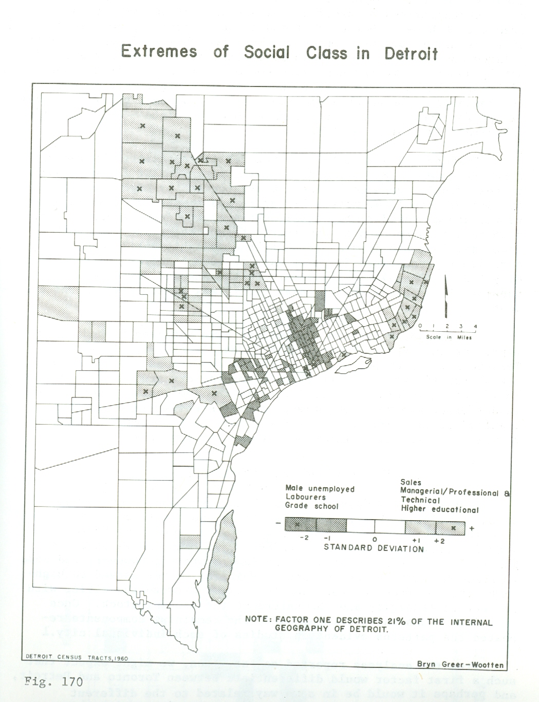
This map is published in William Bunge’s book co-authored with R. Bordessa, “The Canadian Alternative: Survival, Expeditions, and Urban Change.”
The map author, Bryn Greer-Wootten, utilized the 1960 Census (employment, education, income) to look at what Richard Florida might describe today as the geography of the “creative class.” Greer-Wootten finds that the inner city versus Suburb divide is quite stark.

This map shows the limited growth of electric railway development at a time when it was still controversial both because of the new danger of electrical shock and the unsightly overheard wires.

Revisiting the potential for stream recovery, a map of historic and existing rivers and streams from Detroit Water and Sewage, CDM and the Urban Streams Restoration by Lars Gräbner published in March 2015, Mapping Detroit: Land, Community, and Shaping a City is available at the Wayne State University Press.
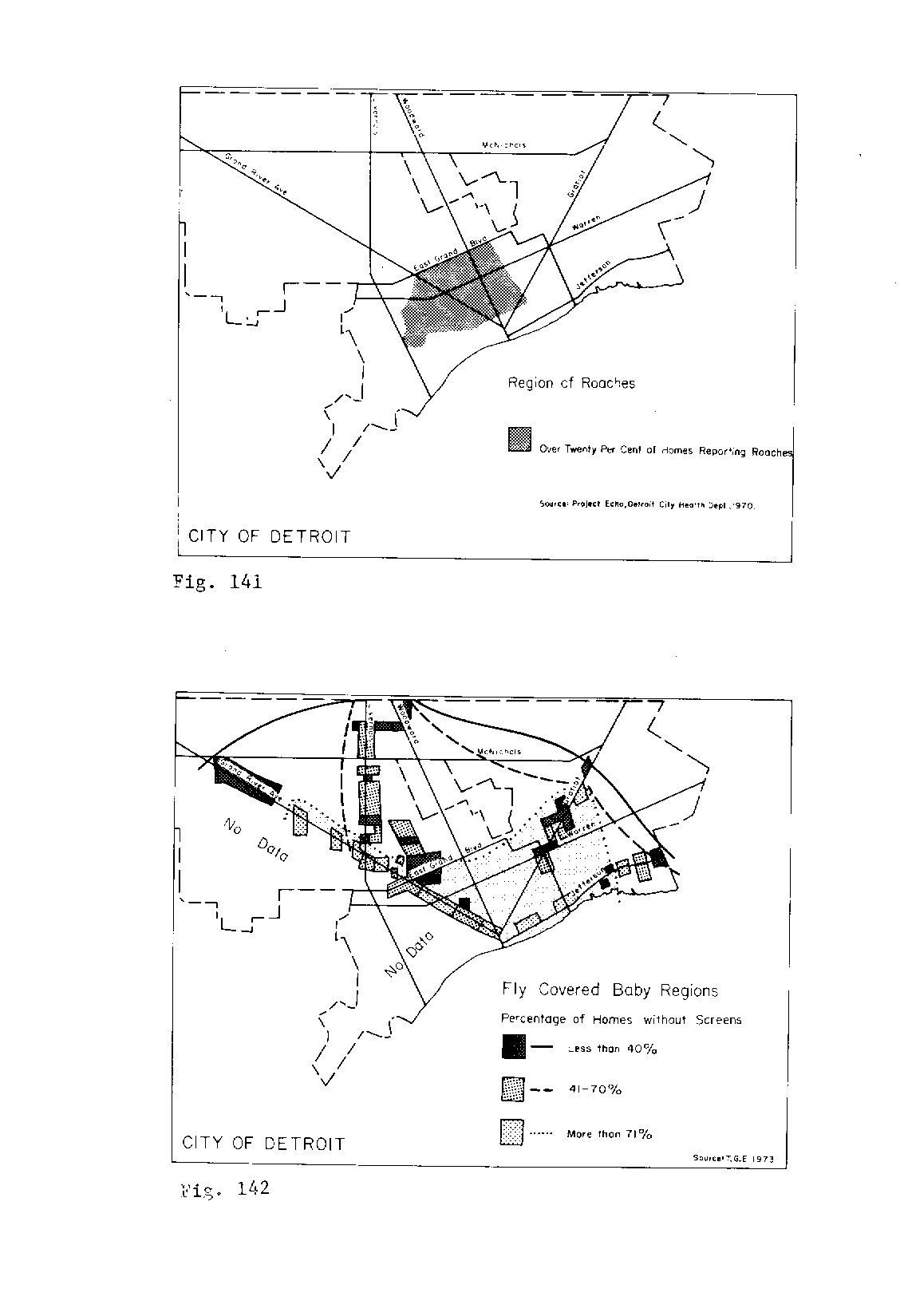
This map was part of William Bunge’s book co-authored with R. Bordessa, “The Canadian Alternative: Survival, Expeditions, and Urban Change.” These maps contribute to the authors’ display of the City of Death among their three distinctions which also include the City of Superfluity and the City of Need.
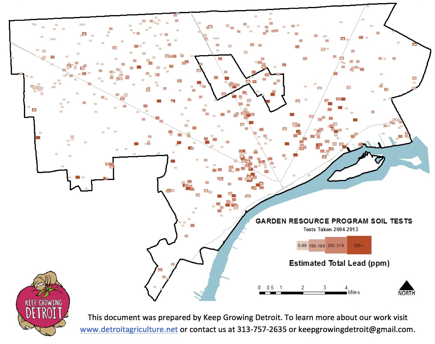
The quality of soil around Detroit is a regular concern with so much former industrial activity and current industrial activity. Much of South Southwest Detroit can’t even consider growing anything both because of the poor soil quality as well as the horrible air quality.
The Greening of Detroit/ Keep Growing Detroit (Garden Resource Program) completed 943 soil tests between 2004 and 2013. Out of all the tests 84% had lead levels below 320 parts per million, which is considered safe for gardening and consuming produce that is grown. You can see on the map that sites with 320+ ppm test results are fairly scattered across the city, but mostly closer to the riverfront than outlying neighborhoods.

Can Detroit really be compared to any other city? No doubt everyone has tried comparing crime rates, economy, and poverty levels in Detroit with other troubled cities. A few groups have even tried fitting different city land areas into Detroit’s 139 square (land) miles. It always seems that Detroit has too much or too little of something for a city to city comparison to make much sense. Rob Linn had similar thoughts and instead of comparing land area or other commonly compared attributes he analyzed infrastructure density (feet of street per resident) as a method to debate the misguided “rightsizing” push. Rob found that Detroit had a high rate of “feet of street per resident” which caused some areas of the city to appear more vacant when in reality they had healthier infrastructure density.
The 2010 Census population for Detroit was 713,777, closer to San Francisco’s. Imagine San Francisco’s southern edge lined up with the river front and perhaps we would see what proponents of a “condensed” city envision. Should the city condense to its former 1913 borders and focus on making services work within that area before moving outwards or would that just be an exercise in discrimination and inequality? Still others have suggested part of Detroit’s downfall was that it stopped expanding its borders. Check out the “map of Detroit” as an amalgamated region.
 I wondered what other cities would actually make sense to compare Detroit to as far as land area, population, and density. Manhattan, New York City is a wild comparison just because the land mass and density of people is so different from Detroit. Boston is interesting because of its area and population size, but San Francisco is more comparable because of its similar population size to Detroit and its smaller corresponding square-mile area.
| State | City | Population | Land (sq mi) | Density (/sq mi) |
| NY | New York | 8,175,133 | 302.64 | 27,012.50 |
| CA | San Francisco | 805,235 | 46.87 | 17,179.22 |
| MA | Boston | 617,594 | 48.28 | 12,792.70 |
| PA | Philadelphia | 1,526,006 | 134.1 | 11,379.50 |
| DC | Washington | 601,723 | 61.05 | 9,856.50 |
| MD | Baltimore | 620,961 | 80.94 | 7,671.50 |
| MI | Detroit | 713,777 | 138.75 | 5,144.30 |
| NV | Las Vegas | 583756 | 135.82 | 4,298.20 |
| CO | Denver | 600,158 | 153 | 3,922.60 |
| AZ | Mesa | 439,041 | 136.45 | 3,217.50 |
| GA | Atlanta | 420,003 | 133.15 | 3,154.30 |
| NC | Charlotte | 731424 | 297.68 | 2,457.10 |
| TN | Memphis | 646,889 | 315.06 | 2,053.30 |
| TX | El Paso | 649,121 | 255.24 | 2,543.20 |
| OR | Portland | 583,776 | 133.43 | 4,375.20 |
| WA | Seattle | 608,660 | 83.94 | 7,250.90 |
| WI | Milwaukee | 594,833 | 96.12 | 6,188.30 |
I choose to compare Detroit in land mass, population density, and population size with 16 other cities. I first chose the common comparisons from the popular comparison map (Boston, New York City, Washington D.C., San Francisco), then chose similar population sizes (Charlotte, El Paso, Baltimore, Memphis), followed by similar population density (Seattle, Denver, Milwaukee, Las Vegas) and finally looked at similar land sizes (Philadelphia, Atlanta, Mesa, and Portland).
While there is still no great comparison city for Detroit, looking at how the city matches up with many of its comparison cities is an important exercise. There may not be any direct comparisons, but there are definitely specific policies and strategies that Detroit can utilize from cities that it is often compared to and vice versa. The details are where better comparisons can be made rather than the surface level comparisons of land area, population, and density.
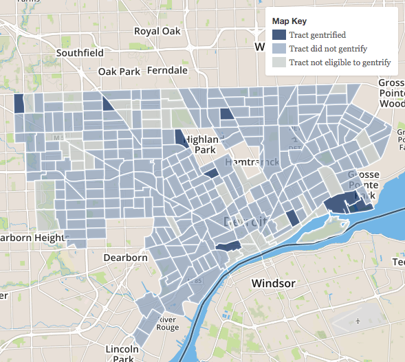
The map from Governing (1990-2000 above) should be an important reminder that data isn’t everything. Especially when it comes to discussions around gentrification we cannot limit ourselves to the hard data collected in the census because gentrification is a social and political phenomenon.
Governing utilized three data points in order to classify “neighborhoods” as gentrifying or not:
Indicators are important and these particular pieces of data do help to look at the issue of gentrification (rising prices, etc.), but the most important data to examine is the process of gentrification, not simply the outcome. What policies have contributed (i.e. redlining, reverse redlining), what political moves are making it more difficult (i.e. water shutoffs and foreclosure), and where are foundations, city government, and others focusing money for new investment.
I would argue that these maps don’t tell the story of gentrification at all, but rather the impact of further disinvestment of the neighborhoods where Detroit residents live. As census tracts/ neighborhoods lose population, those who are able to stay are more likely to have higher income, education, etc.
These maps and data again don’t account for the local nuance of issues with property and displacement:
“These numbers are meaningless. The area in Brightmoor is 70% vacant. How many data could you collect from that? So only 3 in every 10 houses is inhabited, there are no grocery stores, no banks, no high school, just burned out houses, vacant lots, potholed streets. Just another academic exercise that has no practical value for those of us who live there. There are no houses in that area.”
– Riet Schumack
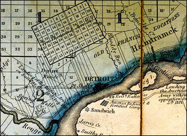 This map is one in the three part series considered to be the first detailed map of the Michigan Territory.
“In the map detail of Detroit we can see the clash of land division systems: Old French long lots meet up with Judge Woodward’s Ten Thousand Acre Tract and are filled in all around with the U.S. Public Land Survey System. To the southeast we can see part of Ontario, Canada, where Windsor was still called “Sandwich.” Significant sites of the War of 1812 are noted on the Windsor-Essex Peninsula.”

This map is from the “Mayor’s Street Improvement Committee” in 1943. It seems like there are an unimaginable amount of “expressways” and perhaps the term is not being used as we currently understand it.
Can you imagine all of these roads existing as expressways?

Detroit holds a fascination to many people for varying reasons. This wonderful chalk map by Fritz Haeg was drawn to help with the planning of a project that hopes to explore the rise of art collectives in the city.
‘Detroit Methods’ is a studio for exploring the particularly innovative ways in which some contemporary artists are working in Detroit today, while developing student projects with similar strategies and approaches. We are looking at ten local art collectives and artist run initiatives, and their ways of working that extend beyond the conventional private production space of the solitary artist studio and the controlled public presentation space of the commercial gallery and art institution. Instead we see these artists turning into the home, and extending out to the commons, i.e. the street and shared public spaces of the city. The fundamentals of human culture, survival, and pleasure become the source and focus. Eating, gathering, conversing, gardening, cooking, composting, constructing, playing, bathing, cleaning, socializing, and learning often become central to the work. In the process our assumption of a clear division between daily life and elevated art may become blurred.

I had been really interested in the various places around the US that have “Detroit” in their name. I was doing a pretty terrible job manually searching for these locations. Thankfully, Paul Ramsey put together a handy heat map tool based on data from geonames.org.
I knew there was a Detroit Street in Ann Arbor, Michigan and I had already found the city of Detroit Lakes, Minnesota. The big surprise was discovering the village of Detroit, Oregon named after Detroit, Michigan in 1890. Some quick googling brought up a news story of the town voting to change (47-37 to not change) its name to “Detroit Lake,” after the adjacent lake and state park. The decision brought the ire of Michigan residents including city councilman Gary Brown who thought “that residents are making a big mistake because the Motor City will one day return to its previous glory.” It is noted that the majority of residents (total population 2010 = 202) and vacationers call the village Detroit Lake anyway.
Search other places using the Placenames Heatmap

Loveland Technologies will be hosting this month’s #maptime where we’ll dig into the various open data portals available to Detroit and learn how to request datasets.
Diana Flora from Data Driven Detroit will lead a presentation on open data and then we’ll collaborate to look for data and make some maps from available open data.
What data do you want to see? What would you do with that data? Make a map?
When: March 31st, 2015 from 6-8pm
Where: Loveland Technologies, 1418 Washington Blvd., Detroit, MI
What: Open Data!
RSVP: Facebook // Meetup
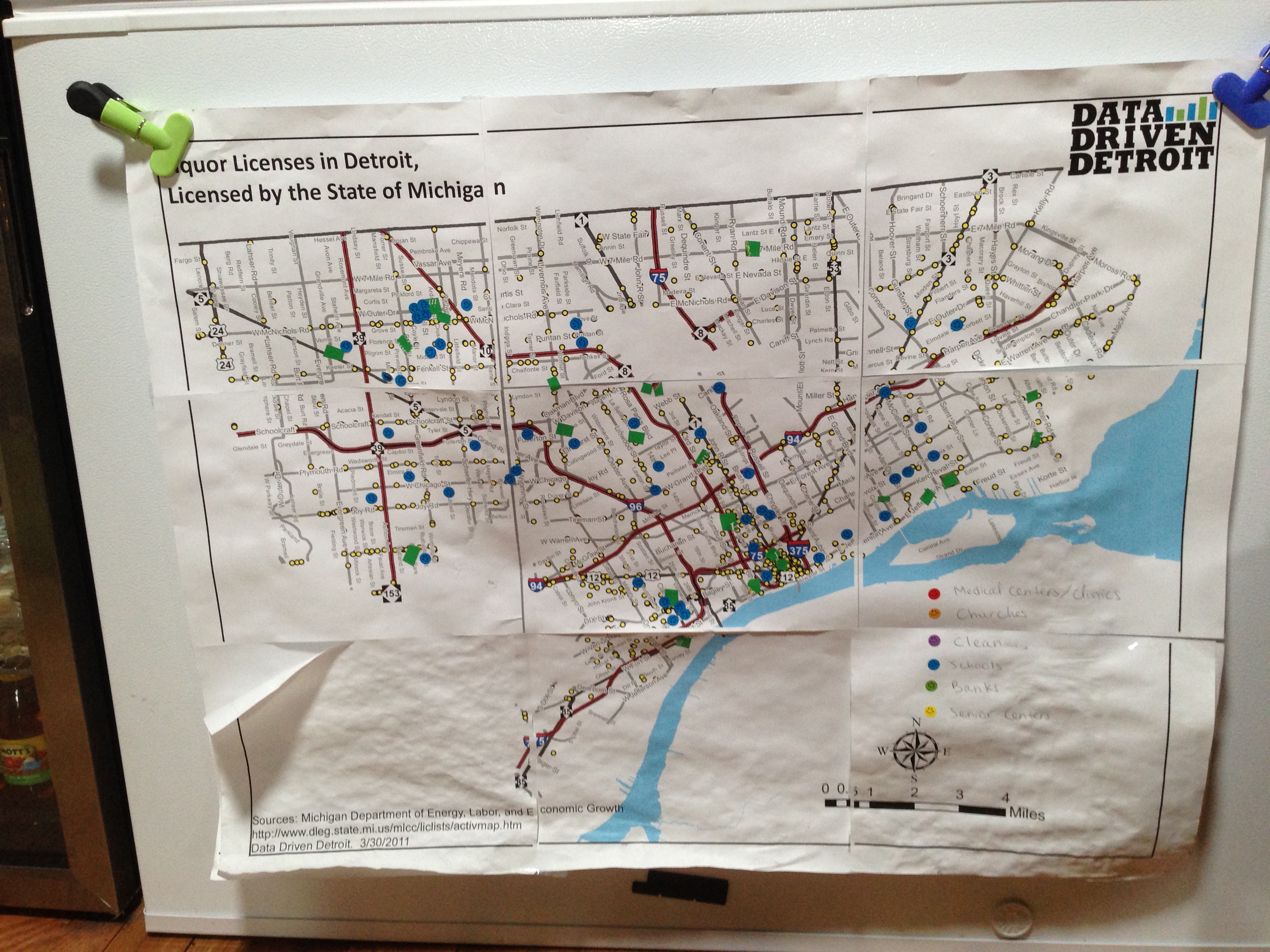
This map was spotted on the Fresh Corner Cafe fridge in the Green Garage. The base map is 2011 Liquor Licenses compiled by Data Driven Detroit with blue stickers for schools and green I think marks the various Fresh Corner Cafe locations?
It’s always nice to see maps in action. Do you have a cool Detroit map hanging in your place of work? Submit it!
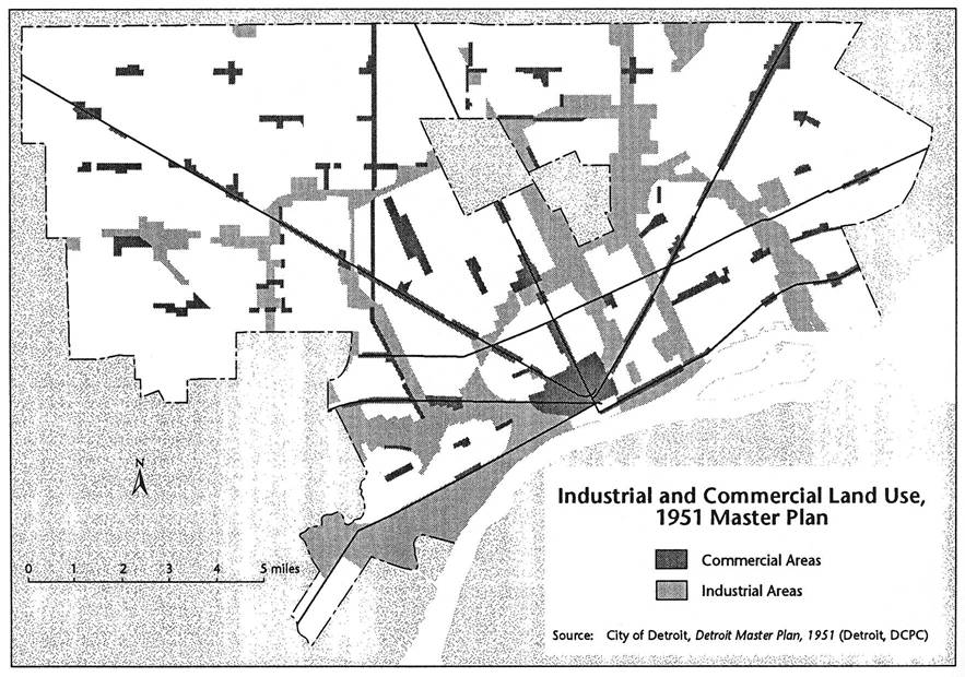 This Master Plan map from 1951 is focused on land use. The 1950 Census puts Detroit population at its peak of 1,849,568 people.
The most significant element that can be seen is this map is the extent of “industrial” land use. Much of the 1951 industrial areas in Southwest and along the I-75 corridor are no longer. Similarly, the “commercial” areas have shrunk considerably, especially Downtown and many of the neighborhood commercial areas.
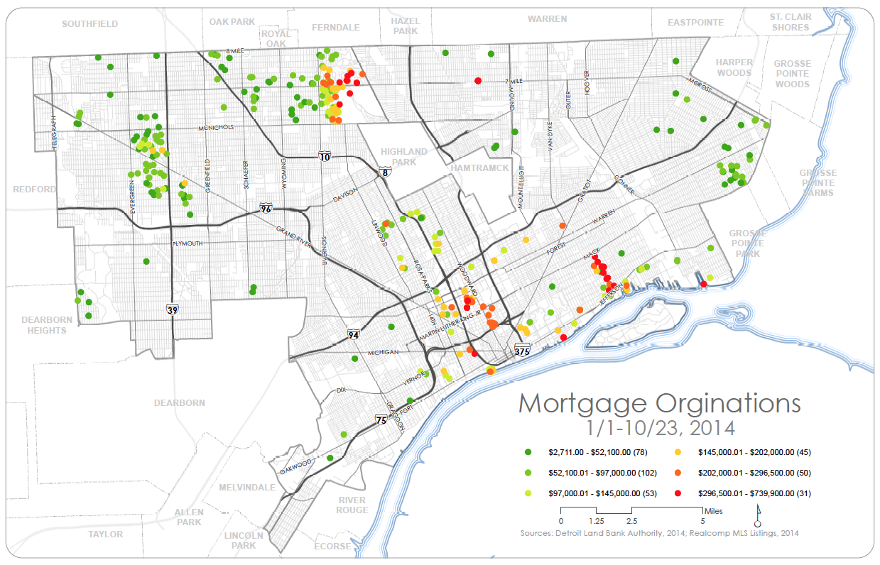 This map from the Detroit Land Bank Authority (DLBA) shows key areas in Detroit where residential investment is occurring as well as where mortgages are more likely to be given to homeowners. There is similarly a clear divide in wealth and home value associated with different areas (i.e. Grandmont -Rosedale/ East English Village vs. The Villages/ Midtown/ Palmer Woods).
 DETROITography