Voting in Detroit is not always easy and hasn’t always been available, like during emergency management. In recent years the city has barely scratched just 21% of registered voters casting a ballot.
The pandemic saw an incredible expansion of ballot drop boxes, early voting, and other tools to increase participation and access to voting for the people who will represent communities. Detroit continues to have a number of early voting centers available as well as ballot drop boxes.
Detroit once became famous for and known as the “city of trees” with Judge Woodward’s plan for large tree lined boulevards. Grand Circus Park in 1909 looked like a forest. In recent years the city has been more focus on tree removal while nonprofits like Greening of Detroit have been attempting to replant what was lost to pests and the Dutch Elm tree disease.
Irregardless, Detroit still has many wonderful spots to enjoy the fall colors of Michigan’s native tree species. The maple is the easiest to spot with typical red coloring, followed by White Oak in orange and orange-red hues, and lastly a host of golden yellows from Aspen, Birch, Hickory, Coffeetree, and Gingkos. I’m very thankful that Dr. Dakota McCoy and team have created this cleaned up dataset from disparate sources.
The fall beauty does seem to be more easily found in Detroit’s historic and wealthier neighborhoods, but you can also find the fall colors along historic boulevards like Oakman Boulevard and Boston or Edison Avenues. There’s even a stretch of East Jefferson Avenue near Belle Isle with vibrant colors.
The neighborhoods near Detroit’s largest parks have the best viewing. Rouge Park can’t be missed and is a joy to follow the winding roads to view fall colors. Many of the neighborhoods of Northwest Detroit like Grandmont-Rosedale and even further northwest are full of changing color. Bagley, Palmer Woods, and Sherwood Forest are also nice drives for fall color. On the Eastside, East English Village takes the win. The southeast corner of Highland Park has a nice cluster of fall as well as the area south of Caniff and west of Jos Campau in Hamtramck.
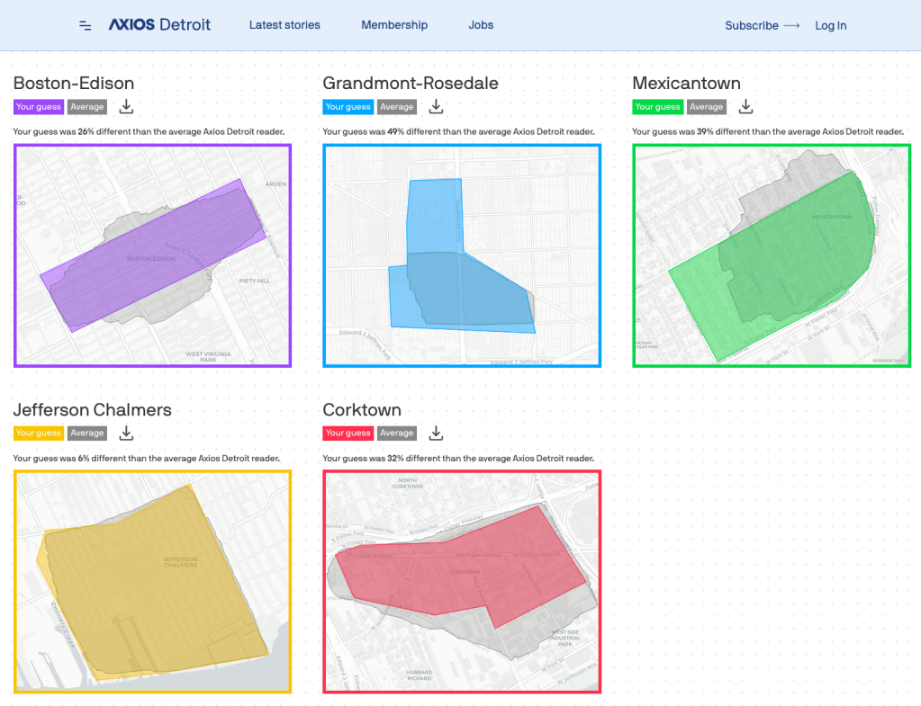
Did you play the neighborhoods game from Axios? Neighborhood boundaries are always contentious whether they are officially defined or not. What did you think?
Boston-Edison is a historic district that functions as a de facto neighborhood
Grandmont-Rosedale is arguable a collection of neighborhoods including: Rosedale Park, North Rosedale Park, Grandmont, Grandmont #1, Minock Park, and/or Westwood Park
Mexicantown is a bit of a nebulous space that most people associate with restaurants in Southwest Detroit
Jefferson Chalmers, named for an intersection and a homeowners association, includes a handful of community groups and block clubs, notably “Chalmers – Best 5 Blocks”
Corktown, the city’s oldest neighborhood, has changed a lot over the years with expressway development and baseball stadium updates
In the spirit of the spooky season what could be more frightening than encountering a rat in the city? This isn’t New York City after all.
I was reminded of the map showing “regions of rat-bitten babies” from the 1970s that noted over 2 million rats were in Detroit at the time. I’ve heard this was largely due to a trash dump for Canadian trash on the Eastside, but haven’t found much else on the topic. The recent shutdown of Lafayette Coney Island due to rat droppings also made me wonder what our current geography of rats looked like.
Since 2014, there have been 21,990 “Rodent Extermination” requests on the Improve Detroit app. The Buildings, Safety Engineering, and Environmental Department (BSEED) is the city government entity over rodents and pests among many other things.
This data may obviously be skewed by who reports on the Improve Detroit app, but the widespread reports from across the city give a good indication that there is broad use. The densest rat regions appear to be in the Grandmont-Rosedale neighborhoods, the Eastside near Pingree Park and Morningside, along with most of District 3.
How does that compare to where you’ve seen rats in Detroit?
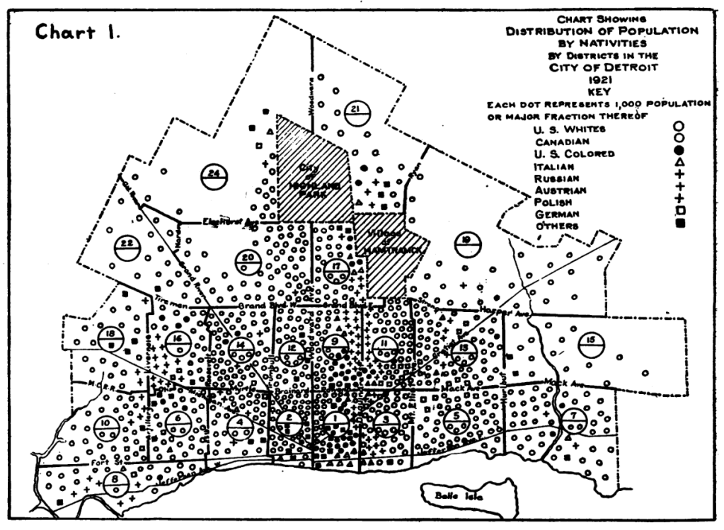
This map was included among many in a journal article published in the American Journal of Public Health by then Department of Health Deputy Health Commissioner, Watson Frank Walker. The article was focused on the relation between health and the environment. At the time the city was in its early growth:
“The city is 79 square miles in area and completely surrounds two municipalities, totaling nearly 100,000 people. It lies along the Detroit River, and is divided almost equally by its principal thorough-fare, Woodward Avenue. The older portion of the city developed around the intersection of Woodward Avenue and the river as a center. The growth has been semi-circular in nature and almost equal in all directions, forming concentric areas of new territories.”
I always find maps of nativity, or place of birth, to be fascinating as Detroit was and is a city of immigrants. Many different groups have made their path through Detroit and into present day suburbs of Detroit. Black Bottom very clearly shows the restricted density of African Americans in city. Polish, Russian, and Austrian-born residents are all coded with the same symbol, but also show a clear grouping near south of Hamtramck.
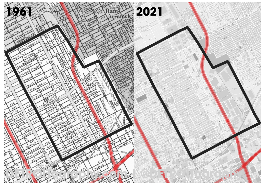
Interstate 75 cut through the eastern side of the North End. Construction began in 1959 and the historic map on the left from 1961 includes a dashed line where the future expressway was going to be built along what was Richmond Ave. The construction of an expressway is hardly a single line on a map however and the present day map on the right demonstrates the amount of destruction required to install an expressway with multiple blocks on either side removed.
This comparison map was made for the Eastern Market After Dark effort for the “North End Pavilion” to honor and support the works and stories of Detroit’s North End Community. Design Core Detroit partnered with Philip Simpson, Donna Jackson, Bryce Detroit, Reshounn Foster, LaDonna Little, the Underground Music Academy and more on the curation of the North End Pavilion.
NOTE: These maps include a boundary of the North End as defined by the project participants.
The City of Detroit’s “Streets for People” campaign from the Department of Public Works (DPW) has identified the top roadways segments for severe injury from vehicular traffic (Figure 11, Page 23). The report notes that, “Detroit does not have a strong culture of traffic safety.” For major US cities, Detroit ranks #2 in roadways deaths and #3 for pedestrian deaths nationally.
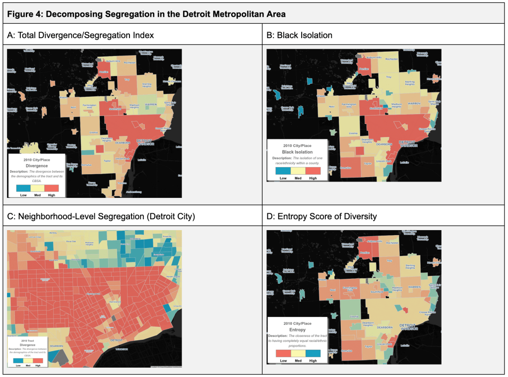
There are many different methods to calculate and describe segregation of cities. Detroit is regularly noted as one of the most segregated cities, but what is often left out is the regional context or the fact that the data calculation of segregation requires comparison to regional data. The Othering and Belonging Institute (OBI) has put together both an excellent interactive tool and a useful technical appendix.
The Dissimilarity Index is the most commonly used index, but only displays dissimilarity between two racial groups at a time. The Divergence Index (A) is preferred by OBI because it compares the relative proportions of racial groups at various geographies. Isolation and Exposure Indices (B) help us observe the degree of racial residential segregation experienced by different racial groups, but again can only indicate the exposure of one group to another. The Entropy Score (D) best demonstrates racial and ethnic diversity within a given geography. It is becoming more frequently used to describe segregation, but does not actual measure segregation.
Were you without power for multiple days? A likely cause is DTE’s lack of priority for infrastructure modernization in Detroit neighborhoods. Present efforts have focused on hardening, which has most often been ridiculed as “fighting with the trees.” Hardening could also include replacing poles, but the majority of “hardening” efforts in Detroit have been tree trimming and power line upgrading. After the most recent storm, DTE’s map of “reliability improvements” changed to include much more utility pole inspection and repair. It remains unclear what constitutes “upgrading” or “strengthening.”
The City of Detroit is served by 4.8 kV power, which is an older, less reliable system, with far less capacity than 13.2 kV. The 4.8 kV system, which is more than a decade past its expected use, has 13% the capacity as 13.2 kV. Modernization efforts prepare Detroit for greater capacity that could support improved solar and other clean, renewable energy efforts. DTE has noted its prioritization is focus on population and economic development. Yet, that leaves Detroit’s population dense neighborhoods underserved in favor of “economic development” in Greater Downtown where there are more jobs, more building permits, and more tax incentives.
It’s always important to assess and re-assess where population is dense based on the most recent Census estimates via the American Community Survey (ACS). The ACS is not the most perfect survey tool, but it is the best data that we have access to on a regular basis. A notable concern with the 2020 Census is the expanding undercount of Black, Latino, and Native American peoples.
Population density really shows the disparities in the revitalizing city where there is a Greater Downtown bubble, a ring of low density around Greater Downtown, and most Detroiters living in the Southwest, Northwest and Far East sides.
This is a beautiful map even if it represents the plans that have doomed most of our country’s major cities to car-centric planning. The map is part of the UM Clark Library map collection. In 1925, “super highways” were simply 204 foot wide major surface roadways. Notably, those super highways were absent from the city’s core and center.
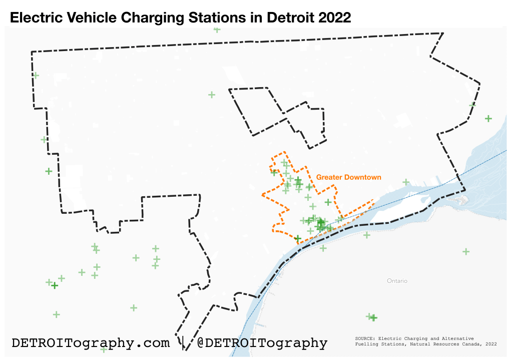
Alternatives to fossil fuel consuming vehicles are much easier to come by these days. The launch of Factory Zero at the old GM Poletown plant is indication enough that electric vehicles (EV) are here to stay. If you wanted you could roadtrip around all the Great Lakes in your EV with the now standard 200 mile range in most models.
However, our infrastructure has a long way to go to make EVs a viable option for everyone. That is low-income and communities of color are extremely underserved by EV charging stations. In Detroit you have to live in the 7.2 square miles of “Greater Downtown” to have any luck. Charging stations are just one part of the equation. The other is our outdated electric grid. In these same areas of Detroit where there are no EV charging stations, the electrical infrastructure is a decade past its life expectancy and has 16% the hosting capacity compared to areas that have been modernized like Greater Downtown. Beyond EV charging, this unreliable infrastructure limits low-income communities from taking advantage of home solar to reduce costs of heating and cooling as well.
This map created in 2011 as part of the “A People’s Atlas” project by AREA Chicago shows the clear indication of imbalance in early Detroit revitalization efforts. Hand drawn representations of Detroit are always fascinating and this one in particular shows a particular point in time that could reflect many time periods in the distance past or even our current city situation.
These are the official “neighborhood planning clusters” as adopted by the Community Revitalization Strategy (CRS) in 1997. The city’s master planning efforts are still bound to these ten planning clusters even though the city has numerous other methods for identifying and prioritizing geographies.
I found this on Detroit’s ancient GIS webpage using the Internet Archives’ Wayback Machine. There’s just something wild to me about the color choices. I wonder what GIS software had these are defaults or how the mapmaker chose this palette of baby blue, pink, and light yellow.
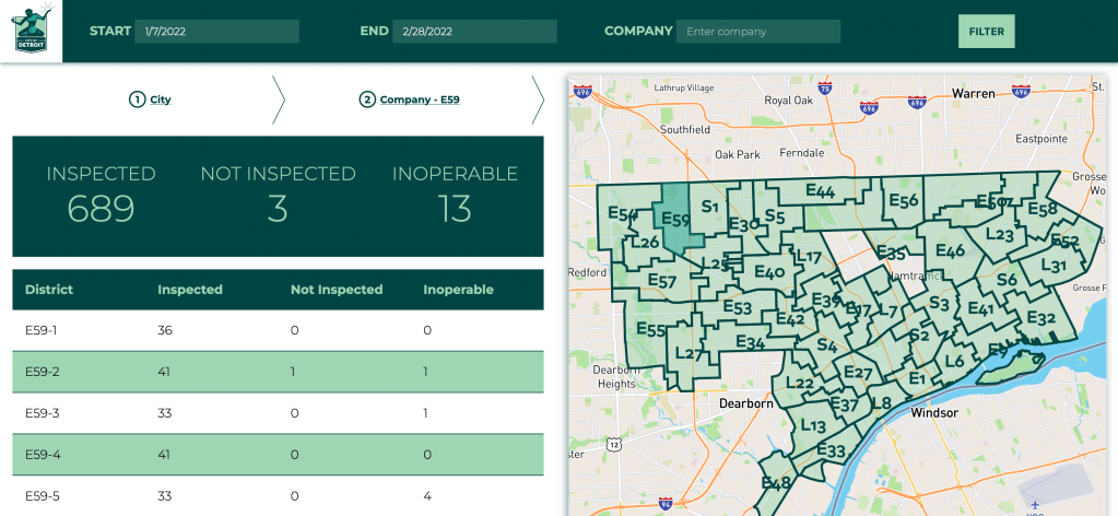
One data oddity that I learned about when working for the city government was that fire hydrants are broken up into their own bounded zones and maintained, at the time (around 2016) not very well, by different Detroit Fire Department (DFD) engine or ladder companies.
When the effort began in earnest to assess the status of every fire hydrant, Detroit was already the busiest fire department in the country. News reports claimed the city was giving an overly low estimate for the number of hydrants not working. In 2015, journalist Steve Neavling surveyed 15% of the city’s 30,000 hydrants and found 279 broken.
Now this city maintains this dashboard to stay up to date on fire hydrant status across the city.
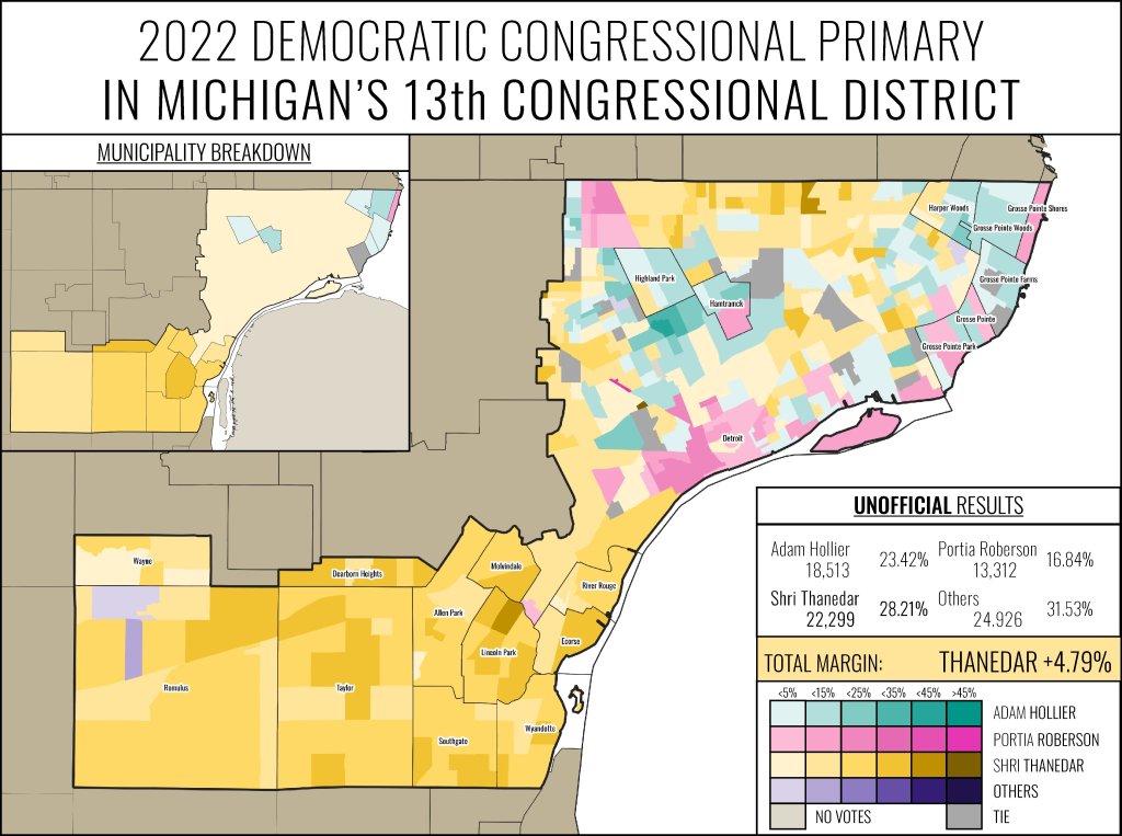
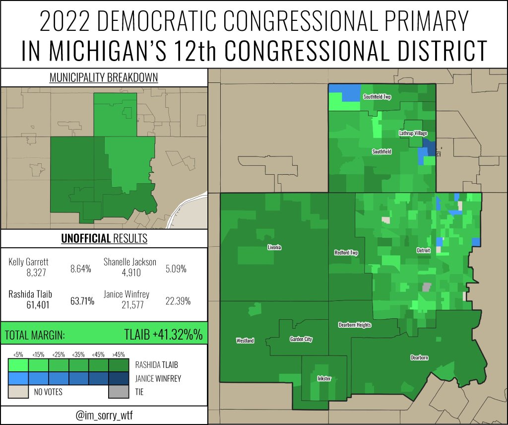
Jackson, an architecture student and lifelong Michigander, (@im_sorry_wtf) has been generating some clear and beautiful maps of election results for primary elections across the state. This is a sampling of the primary races that included Detroit. All data come from the respective county clerk offices.
The most important news coverage, rightfully so, about Detroit primaries has been the loss of Black representation in Congress for the first time in 40 years. This is the exact scenario that community leaders and the Black Caucus of the Michigan Democratic Party warned about after the recent redistricting. The most watched primary was for Michigan’s 13th Congressional seat where 8 of the 9 candidates were Black. India-American businessman and State Representative, Shri Thanedar won the primary by a 4% margin.
The “West End” of Detroit sits within Michigan’s 12th Congressional District. Incumbent Rashida Tlaib was running against embattled Detroit City Clerk, Janice Winfrey. Tlaib won her primary handily despite the influx of pro-Israel funding from groups hoping to unseat Tlaib who is Palestinian-American.
The 8th District State Senate primary is notably for its starkness. The near absolute racial divide in voting along Detroit’s northern 8 Mile Road border is a reminder of our segregated region. The Black candidate, Marshall Bullock won a plurality in the Detroit section and precincts in Oakland County while the white candidate, gaining recent political fame, Mallory McMorrow only won a plurality of votes in one precinct of Detroit.
August is Civic Health Month among many other awareness campaigns like National Breastfeeding Month. Over the last decade, there has been increased recognition that voting and civic engagement are connected to population health and health disparities. Low voter turnout has been well researched and shows that people who have lower self-rated health, certain chronic diseases, poor mental health, or who live with disabilities all experience greater barriers to ballot access. Voter turnout is similarly varied by race, income, and education level.
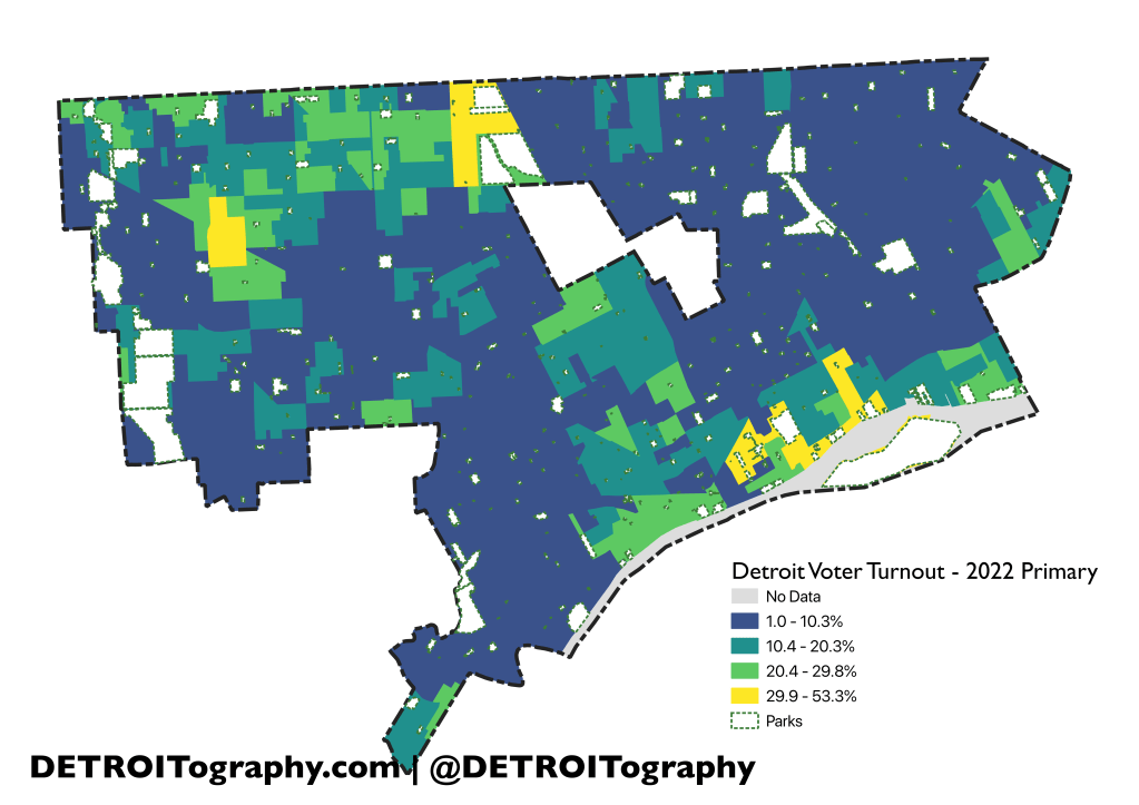
The data nerds and political pundits have all been throwing the numbers back and forth, cutting up districts, cities, and precincts to get to the bottom of how the 2022 primaries shook out. In Detroit, the topic has been the voting patterns of the Congressional 13th where Shri Thanedar took the win. Turnout has always been relatively lower than low in Detroit – and for all the already well researched reasons. Other local politicians even benefit from a lackluster clerk and absence of any meaningful civic outreach that result in low turnout.
Detroit can easily be seen as a sea of low turnout under 10.3% with bright spots that had over 29.9% turnout in Grandmont-Rosedale, Palmer Woods, University District, Indian Village, and Lafayette Park – all areas of high income, high education attainment, and low rates of chronic diseases. Precinct 308 in Grandmont-Rosedale had the highest turnout at 53.3% followed by Precinct 203 in Palmer Woods with 50.8%.
The Detroit City Clerk, Janice Winfrey, lost her own primary against Rashida Tlaib and her office has some different numbers than the Wayne County Clerk. I’m not sure yet how to account for the anomaly.
Eligible Voters
Ballots/Voters
Turnout
Detroit Clerk
504,215
77,749
15.42%
Wayne County Clerk
504,401
78,022
15.46%
Difference
-186
-273
-0.04%
The overall turnout doesn’t change that significantly, but the discrepancy of some 200 voters and 300 ballots is quite odd. The map is based on unofficial precinct level data (election day voting and absentee votes) from the Wayne County Clerk.
The original map posted on 08/05/22 had a number of blank areas labeled “no data,” but the issue was actual an incorrect precinct shapefile. I had used the 2020 precincts and assumed not much had changed in 2022. Since 2020, 52 precincts were merged with nearby precincts. Precincts 17, 28, 37, 48, 54, 57, 67, 76, 87, 96, 99, 104, 106, 108, 109, 110, 113, 114, 117, 141, 142, 149, 152, 154, 163, 170, 179, 181, 187, 196, 206, 235, 237, 270, 322, 388, 391, 412, 451, 454, 455, 456, 459, 465, 467, 469, 476, 478, 487, 492, 494, and 499 were all removed in 2022. Big thanks to Will Ferguson for remapping the precinct changes that, as far as I can tell, were only shared out as an unuseable PDF map (04/05/22 2:10PM). Give the people machine-readable, open data!
I was very wrong, yet this is not an uncommon problem in Detroit where voters often learn of precinct changesthe day they go to vote or never. Precinct changes must be approved by the Detroit Election Commission which looks like it meets extremely irregularly (but a planned meeting tomorrow 08/08/22). The 2022 precincts map was made in April 2022 and from the file name it seems it was approved in July 2022. Michigan election law states:
Precinct boundary changes must be approved no later than 210 days prior to the August primary in an even numbered year; however, in the second year following the federal census precinct boundary changes must be approved no longer than 120 days following the August primary. (MCL 168.661(3))
I can’t interpret if that means the Detroit Election Commission, who last met in August 2021, is severely behind schedule and failed to approved precinct changes properly, or if they have 117 more days to approve the updated precincts. I at least hope they properly mailed updated voter registration cards to everyone.
Now to the topic of “open data,” it appears that the Clerk and Office of Elections doesn’t care to make the data more readily available because they have a pricing menu for various maps and data available. How can our own voting data cost money to access?
The Detroit People Mover was part of the Urban Mass Transportation Authority (UMTA) Downtown People Mover (DPM) program. The program received 35 proposals, and four cities were selected: Cleveland, OH; Houston, TX; Los Angeles, CA; and St. Paul, MN. Detroit had applied, but was able to pursue the DPM with other funding along with two other cities (Miami, FL and Baltimore, MD) bringing the total to 7 DPM approved plans.
Only Detroit and Miami followed through on constructing their DPM system. Miami eventually demolished their DPM. The Detroit effort was started by the Southeast Michigan Transportation Authority (SEMTA), which would later become the Suburban Mobility Authority for Regional Transportation (SMART). SEMTA sold ownership of the system to the Detroit Transportation Corporation (DTC) in 1985 and the DPM launched in 1987.
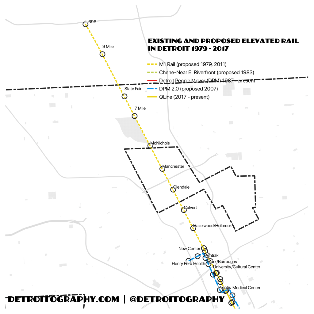
Elevated rail was noted as the most viable option in a 1918 Barclay Parsons Clapp (later Parsons-Brinckerhoff) study and it was again proposed in a 1979 study of rapid transit options for the Detroit region. The rail line was proposed to run underground as a subway from Downtown to Grand Boulevard and then run as elevated rail from Grand Boulevard to McNichols, finally running at street level until I-696. The 1979 study of rapid transit plans included the early analysis for the Downtown People Mover project as well.
A proposed housing development in 1983 near where Orleans Landing was finally built noted the Downtown People Mover project and noted the possibility of expansion eastward to accommodate senior citizen mobility needs while also connecting people to the riverfront. Ideally, this could have been an elevated rail line that eventually connected to Belle Isle, possibly even looping around the island.
The single largest expansion of the Downtown People Mover was in 2007 when David Curry and Marsden Burger proposed the Detroit People Mover 2.0 with key connections to the Medical Center and Henry Ford Hospital. The elevated addition would have run as its own separate line connecting to the DPM loop near Comerica Park. Many similar stops exist along the Qline route, but the convenience of elevated rail could not be made more apparent by the current failures of the Qline curbside routing.
The current DPM technology is outdated, but I can’t help but think of the possibility of add on elevated lines to the North, East, and Southwest that utilize the DPM as a hub like The Loop in Chicago. Maybe the RenCen should be Detroit’s newest transit hub where all the elevated rail lines get routed.
The Detroit Community Technology Project (DCTP) took a deep dive into the controversial Project Green Light (PGL) camera program run by the Detroit Police Department. The now ubiquitously blinking green lights dot every commercial corridor, the inside spaces of public and multi-family housing, and the inside of some businesses (with no blinking light). Concerns about the technology abound as the Real Time Crime Center (RTCC) attempts to monitor all 256 cameras and facial recognition contracts get renewed by City Council.
The PGL program has no evidence that the program has had any meaningful impact on crime although it does often tout unverifiable statistics when working to get more businesses to install the technology. One assumption is that police response times might improve based on PGL locations, but the map included in the report shows there is still an obvious disparity in response time regardless of PGL use or non-use.
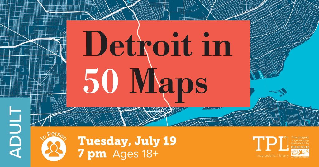
Whether you are a Detroiter, a fan of the Motor City, or a lover of maps, this program has something for you. Join cartographer and anthropologist Alex Hill for a discussion of his bestselling book, Detroit in 50 Maps, as he brings Detroit history, culture, and public policy to life with his fascinating collection of Detroit maps.












 DETROITography