Detroit Macrohoods Map

blight6-edit

Data Driven Detroit and Loveland Technologies developed microhoods and macrohoods as part of the Motor City Mapping project funded by the Detroit Blight Taskforce. This map has been on the wall at “Mission Control” where surveyors and staff have been buzzing around for the last few months capturing every land parcel in the city with a picture and status update.

Detroit Building Age Map

det-building-age

View the full interactive version HERE

Loveland Technologies has been making waves and their most recent Detroit data visualization of “Detroit building age” only adds to the awesomeness. The map reminds me of other great building visualizations from Brklynr of Brooklyn buildings block-by-block and the Waag Society similar project of Amsterdam. Now Detroit is as much or possibly even cooler than Brooklyn and Amsterdam, right?

Not all the data is quite right, but that is why feedback is important in map making.

Map: 21 Homes of Gwendolyn Warren, Detroit

gwendolyn_warren_homesGwendolyn Warren was co-Director of the Detroit Geographic and Expedition Institute (DGEI) and added a wealth of information to the Field Notes III discussion paper. She had formerly led a youth group in the Fitzgerald neighborhood and met the DGEI with strong opposition before starting to work with them and eventually author a significant portion of the third discussion paper based on her experiences.

Map of Bicycle Crashes in Detroit 2005-2009

detbikecrash05-09

There have been a few recent calls for better data or even real time data on bicycle crashes. Detroit has been adding many bike lanes, shared lanes, and greenways over the last few years. This map may help identify where some unmet needs could benefit from bike lanes or buffered bike lanes. Key hotspots in Detroit are Midtown around Warren Ave. and Wayne State University’s campus as well as Northeast along Gratiot, specifically at the corner of Gratiot and McNichols. Hamtramck represents an interest cluster. I’m not sure if that represents better bike crash reporting in the smaller municipality, or if just more people are biking there? There is also a cluster Downtown, which could be interesting to see in the future as development increases Downtown and Woodward corridor walkability is targeted along with the M1 Rail.

Additional exciting news is the plan for buffered bike lanes on East Jefferson!

detroitdata_get

Map of all the Single Ladies in Detroit

single-ladies-detroit

The Center for Urban Studies has put together an interesting piece over at their Drawing Detroit blog. In the name of Valentine’s Day they have utilized the Census Bureau’s data on single people.

“Singlehood in Ann Arbor and Detroit is quite popular, according to data provided by the 2012 American Community Survey. When comparing the City of Detroit to the other municipalities that make up the seven-county region, Detroit was one of only four municipalities where over 40 percent of females 15 and older have never been married.”

Read more at Drawing Detroit. . .

Map: Mexican Foreign Population 1960

mexican_foreign

I was surprised to find that Southwest Detroit has a longer history of Mexican migration than I had ever thought. This map was part of the Field Notes I from the Detroit Geographic and Expedition Institute. The bold line surrounds areas of black population majority in the city.

Map: One Detroit

7_Title_One_Detroit

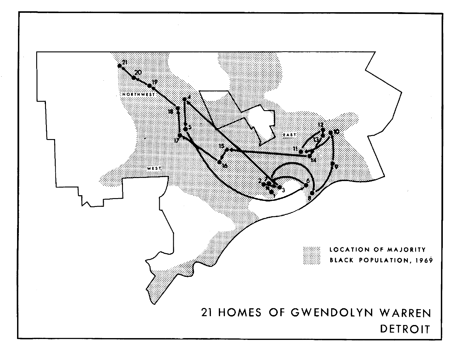
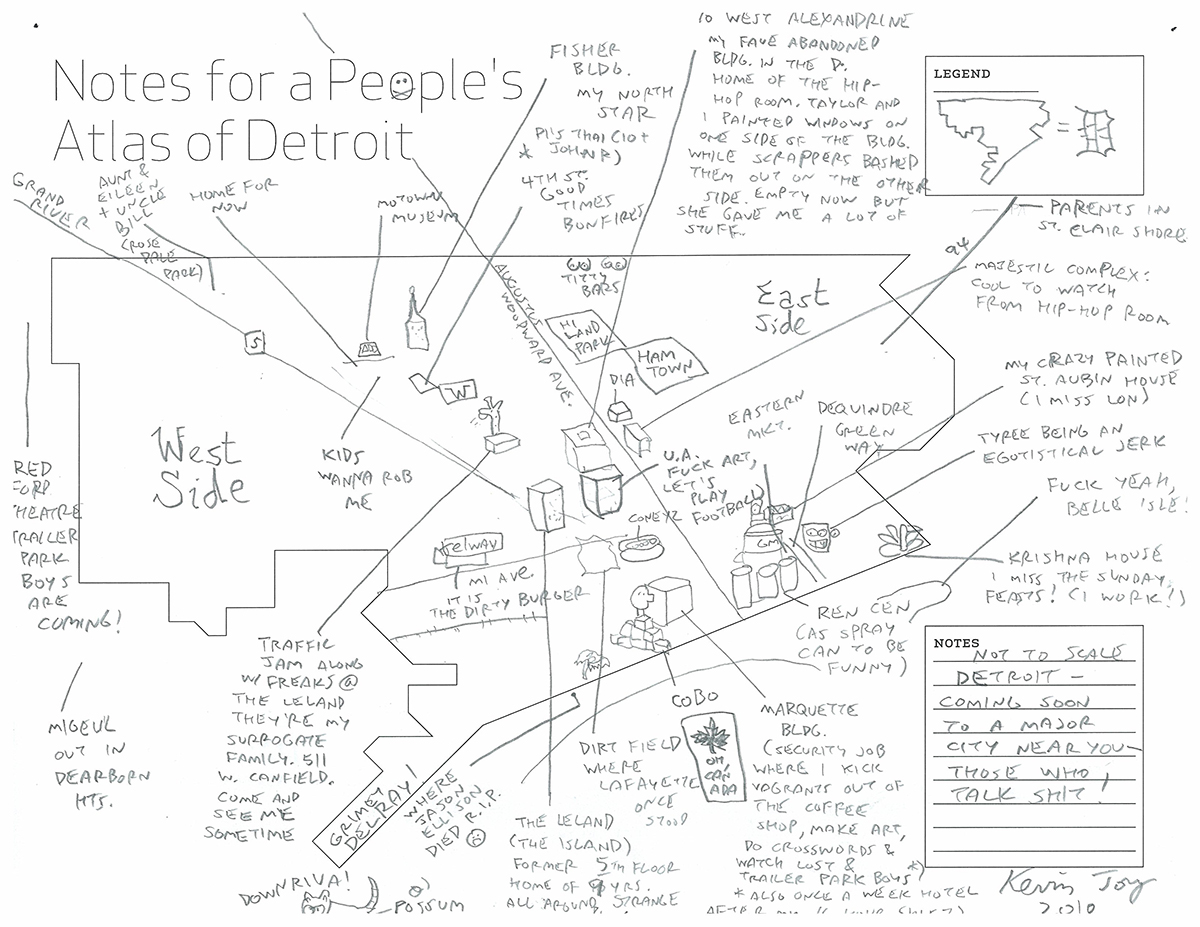
Francis Grunow ponders on Model D about regional cooperation and efficiency. Important identity questions that match up with the definition of Detroit through our “100 Maps of Detroit” piece. There is a larger question here, but one that is critical to the future of Detroit and Michigan as a whole: “can we recognize and move past our troubled history to make Detroit better for everyone?”

“Of all the things I might change about Detroit, if I could choose just one, I would settle the question of what it means to be “from Detroit.” Of course this question is a powder keg. Identity, class, race and politics all get tied up in a pretty sticky wicket. On the one hand, it’s easy. Historically, Detroit is a pretty well defined place, growing in stages since its founding in 1701, and today, “Belle Isle to 8 Mile,” as a recent guidebook so simply suggests, is straightforward enough. You’re either from here, or not.

But, by turns, Detroit is also, equally, a state of mind, a badge of honor, and a curse for some — far too many, unfortunately. The thing is, Detroit could have had a wholly different history. It may have grown and expanded in much the same way it did, but in another version, the city would have also annexed the communities around it as it grew, and as it had done for most of its history.

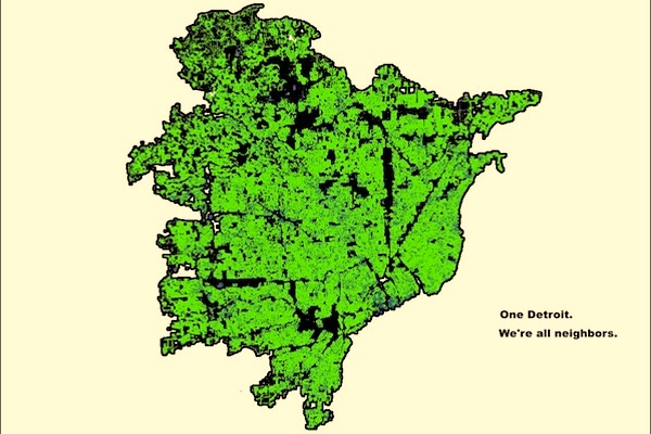
[…] To see what One Detroit might look like, I did a little experiment of my own. Using the household size map as a base, and the free (but frustrating) open source GNU Image Manipulation Program, or GIMP, for short, I was able to create a new map of One Detroit, in a few easy steps.”

Ford Rapid Transit Plan Map 1970

Ford_transit_planEven Ford Motor Company wasn’t beyond fantasizing about regional rapid transit and recognized the crucial role for rail rapid transit in the growing metro Detroit region. In the 1970 report, “Master Plan for Ford Properties” by William L. Pereira & Associates, an 81-mile rapid transit plan is laid out according to the TALUS study. At this time, supposedly a commuter line (2 trains per day) was already running between Pontiac and Detroit. The main lines important for Ford were:

Grand River-Schoolcraft Line

“[…] conveniently located for the low-income low-auto-ownership residents of the area. Six more stations serve an estensive residential corridor of about eight miles lying directly north of the site. In a second phase, the line would continue to Merriman Road […]”

Michigan-Airport Line

“[…] this line on the system originates in the Central Business District running in subway under Michigan Avenue to the Lodge Freeway and sharing some stations with the Grand River-Schoolcraft line in the CBD. […] In a second phase, the Michigan-Airport line continues along the Penn Central right-of-way, wit stations in West Dearborn and Inkster.”

The planners recognized that the feasibility and funding weren’t there for the comprehensive rapid transit system and so proposed an interim system that connected Downtown to the Metro Airport due to the expected population increase in that general area of Wayne County. This sounds much like the commuter rail development that SEMCOG is trying to establish between Ann Arbor and Detroit, over 40 years in the making.

The report closes, noting that “[…] all large scale development in the future must take into account the possibility of rapid transit.”

Mental Maps of Detroit

Screen Shot 2014-01-28 at 11.26.33 AM

These mental maps of Detroit come from Jeffrey Gordon of the Detroit Geographic Expedition Institute (DGEI) and build on the “hand map” example from Detroit.

“A full time member, the cutting edge of Expedition, faces three tasks. First he must get “unlost.” We mildly haze those who are spatially illiterate and it is a condition that must be ruthlessly corrected. We simply can not take the time to explain every location that comes up in conversation. We have two potential instructors in the “Get Found” course.

[…] several different schemes can be used one after another.”

The hand map is the first example followed by these other mental maps as an important method to “unlost” in Detroit.

Do you use a different mental map to know your way around Detroit?

Map: Vehicles in Detroit as Percent of Total Population 2012

DETvehicle_pct

In response to a few comments that the last “motor vehicles in the motor city” would be better based on vehicles as a percent of population, here is the updated version with the new 2012 data. I actually think it might even be better to look at vehicles available per household, but the Census is still an imperfect measure of vehicle ownership.

I could go on for a few paragraphs, but the short answer is that Detroit needs a public transit system.

Updated Detroit Metro Transit Fantasy Map

DM_Invert_1800

We originally shared a post from Jackson Woods (jwcons) and his proposal for Detroit Area Rapid Transit (DART) fantasy transit map, which received over 12,000 views and 3,000+ shares on Facebook. I was finally able to track him down and found out that he has some great route and design updates to the map, which was recently featured in a Wired Magazine piece on fantasy maps. He has shared the absolutely most up to date version with us. Here is a snippet about the map from Jackson’s new website:

“My first attempt at a Detroit rapid transit map was based on a specific historical what-if: what if Detroit had built a metro system during the late 1960s and early 1970s, when Atlanta, Washington, DC, and the Bay Area were building MARTA, Metro, and BART respectively? The new map is more expansive, and it’s more of a best case or dream scenario. Since the 1980s, Los Angeles has made a major effort to build a modern rapid transit system, going from nothing to about 90 miles of track in less than 25 years with much more still to come thanks to Measure R. What if the Detroit region were able to take a similar course?

What I ended up with is surely deserving of the title “fantasy map.” The Detroit Metro is a system comprised of 155 miles of track and 119 stations. This compares to the 90 miles of track and counting in LA, 129 miles with 97 stations in Washington once the new Silver Line is completed in 2018, and about 220 miles of track with 145 stations in Chicago. The circumferential St. Clair line is a big contributor and the main layout difference from my earlier map, adding nearly 40 miles of track on its own. If your fantasy maps need to have stricter limits to be enjoyable for their plausibility, just imagine the map without it.”

Read more about Jackson’s process and transit ideas. . .

Map: Houses Deteriorating and Dilapidated in Detroit 1960

bunge_dilapidated1960

This map was published in Discussion Paper No. 1 from the Detroit Geographical Expedition led by William Bunge. It is interesting to see that the areas with the highest percentage of deteriorating or dilapidated houses are focused in areas at the time that were predominately low-income and minority communities. Today those same areas of Detroit are the focus of massive development along the Woodward Corridor, Corktown, Southwest, and along the Riverfront.

This is an important map as independent groups, led by Dan Gilbert, attempt to tear down every vacant structure in the city. In 2009, the Detroit Residential Parcel Survey helped inform Mayor Bing’s initiative to tear down 10,000 blighted structures even though the DRPS recommended that only 3,480 needed to be demolished. Mayor Bing was able to demolish 8,966 structures during his term. Now the Motor City Mapping initiative (Loveland Technologies & Data Driven Detroit), funded by the independent Blight Authority is completing a repeat survey and including every single structure in the city.

“Maybe I’m out of my mind, which I am for various reasons,” he said. “You get these structures down and, I mean, all of them, not most of them, all of them.” – Dan Gilbert

Detroit Neighborhood Markets Map

neighborhood_markets

It is unclear what year this map is from, but my guess is around 2009. The map includes Detroit Future City (DFC) demonstration areas which would have come at the beginning of the DFC process. The map demonstrates how there Detroit’s core has been devoid of development and strong neighborhoods which in turn caused the population to move to the outer edges of the city or to move out of the city all together. Most telling is the “steady” distinction along the Woodward corridor surrounded by a sea of red “distressed” areas.

Detroit Free Press can we get a year reference on this data?

Map: Birthplaces of the Mayors of Detroit 1802 – 2014

DETmayor

The theme of mapping birthplaces began, I think, when redditor “pete8789” made a map of “Number of US Presidents born in each State,” others followed including, Birthplaces of: South African Presidents, French Presidents, New Zealand Prime Ministers, Leaders of the Soviet Union, Australian Prime Ministers, Swedish Prime Ministers, Dutch Prime Ministers, etc.

I think Detroit should be a part of the fad and has a very interesting map that reaches across the Atlantic showing Detroit’s days as a “frontier town.” The majority of early Mayors came from states on the East Coast, which is not surprising given the level of immigration moving from the East to the Midwest. Detroit was a main way point as immigrants made their way West to new areas of the United States. Detroit’s proximity to Canada earned it two Mayors born in Ontario. Emblematic of the Great Migration of African Americans from the South starting in 1910, Detroit had one Mayor who was born in the South, Coleman Young. His family moved to Detroit in 1923 and he began working for the Ford Motor Company.

In the last 130 years only 9 Mayors were born outside of the City of Detroit.

Source: Wikipedia

A People’s Atlas of Detroit: Kevin Joy 2010

DETROIT_kevin_joy

This map comes from the AREA Chicago project called “A People’s Atlas.” In Detroit, the blank map templates were handed out at the US Social Forum in the summer of 2010. I assume that is where Kevin Joy, best known for window graffiti in the United Artists Building, received a copy and completed the map with a great deal of information. A series of the maps from 22 different cities were published in “Notes for A People’s Atlas.”

I have to say that I’m not a big fan of the very odd Detroit outline that AREA Chicago employed as well as the absence of Belle Isle. I wonder who created the template for Detroit. Do you want to #MapDetroit? Click on the Participate link!

Map of Flickr Photos in Detroit

Luminous Detroit

This screen grab comes from the Luminous Cities project of UK based TraceMedia (try it out!) They have generated an interactive search option for all geotagged flickr photos back to 2005. In Detroit, it is easy to see the upside down “T” (“eet”) of eateries, attractions, and new investments in the Downtown/ Midtown area. There is a cluster of photos from DEMF, a cluster for Comerica Park, Eastern Market, the DIA, and more from WSU Campus up to the Fisher Building in New Center. Beyond that clusters of regularly visited places include Detroit’s iconic ruin porn, Michigan Central Station and the Packard Plant. Smaller clusters can also be seen in the Villages, Mexicantown, Russell Industrial Center, and Hamtramck, but they aren’t as dense and tend to be in the evening hours. The cluster to the far left of Downtown is the Henry Ford Museum in Dearborn. It would be very interesting to overlay this map with geotagged Instagram/Facebook photos.


Map: Motor Vehicles in the Motor City

motorcity2

As the North American International Auto Show (NAIAS) brings in major motor vehicle companies and big names (Joe Biden, Fernando Palazuelo) there seems to be the regular disconnect between the “Detroit” as the Auto Industry (Big Three) and “Detroit” the most recent city to enter bankruptcy with a population of over 700,000. The memorable editorial headline read “let Detroit go bankrupt,” but that was a reference to the Auto Industry not the municipality and its residents. (See how different people define “Detroit” in “100 Maps of Detroit“)

Just within Wayne County where the City of Detroit is located there is a significant divide in vehicle ownership. This in the city where Henry Ford revolutionized motor vehicle production as well as motor vehicle ownership affordability. A notable difficulty in motor vehicle ownership is the high cost of auto insurance (one of Duggan’s campaign topics) in Detroit as compared to the suburbs. However, there is also a high percentage of unemployment, poverty, and low property values that only add to the difficulty for many Detroit residents to own a motor vehicle. This map demonstrates a serious need for improved and innovative public transit in the City of Detroit that also connects to the suburbs to help Detroit residents get around, get to jobs and reduces the number of cars/ traffic from the suburbs.

This is a side thought, but since a very minor amount of revenue from the Auto Industry actually benefits the residents of Detroit maybe the dollars from the private NAIAS Charity Preview could be funneled into the new Regional Transit Authority (RTA) which is in serious need of funding. Just forget the fact that promoting public transit is against the corporate interests of those who produce individualized transportation vehicles.

City Councilman Election Frontrunners 1969

city_council_election_1969

From Field Notes II, this map represents the political climate of 1969 where the core of the city was liberal leaning. Detroit hasn’t had a conservative (Republican) Mayor since Louis Mirani’s term ended in 1962. One of the front runners, Van Antwerp, had served as Detroit Mayor from 1948-1950 and served on the City Council until his death in 1962.

Detroit Heat Map: Climate Impacts on Housing

detroit heat map 2Dr. Larissa Larsen, Associate Professor of Urban and Regional Planning and Natural Resources at the University of Michigan, led a study looking at the oldest housing in Detroit in order to understand the impacts of climate change, specifically extreme heat events, on the built environment and the residents living there.

“We looked at these heat events to find the best adaptive strategies – adding trees, removing unnecessary hard surfaces, and home weatherization to make homes more efficient and reduce the cost of utilities,” said Larsen. “The key to the project will be public engagement and working with people to implement the most practical responses.”

The Detroit Climatology Report 2013 by Detroiters Working for Environmental Justice (DWEJ) estimates a steep increase in heat related deaths. In recent years extreme heat events have led to many deaths, especially among the elderly. Many studies have also demonstrated the causal link between increase heat and increase crime/ homicides as heat causes tempers to flare.

“Climate change is an issue that is quickly gaining momentum throughout the country, particularly in urban communities, as increased heat waves, air pollution and infectious diseases are more prevalent in low-income and minority communities,” said Kimberly Hill Knott, director of policy for Detroiters Working for Environmental Justice.

Map: Detroit overlaid with Chicago Transit Routes

Detroit_ChicagoRail

This map comes by way of the Changing Gears public radio program focused on the industrial Midwest. The map was made by reddit user, northsider1983.

Oddly enough both the Chicago lakefront and Detroit riverfront create a similar geography where imagined rail lines make sense along the waters edge as well as a a handful of routes that radiate from the downtown area. With the exception of so many rail lines bunched together in the same direction, Chicago’s L routes would seem to work fairly well for Detroit.

Thoughts?

Neon Detroit Map in the Madison Building

madison-building-map

If you’ve been inside the Madison Building lobby, then you couldn’t have missed this map on the wall. There is slight problem with the location of the neon circle. The Madison Building is not off of Woodward as it seems to appear on the map, but rather off of Broadway and closer to Grand Circus Park. Hopefully the yellow neon on Michigan Ave. and Gratiot Ave. represents the next streetcar rail development that Dan Gilbert will fund?

Can anyone identify the base map that they used?