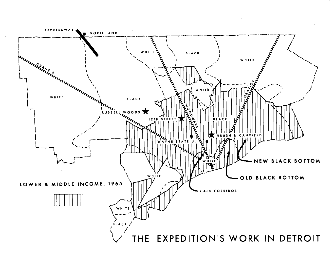
 This map from the Field Notes III publication from the Detroit Geographic Expedition & Institute (DGEI) shows the various places that were focus areas of study between 1969 – 1971.
Author Archives: Alex B. Hill
Map: Detroit’s Coworking Landscape

Just about every month there is a new “coworking” location added to Detroit’s aspiring technology and innovation community. One coworking space has finally not located Downtown, WorkPlace in Grandmont Rosedale. WorkBuild HQ is the most recent addition right Downtown. The map isn’t even able to properly display all of the locations because there is such a high density Downtown.
The Voronni tesselation is based on the costs associated with becoming a coworking member at particular locations. These were determined by available information – a number of locations make it very difficult to get their information if you don’t apply and get vetted (dark green). There are also a fair number of coworking locations that are very community focused and some offer free space and services.
Please send along any updated information if you know more about particular coworking spaces. Thanks!
Event: Mappy Hour for Regional Transit
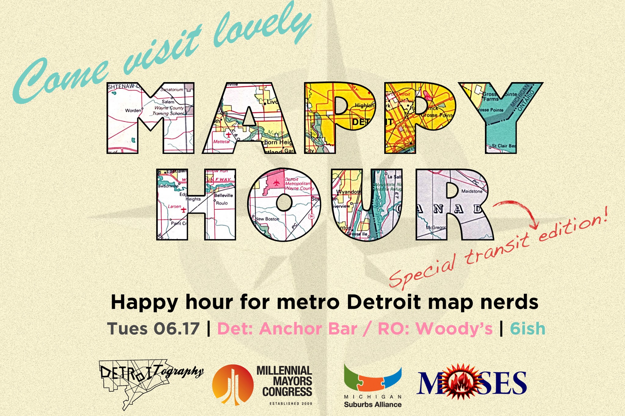
We are cohosting this upcoming Mappy Hour on regional transit. Come out and meet other map nerds, talk regional transit and SMART, while playing bus-opoly!
Map: Detroit Public Schools Near Industrial Zones

This map accompanies the map on “air qualities around schools,” which was noted to have many issues. In this map it would make sense that you would want schools to have a certain buffer zone from industrial sites. This maps is potentially more methodologically sound than analyzing air qualities based on geography, but the problem is that there is no explanation of methods used.
- What is the measure of walkability? 0.5 or 1 mile?
- Are we sure some of these schools are even still open?
- What industries still exist and operate in the “industrial zones” or are they just dormant buildings?
What may be more interesting here is if it was possible to conduct health screenings at schools and determine if dormant or active industrial zones contribute to the poor health or students, which could also potentially be linked to in school performance.
Map: Most Common Country of Origin in Detroit

At first glance, this map is a mess to look. However, I made an artistic choice to keep all of the colors because I thought it gave a nice impression of Detroit as a colorful quilt of different countries, people, and backgrounds. The idea came from Slate‘s series of maps on “most common country of origin” by States. I pulled Census data for all census tracts within the City of Detroit and manually went through selecting the dominant country of origin (n=49) for each tract (n=323).
The dominant country of origin was by far Mexico with 19,327 residents across 40 census tracts. Bangladesh was represented by the second highest number of residents, but they were very concentrated in just 3 tracts. Jamacia came in second, dominating 29 tracts. Canada (19 tracts) and Nigeria (17 tracts) followed. Canada could also be found all across the city from Westside to Downtown to edges of the Eastside.
There is an obvious Mexico cluster in Southwest Detroit (Mexicantown), which has seen immigrants from Mexico since the 1960s. Iraq shows up in 2 main clusters. One in “Chaldean Town” just below 8 Mile and East of Woodward Ave as well as just North of Dearborn (bottom left). Yemen and Bangladesh are clustered around Hamtramck. Jamacia and Canada are interestingly clustered in the West side. China and India seem to be most concentrated near Midtown/ Downtown and I wonder what influence Wayne State University has on this population. European countries were the most represented with 13 countries, but never a significant number of residents.
World Map Legend: 49 countries, 37,084 residents

Map: Distribution of Races in Cass Corridor 1971

This map comes from Field Notes III of the Detroit Geographic Expedition & Institute (DGEI) which had a series of maps and features on the Cass Corridor. The last Cass Corridor map noted the racial differences in Cass Corridor. This map illustrates the racial divide where Black population rarely crossed 3rd Avenue to reside within the Cass Corridor.
The Cass Corridor was considered a “society” neighborhood in the 1860s – 1900s as Lewis Cass sold his farm land and the wealthy began building large Victorian homes there. In the 1960s – 1970s it was considered one of the pockets of White population in the city.
From DGEI’s Field Notes III publication:
“But, physical proximity has done little to bring the white Appalachians of the corridor any closer to blacks socially. Their dislike for each other has a long history, which stretches back to the days when they were both poor in the South. Poor whites and blacks have always had to compete with each other for jobs. An “outsider” may be able to see their mutual hatred as a trick played to keep them from uniting. To them, it is a deeply rooted cultural feeling.”
Map of Detroit in 1796

Although Detroit was formally established by the French (Antoine de la Mothe Cadillac) in 1701 and the Fort was called Fort Pontchartrain du Detroit, the British took over in 1760 after their victory in the ‘French and Indian War.” The British renamed the fort as simply ‘Fort Detroit” and began confiscating weapons from the Frenchmen. The British had constant difficulty keeping colonists and Native Americans happy with their rule and attempted to keep them satisfied by ending tax collection, granting land, etc.
You can tell this is a British map before handing over to American control since there is a section of land dedicated to the British Governor as well as King’s Wharf on the Detroit River. This map represents the plan for Fort Lernoult, which was constructed by the British in 1778 due to its better vantage point on higher ground instead of the former Fort Detroit location right along the riverfront. This Fort Detroit once stood near where the corner of Fort St. and Shelby St. meet in present day Downtown Detroit.
Fort Detroit (Lernoult) didn’t change hands again until July 11, 1796 when the post was handed over to the Americans as part of the Jay Treaty. The Fort wasn’t officially renamed to Fort Detroit until 1805. It was recaptured by the British in the War of 1812
Historical Events Rundown:
- 1701 – Fort Pontchartrain du Detroit established along riverfront
- 1706 – Ottawa attack Fort Pontchartrain
- 1760 – British gain control after French and Indian War, renamed Fort Detroit
- 1763 – Siege of Fort Detroit by Chief Pontiac of the Ottawa
- 1778 – Fort Lernoult constructed on higher ground than former Fort Detroit
- 1796 – Fort Detroit and Fort Lernoult handed over to Americans as part of Jay Treaty
- 1805 – Fort Lernoult renamed Fort Detroit due to former Fort Detroit existing as the town area
- 1812 – British recapture Fort Detroit in War of 1812
- 1813 – Battle of Lake Erie caused British retreat, renamed to Fort Shelby to honor of Isaac Shelby who helped regain control of fort
- 1826 – Congress gives Fort Shelby to the City of Detroit
- 1827 – Fort Shelby demolished
- 1961 – Fort Shelby excavation
7 Great Hand Maps of Detroit

I first came across the idea of using your hand as a mental map of Detroit from the Detroit Geographic Expedition & Institute (DGEI) Field Notes I. The group had collected anecdotal information from a Checker Cab driver in 1968 and started using the “hand map” of Detroit to help visiting students and researchers to get around. This past year I began asking residents to draw their own maps of Detroit using their hand as a guide. Among all the geographic information systems (GIS), parcel surveys, and other technological means that aren’t always accessible – your hand is a map right in front of you. Many of these maps have been collected anonymously while others have chosen to sign their maps. I did not create any of the maps shown here and am grateful to those who have participated.
Participate and submit your own hand map –> Participate & Submit


Map: Cass Corridor 1971

There has been recent confusion over what is considered the Cass Corridor.The area got its name because it is the former farm land of Lewis Cass, second Governor of Michigan.
Being engulfed by the idea of “Midtown,” the Cass Corridor has lost some of his important historic meaning. As I’ve written before, the Cass Corridor once had the highest crime and poverty in the whole state of Michigan. The effects can still be seen if you walk south on Cass Ave. towards Downtown. Just past Alexandrine St. you will begin to notice less new development, homeless encampments, and the various social service organizations that help those in need.
Some history from Field Notes III of the Detroit Geographic Expedition & Institute:
“Generally, those who lived there were white and came from the mountains of Tennessee, West Virginia, Kentucky, and western Pennsylvannia. The neighborhood remained primarily Appalachian after the war [Second World War] , and in the early 1960’s, Student Non-violent Co-ordinating Committee (SNCC) workers referred to it sarcastically as “Little Kentucky.”
Map: Detroit Public Library Locations
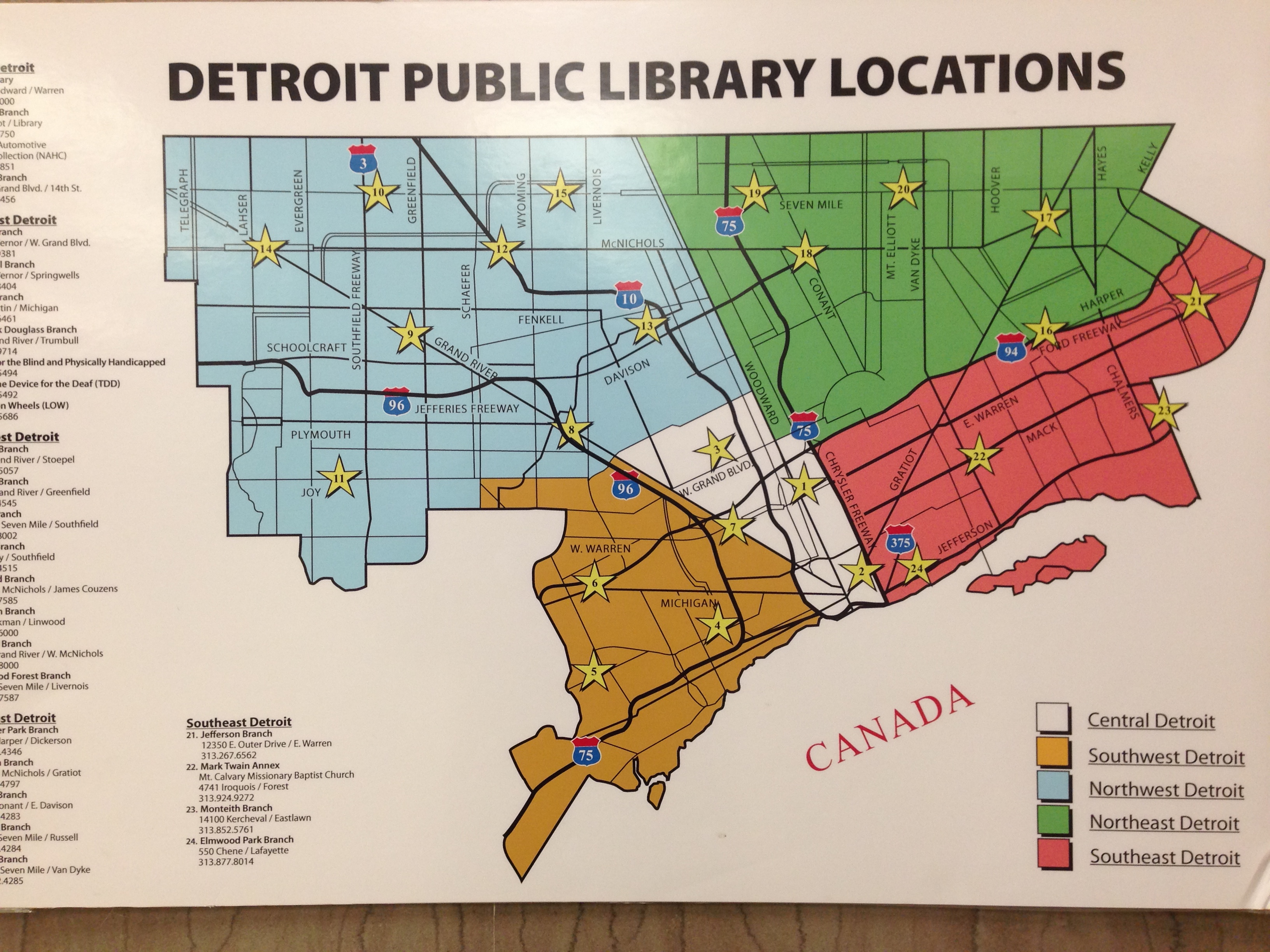
I discovered this map in the Detroit Public Library (DPL) Main Branch. My first thought was that many of the locations are no longer open. Then I noticed the way the city is broken into 5 parts, most interesting is the “Central Detroit” area. Anyone know where these areas may have come from?
I was also extremely saddened to learn that the “Map Room” no longer has any maps. When I asked where I could find maps, I was told by staff that they are all in the basement. I would have to search the catalog and then request to see a specific map.
Map: Non-Local Land Ownership in Detroit

The Detroit Geographic Expedition and Institute (DGEI) led by William Bunge mapped out “nonlocal land use” in 1969. I’ve been interested to see how it might compare today. This map is obviously different in that it is looking at who owns the land as opposed to land use, but still offers interesting perspective. It appears that Detroit’s commercial zones along major roads as well as industrial zones are largely held by companies and groups outside the city. What is surprising is the increase in outside land ownership of housing parcels. The map appears gray because there are individual housing parcels held by non-local owners across the city.
Here is a close up of Downtown/ Midtown area.

Thanks to Loveland Technologies for sharing data to make this map possible.
Map: Citywide pattern of children’s pedestrian deaths & injuries by automobiles

Building off of William Bunge’s similar map, this map comes from the Detroit Geographic Expedition and Institute’s Field Papers III.
“[…] All the area about a mile going out from downtown Detroit is one-way traffic and runs right through the heart of the Black community. And on one specific corner in six months there were six children killed on one corner by commuter traffic. But, naturally, these deaths of these children or the injuries or whatever it happened to be were disguised as something else. They never said that a certain business man who was working for BUrroughs downtown who was on his way to Southfield went through the Black community by way of this commuter traffic and killed my people – Black children. Even in the information which the police keep, we couldn’t get that information. We had to use political people in order to use them as a means of getting information from the police department in order to find out exactly what time, where, how and who killed that child.
Maps: Demolitions, vacancy, income, and education in Detroit 2011
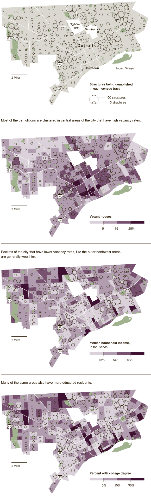
The New York Times completed a series of maps about shrinking Detroit in 2011. They looked at where structures were being demolished and where vacant houses still stood. They posited that the city was looking for which neighborhoods to save in the process and also created maps looking at median income and college degrees.
These are nicely designed maps and help to show the contrasts of the city where problems reach all corners, but funding and solutions are more concentrated and disparate.
Map: the future of Social Services in Detroit’s new city within a city
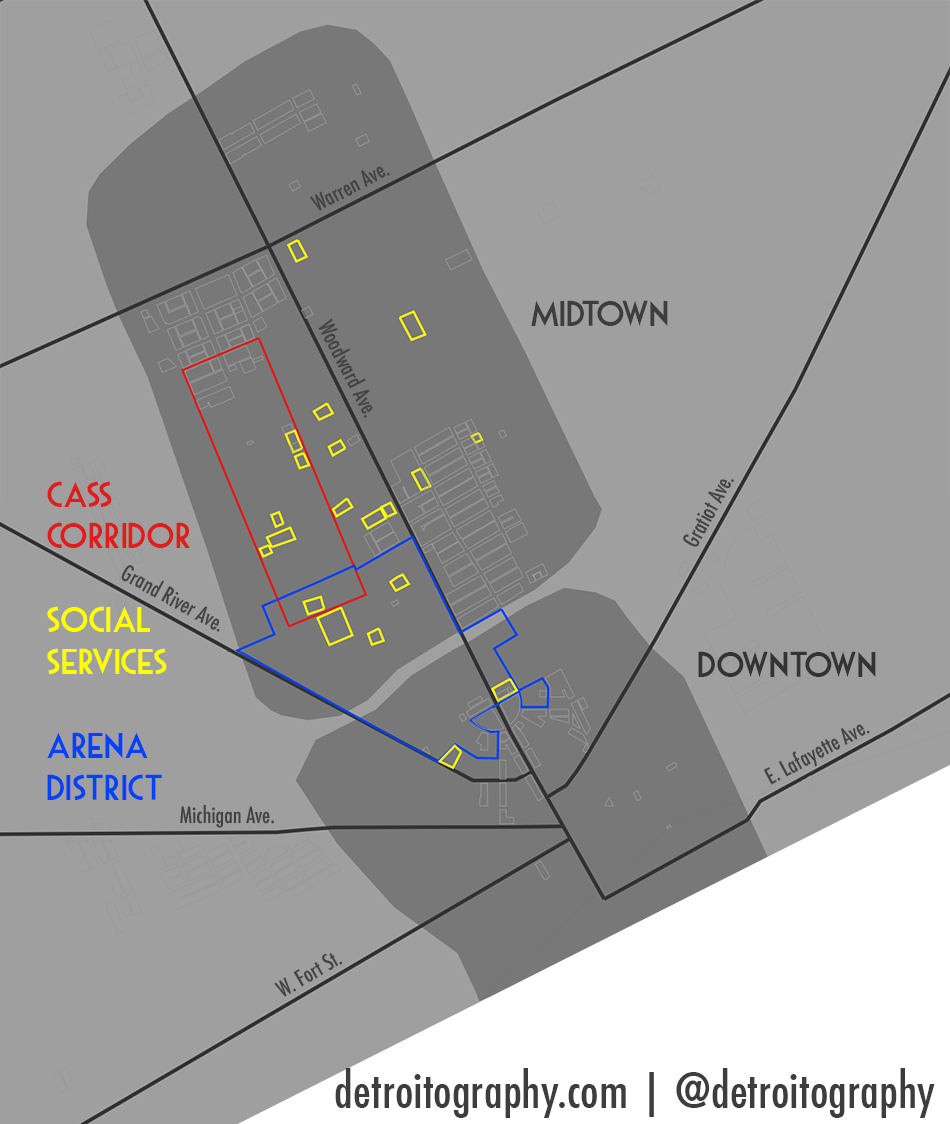
The idea of “Midtown” (district? region? neighborhood?) beginning around 2001 pushed the area to the forefront of Detroit’s most recent efforts to revitalize and bring people and businesses back into the city. At the same time Midtown developments were at odds with an area that had become historically known for its crime, poverty, and drugs. Well into the 1970s and 1980s, the Cass Corridor was the most impoverished area of the entire state of Michigan. Likewise, Cass Corridor had one of the highest crime rates in all of Michigan.
It is no surprise that what followed were a series of social services organizations and programs to assist the high populations of poor, homeless, and recovering addicts. In 2004, A Detroit Free Press article titled: “Development clashes with needs of homeless” highlighted the two different faces of the new Midtown area; the chain-link fence of a homeless shelter serving predominantly black men to the wrought-iron gates of a new condominium development where mostly affluent white people lived.
The serious concerns that low-income people were being moved out of Midtown have arguably not improved over the last decade. In 2003, Salvation Army treatment facility and offices relocated and in 2004 Crossroads of Michigan had to relocate from its original building. In 2005, NSO was supposedly in talks with the City of Detroit to relocate out of the Cass Corridor.
The new Arena District, land owned and controlled by the Illitch family (Little Caesar’s, Fox Theatre, Red Wings, Tigers), will bring a new hockey arena as well as new development to connect many of the Illitch investment sites to create a strong entertainment zone for Detroit. I can’t imagine that the Illitch’s plan to have social services and homeless agencies as their neighbors. The concerns raised in 2004 have not been resolved and the increased level of development will only exacerbate the issue of resource disparities in Midtown, Detroit’s new city within a city.
“Overall, I think what’s happening here [Midtown] is exciting. I just wish our clients could be a part of it.” (Mary Honsel, 2004)
Map: Potential for School Integration 1967

This map from the Detroit Geographic Expedition and Institute (DGEI) comes from Field Notes III, which was focused on all aspects of education in Detroit, represents areas of the city that were more likely to do well with integrating races in schools. It just so happened that these areas (darkest) were also the wealthiest. “Good” integrated education was available to the highest paid black families and middle or high income white families.
More from the report:
“The geographic phenomenon [integration] is not the result of pushy people aggressively invading other peoples’ neighborhoods, it is simply natural proportional growth. Further, the cause of white flight from integrated areas is not necessarily simply racism. “Integration” to whites too often means bad schools; and young liberal white families, the ones more likely to integrate, will not do so at the expense of their children’s education. The low quality of education, especially the predictable tremendous overcrowding that accompanies expanding black neighborhoods, is precisely the overwhelming factor that drives out young liberal white couples from integrated areas. The condition of the schools themselves are the most active instrument of segregation in the city today in spite of an officially proclaimed policy of integration.”
Map: Midtown Boundary is Expanding
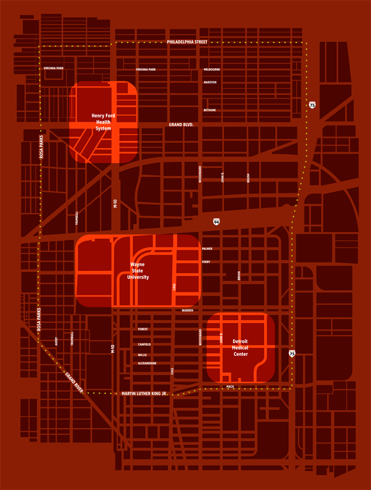
The LiveMidtown housing incentive program was launched in 2011 after University Cultural Center Association (UCCA) merged with the New Center Council to form Midtown Detroit, Inc. The most recent announcement is that the program area has been expanded to include the historic Boston-Edison neighborhood north of New Center.
Midtown is considered Detroit’s premier neighborhood where young people flock and new business compete for space. Midtown is home to what could be considered Detroit’s core industry of health care with DMC campus, WSU Main and Medical Campus, and Henry Ford Health System.
Prior to 2001, Midtown did not even exist and now under Midtown Detroit, Inc. it has become a driving force behind the place-making, investment, and future development of one of Detroit’s core areas. Where will the Midtown boundaries expand to next?
Map: 2013 Gardens with Detroit City Council Districts

This map comes from Keep Growing Detroit, part of the Greening of Detroit. We have been asking for data on gardens for a number of years and it is nice to finally see some data shared even if it is just in map image form.
It looks like there is a high concentration of family gardens in Northwest Detroit, which makes sense and matches with population density. Missing is the similar concentration in the population dense Northeast. I wonder if there is correlation with income level and gardening? The Westside has a higher median income than the Eastside.
Hopefully this data will be opened up at least for market, community, and school gardens?
Map: Percent Integration in Detroit Elementary Schools 1965-66
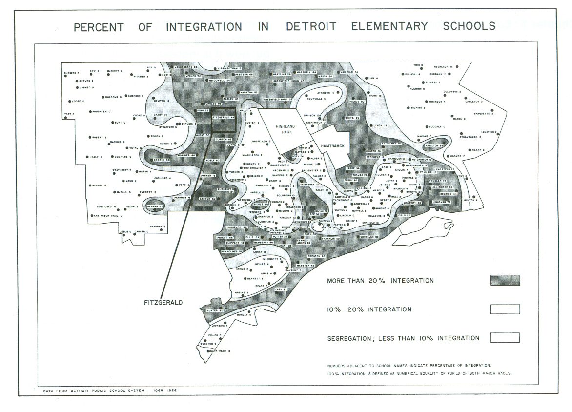
Published in Fitzgerald: Geography of a Revolution, this map compliments the work of the Detroit Geographic and Expedition Institute (DGEI) in looking at equality, race, and integration within Detroit’s school system. The map key shows that 20% integration is the highest among any of the schools.
Map of Detroit’s Planned Expressway Construction

There once was a time when expressways were simply ideas on a map. Their detrimental effects on neighborhoods of color can still be seen today.
Not sure of the year this map was made. Any ideas?
Detroit Street Map 1898
 It is so easy to forget that Detroit used to be so much smaller in land area and more dense in population. I always have to remind myself when I drive across Greenfield Rd. that the area used to be considered a suburb of Detroit, included with Springwells Township, Highland Park, and Hamtramck. This street map from 1898 is a good example of the road density that allowed street railways (carriages pulled by horse) to proliferate.
Cases of Lead Posioning in Detroit 2011
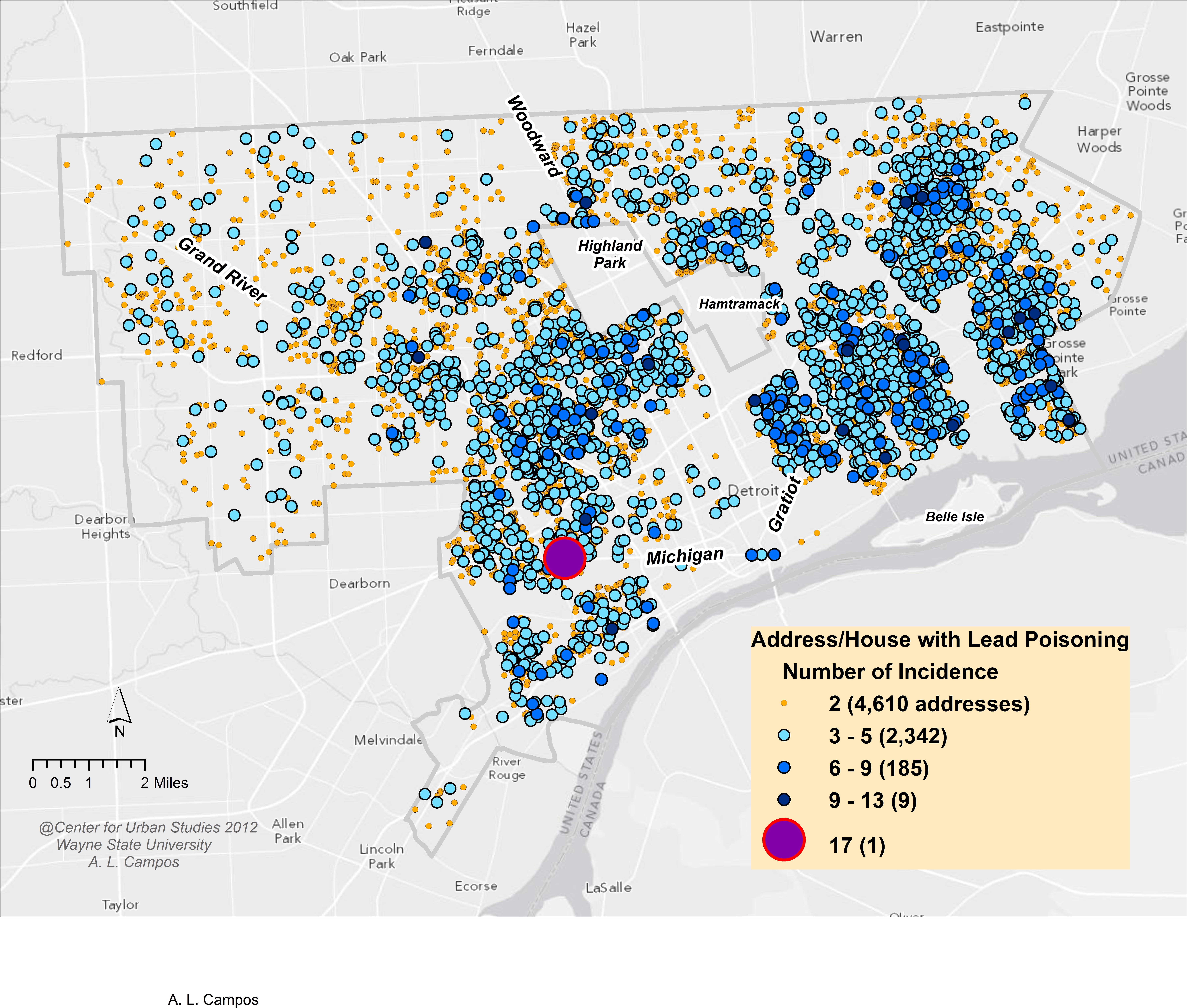 Annalie Campos at the WSU Center for Urban Studies created this map based on 2011 lead poisoning incidence.
The above map shows the number of lead poisoning incidences per address/home in the City of Detroit. The yellow dots show that there are 4,610 homes in the city with two occurrences per home; these are the most frequent. However, the blue dots, which show three to five or six to nine occurrences per home, cover more of the map because of the higher number of people affected. There was one home in the southwest portion of the city that had 17 lead poisoning cases, according to the map.
Issues with this map:
- Poor design choice to use all point level data making it impossible to account for all colors and shapes of incidents. Some get covered up or overlap resulting in lost data.
- Colors don’t offer any real distinction due to the overwhelming amount of data/ number of incidents.
- Lack of analysis – beyond the poor choice of displaying point level data, there is no clear understanding to a reader as to what to take away from the map.
- Lack of citation for source of data.
- Another potential dataset where a map may not be the best option.
