 Annalie Campos at the WSU Center for Urban Studies created this map based on 2011 lead poisoning incidence.
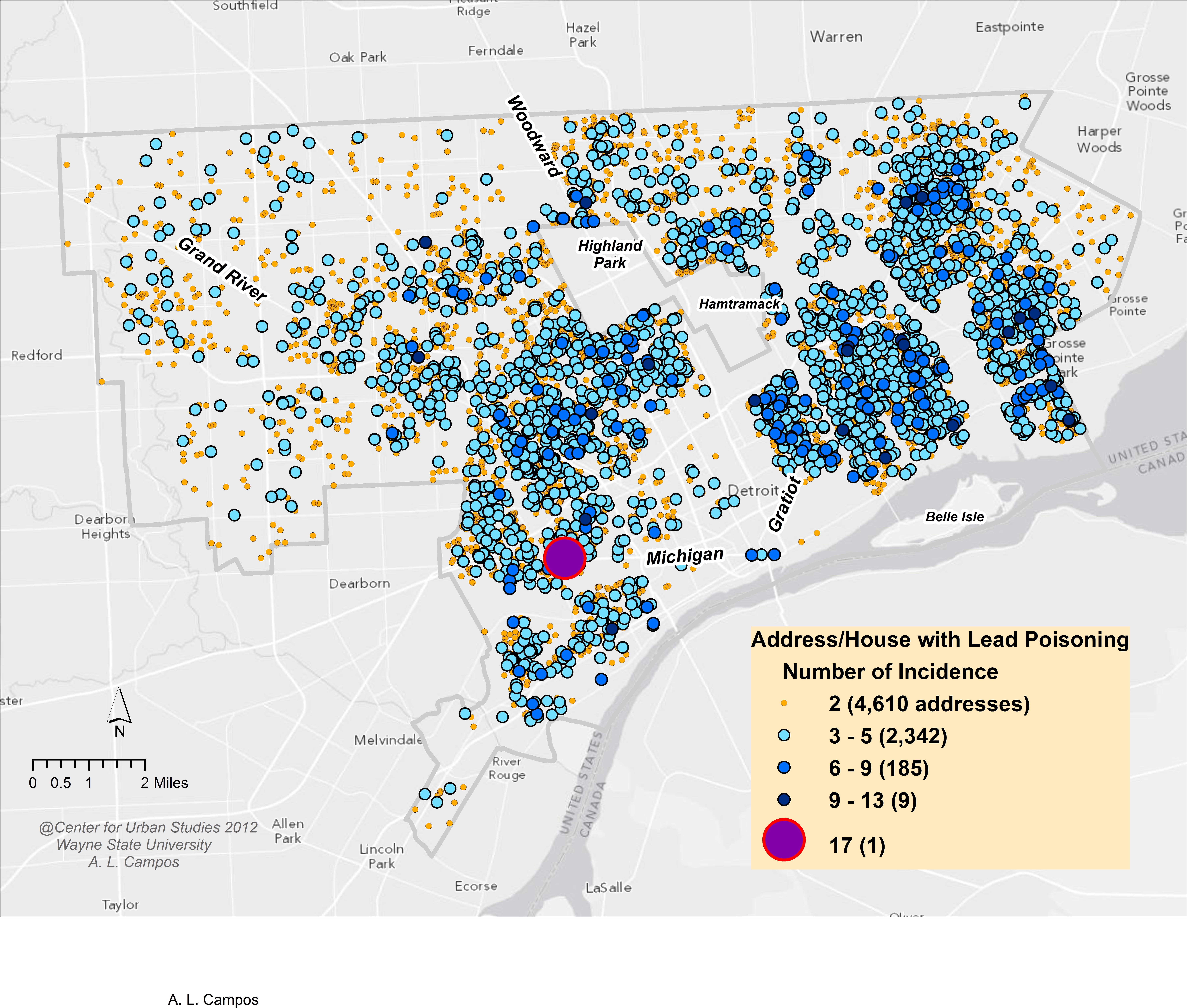
The above map shows the number of lead poisoning incidences per address/home in the City of Detroit. The yellow dots show that there are 4,610 homes in the city with two occurrences per home; these are the most frequent. However, the blue dots, which show three to five or six to nine occurrences per home, cover more of the map because of the higher number of people affected. There was one home in the southwest portion of the city that had 17 lead poisoning cases, according to the map.
Issues with this map:
- Poor design choice to use all point level data making it impossible to account for all colors and shapes of incidents. Some get covered up or overlap resulting in lost data.
- Colors don’t offer any real distinction due to the overwhelming amount of data/ number of incidents.
- Lack of analysis – beyond the poor choice of displaying point level data, there is no clear understanding to a reader as to what to take away from the map.
- Lack of citation for source of data.
- Another potential dataset where a map may not be the best option.
