Detroit Homicide Clusters Map 1975

dethomicides_1975clusters

Source: Rose, H. M. & MacClain, P. D. (1990). Race, Place, and Risk: Black Homicide in Urban America.  New York, NY: SUNY Press.

Homicides in Detroit peaked in 1974 with 750 murders recorded. Between 1965 and 1970, violent crime had doubled. The auto industry was in decline and 100,000 manufacturing jobs had left the city. This economic loss was paired with flight of white residents and the introduction of heroine. Many unemployed black workers turned to the drug trade for both income and relief from depression.

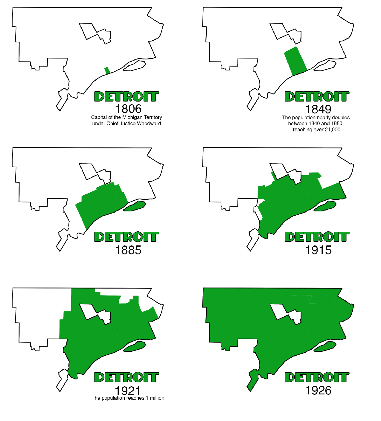
Map of Detroit Land Annexation 1806 – 1926

DETannex3

It is much more interesting to look at Detroit’s land annexations in animated form. You can see how various areas of Detroit were added through the years. Looking at Detroit’s history you can see the slivered expansion northward from the River and then fanning out along the River’s edge, the city’s purchase of Belle Isle in 1879, the glory days of Grand Boulevard in 1891 when the city didn’t extend any further North, and the rapid land acquisition in the 1920s as the auto industry boomed and population swelled. Detroit’s industry, population, and services have changed drastically over the years, but the physical boundaries of the city have remained the same since 1926. Will borders be expanded further in the future to create a cohesive regional Detroit that includes the suburbs?

detroitdata_get

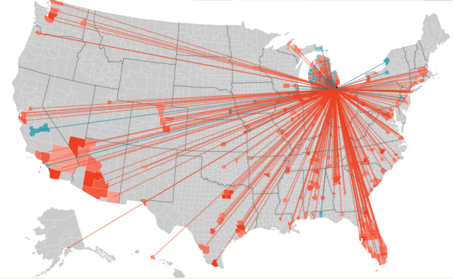
Detroit Population Migration Map 2009

wayneco_mi

Forbes utilized IRS data to map migrations of people. The contrast between cities was not surprising as Detroit showed a bright red migration of people out of the city (blue is people moving in). This is an excellent use of data to represent the movement of people around the US and could also give insight into where and why people leave Detroit and Michigan for other cities and states.

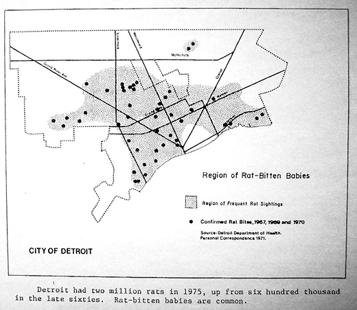
Map of Rat Bitten Babies in Detroit 1971

www

William Bunge mapped incidents of rat bitten babies in 1960, 1967, and 1970. During Detroit’s years of decline its rat population spiked. Now there are often statistics that Detroit has an extremely high rate of stray animals per square mile, I wonder how related this is to rat bites or other animal bites.

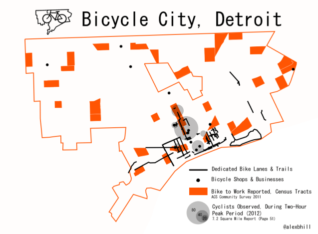
Map of Detroit Bicycle City

detroit_bikes

There is more to Detroit’s bicycle culture than hipsters and new business ventures. Many people all across the city depend on their bikes to get them to work, get to the store, and to earn an income. This is just a snapshot of where those people might be located in Detroit.

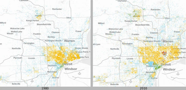
Detroit Poverty Maps 1980 vs. 2010

Urban Institute Detroit Poverty Maps

Urban Institute’s map database that shows comparisons of major metro areas in Michigan between 1980 and 2010. Each dot represents 20 people living under the poverty line. Colors represent ethnicity: Blue dots are White; yellow dots are Black; green dots are Latino; and red dots are Asian. It appears that Detroit’s poverty has spread over time as well as become concentrated among minority groups.

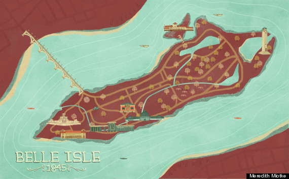
Detroit Neighborhood Art Maps

o-MEREDITH-MIOTKE-570

Recently highlighted on Huffington Post were the beautiful art maps of various Detroit neighborhoods/ areas, including: Belle Isle, Eastern market, Midtown, and Corktown from artist Meredith Miotke. While the maps may be skewed to depict the particular focus on Detroit’s “revitalized” areas, they are beautiful nonetheless.

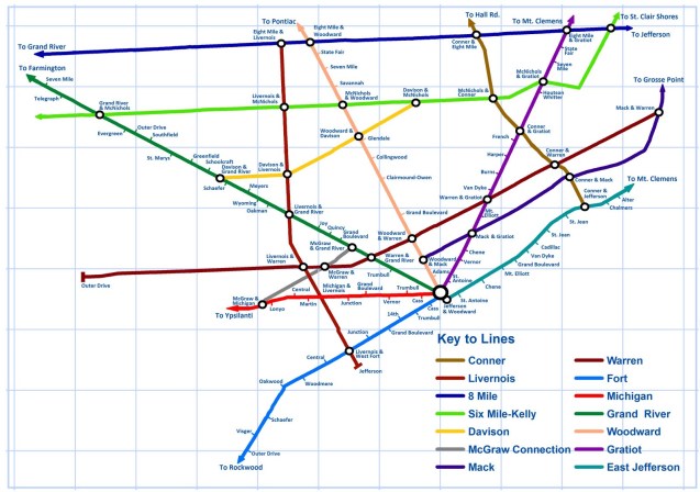
Detroit Rapid Transit Map 1958

Detroit_Tube_Map

Detroit urban planner, Rob Linn brings us this excellent rail transit map as proposed by the Rapid Transit Commission in 1958.

“The plan identifies seven reasons why Detroit and its suburbs need a unified transit system, including current concerns such as reducing congestion, increasing accessibility, and encouraging compact commercial development. It’s greatest concern, however, was that the CBD was beginning to decline. As the plan notes, “…downtown valuations [assessed value] decreased by 38.5% between 1930 and 1953, and citywide valuations had no change. What is indisputably evident here is the definite and gradual decline of the property valuations not only in the central business district but also along the major commercial thoroughfares in the city.” The commission strongly believed that these space-age trains would draw people to arterial commercial zones and the CBD, and reinvigorate these areas.”

Map of Black Population, Detroit 1910-1950

Location of black population, 1910to 1950. Map prepared by Bradley Davis, Department  of Geography and Urban Affairs, Michigan State UniversitThis Wednesday’s map from William Bunge shows the dispersion of Detroit’s black population from the core Paradise Valley and Black Bottom (named for its rich black soil near the Detroit river) out into other regions of the city. The city is now 82% Black/ African American by the 2010 Census.

Land Use for Automobiles in Detroit 1974

bunge_bw

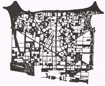
The next “William Bunge Wednesday” is creative mapping idea that show the land area use dedicated to automobiles. The dark areas are roads, parking lots, etc. while the white spaces are buildings and parks. It seems that many of Detroit’s infrastructure woes are built on the back of the shrinking automobile industry. Public transit is next to non-existent due to the automobile industry influence.

EDIT: This is actually a map reprinted by Bunge from Ronald Horvath’s, member of DGEI, ‘Machine Space’ article in 1974

Detroit Median Home Sales 2006-09

Med_Sales_Price_VacHU

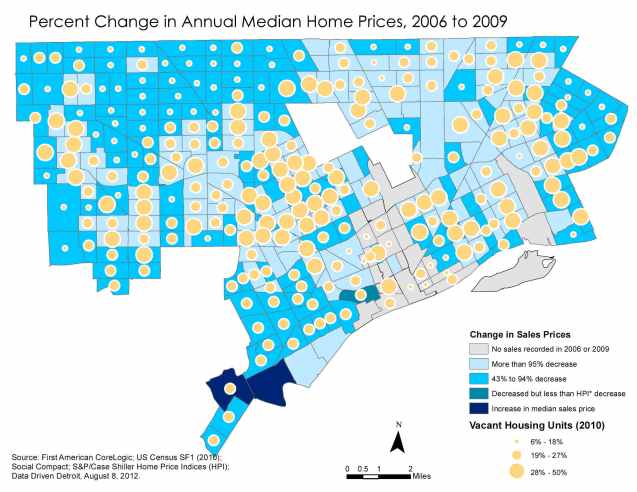
It is always interesting to see how home prices change over time. This map in particular helps represent the shifting redevelopment focus in Detroit. You can easily see the areas where there is high population (low vacancy) and areas where property value will be increasingly important. However, the overall decrease in home price would be interesting to pair with more recent data.

Also see: Detroit Average Neighborhood Rent Price

Where Commuters Run Over Black Children, Detroit 1968

runOverMapStarting William Bunge Wednesday and posting his radical cartography from his work at the Detroit Geographical Expedition.

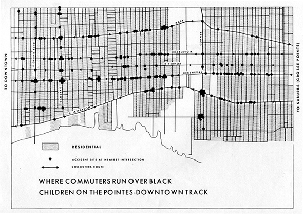
“Any Detroiter would have known that these commuters were white and on their way between work downtown and home in the exclusive Pointes communities to the east. That is, this is a map of where white people, as they rush to and from work, run over black children. That is, it is a map of where white adults kill black kids. It is a map of racist infanticide, a racial child-murder map.” – Denis Wood in Maps and Protest

More from on Gwendolyn Warren’s analysis:

In her subsequent analysis, Warren uses this map as a jumping off point to discuss spatial justice more generally for the Black community. For example, most African-Americans work in the factories which are situated several hours from their community so they leave for work at 3 or 4AM because the buses only run once an hour. Those coming from the black community who do have cars are unable to get on the expressway between the hours of 3-5pm due to the timing of the stoplights. She uses these examples and others to unequivocally demonstrate that Detroit’s urban planning and transportation is inadequate and unjust for the Black community and calls for the DGEI to establish “Black planning” for the city of Detroit.

Detroit Timelapse 1984-2012

detroit_timelapse

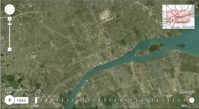
View it here: http://earthengine.google.org/#timelapse/v=42.33549,-83.05551,10.812,latLng&t=0.30

A collaboration between NASA, the USGS, TIME, Google, and the CREATE Lab at Carnegie Mellon University brings us this time-lapse GIF mapper of the whole world. It’s possibly the most distracting thing ever. Basically, it allows you to watch the 28 years between 1984 and 2012 go by at any point on earth. Let’s go to Detroit. It’s somewhat blurry, but we want to know what you see changing over the years. Look for changes at Belle Isle, the northern area of Downtown losing its buildings, the emergence of theConnor Creek Industrial area on the east side, and the construction of theGateway Project at the Ambassador Bridge. (via CurbedDetroit)

Heatmap Walkscore in Detroit

detroitwalkscore

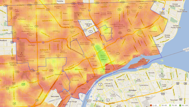
Walkscore has screwed over the city of Detroit. Their algorithm is grabbing data from restaurants in Canada giving downtown a very low walkscore and lowering the overall score of Detroit. You can see the incorrect calculating along the river.

Beyond this messed up algorithm, no one has really commented on how Midtown is the only area with high walkability in the city. Yet, I see people walking all the time in neighborhoods beyond Midtown/ Downtown. I know Midtown is also the area with highest income and likely that it is the area of the city with the most commuters/ access to personal transportation, and student populations. How can we improve the walkability and safety of neighborhoods to improve health and community?

Detroit Average Neighborhood Rent Prices

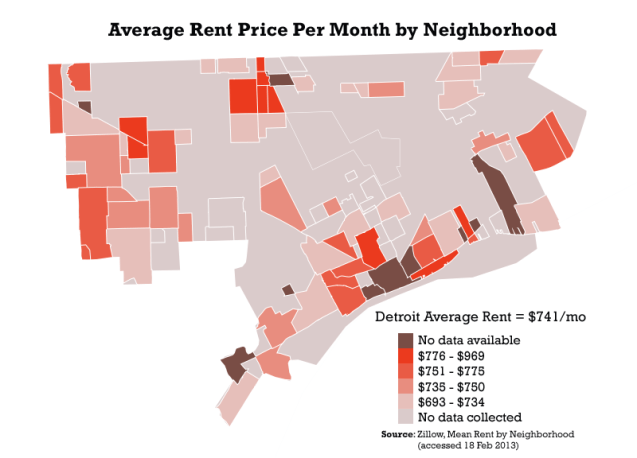
DET_rentThis map represents an inadequate data set, but provides an interesting picture nonetheless. I was really curious about rent around the city when my wife and I were apartment searching in Sept. 2012, I found the data from Zillow and decided to put it together. Zillow updates their data each week, so this is from data accessed on 18 Feb 2013.

Many activists in Detroit have commented that there needs to be rent control in the city or we will lose the diverse make up of our neighborhoods. What many people don’t realize is that Cass Corridor/Midtown used to have the highest rate of concentrated poverty in the nation, and had the most drug and violent crime in Michigan. It wasn’t until gentrification in the 1990s led to redevelopment and we now see the hip, young, focus on the heart of Detroit’s renewal.


Detroit Streetviews 2009 to 2012

goobing

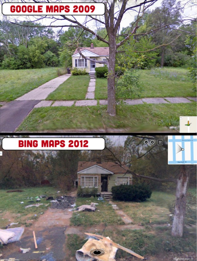
This is an excellent blog on the sense of how place matters in Detroit. There are just a few comparisons up currently, but this is an excellent project looking at changes over time. I chose to include the above image because I found the juxtaposition striking. It is also an interesting exercise in data collection between Google 2009 and Bing 2012.

A lot can change in 3 years.

More at goobingdetroit.tumblr.com

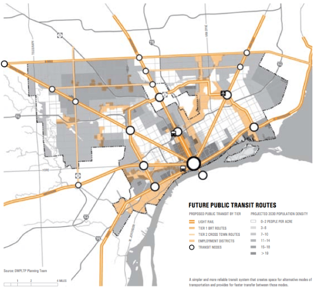
Detroit Future City Transit Planning Map

dfc-transit

This map was included in a “Detroit Future City” strategic framework highlights handout. I found it very interesting that it included a lot of “Tier 1” bus rapid transit (BRT) routes along major roadways: Michigan Ave., Jefferson, Grand River, Gratiot, and Woodward. However, yet again in transit planning it looks like the Rosa Parks bus terminal was overlooked. There seems to be a bus icon where the Rosa Parks terminal is roughly located, but there is a large “Transit Node” circle right in the middle of downtown – where there is no space for a transit node, unless you build it in Hart Plaza.

There is no mention in the report highlights that the light rail plan is disconnected from the bus routes, or that more funding is being pumped into expressway expansion (I-94)  versus public, regional transit.

“It was the lack of consideration given to truly multimodal, transit-oriented solutions that prompted Transportation Riders United, a Detroit transit advocacy group, to write a scathing 53-page response to MDOT’s draft Environmental Impact Statement.”

Read more on ModeShift and a list of planned demolitions as part of the I-94 expansion.

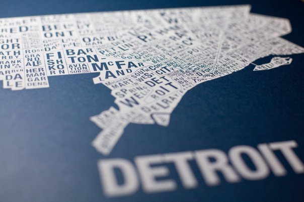
Detroit Fictional Neighborhood Map Print

10319_70471774998_2818278_n

This is a really nice art print of Detroit’s neighborhoods by Chicago-based typographer Jenny Beorkum’s Ork Posters. However, there are some discrepancies and constructions. As Timothy notes, some are just made up.

Recently, Detroit’s Long Term planning efforts have pushed the renaming of a historic neighborhood in Detroit, Hubbard Richard neighborhood is now being referred to as Corktown Shores.

Who gets to name neighborhoods? Google Maps, property developers, City Officials, or residents of those areas? This will be a critical debate and effort as Detroit attempts to rebuild. I vote that the people who live there get to decide and history must be referenced.

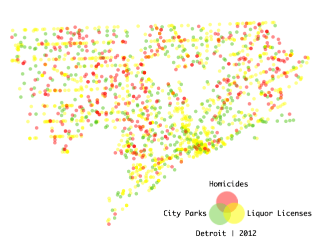
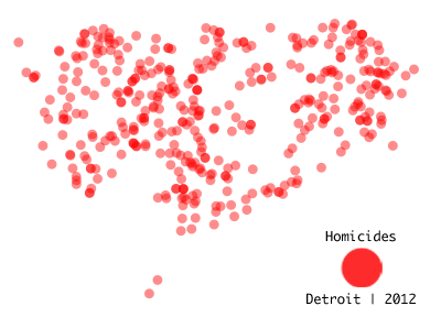
Detroit Homicide Map 2012: Liquor, Parks, & Homicide

DET_homicide_map

411 homicides, 1130 active liquor licenses, 350 city parks

The goal of this map is to demonstrate the relationship between homicide, locations where alcohol is sold/ consumed, and community green spaces.

Research shows corner stores/ convenience stores don’t necessarily have a negative effect on violent crime. However in higher income neighborhoods corner stores are seen as a positive, while the opposite is true in lower income neighborhoods. I also began noticing that a number of homicides occurred at or near clubs and liquor stores.

A great deal of research has also been conducted on the benefit of turning vacant lots into parks or green spaces in order to reduce violent crime. The most important aspect of this, however, is that community parks are beneficial in reducing violent crime when they are maintained. Many city parks in Detroit are not able to be maintained.

I wonder if Greening of Detroit has any data on areas that they have “greened” and if there is any association with reduced violent crime?

Note: This map was made before the city announced closing down parks and limiting maintenance. Additionally, there will be a regression analysis of homicides to liquor stores (excluding bars and restaurants) soon.

Data sources: City Parks (edited), Detroit Data Collaborative | 2012 Homicides, Detroit Crime and Homicide Group/ Cham Green | 2012 Active Liquor Licenses, Michigan LARA

DET_homicide_2012

Detroit at Night from Space

cmdr_hadfield_detroit

Thanks for Canadian astronaut, Commander Hadfield, we now have this incredible image of Detroit at night from the International Space Station. I’m not sure if there has ever been a picture taken of Detroit from space besides satellite images and none can even be compared to this one.

HT @Rob_Linn