
The Detroit Future City worked to identify key employment areas in the city. The list seems pretty limited and doesn’t account for community based businesses.
Do you agree with the employment districts? What do you think is missing?
The Detroit Future City worked to identify key employment areas in the city. The list seems pretty limited and doesn’t account for community based businesses.
Do you agree with the employment districts? What do you think is missing?

Another persistent health issue in Detroit has been infant mortality. As William Bunge demonstrates in his map, many of Detroit’s zipcode areas infornat mortality rate match with “third world” or “developing” countries rates. This has remained an issue in Detroit. Recently the ‘Sew Up the Safety Net” program, a collaboration between all of the major health systems in the city as part of the Detroit Regional Infant Mortality Reduction Task Force. Recently, renamed to the Women’s Inspired Neighborhood Network (WIN Network), the program has had incredible success and extensive outreach.
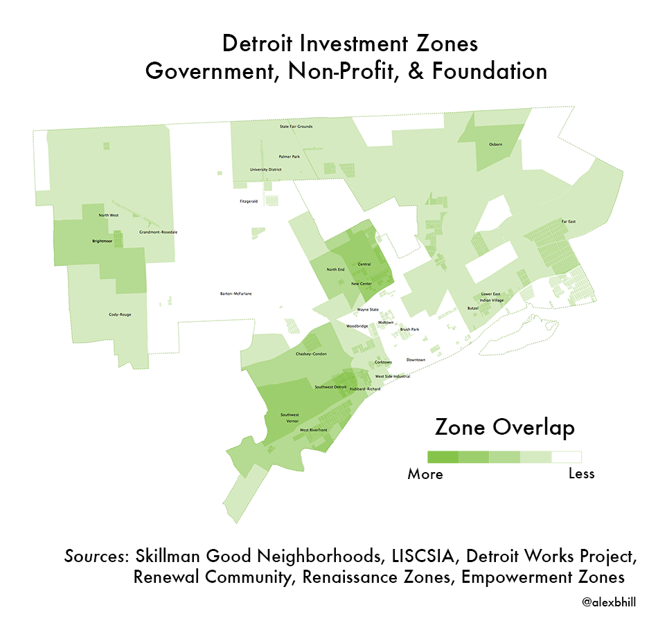
In the current economic climate in Detroit as well as recent conversations with Matt Hampel about investment in the city from foundations and non-profits, I couldn’t help imaging how much overlap could be found among investments and how the particular communities were doing as a result of the investment focus or lack of focus.
Southwest Detroit, Corktown, West Riverfront, and Hubbard-Richard areas have been included in the most investment zones in the City of Detroit. These areas have seen the largest influx of young white residents with artistic focus.
Northern Wayne State, New Center, and Central/Middle Woodward follow close behind as prominent investment zones where there has been much activity to build a strong connector between the thriving Midtown area and New Center.
Brightmoor and Osborn are often talked about as key areas of investment, but have not been included as much as other areas.
A excluded stand out is Barton-McFarlane, a neighborhood in the 48204 zipcode listed as one of the most dangerous neighborhoods in the US. This area has also been a focal point of gang and drug violence since the 1970s. It is an overlooked area which could use more investment.

I have often wondered about how many people commuted into Detroit for work as I often had to fight the traffic going both ways to see clients across the city. Incredibly, there are more people who come into the city than the number of people who live and work in Detroit. Not to mention the massive amount of people who have to leave the city to get to work. This Detroit Future City map bolsters the argument for a rapid transit system, not more expressways, but a regional transit system (RTA).
Pair this with the Detroit Rapid Transit Map 1958 from Rob Linn

As part of their course “Integrative Field Experience” prepared for the Detroit Eastside Community Collaborative, Kami Brown and Michael Ritz from the University of Michigan College of Architecture & Urban Planning created this map of street congestion on the east side in 1996.
Red = Congested two-way streets
Blue = Proposed one-way streets
It appears that St. Paul, Belveidere, and Dequindre were the most congested two-way streets at the time of the project.
I discovered this map, currently serving as a window shade, in the basement of St. Charles Catholic Church on Baldwin Street.
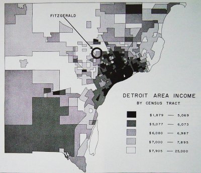
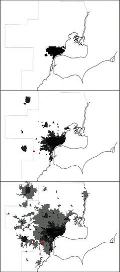
This map comes from William Bunge in what I assume is around 1970 since he highlights the Fitzgerald community where he had been doing participatory mapping in the 1960s and 1970s (his book was published in 1971 on the Fitzgerald community). Oddly, this map doesn’t look much different than the Urban Institute’s maps of poverty between 1980 and 2010. Income disparity and poverty has been an issue that Detroit has long struggled with. Strong industry in Detroit had only a brief impact in sustaining widespread income benefits for residents of Detroit.
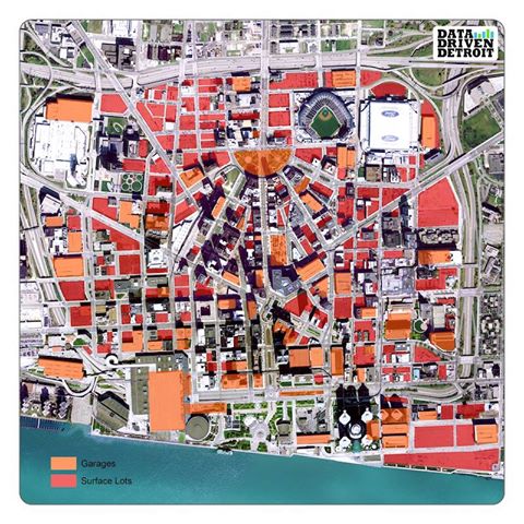
Parking in Detroit has been an important point of discussion and potentially a major reason that there hasn’t been a more successful and focused public transit system put in place. Rob Linn while at Data Driven Detroit mapped out the footprint of parking downtown. This excellent visualization has recently been shared across the interwebs.
Pair this with William Bunge’s map, “land use for automobiles” downtown.
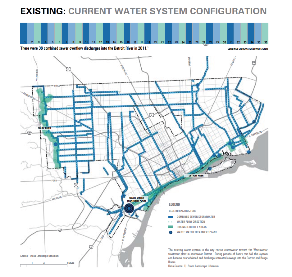
We are starting a “Future City Friday” regular post to discuss the various maps generated by the Detroit Future City report. Detroit’s water system is an interesting beast, particularly in that Detroit’s system supplies water for most of the Metro region. The report highlights that there were 38 sewage discharges into the Detroit River in 2011.

This map comes from the Detroit Free Press coverage of the primary battle for mayoral candidates in Detroit. With controversy abounding, Duggan captured significant write-in votes to secure a spot in the primary against Benny Napolean. Duggan won votes in the wealthiest and poorest Detroit neighborhoods as well as across racial lines, although more Duggan won by wider margins in predominantly white and latino precincts.
Read more: Breaking down Mike Duggan’s election blowout: Analysis shows surprising patterns

From Loveland Technologies, makers of Why Don’t We Own This, this is a more recent attempt to pull together various understandings of neighborhoods in Detroit. A continually controversial topic and likely only get more confusing as the city “redevelops.”
“We got tired of looking at a Detroit split up by zip codes, and all the neighborhood maps of Detroit that are half empty, so we created a map where Detroit is completely filled in with neighborhoods.
We know it’s not 100% accurate (there’s probably no such thing as a completely accurate Detroit neighborhood map) so if you see things that are wrong, take it to the comments and let us know! The map will change as our understanding of peoples’ neighborhoods does!”
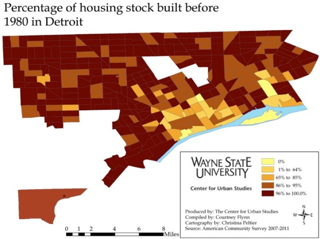
The Center for Urban Studies (CUS) at Wayne State University has been examining the connections between health and lead poisoning in a number of ways. This latest map shows how the age and potentially quality of housing impacts lead exposure among other health issues (mold, asthma, etc.).
Detroit has the highest percent of homes built before 1980 of all the areas examined. Since Detroit has such a high percentage of older homes (a majority of the Census tracts in Detroit have 86 percent or higher of the homes built before 1980). […] One of the especially interesting features of this map is that much of the younger housing is located in the inner core where housing demolition and replacement has been intense since the 1940s and 1950s. (from the CUS Drawing Detroit blog)
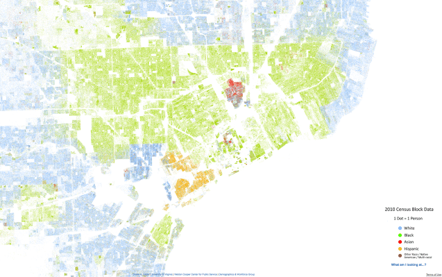
This is dot density mapping idea that was first popularized by radical cartographer, Bill Rankin, using 2000 census data in Chicago with then a widely shared series of maps by Erica Fischer building on Rankin’s idea. Brandon Martin-Anderson put together a fascinating US population dot density example from 2010 census data and now we have this map (above) from Dustin Cable utilizing the same data, but showing the racial/ ethnic breakdown of the 2010 census.
Not that much has changed since the 2000 census as far as racial/ ethnic makeup of Detroit. Sure, there are a number of small changes and growing immigrant populations, but by and large Detroit and its Metro region have remained mostly the same. Perhaps, we can see the recent “black flight” (26% population loss in Detroit between 2000 and 2010) in the top left corner of the city?
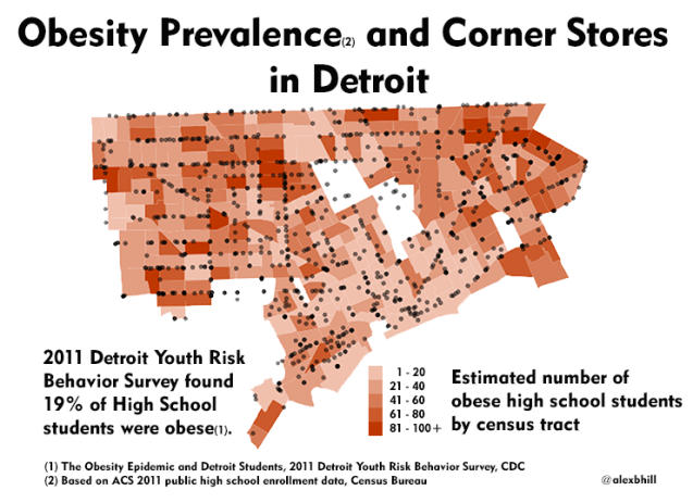
The data on enrolled public high school students maps almost exactly with population density, but there is enough of a difference to make it worthwhile to examine the interactions between social and environmental factors. Corner stores (liquor stores, gas stations) were added to demonstrate the prevalence of these food locations in relation to obesity among students, however there is no significant correlation.
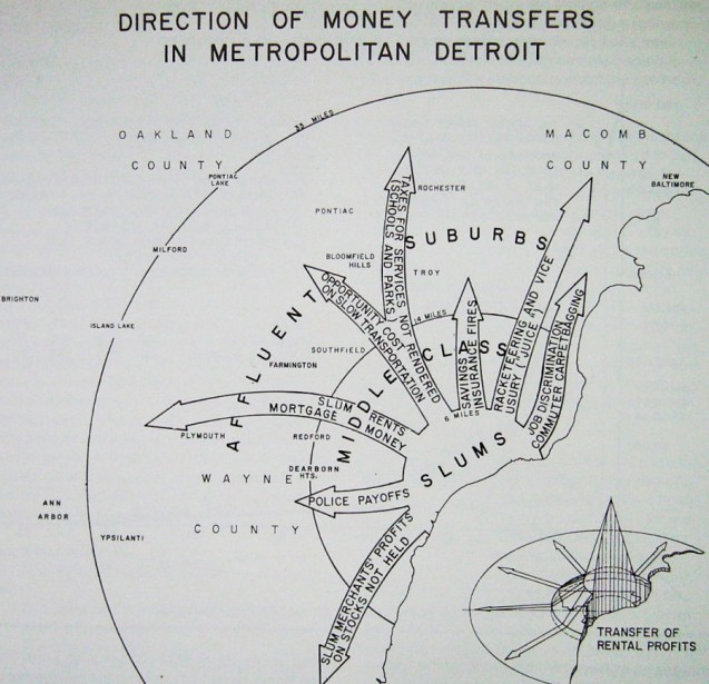
This installation of William Bunge Wednesday brings an incredible example of the flow of money from Detroit (here shown as the “slums”) into the suburbs. This map is definitely a more political depiction of what was happening in Detroit at the time, but nonetheless is a critical view that gives perspective to Detroit difficulties. Racketeering, exploiting slums for profit, unreliable public transportation, job discrimination, and even police payoffs – a laundry list of issues that plagued Detroit and aided its economic woes.
Top: 1900; Middle: 1950; Bottom: 2000. Image credit: NRDC Switchboard
Some have argued that sprawl is what got Detroit into this mess, others have said that Detroit should have just continued to expand. Sprawl arguments note that Detroit sprawl was not like sprawl in other cities. Detroit sprawled when there was no economic growth and it drew people away from the city as opposed to bringing new people in around the suburbs leaving an empty city center.
Should Detroit have worked harder to keep people inside the city? Sure, but there were a myriad number of factors working against that goal. Should Detroit have continued to expand its borders to encompass the suburbs and a broader tax base? Maybe, but Detroit already has a huge footprint as a city, anything more would most definitely have been unruly.
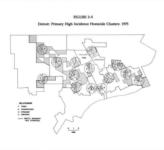
Source: Rose, H. M. & MacClain, P. D. (1990). Race, Place, and Risk: Black Homicide in Urban America. New York, NY: SUNY Press.
Homicides in Detroit peaked in 1974 with 750 murders recorded. Between 1965 and 1970, violent crime had doubled. The auto industry was in decline and 100,000 manufacturing jobs had left the city. This economic loss was paired with flight of white residents and the introduction of heroine. Many unemployed black workers turned to the drug trade for both income and relief from depression.
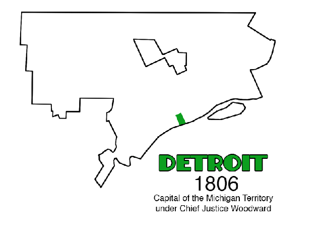
It is much more interesting to look at Detroit’s land annexations in animated form. You can see how various areas of Detroit were added through the years. Looking at Detroit’s history you can see the slivered expansion northward from the River and then fanning out along the River’s edge, the city’s purchase of Belle Isle in 1879, the glory days of Grand Boulevard in 1891 when the city didn’t extend any further North, and the rapid land acquisition in the 1920s as the auto industry boomed and population swelled. Detroit’s industry, population, and services have changed drastically over the years, but the physical boundaries of the city have remained the same since 1926. Will borders be expanded further in the future to create a cohesive regional Detroit that includes the suburbs?

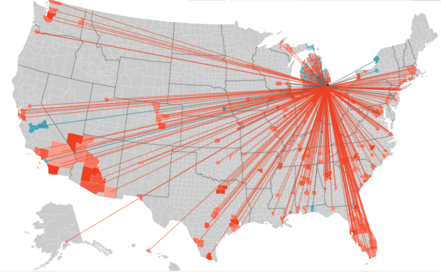
Forbes utilized IRS data to map migrations of people. The contrast between cities was not surprising as Detroit showed a bright red migration of people out of the city (blue is people moving in). This is an excellent use of data to represent the movement of people around the US and could also give insight into where and why people leave Detroit and Michigan for other cities and states.
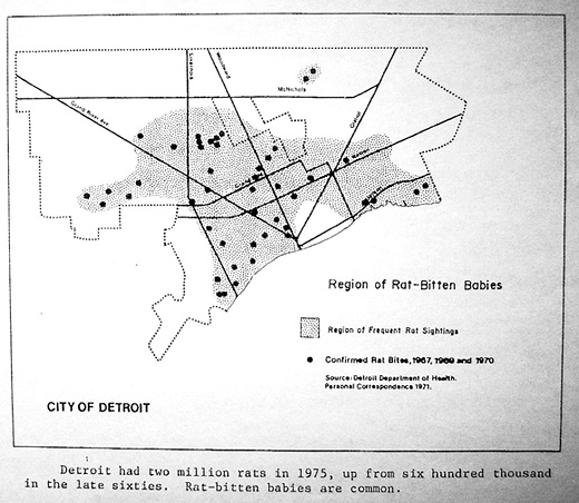
William Bunge mapped incidents of rat bitten babies in 1960, 1967, and 1970. During Detroit’s years of decline its rat population spiked. Now there are often statistics that Detroit has an extremely high rate of stray animals per square mile, I wonder how related this is to rat bites or other animal bites.
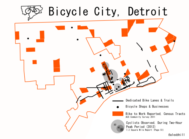
There is more to Detroit’s bicycle culture than hipsters and new business ventures. Many people all across the city depend on their bikes to get them to work, get to the store, and to earn an income. This is just a snapshot of where those people might be located in Detroit.
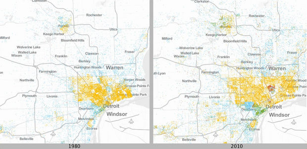
Urban Institute’s map database that shows comparisons of major metro areas in Michigan between 1980 and 2010. Each dot represents 20 people living under the poverty line. Colors represent ethnicity: Blue dots are White; yellow dots are Black; green dots are Latino; and red dots are Asian. It appears that Detroit’s poverty has spread over time as well as become concentrated among minority groups.
