Detroit Future City Mini Maps & Open Data

Screen Shot 2013-10-13 at 11.47.12 PM

For the massive Detroit Future City report, piles and piles of data were compiled and aggregated from many different sources, yet only a small portion of this data is open to the public.

  • Hamilton Anderson – Land Use and Neighborhoods
  • Stoss Landscape Urbanism – Landscape, Ecology, Environment
  • Initiative for a Competitive Inner City – Economic Growth
  • Mass Economics – Economic Growth
  • Interface Studios – Economic Growth
  • Happold Consulting – City Systems
  • Center for Community Progress – Public Assets
  • Carlisle Wortman – Zoning
  • AECOM – Landscape, Ecology, Environment
  • Skidmore Owings & Merrill, LLP – Urban Design
  • HRA Advisors – Public Land

As Detroit changes and grows, I challenge these businesses and groups to open up their data and share it for the benefit of all of those living in Detroit, working in Detroit, and making steps to revitalize Detroit. Open data can only be a benefit to the city, its economic, and most importantly its people.

Map: Nonlocal Land Use in Detroit 1969

bunge_nonlocal_land_1969

This would be a really interesting map to replicate today if the data existed. There are plenty of interesting maps on privately owned land and largest land owners, but a more comprehensive picture would be cool to see. With the rise of the Wayne County auction and renting in key areas of the city I wonder how much of the city is owned by people living within the city limits.

This map from William Bunge’s Detroit Geographical Expedition Field Notes II on School Decentralization.

Map: Renovating Homes & Ponzi Schemes in Detroit

metro_property_renovate

Back in February, the Free Press covered Metro Property Groups great success at revitalizing Detroit homes.

Beydoun’s Metro Property Group, founded in 2009, is getting a lot of notice for its up-tempo approach to renovating distressed houses. Buying in bulk from a variety of sources, Metro Property Group renovates dozens of houses each month, renting them to qualified renters who may one day turn into home buyers.

Many individuals, nonprofits and companies renovate homes in the city, but Beydoun may be among the few doing it on an industrial scale, refurbishing around 60 houses each month. Each house gets a new hot-water tank and furnace; floors are buffed; kitchens and baths redone.

If you know much about their target areas highlighted in the map – these are areas of high crime, high poverty, and haven’t seen as much investment from foundations and non-profits. The story was too good to be true.

Late last month another story hit the presses, “Metro Property Group turns investors into “unwitting and unintentional slumlords.” The Metro Property Group is called the top buyer of distressed homes, which matches the Free Press’ “60 houses each month” stat. Baydoun (sp Beydoun) who is a Dearborn City Council candidate allegedly intimidated investors and falsified legal records in order to cover up the scam.

Detroit Streetcar Rail Map 1941

DSR-map_railservice-1941The Department of Street Railways (DSR) used to dominate Detroit’s roadways. The 1940s and 1950s were a time when public transportation was real in Detroit. Just check out the guy in the picture below (circa 1955) using a light up map to find his desired streetcar. The rise of the automobile industry is be credited with destroying the streetcar rail network as it pushed the adoption of it’s motor coach buses after World War II. During the war there was a need to conserve gasoline and rubber, so rail car was the preferred public transit option. By 1956, all streetcars had been converted to Ford motor coach buses.

The M1 Light Rail is now less of “light rail”and follows the streetcar model that can best be seen in Portland and Seattle. Hopefully future developments follow the main arteries as seen in the DSR map with streetcars running along Woodward, Gratiot, Grand River, Michigan Ave., Jefferson Ave., and Fort St. The most important consideration for future streetcar rail development should be on commuter flows.

DSR-ServRobotInformationMachine_1955

Map: Where will the new Neighborhood Police Officers program focus?

dpdcraig

Detroit Police Chief James Craig has made a lot of big changes since taking the position on July 1st. There have been a number of senior staffing shake-ups as well as a shift to getting more patrol officers on the street.

This last Saturday, October 5th, at his “Call to Action” attended by almost 400 Detroit residents, Craig announced that the new Neighborhood Police Officers (NPO) program would focus police activities around liquor stores, gas stations, and schools.

New Neighborhood Police Officers (NPO) program will place officers around schools, gas stations and liquor stores.

— Michigan Citizen (@MichiganCitizen) October 5, 2013

Earlier in the week on Wednesday, October 2nd , Craig asked gas station and party store owners to clean up their properties to deter crime.

“We have too few police officers,” he said. “There can be no expectations that we can do it all. Through a partnership, we can do it all.”

At first blush it would appear that Chief Craig plans to just focus on the entire city (see first map). There are 582 liquor stores, 449 gas stations, and 105 schools. That makes 1,136 key locations that Craig wants neighborhood officers to focus on, but how does that break down by neighborhood? Which neighborhood might see an increased presence of neighborhood police?

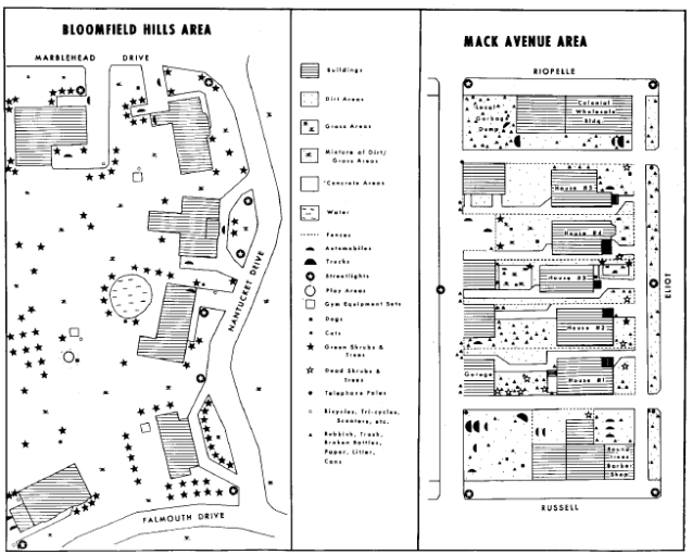
(Note: neighborhood is a very fluid term in Detroit, so we relied on the City of Detroit Master Plan neighborhoods GIS shapefile)

dpdcraig_dense

By aggregating these 1,136 locations by neighborhood, we can see where police might increase presence or at least be more noticeable. Connor just below the Osborn (Mt. Olivet) area, Finney on the far East side, and Cerveny/ Grandmont (Grandmont-Rosedale) to the West have the highest numbers of these locations. This is not surprising based on the fact that the city’s population is more dense to the far East and West. This map also helps to show greater prevalence of locations on the greater West side than the East side. Ok, great so now we know in general which neighborhoods have a greater number of locations that the new NPO program wants to focus on, but how does that map with crime trends in Detroit?

dpdcraig_homicide

In general, homicide rates follow the same trend as property crimes (burglary, larceny, car theft). The best available data is on homicides, so that was used a general crime marker. In comparing the two maps it would appear that neighborhoods that have higher density of liquor stores, gas stations, and schools also tend to have higher prevalence of homicide. It appears that the Detroit Police Department and Chief Craig have made good on their promise to utilize more data driven approaches to crime prevention. Hopefully the NPO program is able to improve safety in these neighborhoods. What remains to be seen is the implementation of Stop-and-Frisk in these neighborhoods and if these neighborhoods also become hotspots of unjustified frisks.

Map: Children’s automobile ‘accidents’ in Detroit

bunge_child_auto

Not much more explanation is needed for this William Bunge map. The important and critical piece is his question: “If you can predict an event, why call it an accident?” I feel like this can easily be applied to many issues in Detroit. Many crises were predictable, yet there was a lack of interest to act. Bunge reminds us that we need to utilize data to better predict and improve conditions for all residents of Detroit. In many ways the city’s environment can be improved to assist in the health and well-being of residents.

Map: Asthma Prevalence by Zipcode in Detroit 2010

asthma_zipcode

Asthma is another chronic condition that has high prevalence in Detroit, above the national average. This map showing hospitalizations resulting from asthma comes from a current Geography Professor, Dr. Annalie Campos, who is also working for the Center for Urban Studies. Interestingly the data doesn’t match 48217’s title as the “most polluted zipcode.” The Drawing Detroit blog has more:

The above map shows persistent asthma prevalence rates for children (under 18 years of age) enrolled in Medicaid in 2010 for each zip code in the City of Detroit. The asthma prevalence rate for children in Medicaid in the City of Detroit in 2010 ranged from 4.6 percent to 7.9 percent. Five zip codes recorded the highest rates (6.71%-7.9%) among all 27 zip codes.  These five zip codes are: 48201, 48207, 48212, 48213, and 48216. As depicted in Table 1, the persistent asthma prevalence rate for children (under 18 years of age) enrolled in Medicaid in the entire City of Detroit in 2010 was 6 percent.

See also: Detroit Asthma Morbidity Map

Detroit Blue Green Open Space Map

Print

This Detroit Future City map imagines Detroit’s landscape with expanded blue/ green open spaces. While land use like Hantz farms has been extremely controversial, there are many issues to cover before these ideas will become reality. Belle Isle was (again, controversially) leased to the State of Michigan this week and the figures are that $10 million will be invested to improve the park/ island’s infrastructure and amenities. In particular on this map I would love to see the expressway zones look like forests. I’m imagining what it looks like driving in Northern Michigan (tall trees on either side of the road), but instead I would just be driving along the Lodge to get home. I wonder when the Greening of Detroit will move from neighborhoods to overpasses (sarcasm). Also can you really imagine a “innovation ecological” zone right behind MotorCity Casino or the new Red Wings Stadium? Maybe if Illitch gets a new stadium he should also be responsible for maintaining an equal square mileage of green space for the public.

Detroit Racial Tensions Map 1968 – 1969

bunge_racialtension_1968-69

Following the race riots of 1967 racial tensions were still very high. William Bunge’s DGEI mapped incidents of housing discrimination which was rampant in Detroit. Many homeowners associations were white only and denied black families the ability to purchase housing in their neighborhoods. This is a great map for historical context and present issues as well. On this map the Northend stands out as a dense cluster of racial discrimination, but today the Northend is known for poverty, poor housing, and high crime. Highland Park’s early decline spread to the Northend, but now many foundations are investing in the Northend, it is designated as one of the Skillman “Good Neighborhoods.”

Also see: Detroit Investment Zones Map

Detroit Infant Mortality Map 2009 – 2010

detinfantmortality

Infant mortality has been a persistent problem in Detroit that accompanies racial health disparities, low income, and environmental factors. This map compares infant mortality rates per 1000 to those of other countries around the world.

The Women Inspired Neighborhood Network (WINN), formerly Sew Up the Safety Net is a collaborative program with the major health systems in Detroit and has had incredible success in educating mothers and improving infant lives in a short time period.

See also: William Bunge’s infant mortality map 1969.

Map: Current and Vacant Commercial Corridors in Detroit

Screen Shot 2013-09-12 at 10.53.55 PM

This Detroit Future City map is interesting in that it appears there a numerous commercial corridors around the city that are thriving, but Downtown and New Center have the most space that remains vacant. This may be a good representation of the dispersion of the population and the absence of an economic presence Downtown for many years. This will be interesting to reassess in a few years as Downtown is increasingly an investment focus for Dan Gilbert and others.

Inequality between Detroit City and Suburbs 1970

bunge_bloomfield

In 1970, William Bunge’s Detroit Geographic Expedition compared the neighborhood assets in two different communities: Mack Avenue in Detroit and an area of Bloomfield Hills.

From the MIT Civic Media Center:

[…] Field Notes III contains more qualitative data in the form of personal accounts, ethnographic interviews, and testimonials. Gwendolyn Warren mapped the 21 homes she inhabited growing up and provided harrowing details of rat-infested tenements and their impact on the children in her family. A team of researchers conducted interviews with children on playgrounds in a predominantly white neighborhood and a predominantly black neighborhood, detailed their own observations of the two places, and mapped the visual aspects of the two neighborhoods to characterize the relative dangers and affordances of children’s lives in each.

This reminds me of a more modern example of inequality from space by Tim de Chant, see more: Detroit Inequality from Space

Detroit Transit Alternatives Map: Toward Public – Private Partnerships

det_alt_trans

I’ve been thinking about transportation in Detroit and how a number of alternatives to DDOT and public transit have been blossoming. Most recently I was surprised and excited by the University of Michigan (UM) launching a new, free shuttle service between its Ann Arbor campus and the UM Detroit Center in Midtown. The plan will also include shuttle routes to Eastern Market, Cultural Center, Southwest, and Downtown.

Most recently, the city has seen the development of The Detroit Bus Company which launched to “reinvent” how Southeastern Michigan gets around by offering rides to students to get to after school programs and helping suburbanites get into the city without a congested commute. Before there was the Detroit Bus Company, the College of Creative Studies was running a free shuttle for students around the city. A few years ago Wayne State University (WSU) teamed up with DMC and Henry Ford Health System to create the Midtown Connection Shuttle, which can take you from DMC through WSU’s campus with connections to Henry Ford through New Center. (When writing this the Detroit Bus Company didn’t have regular routes posted on its website, so those were not included on the map.)

The transit alternative giant in Detroit is Quicken Loans. CEO Dan Gilbert has been a huge supporter of the new M1 Light Rail plan along Woodward Avenue, launched a company-wide bike share program this year, and has been operating the Opportunity Detroit shuttle buses for employees. This private shuttle system is the largest alternative transit system in Detroit even though it is only focused Downtown and Midtown.

Additional transit alternatives have been enacted by various organizations to help shuttle senior citizens to farmers markets, to get clients to medical appointments, and to take congregations beyond their neighborhood boundaries. An idea in the vein of many transit alternatives is the HealthLine Bus Rapid Transit (BRT) in Cleveland, funded by the Cleveland Clinic and University Hospital, it is designed to help patients get to appointments by offering a regular and reliable transit to the health center. This seems like a perfect model that could be replicated in Detroit where the health systems already have their own shuttle networks in place and need to help patients get from the dense corners of the city to the center where the health systems are located. If UM is willing to fund a route to connect Ann Arbor and Detroit, might they be interested in funding a BRT along Michigan Avenue? MSU could take Grand River Avenue and maybe Quicken Loans could get talked into covering Lafayette Ave. and Fort St. Then DMC and WSU could partner to run BRT along Warren Avenue and Henry Ford could cover Grand Boulevard.

There are limited options for funding public transit, but there are plenty of social good and private interests that could make public transit a reality in Detroit. A working transit system helps patients get to appointments on time, helps employees have a happier commute without car congestion, and also helps residents get around and visit the businesses potentially partnering to fund the transit system.

detroitdata_get

Detroit Neighborhoods Map 2003

detroit_neighborhoods_independent

Known as one of the first attempts at a comprehensive neighborhood map for the city, this project from Cityscape’s Arthur Mullen and Andrew Koper provides a look at how their map shaped many future neighborhood maps in Detroit.

Detroit is composed of many neighborhoods, each with a unique history and features. Not many people are aware of them all or where they are located.

Huffington Posts noted:

Mr. Mullen’s map, despite its precision, does not provide complete coverage of the city (note the white spaces in the below screenshot) and makes no claim to be the final, comprehensive authority on Detroit’s neighborhood boundaries. However, in a sort of butterfly effect that could have only originated in an earlier decade of the Internet, Mr. Mullen’s map caught on. When Google Maps began to display neighborhood details for the world’s major cities, they simply scraped the Cityscape map. In the months that followed, countless other Internet content providers, in turn, scraped Google’s data. Now, Mr. Mullen’s work has come to be used by pretty much everyone as the de facto Detroit neighborhood map.

Detroit School Decentralization Map 1970

bunge_school_districts

Highlighted by the MIT Center for Civic Media, this map by the Detroit Geographic Expedition Institute’s (DGEI) “Field Notes II: School Decentralization” demonstrates the racial disparities in education in the city.

“In order to maximize sympathy and retain community control over community schools, the DGEI proposed a plan which placed 91.4% of black children under “sympathetic authority”. Their plan followed divided the districts according to the existing racial landscape of the city.”

From Field Notes II: School Decentralization:

Black children are among the most abused children in America. It is imperative that these most endangered children receive the most protection. (The infant mortality rate of black children in the King High School area on the east side of Detroit is higher than that of San Salvador, a fact that some Americans consider unpatriotic.)…

To meet the primary goal of protecting the most abused children, every possible legal regional combination of Detroit high school districts (over seven thousand) were ranked according to sympathetic authority to the children from most to least. The measure of sympathy used is “the total number of black children under white authority.” A regional school district is defined as being under white authority where a majority of voters voted for white candidates in the mayoral primary.

— Field Notes II, Chapter 1, “Community Control”

Map: Stabilization is Demolition in Detroit

stable_demoBased on this map from the Free Press, it would appear that the idea of neighborhood “stabilization” is directly related to the demolition of vacant and derelict properties. This is a key piece of Mike Duggan’s plan for Detroit if he is elected Mayor.

The question of vacant property is quite a buzz in Detroit now, especially with the work of the Detroit Blight Authority and the ongoing efforts of Blight Busters. The city government has been moving quickly to clear up abandoned homes in the paths of schools to increase safety of children walking to schools.

Additionally, there have been a number of recent demolitions of homes bought in the recent auction. As Detroit continues to be managed by an Emergency Manager, it will be interesting to see if the money will continue from private sources for demolition/ stabilization efforts such as the recent federal dollars disbursed to a number of Michigan cities, including Detroit.

Detroit Freight Network Map

Screen Shot 2013-09-11 at 8.01.50 AM

From the Detroit Future City report, this map brings a fairly comprehensive picture of Detroit’s importance as a freight transportation hub and a major border crossing. The Detroit-Windsor connections is also well known for its illegal gun and drug smuggling. 

This map also illustrates why certain areas of the city have high pollution and asthma rates, particularly SW Detroit where truck routes even pass right outside schools.

See also: Detroit Asthma Morbidity Map


Map: Parking Lots in Detroit Central District 1936

Screen Shot 2013-08-28 at 11.47.13 PM

This incredible historical gem comes from the University of Chicago Library Map Collection of Planning Maps of Midwestern Cities in the 1920s and 1930s. This map from the Detroit Plan Commission provides an early glimpse at the focus on car culture in Detroit. Not to mention the map appears to be hand drawn including the typography.

Detroit Asthma Morbidity Map

Detroit area demographics_asthma

With funding from the EPA, Dr. Stuart Batterman at the University of Michigan examined the high incidents of asthma as part of the Detroit Asthma Morbidity, Air-Quality, and Traffic (DAMAT) Study.

This study will develop and evaluate a direct health indicator of pediatric asthma morbidity resulting from exposure to ambient air pollutants using an epidemiological approach that merges existing datasets and incorporates population susceptibility, exposure patterns, and other local conditions.

The green dots are schools, which the study found were often located near expressways.