100 Maps of Detroit

detroit100I’ve admired Bill Rankin’s map of “The Midwest” as defined by 100 different corporations, organizations, and agencies. While the Midwest is a contested region, so too is the geographic definition of “Detroit.”

I chose to look at the first 100 images that appeared in a Google image search for “map of Detroit” and overlay the results. Many corporations based in Southfield, Warren, or Dearborn choose to say they are based in “Detroit,” Likewise, most regional organizations (Detroit Chamber, Detroit Water & Sewage, SEMCOG, etc.) represent Detroit with boundaries that extend into surrounding municipalities, most commonly the tri-counties (Wayne, Oakland, Macomb). A number of the 100 maps show urban sprawl to varying degrees while some maps categorize municipalities around the city as “Detroit.” Some maps even included parts of Windsor, Ontario in the “metro Detroit” area. The larger boundaries match the Combined Statistical Area (CSA) and the Metropolitan Statistical Area (MSA) as outlined by the federal Office of Management and Budget (OMB), which represent “Detroit” as either a 6 county area (MSA) or a 9 county area (CSA).

I was actually very surprised to find that a great number (35%) of the 100 maps only represented the “Downtown” area of Detroit followed by the City Limits (not including Highland Park and Hamtramck) with the Regional representations of “Detroit” coming in at the third most common. There were two maps of the airport included as well as one map of Detroit Lakes, Minnesota (omitted). I’m not sure what these percentages really represent: where people visit and where investment is focused (Downtown) or maybe a strong regional appeal to being “Detroit.” Thoughts?

Map: Race and Payday Lenders in Detroit

Race_Payday_Lenders

Rob Linn notes that “Nationally, payday lending customers get caught in a predatory cycle.” In his analysis he found that 12% of payday lenders in Detroit were unlicensed, claim false affiliation with FDIC, and almost always go unenforced and unpunished. Rob also found that these predatory lenders were concentrated in areas where a majority African American population lives.

“Given the Detroit City Council’s willingness to standup to other harmful businesses, it’s time to increase enforcement, if not regulation, of these lenders at the local level.  As it stands, the residents who can least afford these punishing rates are the ones facing the consequences. “

Open Spaces and Hantz Farm Map in Detroit

tumblr_mwhmy7mmp91rasnq9o1_1280

This is a fascinating visualization of Detroit based on satellite imagery of Detroit. The distinction of “open space” is interesting, especially when thinking about where Detroit current population resides. Population density is not focused in the center of Detroit as one might imagine from the “closed space” in black. The greater question is why Hantz chose those parcels when there are obviously more “open” spaces in the city?

Minimalist Map of the Detroit People Mover

peoplemoverminimal2

Image source

I came across this simplified Glasgow transit map and thought that would be an interesting idea to apply to Detroit’s ultra simple downtown “public transit” system. I choose some highlights of each station stop based on the station guides (no guarantees). The People Mover was constructed in 1987. Detroit was one of four cities selected to receive this “new” transit system as part of the “Downtown People Mover Program,” yet Detroit has one of the two remaining people movers from that program. Last year was the 25th anniversary of the Detroit People Mover.

EDIT: 12/03/13 Lafayette Coney Island added

Map of School Board Income Disparities 1970

bunge_school_board

This map comes from the Detroit Geographical Expedition Institute (DGEI) in the Field Notes II paper. William Bunge and the DGEI had a particular focus on children and how social issues impacted children. Field Notes II was a compelling report that highlighted inadequacies and inequalities in the education system of Detroit. This map demonstrated the income inequality of representation on the school board.

Map: Detroit Construction and Demolition 2006 – 2009

detroit_demo_permit

Not much more needs to be explained here. These maps are good representations of Detroit’s future development especially as Dan Gilbert has been appointed by President Obama to lead the Blight Task Force and says he has plans to demolish every blighted property in the city. Even in 2009 these maps showed a number of building permits Downtown. Soon we will see Gilbert and the Cotton family make their mark on Detroit’s skyline with new skyscrapers. There are notable building permit clusters in the neighborhoods and it would be great to know what those represent. Hopefully, they represent building permits to renovate existing structures. There is a great need for many Detroit families to be able to retrofit their homes in order to improve the health and quality of Detroit’s aging housing stock, maybe there will be federal dollars in the future for such a program.

Detroit Maps at Whole Foods Market

wf_map2

The new Whole Foods Market in Detroit has some fun maps! The mosaic map located upstairs by the community room appears to represent one of Data Driven Detroit’s proposals for the new city council districts. The map downstairs is less fun and more empty. For Whole Foods, it appears that Detroit is only represented by McClure’s Pickles and Avalon International Breads? Really? Maybe Whole Foods needs to support some other local food producers to help them enter the supply chain.

photo(1)

Map of Detroit’s Black Population 1940 – 1970

BlackPop1940-1970

Detroit’s African American population has followed interesting migration patterns throughout the years. These are a series of maps that help demonstrate how people moved around the city as a result of changing racial attitudes, a growing black middle class, as well as shifting demographics from economic downturn. Paradise Valley can be easily seen in 1940 while it isn’t until later that we see other prominent black neighborhoods emerge to the West of Cass Corridor.

Still trying to track down a source, please leave a comment if you know.

Update 11/15/13

Thanks Matt Baker! These maps appear between pages 183 and 188.

Sugrue, T. J. (2005). The origins of the urban crisis: Race and inequality in postwar Detroit. Princeton University Press.

Map: Detroit Election Wards and Black Population 1915

bunge_black_electionwards_1915

This map comes from a 1926 report “The Negro in Detroit” by the Detroit Bureau of Governmental Research, Inc. The map provides an historical representation of the limited geographic footprint of Black residents as well as the Black Bottom/ Paradise Valley neighborhood. This map helps to show the base for the racial/political evolution of Detroit.

Map: Public Lighting in Detroit

publiclightingmap

Charlie LeDuff recently reported on the public lighting system and how it hasn’t seen investments in the last 40 years. He discovered that the last time that street lights were mapped was on this 1960s era map with pushpins. Incredible that in 2013 the mapping system is so archaic.

publiclightingmap2

In September, it was also reported that Detroit was conducting a comprehensive GPS light pole audit in a handful of focused zones. The goal is to map 6,600 of the 88,000 street lights in Detroit and then devise a plan to improve the system. Hopefully this street light data collected will be open to the public.

Map: Borders of Detroit

detroit_border

Detroit is bordered by 20 municipalities and 1 river. The Detroit River has the longest border with the city followed by the City of Dearborn. I thought this would be an interesting way to visualize the different borders inside and outside the city without being technical and geospatial.

Edited 11/11/13: Eastpointe and Grosse Pointe added bringing total to 20 municipalities, “Twp.” added to Royal Oak

Map: Race, Voting, and High School Districts in Detroit

bunge_highschool_districts

This map comes out of Field Notes II from the Detroit Geographical Expedition Institute and William Bunge. It is a representation of the number of black and white students compared to the number of black and white voters. The DGEI spent the entirety of Field Notes II running statistics and creating maps to show the racial and power imbalance in Detroit’s education system. The premise was that the majority of black students were not being taught by a majority of black teachers or administrators, which led to lower educational achievement. The idea was that a “sympathetic authority” would enable black children; “the most abused children in America,” to be protected from getting gerrymandered into the lowest performing schools.

This is a very interesting tie in to the last decade of difficulties within Detroit’s public schools system. I have a feeling that the DGEI report was not taken into consideration.

DDOT System Map Redesign

DDoT System 09-2013(2)

The French graphic designer, Aurélien Boyer-Moraes first learned of Detroit as a teenager in the 1990s through a TV documentary about the Detroit electronic music scene (before the internet existed). He went on to study graphic design and with the advent of the internet was able to learn more about the City of Detroit. Aurélien has always been interested in mapping and currently works as a map maker in information design specifically on standards for transit systems. He has designed the subway, light rail, and BRT map for Lyon, France.

Detroit came naturally to my mind for a first attempt, as an exercise initially, during my graduate, because I was very disappointed by the actual map which is very poor designed, useless to speak plainly, very much a counterexample… Then after my master and with my professional skills growing along with my experience in that field I updated it  when I have some spare time to follow the system’s changes and my “own” graphics changes. That’s the story : a genuine interest in that city, a genuine interest in transit mapping!
Aurélien first designed this DDOT map as part of his Graduate studies, but has recently updated the map. Maybe someday the transit systems in Detroit will be worthy of his excellent design work.


Map: Color Coded Detroit Growth by Annexation


Manual Wayne County

This map makes the rounds of good looking Detroit maps. I’m not sure what year it is from, but looks like it is potential a picture taken of a book page?

EDIT 6/4/14: This map is included in the “Manual, County of Wayne, Michigan 1926” (available online) along with a series of nice color maps of Detroit and Wayne County.

See also, the animated Map of Detroit Land Annexation 1806 – 1926

Illuminated Satellite Map of Detroit

1074390_10151924578781575_1931591488_o

We are seeking out maps around town. This first one is pretty exciting. Shoot us a message or submit the cool map of Detroit in your office.

The Why Don’t We Own This (WDWOT) office has a new, incredible map of the city! It is a 6 foot by 4 foot back-lit high-res satellite map of Detroit. It is possible to see every rooftop and car perfectly. Jerry Paffendorf noted that he, “can’t stop staring at it.”

Map: Gaps Downtown in Detroit’s Urban Decline

detroit1

This diagram and map from Charles Waldheim (Stalking Detroit, Waldheim et al, 2001) of Downtown shows the growing gaps in downtown development over the years. They help to illustrate the reality of Detroit’s decline and the dispersion (sprawl).  Detroit’s “urban core” was critical to its early development from “frontier town” to city. Downtown became rife with poverty, drugs, and murder in the 1970s and 1980s – pictured aboce (1994) and from historical data the decade of the 1990s wasn’t much better. In a few years (2016)  it will be almost stunning to look back at the last 100 years of downtown Detroit and see how it rose and declined.

Boulevard, Avenue, Road, and Street in Detroit

detroit_roads

Over the last three years working as a community health worker in Detroit, I have logged over 80,000 miles on my tiny car with the majority of those miles being from getting around Detroit to meet with clients, families, and community events. After a while I became really interested in street naming.

I first saw this street name mapping idea from Bill Rankin’s work in Vancouver to the Derek Watkins applying a similar effort to the Portland – Seattle area. I was finally given my last push and decided to create this map after following Bostonography. The piece that took the longest was finding a good file of Detroit streets (finally acquired one from my GIS professor this summer).

In order to understand the layout of Detroit “streets” you really have to know Detroit’s history. The different groupings of “street” names shows the development of Detroit and its expansion over the years. Arthur Mullen of Cityscape has a great explanatory article, here are some highlights:

“In the immediate downtown area, the earlier French physical imprint was removed by the devastating fire of 1805. Nearly the entire small village was destroyed by that fire and the new territorial governor, Judge Augustus B. Woodward, decreed that the town would be reconstructed utilizing a grand urban grid based on a spoked wheel system […].”

“The French rectilinear grid was built off of their “ribbon farms” which was their method of dividing property near Detroit. These farms, usually ranging between 200 to 400 feet wide, stretched linearly inland for approximately three miles, thus the name. […] After the fire of 1805, the new Woodward grid was laid on top of the French property grid in only the central portion of downtown.”

“Eight Mile road became the Base Line for all of this surveying in the NW territories. (For your information – Eight Mile Road stretched across Lake Michigan becomes the border between Wisconsin and Illinois.) […] The outlaying parts of Detroit and the suburbs follow this true north south grid pattern as evidenced by our regions north-south and east-west mile roads. This explains why there are three basic grid systems in the City of Detroit. Their existence physically illuminates the early history of the city of Detroit.”

“Our Native American heritage is also evident in the physical layout of the city. Michigan Ave.– aka U.S. 12, Chicago Road, Sauk Trail — follows an old Native American trail used for trading to circumnavigate around the south shore of Lake Michigan. This earlier history is visible in the subtle twists the road makes as it nears Dearborn, and it becomes even more profound as you head west on the road.”

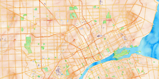
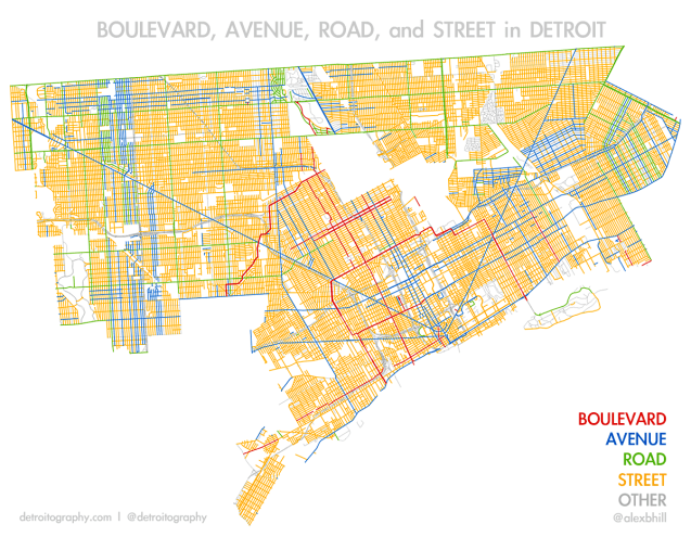
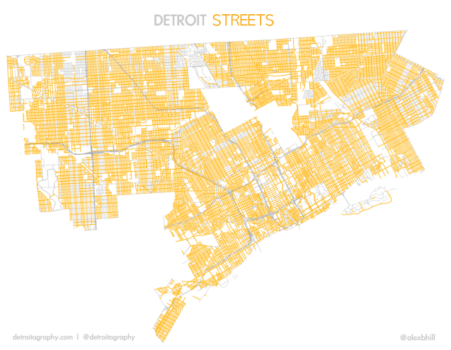
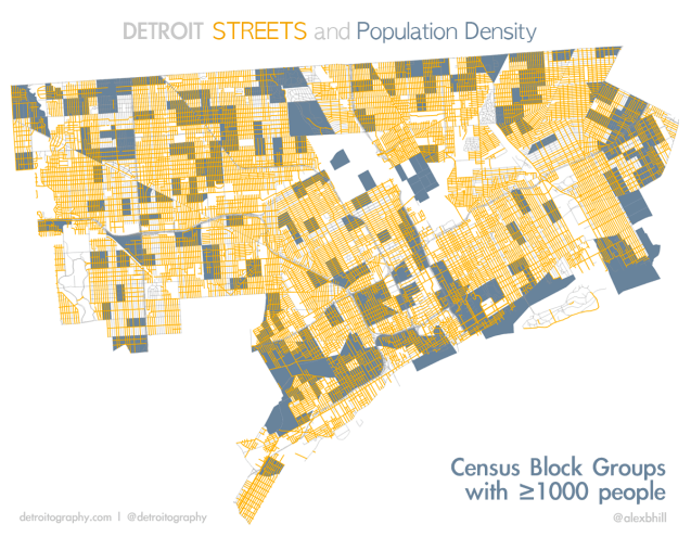
Maybe that was more than you wanted to know, but the history of Detroit gives incredible insight into its present day make up. As evidenced by all the orange in the map, the term “Street” was used widely in all three of Detroit’s street grid systems. It’s hard not to go anywhere in the city and not drive on a street.

detroit_streets

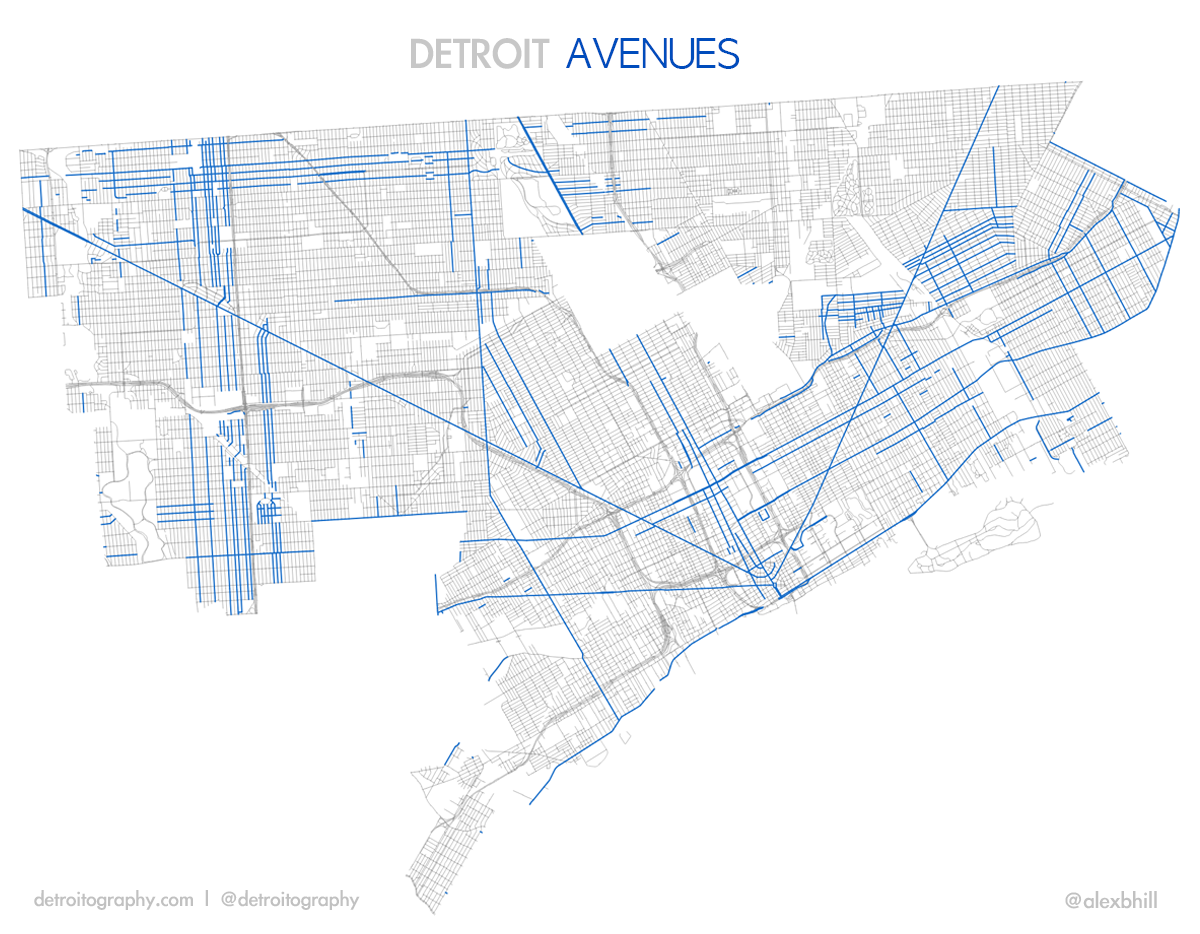
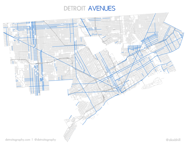
Detroit’s “Avenues” show the lasting impact of Detroit’s initial plan of 1806, Augustus Woodward’s hub-and-spoke grid plan. These Avenues are still important connectors to other Michigan cities and regions. It seems that “Avenues” also became popular again after official US control of Detroit, notably on the Westside and as important cross-city routes.

detroit_aves
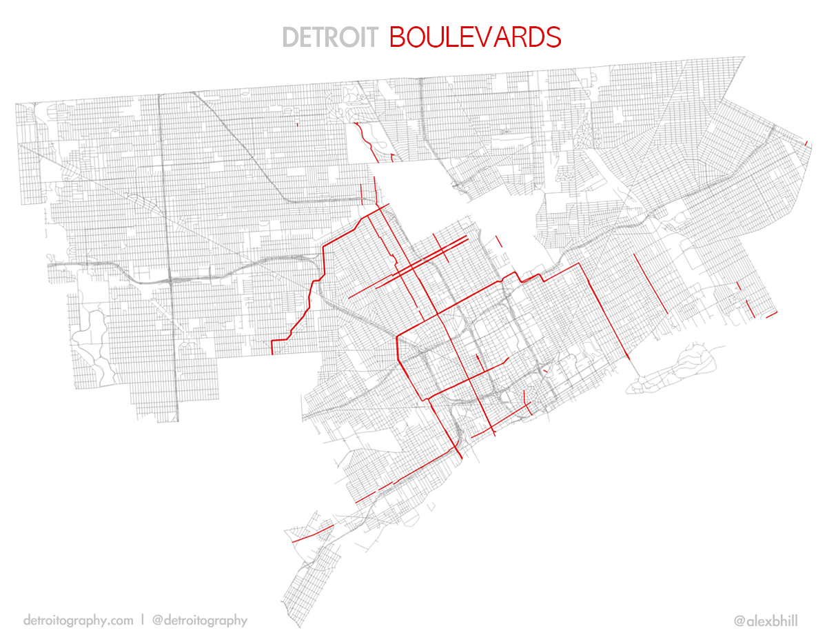
Boulevard’s aren’t the most widespread in Detroit, but they are some of the most prominent streets in Detroit’s history. The most recognizable “Boulevard” is Grand Boulevard, which at one point was one of the most prominent streets to build your house. Modeled after the French design, Grand Boulevard encompassed the outer limits of the city in 1913 and was decorated with beautiful landscaping.

detroit_blvds
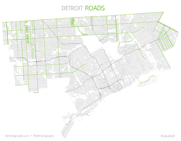
“Roads” in Detroit follow the convention of the true East-West Mile roads and North-South street naming after official US control of Detroit after 1837. It is easy to see that “Roads” are limited to the outer areas of the city, away from the city center.

detroit_roads1

“Streets” and “Avenues” may be timeless as far as street naming in Detroit, but “Boulevards” and “Roads” reveal Detroit’s historical planning past. Depending on where you live in Detroit, there may be some street names that you never encounter – but everyone will live or drive on a “street” (from Census 2010 data, Social Explorer).

detroit_st_popdenSee also: Map of Detroit Land Annexation 1806 – 1926
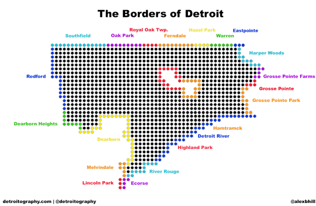
Detroit Median Family Income Map 1965

bunge_medianfamilyincome_1965

From the Field Notes II of the Detroit Geographical Expedition Initiative with William Bunge, this map shows how downtown and Cass Corridor areas became impoverished and abandoned over the years. Now we see these areas as the primary focus of redevelopment. This is a good reminder of historical information allowing us to better understand present day developments.

Detroit Smallpox Map 1920

SmallpoxInDetroit1920

Published in the City Health Bulletin, May 1920 (Page 3) by George T. Palmer, Epidemiologist – this map shows how the first cases of smallpox were concentrated in the Black Bottom where the small black population resided. Since smallpox spreads easily by close contact and housing conditions in the Black Bottom were less than ideal, it is no wonder that the disease found easy vectors.

Epidemiologist Palmer notes that the “unprecedented influx of people to Detroit, combined with a woeful lack of suitable housing” causing overcrowding aided in the spread of disease by close contact.

The disease among the colored is confined largely to the unmarried adult male, from 20 to 50. This is mainly a roving population, living in rooming houses. Two-thirds of the colored cases have been in Detroit in less than a year. Never having been successfully vaccinated, this group furnishes a fertile field for smallpox once introduced.

Detroit Techno Pac-Man Map

p_4456

Canadian artist group, Price Budgets Boys have made a series of interpretations described as a mix of Piet Mondrian, Pac-Man and Boggie Woggie music. The videogame board consists of Piet Mondrian’s painting “Broadway Boogie Woogie” (1942-43), which in its turn is inspired by Manhattan’s street grid and boogie woogie music.

They created three versions after the initial NYC version: “Detroit Techno” (2005), “Tokyo Techno” (2006) and “Toronto Techno” (2006). The labyrinths in the new versions are created by stylized street grid from each city, executed in the style of Piet Mondrian.

See also: De Troit a la Mondrian – population change map in Piet Mondrian style