Map: Detroit’s New Planning and Design Districts 2016

PDD-Design-Districts

At the August 4th, 2016 Community-wide meeting, Mayor Duggan and new Planning Director, Maurice Cox shared information about how the city will be planned for the future and specifics on the goal of creating “20 minute neighborhoods.”

As part of tackling the size and expansiveness of Detroit, the Planning and Development Department (PDD) is breaking the city up into East, West, and Central “Design” Districts – not to be confused with the “Design District” proposed for Cass Corridor or the existing City Council Districts.

Watch the full presentation HERE

Map: Cyclespace in Detroit

momentum-mag-bike-map

This map by Dr. Steven Fleming of Cyclespace looks at space for bicycles in Detroit with a dense and bikeable future:

Did you know that a 9.3 mile (15 kilometer) diameter city, if it were as dense as Manhattan, would have a population of 6 million people? And did you know that if it were designed around cycling – the way, say, Houston was designed around driving, or how Venice was designed around boats – and if no vehicle were allowed in that city that impeded the smooth flow of bikes, that the average commute time would be faster than in any other city that size? This was one finding from a design research project I ran. I’m now in the process of disseminating these and other findings to my colleagues and bike transportation enthusiasts.

Related: Land Use for Automobiles 1974

Map: Detroit’s Longtime Gayborhood

michigan-gayest-square-mile

WDET’s CuriosiD series recently examined the idea of the “Gayborhood” in Detroit. Many people assume that the northern suburb of Ferndale hosts the most gay-friendly establishments, but just south of 8 Mile there existed and still exists a strong gay neighborhood in Detroit’s Palmer Park area. The main difference today is the demographic shift.

I think it would be a mistake to say that Palmer Park is no longer a gay neighborhood,” says Dr. Tim Retzloff, a historian who has tracked the gay migration in Metro Detroit. “In some respects there’s still a strong gay presence in Palmer Park, it’s now just an African-American gay presence and not a White gay presence.”

Listen to the whole story on WDET.

Map: Detroit Travel Time Map 1915

isochronal-transport-time

This map represents an analysis from the 1915 “Report on Detroit Street Railway Traffic and Proposed Subway” (Barclay, Parsons & Klapp) looking at travel times from Downtown. The isochrone lines show that in 1915 it would take 40min to get 7 miles (to Highland Park) and the same distance and time to reach Grosse Pointe Park.


Detroit Wall Map: Different Data

differentdata_mocad_04

The Design Inquiry (DI) group made up of Dan McCafferty, Joshua Singer, Patricio Davila, and Rachele Riley created this installation at MOCAD based on some of our data and others:

The Different Data Detroit project is a mapping of various narratives of the city of Detroit, combining and layering data gathered from diverse sources: information on water usage and future water infrastructure (from Detroit Future City proposal and Detroitography); visualizations and reports on spaces in Detroit whose official use is ‘unknown’ (as determined by Data Driven Detroit in their recent Motor City Mapping Parcel Survey); historical maps, large sample collections of typographic typologies from the urban landscape; our own photography, notes, and GIS mappings from field visits in the city; imaginary structures that delineate hidden pasts.


Map: Drawing Southwest Detroit

Yesterday’s #Maptime workshop went analog at Repair the World (which has their own awesome wall map). This time we were focused on the time-tested practice of hand drawing maps. Each person took a different section of Southwest Detroit to recreate in their own style.

Screen Shot 2016-07-08 at 7.21.08 AM

Using fieldpapers.org, I generated a quick grid for Detroit that wasn’t too granular, but allowed for a single page to have a good amount of detail.

Everyone has a different way of viewing and understanding maps and geographic areas. Since we were focused on Southwest Detroit there were a number of discussions about industry, pollution, and environmental impact.

Map: Hand Drawn Southwest Detroit 1897-1905

Detroit Brickyards

This map was found and posted by architect, Robert Saxon Jr., while looking for historic information on Detroit brickyards.

It’s unclear whose signature “T. Klug” appears in the bottom corner. Nevertheless, a great example of a hand drawn map used to understand a specific area of Detroit.

UPDATE 07/08/16: Dr. Thomas Klug, Director of the Institute for Detroit Studies at Marygrove College has confirmed he is the map creator. The map was part of a 1999 Report titled: “Railway Cars, Bricks, and Salt: The Industrial History of Southwest Detroit Before Auto.”More from Dr. Klug:

I used a relatively contemporary map  of Detroit…in order to situate “industrial” places in SW Detroit based on the 1905 city directory and the 1899 Sanborn maps.

It was a real eye opener to  come across all those brick yards in Springwells Township.  They looked pretty impressive in the Sanborns, and i came across a description of the miserable conditions facing the workers (German immigrants) from the Michigan Bureau of Industrial & Labor Stats.


Event: #Maptime Detroit – Hand Drawn Maps

maptime-june

WHEN: July 7, 2016, 6-8pm

WHERE: Repair the World: Detroit, 2701 Bagley St.

WHAT: Sometimes the best way to understand your neighborhood is to draw it out. We’ll be looking at aerial imagery to understand and dream about the places that we live. We’ll kick off the evening by learning the some map anatomy and look at historic and new examples of hand drawn mapping.

You’ll need to bring:

  • Yourself
  • A friend
  • Any art supplies that you like to work with

Beginners are welcome, mapping is for everyone!

View on Facebook

All Detroit Hand Maps Are Accurate

13323634_1734083876850064_8918731766842958521_o

Nothing beats a good mental map. Nothing.

It has been great participating in the Data Discotech’s put on by the Detroit Community Technology Project (DCTP). In the last event held at the Boggs School, we shared the hand map example to help students understand the geography of their city.

Hand maps are rarely accurate, but help build a conceptual understand of the world around us. The Boggs students taught us as much about the geography of Detroit as we hoped to teach them about spoke streets.

Map: Fig. 130 – Detroit 1892

PerronDetroit1892

This map is from La Nouvelle Géographie universelle, la terre et les hommes, 19 vol. (1875-94) by the French cartographer, Charles Perron published with colleague Élisée Reclus. The two cartographers produced nearly 10,000 maps from the 16th to the 20th century, including several reproductions of early maps from Antiquity and the Middle Ages. They were considered pioneers in the field of cartography.

Map: Housing Value Change in Detroit 2004 – 2015

Screen Shot 2016-06-26 at 8.32.28 PM

This Washington Post article uses data from Black Knight Financial Services to examine home values pre-recession to the more current 2015 home values. As many other socio-economic analyses have suggested, the examination of home value data shows a deeply uneven recovery. On the data:

“The estimates reflect repeat sales and loan data from 2004 to 2015 across the country, down to the neighborhood level for some 19,000 Zip codes. Values are not adjusted for inflation. The data are adjusted to correct for the sales prices of distressed properties such as foreclosures to better capture what homes would sell for on the open market.”

Across zipcodes in Detroit, home values are down between 50% and 73%. The zipcode 48216, where Corktown is located and quickly becoming an expensive neighborhood in which to own housing, has seen the lowest home value loss since 2004.

Map: Detroit Wall Map at Repair the World

Spent the day starring at this colorful wall map of Detroit in Repair the World‘s space in Southwest.

It’s not the most geographically accurate, Belle Isle is a little shaved down on one end, but it sure is beautiful and must have taken a long time to put up. Each block of color looks like it was painted, but I might be wrong.

Map: Downtown Detroit Building Heights 1956

Screen Shot 2016-06-13 at 8.16.15 AM
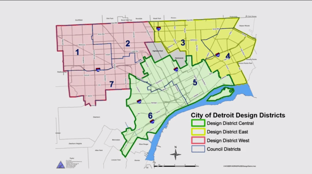
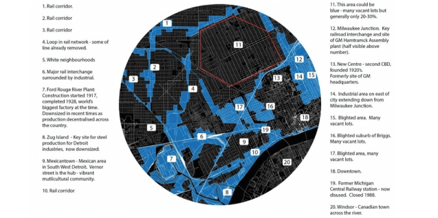
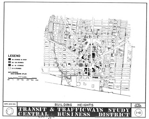
From the Detroit City Plan Commission’s “Central Business District Study: Land Use, Trafficways, and Transit: A Basis for the Long Range Growth of Downtown Detroit.

Compared to the most recent data on building heights, not too much has changed. Most notably the Renaissance Center had not yet been built (see the large empty space where Woodward ends at the Detroit River).

Map: Detroit District-Neighborhood Name Mashups

Map_Detroit_Future_City_v2

Francis Grunow wrote a post a while back on the shortcomings of the Detroit Future City plan, its lack of regionalism, and collaborative pathways that could be used moving forward. Most notably, he calls for a Planning Corps to integrate efforts with existing community-based organizations.

He also drew this map to accompany the post which mashes up City Council Districts and neighborhood names within those areas.

  • District 1: La Grand Rose Moor (Grandmont-Rosedale, Brightmoor)
  • District 2: Bagley Greenwoods (Bagley Community, Green Acres, Palmer Woods)
  • District 3: Osborn Landia (Osborn)
  • District 4: Jefferson Morningside (Jefferson-Chalmers, Morningside)
  • District 5: New North South East West End Village Center Bottom (New Center, North End, West Village, Black Bottom)
  • District 6: Mid-Swowntown (Midtown, Southwest, Downtown)
  • District 7: McRouge Dale (Rouge Park, Rosedale)


Map: Detroit Master Plan Trafficways 1951

Screen Shot 2016-06-13 at 8.03.33 AM

In the 1950s, Detroit planning seemed to be all about expressways. This map from the 1951 Master Plan shows the Edsel Ford (I-94) partially built and the Lodge (M-10) creeping Northwest with dotted lines planning to build many more expressways.

The Master Plan also notes that there was a large park within 20min drive or bus ride for every resident of the city.

Map: Detroit’s Woodward Avenue Subway Plan 1915

Screen Shot 2016-06-08 at 7.35.49 AM

According to the 1915 “Report on Detroit Street Railway Traffic and Proposed Subway” (Barclay, Parsons & Klapp), the Woodward lines saw significantly increased utilization between 1904 (12,990,027 passengers) and 1914 (47,457,294 passengers).

Downtown, where all the routes terminated, impeded efficient movement of people in and out of the city. Therefore, their report proposed a series of rerouting of lines as well as a Woodward Avenue subway system.

Map: Detroit’s Pattern of Growth 1960s

This gem of a video (from sometime in 1960s?) that I wish I had known about years before now has been circulating on social media, but needs to be shared more widely.

Former Chair of the Geography Department at Wayne State University, Robert J. Goodman (d.2005), and Gordon W. Draper created this important look at the history behind Detroit’s street patterns.

“To an overhead observer the street pattern of Detroit presents a strange mosaic of conflicting systems which seem to start and end with no apparent reason and to have no relation with each other.”

Who knew that Gratiot jumps one block north before Brush St. so as not to cut through Elijah Brush’s orchard? Or that Detroiters donated 90% of the land in order to create Grand Boulevard? Did you know the Streets in Highland Park are narrower because that city is much older than the areas of Detroit that grew around it? Even Palmer Woods and Sherwood Forest neighborhoods were labeled as “exclusive” at the time with their curved street patterns.

It is all to easy to forget the deep history of Detroit from the original Indian trails that inspired the spoke streets to the varied roads patterns planned at different points in the city’s history. Don’t forget you can use your hand as a map of Detroit if you ever get turned around.

dgei_hand

Map: Geography of Baseball Diamonds in the Detroit Region

terrapattern-baseball-detroit-region

Terrapattern recently launched to investigate typologies of similar places across cities via satellite imagery.

“…the Terrapattern prototype is intended to demonstrate a workflow by which users—such as journalists, citizen scientists, humanitarian agencies, social justice activists, archaeologists, urban planners, and other researchers—can easily search for visually consistent “patterns of interest”. We are particularly keen to help people identify, characterize and track indicators which have not been detected or measured previously, and which have sociological, humanitarian, scientific, or cultural significance.”

I decided to click on the baseball diamond at Tigers Stadium to see what places were similar in “Detroit” – Terrapattern’s sample area for Detroit includes a broader area beyond the city limits, but also cuts off the Far Westside.

terrapatttern-baseballThe result is this great geographic plot of similar images and a series of snapshots of other baseball diamonds. Terrapattern even gives you a nice GeoJSON file to play with if you want to export your search results. Obviously, this isn’t all baseball diamonds in the city, especially ones that might be overgrown or covered in grass.

terrapattern-baseball-detroit

The resulting sample area shows the Far Westside cutoff. However, taking into account the significant clustering (z-score: -9.4) in both the suburbs to the east and Downriver, there appears to be a greater level of access to baseball diamonds and/or maintained baseball diamonds.

Map: New Detroit Regional Master Transit Plan 2016

RTA foldout map_1464612396571_6448641_ver1.0.jpg

The unprecedented level of collaboration the Regional Master Transit Plan for Southeast Michigan has produced a hopeful future for a connected region. With over 60% of Detroiters working outside the city limits and over 70% of Detroit jobs held by non-Detroiters, this plan has big potential to improve access to opportunity and equity in our metro-Detroit region.

The map is pretty nice too!

Map: Increases in High Poverty in Detroit 2013

Detroit_Segre-02

Poverty is a regular topic in Detroit, but there is much more to the data and narrative than an elevated rate of poverty. Since 2000, the Detroit metro area has seen some of the largest increases in racially concentrated poverty (see 2000 map below for comparison).

detroitsegr-1439235033-49