Beautiful Detroit Map at Shake Shack

image1

This is not a restaurant endorsement, but if you’ve got maps on the walls I’m much more likely to eat there. Michigan’s first Shake Shack opened at the end of February in the First National Bank building Downtown.

Photo credit: Nora Birch

Update 03/13/17: Map by Jesse Kassel. She won’t have this exact map available for sale, but notes she is working on another similar design that will be available!

Map: Detroit Non-White Population 1950

screen-shot-2017-03-06-at-7-08-15-am

In a report titled: “The Non-White Population of Metropolitan Detroit: The Number and Distribution of the Non-White Population in the Metropolitan Detroit Area: 1950 and Earlier Censal Years,” the United Community Services of Metropolitan Detroit Research Department published pages and pages of data tables and maps.

screen-shot-2017-03-06-at-7-09-40-am

Map: Detroit Neighborhood Opportunity Change 2000 – 2010

screen-shot-2017-03-06-at-7-02-40-am

The Kirwan Institute at Ohio State University (OSU) has been developing an “opportunity index” for a number of years. In a 2014 presentation to the Kresge Foundation they conducted an analysis of the change in opportunity between 2000 and 2010 for “neighborhoods” (census tracts) in Detroit. There are a number of areas with positive change, but they are very concentrated in Greater Downtown with more absolute negative change focused in outer neighborhoods.

Map: Respiratory Risk in Detroit

respiratory-hazard-midb-ems_v2

Air quality is extremely difficult to capture due to changing wind direction (generally moving from SW to NE), temperature change, size of the Detroit-Windsor airshed, and various other factors. Measuring air quality at a neighborhood level is next to impossible without an extensive network of instruments to collect data in a small area.

A handful of data sources can be helpful in examining the issue, but still lack the necessary specificity. This is highlighted in Southwest Detroit where persistent asthma, emergency calls, and respiratory risk are all categorized as low even while there is such a high density of pollution emitting facilities.

Many anecdotal accounts of teachers keeping a drawer full of inhalers and inhalers being sold for cash on the street all indicate that respiratory risk is higher in Southwest Detroit than the data show, but people are likely not utilizing emergency and other health services.

Map: Campus Martius Square in Detroit

screen-shot-2017-03-01-at-7-50-45-am

This historic map comes from the writings of none other than Clarence Burton himself in a volume titled: “Detroit in earlier days : a few notes on some of the old buildings in the city” focused on four specific parcels of land in the city surrounding Campus Martius.

The Campus Martius square used to be the focal point for city government, including Detroit’s original City Hall erected in 1871, an Academy for women’s education (later leased to the University of Michigan for 999 years), and a private railroad depot owned by Edmund A. Brush (later to become the Michigan Central Railroad depot).

Next time you enjoy the Campus Martius beach, think of all the history you are sitting on.

Map: Preferred Bicycle Paths in Detroit 2006

preferred_bicycle.png

This map comes from the June 2006 City of Detroit Non-motorized Transportation Master Plan. The report notes the need for more bicycle parking and bike lanes (395 miles), all of which would be incrementally added as regular maintenance and upgrades occurred.

Among the many ideas and proposed plans, the report called for Mayor Kilpatrick to convene a Non-motorized Taskforce to implement, educate, and use of a new non-motorized system.

Streets should be swept regularly, with priority given to those with higher bicycle traffic. (Page 43)

Map: Comparative Health Rating for Sections of Detroit 1920-1921

Screen Shot 2017-02-20 at 8.27.36 PM.png

In 1922, the health of Detroit was marked by a spike in measles cases. Infant mortality was through the roof at 87.6 deaths per 1,000 births.

This map in particular ranks each of Detroit’s 23 sections at the time by aggregating 23 different health indicators.

Map: Predicting Gentrification in Detroit with Longitudinal Census Data

screen-shot-2017-02-19-at-5-54-48-pm

Ken Steif and his team at Urban Spatial note the Urban Institute’s call for an early warning system for gentrification in US cities. In response, they decided to start analyzing data and building models to help predict gentrification potential. The above map is based on models run with 2000 and 2010 data to forecast at the census tract level for the year 2020.

Wall Map at Detroit Animal Care and Control

IMG_0672.jpg

Detroit Animal Care and Control (DACC) recently moved into the former Michigan Humane Society building at 7401 Chrysler Dr. from their previous location on West Jefferson.

Staff had enjoyed referencing this large Hearne Brothers wall map to be able to  get down to the street level for their work. Notice the built in tape measure hanging from the middle of the map.


Map: Rough Sketch of the King’s Domain in Detroit 1790

160928_detroitmap_1500px

Last September, the Clements Library at the University of Michigan acquired a previously unknown map of Detroit that was discovered in a Windsor home basement.

The Clements Library will be holding an upcoming event about the discovery:

A Newly Discovered 1790 Detroit Map 
March 7, 2017 12 – 1pm
William L. Clements Library, Room G060

The 1790 Detroit Map is also available for viewing at the WIlliam L. Clements Library every Friday from 10am – 4pm. The Library is free and open to the public every Friday, and is available to researchers MondayThursday.

Map: Detroit’s Changing Region 2000-2010

2000-2010-metro-detroit-race-map

The CUNY Graduate School Center for Urban Research has put together some great tools to compare shifting demographics across various regions in the U.S.

In the Detroit region in particular you can see the dispersion of Detroit’s black population into inner ring suburbs and the general decrease in population density across the whole region.

Map: Languages Spoken in Detroit Homes 2014

language-home-map

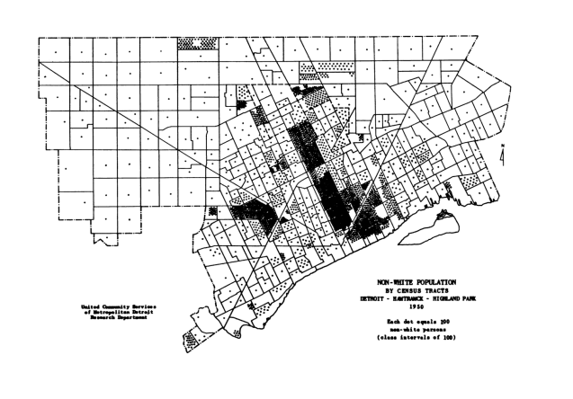
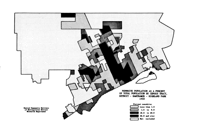
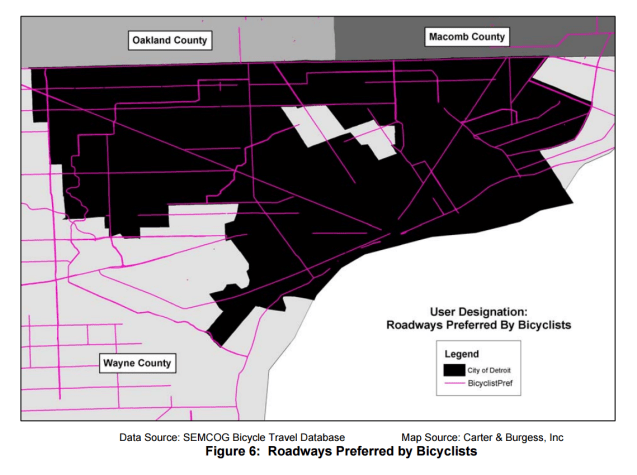
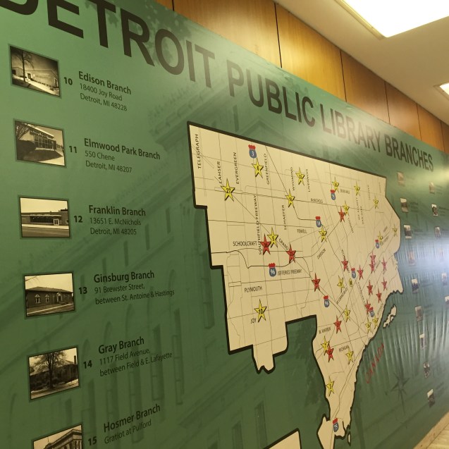
Households in Detroit in general are homogeneous; the city ranks low on the diversity scale due to the 83% majority African-American population. However, the city has incredibly concentrated neighborhoods of cultural significance. Detroit remains a global city.

Southwest Detroit is most often referred to as Mexicantown due to the large Mexican-American population that can be traced back for decades in the city. There was a small, but growing Mexican foreign born population in the 1960s (map). The increase in Mexican immigration was due in large part to the industrial jobs offered by Henry Ford. Mexican-Americans are currently the largest single immigrant group in Wayne, Oakland, and Macomb counties.

Warrendale, on the city’s lower Westside, neighbors Dearborn and has a similar history of Middle Eastern immigrants with the first coming in the 1870s. Various waves of immigration followed Middle Eastern conflict such as the Lebanese Civil War, the Gulf War in Iraq (2003), and even the current Syrian War. The area near 7 Mile and Woodward is known as “Chaldean Town” due to the large Iraqi Christian population, but Arabic is not the primary language spoken so the area does not highlight on the map.

Country of origin, heritage, and language are not always synonymous. In 2007, the Detroit City Council passed legislation that prohibited city employees and police from asking for someone’s immigration status unless directly related a suspected crime. Detroit has always been a city of innovative immigrants and should protect its status as a sanctuary for all who come seeking opportunity.

Workshop: Data, Mapping, and Research Justice

coopen_banner_data-300x300

I’ll be teaching my workshop on data and mapping again this February 2017 with Allied Media Projects/ Co.Open.

During the 4-week course we will journey through the entire mapping process; from paper survey to digital database, basic map visualizations, and finally analysis. We will be working with free and open source software (LibreOffice, QGIS, Inkscape, etc.).

Check out some of the past course projects:

Wednesday nights in February (4 weeks long) 6-9pm

Sign up at store.alliedmedia.org

Map: Detroit Neighborhood Markets “Blue-lining” 1932

Screen Shot 2017-01-10 at 7.18.59 PM.png

This map is one among 35 other cities profiled in a market survey by the Advertising department of the Curtis publishing Company, called: “City Markets: A Study of Thirty-Five Cities.” The primary market assessment conducted here was based on circulation of newspapers and magazines, but included auto sales, consumer goods, and transportation spending.

The report notes that the 1932 maps are improved from earlier versions as “homogeneous residential areas” have their own boundaries rather than conventional or municipal boundaries. The map also has similarities with the well-known “redlining” maps, but in this case it is “blue-lining”:

“[…] manager was instructed to conduct circulation work in the better residential areas (colored red and yellow on the Survey map). He was forbidden to do work in areas colored blue (for the most part with foreign-speaking or colored residents).

In 1932, Detroit’s Black Bottom and Paradise Valley match the South-North grouping of blue areas that reach from the riverfront almost to Detroit’s northern border of 8 Mile Rd. Notable red areas that stand out are Indian Village, Rosedale Park, Palmer Park, Dexter-Linwood, as well as outside of the Detroit border in the Grosse Pointes, Royal Oak/Pleasant Ridge, and Birmingham.


Map: De Lery’s Plan of Detroit 1749

Screen Shot 2017-01-10 at 8.18.05 PM.png

Many people have seen Bellin’s map of Fort Detroit from 1764, but fewer people know that Bellin’s map was based on Gaspard-Joseph Chaussegros de Lery’s survey in 1749. Huron Creek really stands out as a significant landmark.

This version of De Lery’s map appears in “History of Wayne County and the city of Detroit, Michigan” edited by Clarence and M. Agnes Burton.

Map: Environmental Justice in Detroit

Screen Shot 2017-01-09 at 9.16.10 AM.pngThe EPA has developed a handy tool called EJSCREEN to explore data related to environmental justice around the country. Data from EPA and other sources are pulled together and can be examined side-by-side. In the image example the maps are comparing “linguistic isolation” and the EPA’s cancer risk index.

Map: Detroit Eastside Evolution 1876-1925

eastside_detroit_1876-1925

Thanks to images posted by member of DetroitYes these images show the evolution of the Eastside of Detroit from rural and uninhabited to at one point becoming home to the Detroit Municipal Airport in 1925. The one piece that never changes is the location of Windmill Point Lighthouse.

Another interesting change to watch is the changes to the Conner Creek from a wide-mouthed creek to a diagonal waterway until it was finally covered over to serve as a covered sewer drain.

The most evident change between 1876 and 1925 is a natural and flowing landscape to a rigid, grid of a growing major city.