Map: Discriminatory Mortgage Lending in Detroit

detroit_hmda

The Urban Institute has completed an excellent analysis with Home Mortgage Disclosure Act (HMDA) data. I had been wanting to work with the HDMA data after Michigan Legal Services and the ACLU won a lawsuit against Morgan Stanley for employing racial discrimination in subprime home mortgages offered to Black Detroit homeowners during the economic recession. The New Century Financial Group (now bankrupt) was tasked with seeking out Black homeowners to offer subprime mortgages. From Reuters:

“The ACLU asked the court to certify the case as a class action. It said as many as 6,000 black homeowners in the Detroit area may have suffered similar discrimination as a result of being offered loans that many could not afford.”

Recently, JP Morgan Chase (Chase Bank) announced that it would be investing $100 million in Detroit over the next 5 years. This could only be seen as a corporate move to appease their racial discrimination. Detroit has been named as the 5th hardest hit city during the housing crisis. At the Detroit Homecoming Mayor Duggan told the audience that the city had sold 162 homes, but people are saying, “we can’t get mortgages.” It seems that Mayor Duggan should be keeping a very watchful eye on Chase Bank, Morgan Stanley, JP Morgan Chase, etc. if he truly hopes to stem the tide of migration out of Detroit.

Text from the Urban Institute‘s page:

A delayed recovery still hurts minorities most: Detroit

Detroit is the poster child for cities that have lacked a strong recovery like San Francisco’s. The sharp drop in the number of mortgages reflects this ailing Rust Belt city’s sweeping economic decline. According to the US Census Bureau, Detroit’s population fell from 951,270 to 713,777 between 2000 and 2010 as the auto industry stumbled, jobs disappeared, and the city entered the largest municipal bankruptcy on record. Though the recession took a toll on the entire region, the housing bust still disproportionately hurt minority borrowers.

Detroit’s downtown, which held a large share of mortgages made to African American borrowers during the boom, has remained virtually devoid of new mortgages since the bust. From 2006 to 2012, the number of mortgages in the metropolitan area fell 79 percent for African American borrowers as lending within city limits fell off the map. In comparison, the number of mortgages made to white borrowers dropped only 11 percent. Recent investments from the private sector suggest a comeback could be under way, but the mortgage market in the inner city shows no sign of recovery yet.
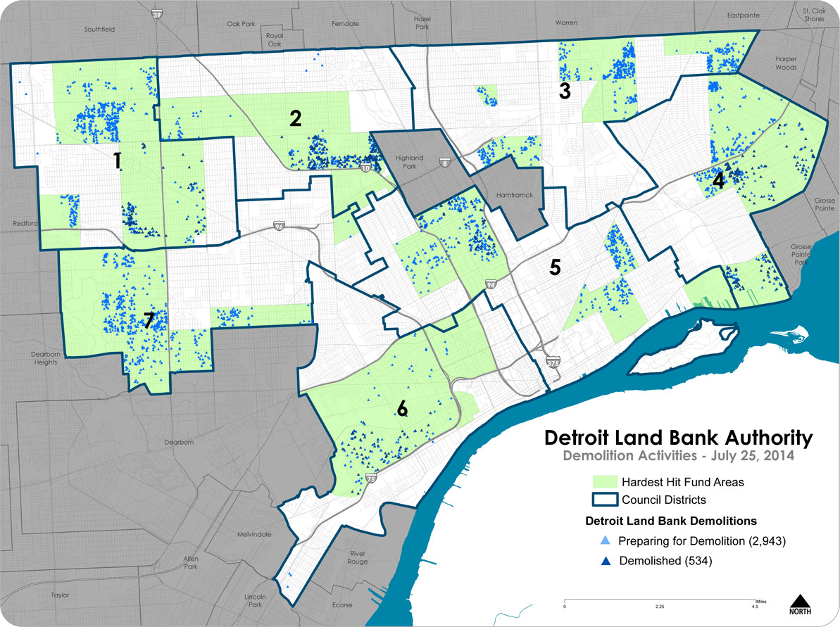
Map: Hardest Hit Fund Demolitions in Detroit

HHF_Demos_PubicMap_7_29

One of Mayor Duggan’s biggest initiatives came with a large amount of federal and private funding. Duggan essentially kicked out the Pulte Family’s “Detroit Blight Authority” efforts, so they have started spending their money focusing their efforts on tearing down blight in Pontiac. The Motor City Mapping project and the subsequent “Blight Report” from the Blight Removal Task Force chaired by Dan Gilbert further emphasized the removal of blighted structures. There are a number of financial interests in bringing down blight, from the city government image department, to funders of the Detroit Future City Plan (Kresge, Skillman, etc.). Each week the Mayor highlights how many houses were demolished as part of blight elimination.

In the last 2 weeks I’ve heard various reports from friends who are residents of dozens of homes getting torn down in the matter of hours: in the Osborn area someone talked about starting at 7am, eight houses in a row were torn down and in the North End nearly 12 were taken down between 9am and noon.

The data used in the above map is unfortunately only available in PDF format.

UPDATE 09/22/14: I spent a few hours today scrapping the data. Enjoy!

detroitdata_get


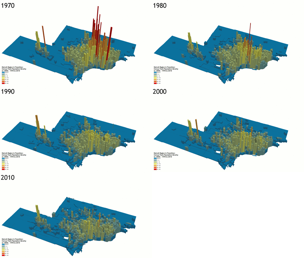
Detroit Region Population Density Map 1970 – 2010

detroit-density-years


Detroit Region Census track population density change 1970-2010 by redditor Butter-Tub :

The population data came from the US Census, downloaded from NHGIS, and joined in ArcGIS. The 3D visualizations were created in ArcScene, exported for each year, and then loaded into GIMP as layer files. From there it was a simple export to GIF.

Workshop: Data, Mapping, and Research Justice

coopen_banner_data-300x300

A little horn tooting: I will be presenting a workshop on data and making maps in October with Allied Media Projects Co.Open. We’ll be doing some active data collection and retrospective analysis of the Cass Corridor. Sounds exciting right!? This is all to keep working towards to goal of getting more people making maps!

Everyone wants to use amazing maps and visual graphics for their causes, but there are a number of behind the scenes steps to ensure data is collected in a way that promotes justice. Maps and data can be used to better understand where inequality exists, to look at possible correlations between environmental risk factors, or even to visualize community responses. Working within the frame of research justice, we will be using open source tools to work with GIS data. Our goal will be to successfully understand data collection, data management, and basic map visualization. Do you want to use maps and data to further your social justice cause? Then this is the course for you!

Register here!

Here is a link to apply for reduced rate scholarships

Map: Growth of Detroit in Pictograms

detroit-growth-pictograms


These fun pictograms come from “Detroit: a manual for Citizens” published by the Detroit Public Schools in 1958.

In the text it asks:

“Perhaps it will interest you to locate the year of your birth and notice how Detroit has grown in your lifetime.”

I’m not sure how many Detroiters are alive today that can still do that.

Map: Historic Detroit Neighborhoods 1884

silas_nhoods

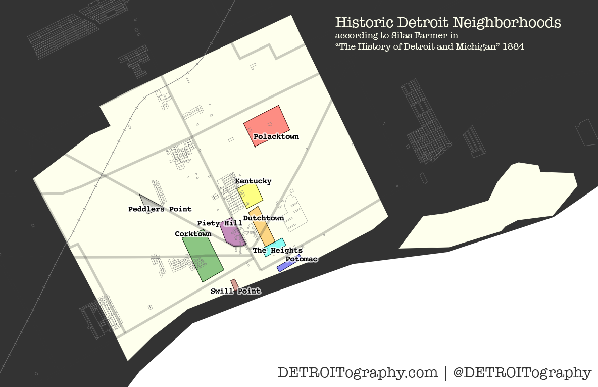
From “The History of Detroit and Michigan” by Detroit’s first cartographer, Silas Farmer.

Excepts on each neighborhood:

“This the larger portion of the territory on Fifth and Sixth Streets, for several blocks each side of Michigan Avenue, is called Corktown, because chiefly occupied by people from the Emerald Isle.

The eastern part of the city, for several blocks on each side of Gratiot Avenue beyond Brush Street, for similar reasons is often spoken of as Dutchtown, or the German quarter.

That part of the city lying a few blocks north of High Street and between Brush and Hastings, is known as Kentucky, from the number of colored people living there.

A walk a few blocks east and north of this locality terminates in the heart of Polacktown, where many Poles reside.

The portion of the city just west of Woodward Avenue and north of Grand River Avenue, forming part of the old Fifth Ward, is sometimes designated as Piety Hill; for the reason that it is largely occupied by well-to-do citizens, who are supposed to largely represent the moral and religious portion of the community.

Peddler’s Point is the name frequently applied to a part of Grand River Avenue near Twelfth Street. The intersection of several streets at that place forms a pointed block, which locality is a favorite place itinerant hucksters to intercept and purchase supplies from farmers coming in on the Grand River Road.

Swill Point is not the very euphonious appellation sometimes given to a portion of Larned Street near Second, because of a distillery formerly located near by.

Atwater and Franklin Streets, for several blocks east of Brush Street, are frequently designated as the Potomac. This locality is near the river, and in memory of a familiar saying of the last war, the phrase “all quiet on the Potomac” indicates that otherwise disturbances might be looked for in the region indicated.

The Heights is a name applied to a region near the westerly end of Fort Street East, occupied in part by former denziens of the Potomac quarter.”

Many of these names remain with Corktown likely being the most recognizable. The development of the expressways changed the neighborhood, but did not wipe it out as it did to neighborhoods like Kentucky along Hastings Street which barely even exists today. Dutchtown isn’t much referred to today, but Germantown Park (Harmonie Park) can still be visited Downtown. Polacktown seems to have morphed into Poletown and the Polish population moving to occupying Hamtramck.

This map also includes the local historic designations. Beyond the 1884 referenced boundary from Silas Farmer, there are only about 4 other major clusters of historic areas. Downtown was a critical zone for various immigrant communities to make their start in Detroit. Greektown is the well known name today, but a series of immigrant groups have cycled through that neighborhood throughout Detroit’s history.


Map: Public Health in Detroit 1955

public-health-detroit-1955

This map is from a booklet published by the Detroit Public Schools in 1958 titled, “Detroit: A Citizens Guide.” Among the many informational sections is a section on “public health” in Detroit.

“The commissioner [Department of Public Health] must also collect information on the cases of diphtheria, scarlet fever, typhoid fever, smallpox, pneumonia, and several other diseases that are reported each day. He keeps a record of where these people live, who is taking care of them, and of any deaths. This information is important for the health of the city because it supplies facts on which the health commissioner may lay plans to prevent the spread of disease and promote health. The map on page 150 gives you some of this information, according to the various sections of the city.”

Map: Detroit Neighborhood Strength Index

Screen Shot 2014-09-06 at 11.13.19 PM

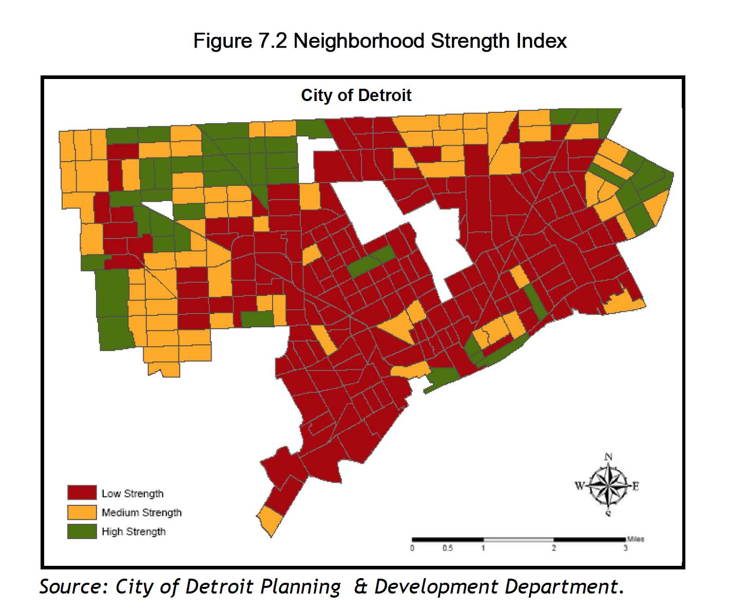
A group of University of Michigan urban planning graduate students completed a 2006 report titled, “Planning for Detroit’s Tax-Reverted Properties: Possibilities for the Wayne County Land Bank.” The project was supported by Community Development Advocates of Detroit (CDAD) and funded by Local Initiatives Support Corporation (LISC). From the report:

“Planners working with the City of Detroit’s Planning & Development Department created an index for the City of Detroit using a ranking system to classify areas, where census tracts with a ranking of 1 are the weakest and 10 are the strongest. The average census tract score is 6. This system uses six indicators that serve as the basis for comparison:”

  • Rate of owner-occupancy
  • Number of occupied units
  • Households above the poverty line
  • Median household income
  • Population below age 65
  • Workers employed in professional or managerial occupations

Map: Detroit Water Affordability

detwater_affordability

The standard for affordable water is set by the Environmental Protection Agency (EPA). The EPA attempts to stress equity and consideration for low-income individuals. In 1995, the EPA set the first water affordability rate at 2% which is considered a “large economic impact.” Unfortunately, the Detroit Water and Sewerage Department (DWSD) among other non-governmental actors disagree with the EPA and have different ideas as to how to pay for and maintain this basic human need and natural resource.

Detroit’s water rate was increased by 8.7% in July 2014 effectively making an average monthly water bill at $70.76 (or $849.12 annually). In order for this $850 annual rate to fit within the EPA’s standard of “affordability” a household would need an annual income of around $40,000. Anyone aware of the situation in Detroit and Census data could tell you that the majority of households in Detroit do not have that level of income and that the median income in Detroit is $26,955. That goes without saying that 40% of Detroit residents live below the poverty line. For the Detroit average household of 3, less than $19,790 is living below the poverty line.

All of these numbers show that 303,389 households in Detroit have an income less than $39,900 making almost 80% of Detroit households vulnerable in regards to water affordability.

Event: Network Detroit 2014 – Detroit Cartographies

Network Detroit is an event focused on digital humanities. I was approached to give a presentation on the efforts of this blog to catalog, share, and create maps of Detroit. I get a lot of information and maps from both digital libraries hosted by universities as well as public libraries and archives.

Bringing together the libraries, universities, and museums of Southeast Michigan, Network Detroit is a conference aimed at sharing and promoting cutting-edge digital work in the humanities. The conference will be held at Lawrence Technological University in Southfield, Michigan on September 26-27, 2014.

Friday, September 26th

11:00-12:30 p.m.

Panel I:  Detroit Cartographies

  • Peter Leonard, Yale University, “Ghost Streets of Detroit: Towards an Online Historical Gazetteer of the Motor City.”
  • Alex B. Hill  Wayne State University, “Archiving Cartography as Method to Understand Detroit’s Present and Future.”
  • Kim Lacey, Saginaw Valley State University, “’Detroit is a Shithole’: Matthew Barney and the City.”

I will be part of the first panel discussion. I’m not sure the direction of the discussion based on the other panelists, but am looking forward to sharing what I have learned over the past year of digging up Detroit’s history to understand its present through maps. The event is free to undergraduate and graduate students, so please consider coming out to support. There will be a number of presenters from Wayne State University’s Anthropology program later that same day.

Map: Detroit Postal Area Codes 1946

PostOfficeMap1946small

Thanks to the DetroitYES forum post by MikeM:

This map from 1946 shows the postal zones (forerunners of the ZIP code system) for Detroit. I think these were introduced around the time of WWII. Each zone had its own office and a lot of the zone numbers eventually became the last two digits of the ZIP code. As the city grew some of the zones were further divided.


Map: Detroit Percent of Land in Farms 1900 – 1959

se_mi_pct_land_in_farms

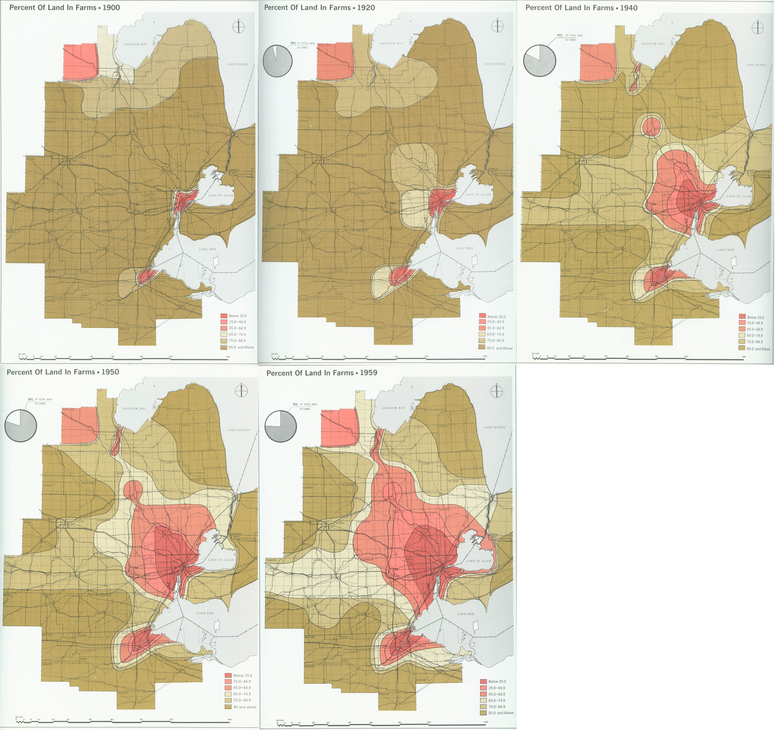
This beautiful series of maps, among many others, come from a three volume set of books commissioned by DTE in the 1970s titled, Emergence and Growth of an Urban Region: The Developing Urban Detroit Area. Constantinos Doxiadis was hired by DTE because of his focus on the “science of urban settlements” which he called Ekistics.

These maps help to show how the Detroit region shifted from an agricultural focus to industrial as population and industry grew over time.


Map: Detroit Transit Dependency Index

Screen Shot 2014-08-10 at 7.22.55 AM

This is another map from the research work of Nicholas Grisham, Terra Reed, and Kevin Shelton of the University of Michigan. As part of their deeper look into the Social Justice Impacts of Transit Reductions in Detroit, they developed a “transit dependency index” (TDI) index score for each Census Tract.

The TDI score is based on vehicle owership, elderly population, youth population, and median income within each Census Tract. The score doesn’t reveal any clear pattern across Detroit, but does show an interesting set of darker TDI areas along Detroit’s major avenues: Woodward, Grand River, and Gratiot. These routes have some of the highest bus ridership, but due to the nature of Census Tracts, might not make sense for all residents of Detroit.


Detroit Flood Insurance Map 1981

Detroit FEMA 1981

This map (with an interesting take on the Detroit border) is unfortunately timely in its discovery after the recent flooding. The map is a part of a 1981 study of flood insurance and flood plain issues in Detroit.

“This Flood Insurance Study investigates the existence and severity of flood hazards in the City of Detroit, Wayne County, Michigan, […]”

The study was to cover areas of low development for potential upcoming flood risk as far into the future as 1983 and there was a focus on the shoreline because it was highly developed and “susceptible to flooding and erosion.” The report later notes that the shoreline area of the City of Detroit had a very low likelihood of flooding. There haven’t been ferry boats on Downtown streets since composite photography made some stunning fake postcards in the early 20th century.

Source: Detroit Historical Society

The 1970s also saw some serious flooding:

“One of the most sever recent storms which affected the eastern portion of Detroit occurred on November 13 and 14, 1972. Storms on these dates, combined with a high lake St. Clair level, caused flooding which inundated approximately 800 homes within the city. This resulted in gross property damage estimated at $2 million. The storm of March 17 and 18, 1973, inundated an estimated 600 acres of the urban Detroit area.”

The study’s final recommendations were to develop a floodway that could handle a 100-year flood. It seems that the recommendations of this report were not followed.


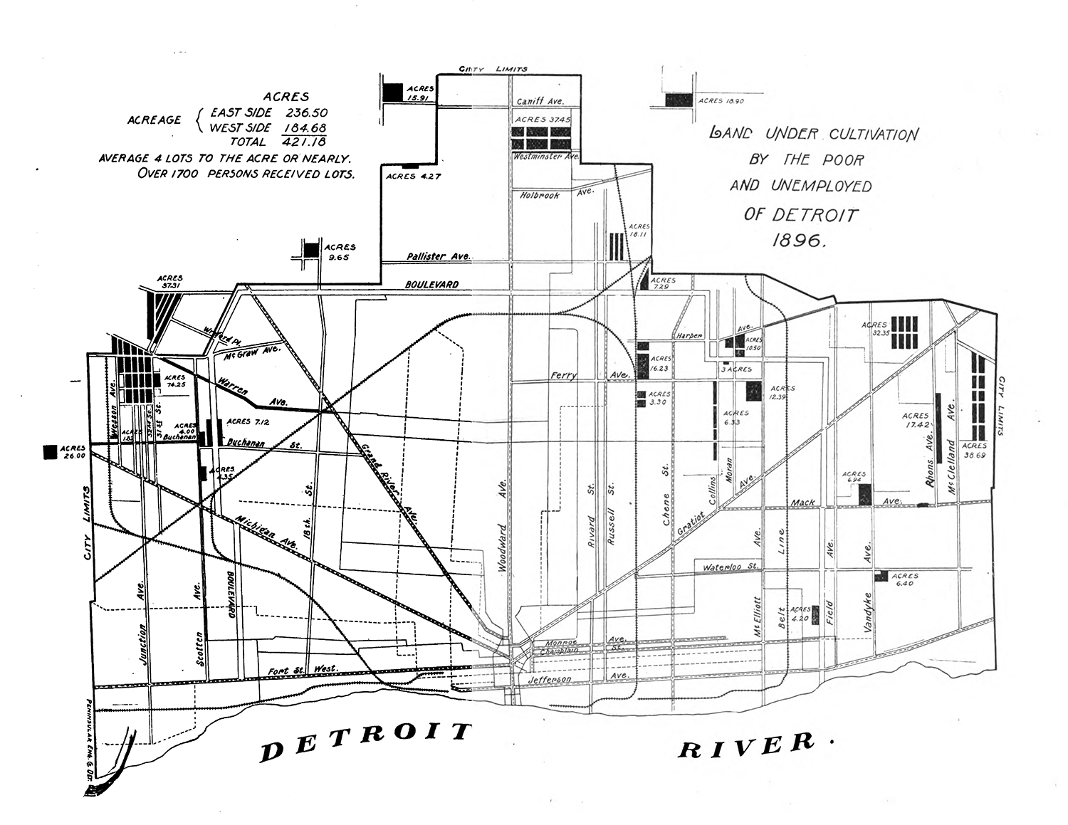
Map: Detroit Pingree Potato Patches 1896

pingree_patches_1896Mayor Hazen Pingree launched an elaborate plan to help employ and feed Detroit residents affected by the economic depression of 1893, which was a result of overbuilding and financing of the railroads. In the Report of Agricultural Committee of the cultivation of idle land by the poor and unemployed, John Conline recommended:

“[…] that the city purchase, if practicable, 200 or more acres of land on either side of Woodward avenue, to be used as farms, fenced and provided with inexpensive store houses for tools, seeds, etc. with an intelligent overseer or superintendent for each division.

In short, have the Pingree Detroit Plan so systematically arranged in advance in all its details, that work which is now spread over six weeks, can be concentrated into one week or less time, and the entire issue of lots and seed be confined to a single day.

These farms can, as the city becomes larger, be converted into parks.”

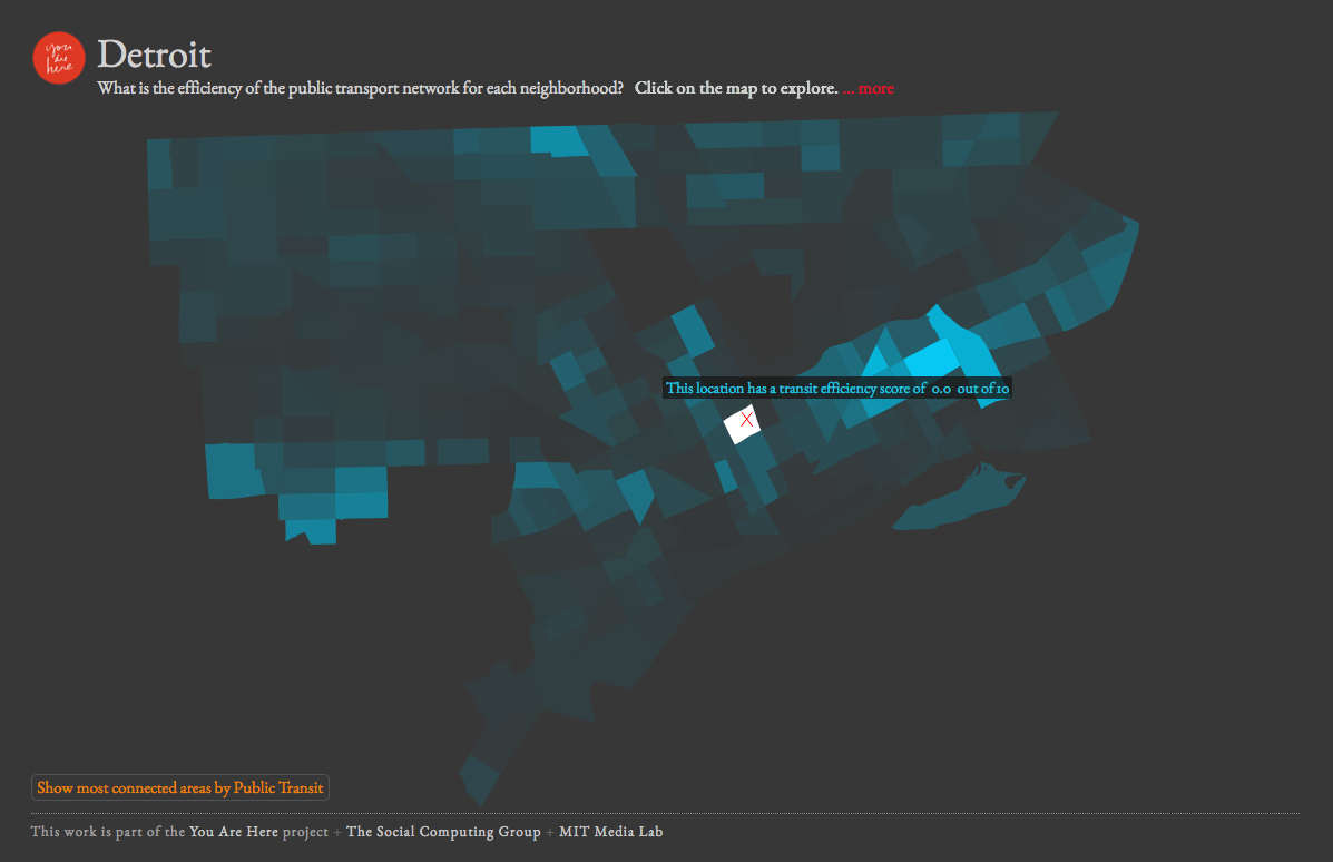
Map: Detroit Transit Efficiency

transit_efficiency_mit

This is another project that comes from MIT Media Lab’s You Are Here that looks at transit efficiency. This one I have less of a problem with than StreetScore. There are glaring issues with public transit in Detroit and this map helps to show how much the system is potentially failing large sections of the city. The missing piece is obviously anecdotal information about how long it really takes to get from one point to another on DDOT buses, such as: wait times, delays, no buses, etc. My only critique would be to include some reference roads and streets because no one knows their Census Tracts. The pictured tract received a “transit efficiency” score of 0.0 out of 10.0. It happens to be the Census Tract where I currently live and indicates that I would need to walk a while before being able to efficiently use public transit.

“This map visualizes the efficiency of the public transit infrastructure for different neighborhoods in the city. For each point in the city, we query the times it takes to reach every other point by riding public transit and by driving a car. We then divide the former with latter. This ratio represents the efficiency of a transit system. We normalize each scores by dividing it by the maximum ratio in a city and multiplying by 10, giving a relative transit efficiency score for each neighborhood. Darker areas (closer to 0) are transit deserts where cars are a necessity, while lighter areas (closer to 10) are places where public transit represents a more viable alternative.”

Map: Detroit’s Black Neighborhoods 1940

scan0005

This map appears in The Origins of the Urban Crisis by Thomas Sugrue. It is often easy to forget that most of what is exciting and “happening” in Detroit today once represented the pinnacle of the Black middle class in America. Paradise Valley, extending from the Riverfront nearly to Highland Park, grew after Black migration to Detroit after WWII. It was a hot spot for music, entertainment, and also the seedy covert businesses that go along. The flip side of all of this was that these areas were also representative of the worst housing and conditions because Blacks were not allowed to live or buy homes anywhere else. This often led to overcrowding, disease, and concentration of poverty. This was the oldest housing and prone to fires. Sugrue notes that Paradise Valley represented 12% of the city’s housing, but one third of all fires. The Lower Eastside was also referenced as the “rat belt” because there were 206 rat bites between 1951-52.

The Westside neighborhood around Tireman and Grand Blvd. was where many sought to get away from the overcrowding. These families represented more upwardly mobile black families (ministers, business leaders, professionals) who took great pride in their “high-level” homes and neighborhood.

Eight Mile-Wyoming was an area settled by Black migrants in the 1920s when it was still empty farmland. Families built temporary homes and usually farmed the adjacent vacant lots.

Conant Gardens was considered the most exclusive Black neighborhood where residents had the highest incomes and the majority owned their own homes. Residents here actually sided with White homeowners in opposing the Sojourner Truth housing complex because it would bring down their exclusive status.

Source: Sugrue, T. J. (2005). The origins of the urban crisis: Race and inequality in postwar Detroit. Princeton University Press.

Detroit Bus Ridership Map 2013

ddot_bus_2013

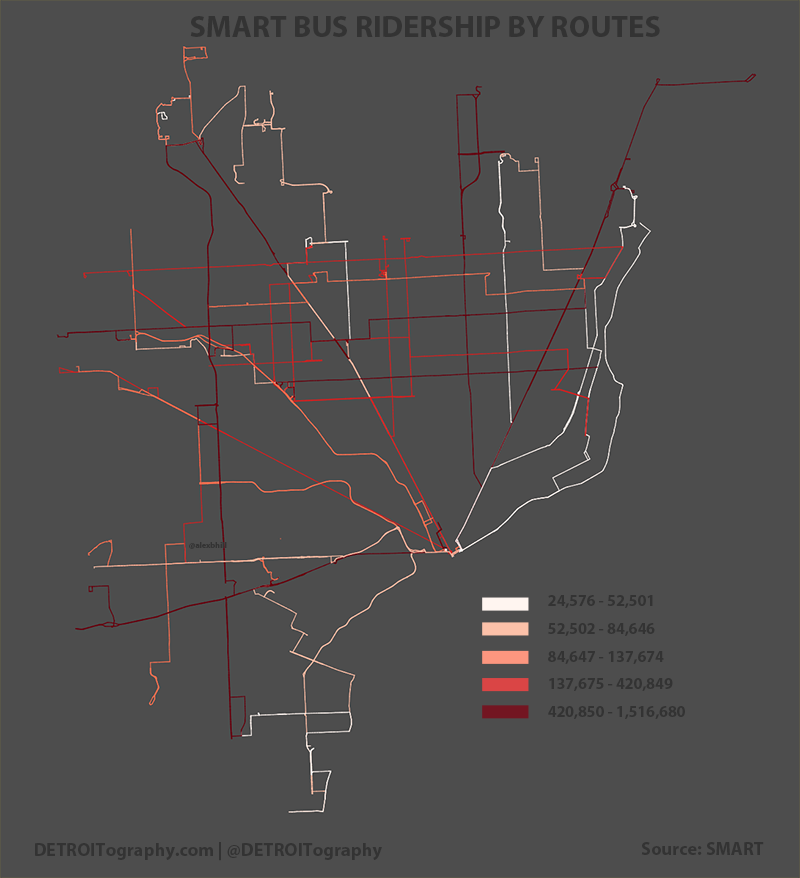
After looking into the DDOT data via TextMyBus for a while, I had been very interested in ridership and where people were riding the bus the most. All the issues with DDOT aside, my main question was: ‘what routes were transporting the most people.’ The data that I have obviously doesn’t account for where people got on or off, but rather an aggregate number of riders for the year on a particular route. Not surprisingly, the busiest routes are on Detroit’s main artery roads:

Agency Route Num Name TOTAL
DDOT 53 Woodward 3,029,371
DDOT 16 Dexter 2,549,735
DDOT 21 Grand River 2,399,730
DDOT 34 Gratiot 2,038,153
DDOT 45 Seven Mile 1,573,339

The crosstown routes were also busier than others with 7 Mile, 8 Mile, Crosstown, and Jefferson routes all moving at least 1 million riders.

The top SMART routes also follow Detroit’s main arteries (Gratiot, Michigan, Grand River), but tend to have an expected focus on routes that travel North-South from suburbs to city, such as Van Dyke or Southfield-Greenfield. With the passage of the recent SMART millage, these data show that SMART is an important connector for many people to travel between the city and suburbs and vice versa.

smart_bus_2013

Map: Educational Achievement Authority Schools in Detroit

EAA-school-map2

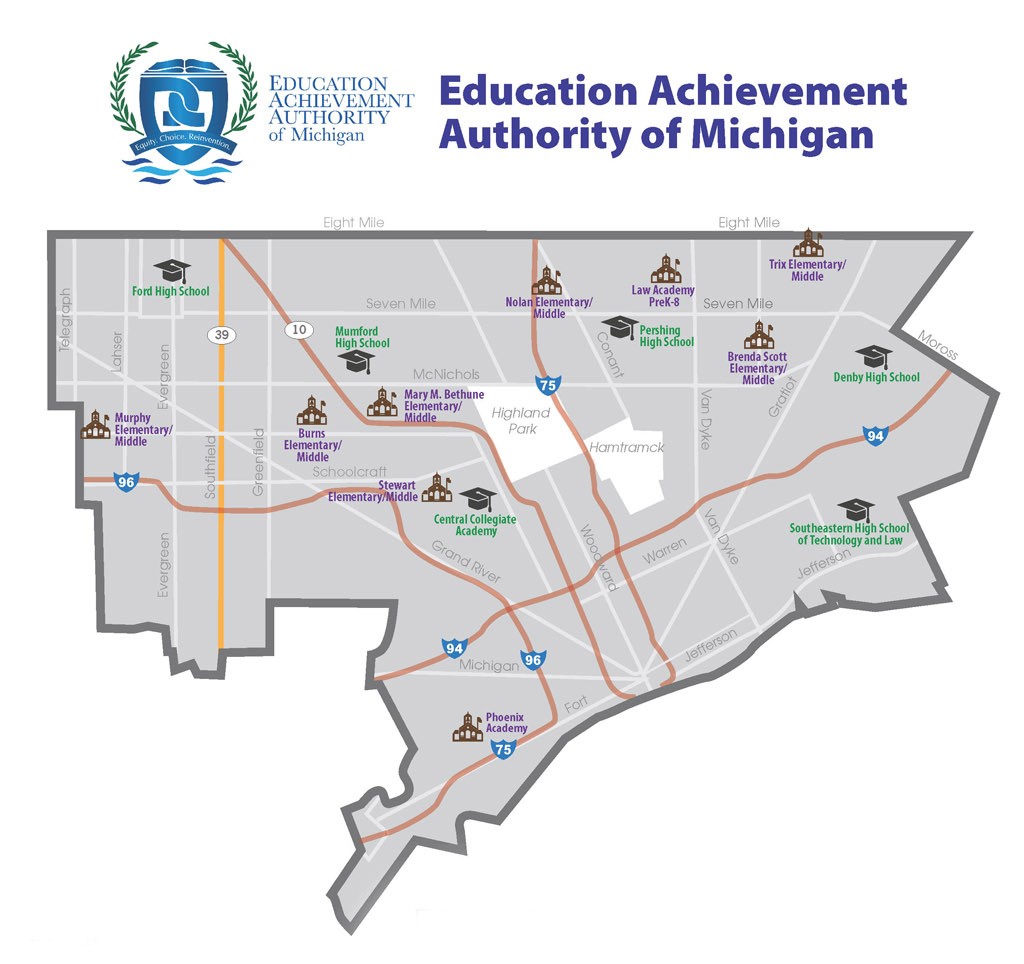
The controversial Educational Achievement Authority (EAA) was established by Governor Snyder as a statewide school district for failing schools. However, the EAA only consists of Detroit Public Schools and has faced difficult legal, financial, and safety concerns through its operations. The most alarming fact that demonstrates that people are not happy with the program is that EAA schools have seen student enrollment drop drastically (24% drop in enrollment).

There doesn’t seem to be anything geographically significant within the city limits. There are notably no EAA schools near the Downtown/ Midtown areas of “revitalization.”

EDIT: 08/07/14 Read this excellent look into the world of charter school profiteering in Detroit, The Charter School Profiteers