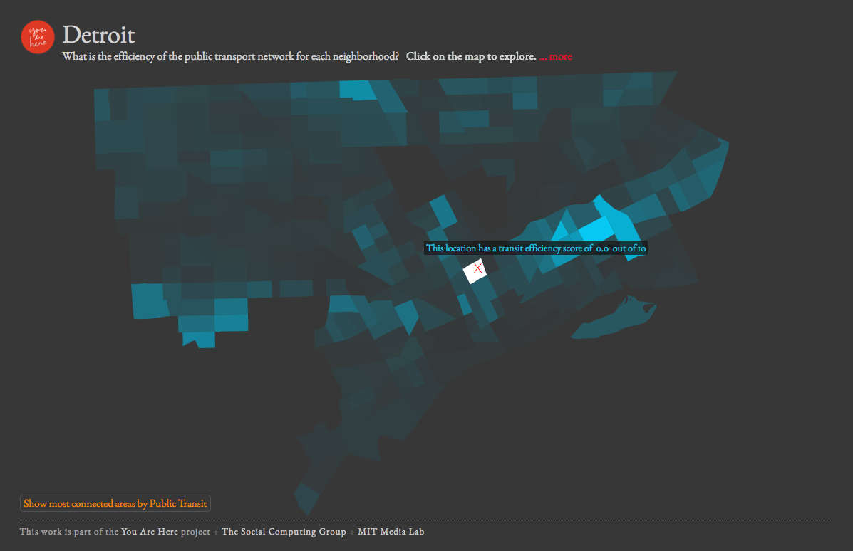
This is another project that comes from MIT Media Lab’s You Are Here that looks at transit efficiency. This one I have less of a problem with than StreetScore. There are glaring issues with public transit in Detroit and this map helps to show how much the system is potentially failing large sections of the city. The missing piece is obviously anecdotal information about how long it really takes to get from one point to another on DDOT buses, such as: wait times, delays, no buses, etc. My only critique would be to include some reference roads and streets because no one knows their Census Tracts. The pictured tract received a “transit efficiency” score of 0.0 out of 10.0. It happens to be the Census Tract where I currently live and indicates that I would need to walk a while before being able to efficiently use public transit.
“This map visualizes the efficiency of the public transit infrastructure for different neighborhoods in the city. For each point in the city, we query the times it takes to reach every other point by riding public transit and by driving a car. We then divide the former with latter. This ratio represents the efficiency of a transit system. We normalize each scores by dividing it by the maximum ratio in a city and multiplying by 10, giving a relative transit efficiency score for each neighborhood. Darker areas (closer to 0) are transit deserts where cars are a necessity, while lighter areas (closer to 10) are places where public transit represents a more viable alternative.”

How many people actually live in that tract with the zero score? Doesn’t seem very efficient for a broke city to send buses into empty neighborhoods.