Detroit Timelapse 1984-2012

detroit_timelapse

View it here: http://earthengine.google.org/#timelapse/v=42.33549,-83.05551,10.812,latLng&t=0.30

A collaboration between NASA, the USGS, TIME, Google, and the CREATE Lab at Carnegie Mellon University brings us this time-lapse GIF mapper of the whole world. It’s possibly the most distracting thing ever. Basically, it allows you to watch the 28 years between 1984 and 2012 go by at any point on earth. Let’s go to Detroit. It’s somewhat blurry, but we want to know what you see changing over the years. Look for changes at Belle Isle, the northern area of Downtown losing its buildings, the emergence of theConnor Creek Industrial area on the east side, and the construction of theGateway Project at the Ambassador Bridge. (via CurbedDetroit)

Heatmap Walkscore in Detroit

detroitwalkscore

Walkscore has screwed over the city of Detroit. Their algorithm is grabbing data from restaurants in Canada giving downtown a very low walkscore and lowering the overall score of Detroit. You can see the incorrect calculating along the river.

Beyond this messed up algorithm, no one has really commented on how Midtown is the only area with high walkability in the city. Yet, I see people walking all the time in neighborhoods beyond Midtown/ Downtown. I know Midtown is also the area with highest income and likely that it is the area of the city with the most commuters/ access to personal transportation, and student populations. How can we improve the walkability and safety of neighborhoods to improve health and community?

Detroit Average Neighborhood Rent Prices

DET_rentThis map represents an inadequate data set, but provides an interesting picture nonetheless. I was really curious about rent around the city when my wife and I were apartment searching in Sept. 2012, I found the data from Zillow and decided to put it together. Zillow updates their data each week, so this is from data accessed on 18 Feb 2013.

Many activists in Detroit have commented that there needs to be rent control in the city or we will lose the diverse make up of our neighborhoods. What many people don’t realize is that Cass Corridor/Midtown used to have the highest rate of concentrated poverty in the nation, and had the most drug and violent crime in Michigan. It wasn’t until gentrification in the 1990s led to redevelopment and we now see the hip, young, focus on the heart of Detroit’s renewal.


Detroit Streetviews 2009 to 2012

goobing

This is an excellent blog on the sense of how place matters in Detroit. There are just a few comparisons up currently, but this is an excellent project looking at changes over time. I chose to include the above image because I found the juxtaposition striking. It is also an interesting exercise in data collection between Google 2009 and Bing 2012.

A lot can change in 3 years.

More at goobingdetroit.tumblr.com

Detroit Future City Transit Planning Map

dfc-transit

This map was included in a “Detroit Future City” strategic framework highlights handout. I found it very interesting that it included a lot of “Tier 1” bus rapid transit (BRT) routes along major roadways: Michigan Ave., Jefferson, Grand River, Gratiot, and Woodward. However, yet again in transit planning it looks like the Rosa Parks bus terminal was overlooked. There seems to be a bus icon where the Rosa Parks terminal is roughly located, but there is a large “Transit Node” circle right in the middle of downtown – where there is no space for a transit node, unless you build it in Hart Plaza.

There is no mention in the report highlights that the light rail plan is disconnected from the bus routes, or that more funding is being pumped into expressway expansion (I-94)  versus public, regional transit.

“It was the lack of consideration given to truly multimodal, transit-oriented solutions that prompted Transportation Riders United, a Detroit transit advocacy group, to write a scathing 53-page response to MDOT’s draft Environmental Impact Statement.”

Read more on ModeShift and a list of planned demolitions as part of the I-94 expansion.

Detroit Fictional Neighborhood Map Print

10319_70471774998_2818278_n

This is a really nice art print of Detroit’s neighborhoods by Chicago-based typographer Jenny Beorkum’s Ork Posters. However, there are some discrepancies and constructions. As Timothy notes, some are just made up.

Recently, Detroit’s Long Term planning efforts have pushed the renaming of a historic neighborhood in Detroit, Hubbard Richard neighborhood is now being referred to as Corktown Shores.

Who gets to name neighborhoods? Google Maps, property developers, City Officials, or residents of those areas? This will be a critical debate and effort as Detroit attempts to rebuild. I vote that the people who live there get to decide and history must be referenced.

Detroit Homicide Map 2012: Liquor, Parks, & Homicide

DET_homicide_map

411 homicides, 1130 active liquor licenses, 350 city parks

The goal of this map is to demonstrate the relationship between homicide, locations where alcohol is sold/ consumed, and community green spaces.

Research shows corner stores/ convenience stores don’t necessarily have a negative effect on violent crime. However in higher income neighborhoods corner stores are seen as a positive, while the opposite is true in lower income neighborhoods. I also began noticing that a number of homicides occurred at or near clubs and liquor stores.

A great deal of research has also been conducted on the benefit of turning vacant lots into parks or green spaces in order to reduce violent crime. The most important aspect of this, however, is that community parks are beneficial in reducing violent crime when they are maintained. Many city parks in Detroit are not able to be maintained.

I wonder if Greening of Detroit has any data on areas that they have “greened” and if there is any association with reduced violent crime?

Note: This map was made before the city announced closing down parks and limiting maintenance. Additionally, there will be a regression analysis of homicides to liquor stores (excluding bars and restaurants) soon.

Data sources: City Parks (edited), Detroit Data Collaborative | 2012 Homicides, Detroit Crime and Homicide Group/ Cham Green | 2012 Active Liquor Licenses, Michigan LARA

DET_homicide_2012

Detroit at Night from Space

cmdr_hadfield_detroit

Thanks for Canadian astronaut, Commander Hadfield, we now have this incredible image of Detroit at night from the International Space Station. I’m not sure if there has ever been a picture taken of Detroit from space besides satellite images and none can even be compared to this one.

HT @Rob_Linn

Detroit Ribbon Farms Map 1796

Detroit1796

Detroit in 1796 was little more than a series of ribbon farms between the Detroit River and the woods, adjacent to Fort Detroit. The city has recently passed an urban agriculture ordinance to allow urban community and personal gardens. Is Detroit getting back to its roots?

The size of ribbon farms can vary from lot to lot and from place to place. In Illinois, these lots could be a quarter mile or more long and only 30–40 feet wide. Near Detroit, the ribbon farms were about 250 feet wide and up to three miles long.

Farmers of ribbon farms typically, although not universally, built houses on the farm along the river such that the houses on a series of ribbon farms were located near each other.

The French government initially enticed its citizens to move to the “New World” by offering free farmland in 1765. In the year of this map, 1796, Detroit passed into US control under the Jay Treaty.

War gardens were a major facet of life in Detroit during World War II. Mayor Coleman launched the Farm-a-Lot program to 1970s and the Boggs Center launched Gardening Angels in the 1980s to repurpose vacant lots. Now there are a host of gardening programs and organizations continuing the work of the Boggs Center and Coleman with others attempting to create an industrialized farming system in the city’s empty spaces. Farming, gardening, and growing have never been far off from Detroit’s roots regardless of the machinery produced in the city known for its motorized might.

Map of 51 Detroit City Parks Closing

DET_Parks

51 City Parks Closing, 37 to receive less maintenance

  • Dark green are existing parks that are not slated for closure
  • Light Green are parks that will be maintained less
  • White are parks that are closing

Detroit will still have a wealth of city park space after today’s announcement, but it was surprising to see Romanowski Park, Butzel (near Rec Center), and Grand Circus Park on the list of closing parks. It is very unclear what closure or low maintenance will mean. It is also debatable that these parks were already seeing low to no maintenance.

Source: “A list of the parks to close or receive less maintenance” Detroit Free Press, 2/1/13

DET_Parks_786922

Thanks to Matt’s suggestion:

@MattH : Do you have the parks outlines? Would be cool to render those to show size / scale.

Detroit Minimalist Bicycling Map

bike_det

Part of my Michigan Bicycle Cities series, this map is made to show the emphasis on biking in Detroit (or rather the new emphasis on biking in Corktown and SW Detroit).

I saw this idea over at Paste in Place by Ryan Sullivan and it really got me thinking about the cities that I’ve biked in most and how they measure up to other cities around the world. Michigan has a long way to go, but these cities all have great bicycle cultures. I decided to add a circle around the cities because they don’t really have cool bodies of water to fill the negative space, just rivers that run through them. All lines are bike lanes, bike paths with signage, or multi-use bicycle trails.

Source: City of Detroit, Non-Motorized Master Plan

Map the Crap out of Detroit (Part II)

When: March 13th, 2013

Where: Loveland Technologies, Department of Alternatives, 1514 Washington & Clifford

What:

Round 2 of our 2013 meetups discussing city mapping, data sharing, land use policy, and neighborhoods++. Last time was an awesome (optionally wine- and beer-fueled) round table of 25 people talking about this, that, and the other interesting Detroit thing. This time we’ll also have some 5-7 minute project presentations to seed the conversation. There are a few presenters lined up — to be announced when their pencils turn into pens — but if you also want to share, let us know you care.

Map: Detroit Racial Divide 2000

5560480146_5c3a709d84_z

Likely one of the best known maps of Detroit, this map created by Erica Fischer as part of their “Race and Ethnicity 2010” series representing one dot for a group of 25 people of the same race shows the deep racial divides in Detroit metro area. Hamtramck stands out as a diverse island in the middle of Detroit, but otherwise there is s sharp line at 8 Mile, the City’s northern border.

Sources: Erica Fischer

Personal Cartography in Detroit, 2012

detroit_2012

Many cartographers like to take inventory of their personal cartography near the year end. I figured it would be a fun experiment to map my own personal journeys and travels of 2012 on top of my foursquare check-ins.

I had to reconstruct my travels from my Google Calendar and Foursquare check-ins after losing all my GPX data when my Garmin was stolen out of my car. I think this made the exercise that much more interesting and challenging.

Being a community health worker, I was driving all over the city and metro area every day. Data shows that I typically use I-96 and usually check-in at locations in Midtown. Sadly, my job doesn’t let me walk or bike very often. I am resolved to ride my bike more in Detroit during 2013.

Source: original post

De Troit a la Mondrian

mondrian_detroit

While looking at the 2010 census data on population density and the percentages of change between 2000 and 2010, I kept imagining the Detroit census tract grid in the style of Dutch painter, Piet Mondrian. He began painting his primary color grid works while studying in Paris.

Then I saw this Mondrian world map and went for my own version of Detroit’s percentage of population change.

Zipcodes of Detroit Map

detroit_zipcode

This was a fun typographic/ numerical mapping idea that I thought of the other week and decided to make it happen. It took a bit of time, but turned out how I imagined.

The Crayola Crayon colors that I used are: Blue Gray, Brick Red, Burnt Sienna, Canary, and Granny Smith Apple.

Reference: Zip Codes | GIS Maps | City of Detroit

Detroit Downtown Population Growth

detroit_ann_arbor

Many recent maps have highlighted the population loss of Detroit. Although the Census data and population loss is disputed, the interesting bit highlighted by this map (that does not have a legend or map key #fail) is that it shows population growth in the downtown region (blue) surrounded by a sea of population loss (red) with growth in Detroit’s suburbs.

Not many maps have taken time to demonstrate that there are some areas of population growth in Detroit, however this is largely due to new incentive programs to live near downtown Detroit and the influx of some large corporations who also incentivize employees to live in the city.

Source: Stephen Von Worley | http://www.datapointed.net/visualizations/maps/growth-rings/detroit-michigan/

Detroit’s Income Inequality from Space

detroitsquaremile

Firstly, this was not my idea, but I wanted to test it out in Detroit. Tim De Chant posted on Per Square Mile that inequality can be visualized from space via satellite images on Google Maps/Earth. He previously wrote about the concept that the lack of urban trees represented the absence of wealth in certain areas of a city.

“Research published a few years ago shows a tight relationship between per capita income and forest cover. The study’s authors tallied total forest cover for 210 cities over 100,000 people in the contiguous United States using the U.S. Department of Agriculture’s natural resource inventory and satellite imagery. They also gathered economic data, including income, land prices, and disposable income.” (source)

The research basically stated that with an increase in income the demand for trees increased likewise decrease in income showed a decrease in demand for trees. As De Chant writes, the authors found that trees were seen as a luxury item.

This all made the gears turn in my head about how this research and De Chant’s image grabs from Google satellite imaging applied to Detroit.

48205 Osborn (“Deadliest” Zipcode)


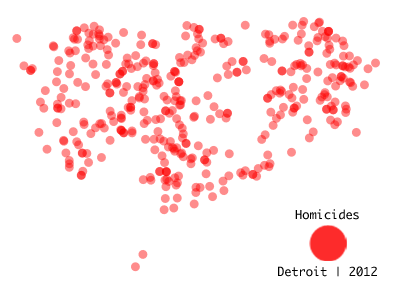
I choose 48205 because, “The neighborhood of 44,000 residents accounts for 6 percent of the city’s population, but was home to 15 percent of its murders and 13 percent of its shooting victims.”
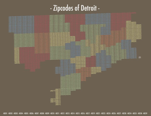
48221 Palmer Woods

I used to live in this zipcode, in the University District. I would often run around the Palmer Woods neighborhood because I was fascinated by how different running south past 6 Mile Rd. and running north above 7 Mile Rd. could be such different environments. Census data pegs this zipcode as one of the highest income areas of the city.

The idea seems to work well in Detroit neighborhoods, however the Greening of Detroit is working hard to plant more trees every day in both wealthy and poor neighborhoods.

“Between 1950 and 1980, around 500,000 trees were lost in Detroit to Dutch Elm disease, urban expansion and attrition. During that same time period, economic constraints prohibited the city of Detroit from replacing those trees. […] In 1989, Detroit, a typical American city, was losing an average of four trees for every one planted.”

The organization is estimated to have planted over 65,000 trees since its inception in 1989.

Cross-posted from Alex B. Hill