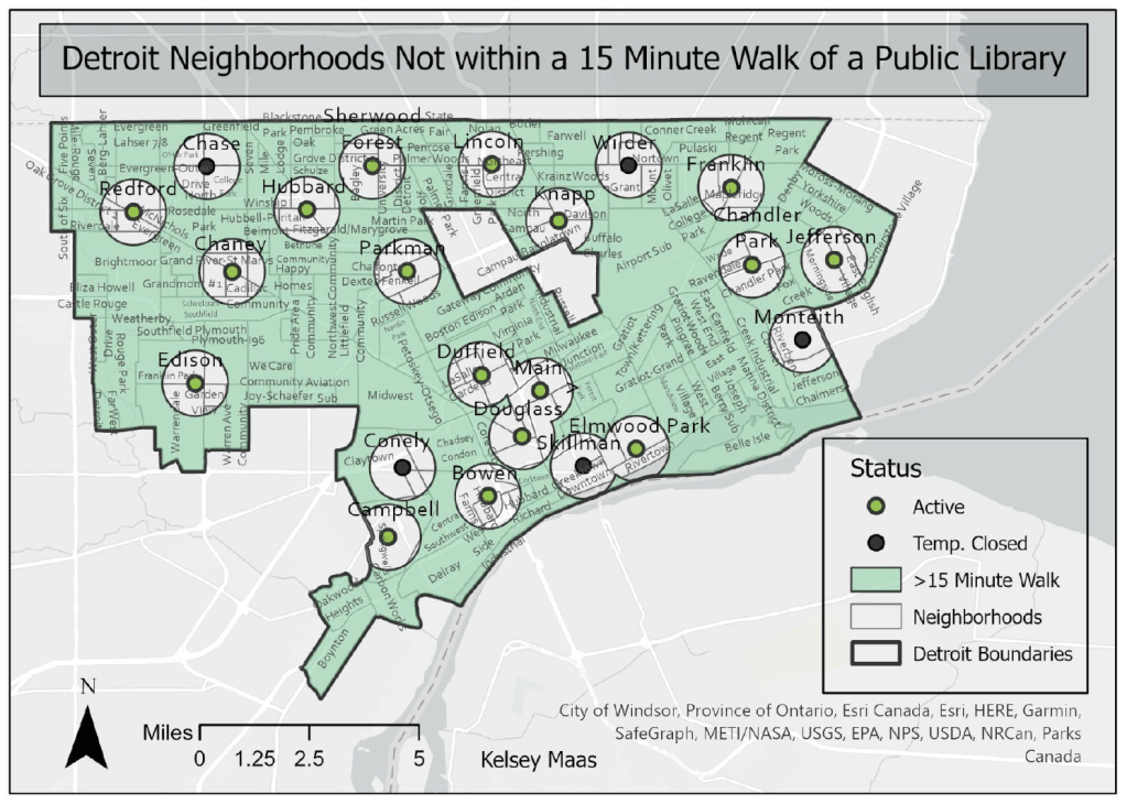
by: Kelsey Maas, Wayne State University (Intro to GIS, Fall 2024)
Public libraries have long served the people of Detroit. The first public library opened in 1865 in the Old Capitol building. Due to extensive population growth, the City constructed its first library branches to meet need. Eventually, eight more branches were created from funds from the American Industrialist Andrew Carnegie with the last Carnegie branch approved by the City Council in 1917. More branches continued to be built to serve the growing city well into the twentieth century. Eventually, the appearance of new branches ceased as the population shrank in the mid-twentieth century.
More recently, public and community resources (library branches, public schools, etc) have reduced due to the loss of Detroit residents and disinvestment. As Detroit is geographically large (143 mi), this means residents must travel further to access public amenities. Additionally, limited public transportation options and frequency, further adds to access issues. This project aims to examine who can walk to Detroit Public Libraries and who is left out through a spatial lens. The boundaries are the City of Detroit’s borders. It will highlight the neighborhoods served and underserved by Detroit Public Libraries.
The concept of the 15 Minute City helps to frame walkability. The term was coined by urbanist Carlos Moreno and remains a popular framework for evaluating the livability of cities. The 15 Minute City is an ideal urban environment that is structured at a human scale where residents can get to their everyday needs within a 15 minute walkable or cyclable travel radius. Community benefits from a 15 Minute City design consist of socioeconomic equity (residents are not limited if they do not have a car), less vehicle dependence (reduces carbon emissions), increased walking and biking (better health), and increased standards of living (conveniently located services).
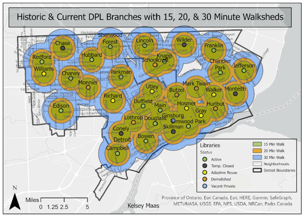
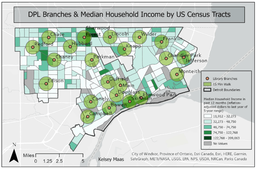
The Detroit Public Library system currently has 22 physical locations. Of these branches, five are temporarily closed. The first set of maps illustrates which Detroit neighborhoods are serviced within a 15 minute (0.75 mile), 20 minute (1 mile), and 30 minute (1.5 mile) walk of a library branch. The map’s buffer distance was calculated per the 15 Minute City framework and methodology.
The maps include both the active and temporarily closed branches with the understanding that the five temporarily closed branches will reopen in the coming years.
by: Andrew Chiles, Wayne State University (Intro to GIS, Fall 2024)
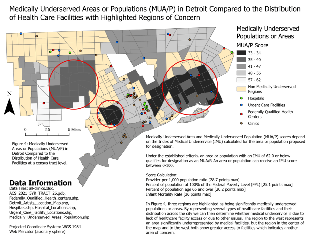
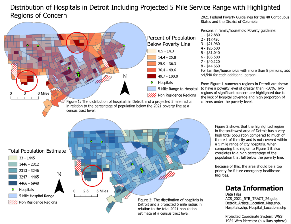
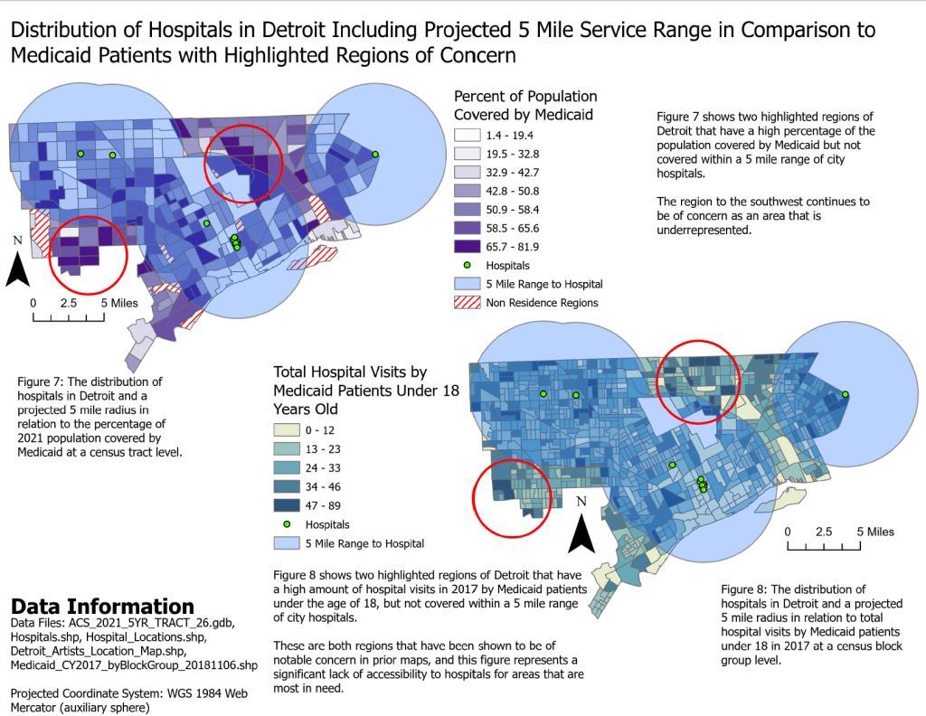
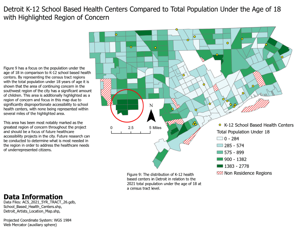
Access to healthcare is a crucial aspect of public health outcomes, even more so in urban areas such as Detroit, where socioeconomic disparities can influence who receives adequate medical care. This project will focus on examining access to healthcare facilities across Detroit, through the use of geospatial data analysis. Specifically, I would be seeking to answer how the spatial distribution of healthcare facilities in Detroit corresponds to varying demographic dynamics within the city, and what gaps exist in terms of healthcare accessibility.
By examining the geographic placement of hospitals, clinics, and other healthcare facilities in Detroit and overlying the data with population metrics and health outcomes, we can identify areas that are underserved by healthcare services and/or disproportionately affected by preventable or manageable diseases and health issues.
This topic is significant in regard to discussions on health equity and urban health disparities. Detroit has been deeply affected by systemic racism in the past and continues to have the lingering effects. This research may help to showcase how it is rooted within public health. The results of which can inform public health initiatives aimed at improving healthcare accessibility and reducing illness prevalence in vulnerable communities.
The geographic focus of the project is the entire city of Detroit, with a detailed analysis at the neighborhood or census-tract level. Detroit is characterized by it’s extremely diverse neighborhoods and communities, many have been shaped by historical patterns of disparities and economic disadvantages. By focusing on the entire city, we are able to capture the spatial variations in healthcare access and diseases to explore how they differ across different parts of the city. Neighborhoods of specific interest or concern will be highlighted and focused on to showcase these disparities across the city.
The data used in the project is from DetroitData and Data Driven Detroit (D3), catalogues of opensource data for the Detroit community, as well as the 2021 TIGER/Line Demographic and Economic Data and 2020 TIGER/Line zip code tabulation areas from the US Census Bureau. Additional reference material comes from the US Department of Health and Human Services – Office of the Assistant Secretary for Planning and Evaluation (ASPE) and the Health Resources & Services Administration (HRSA).
by: Yanyun Li, Jered Dean, Houjon Ding, Raven Wright – City of Detroit
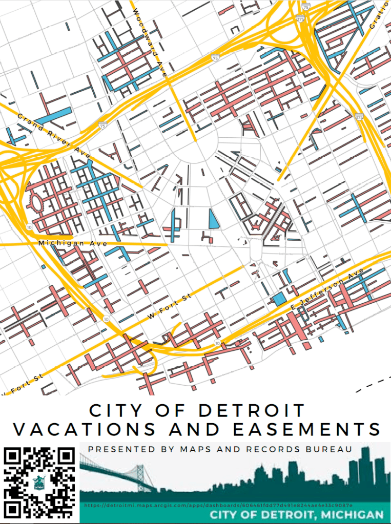
This layer indicates all streets and alleys vacated ‘Outright’ and vacated with conversion to utility easement in the City of Detroit. This layer is updated regularly.
by: Steven Wiltse, Martin Denicolo, Zachary Manning, Kevin Zhang, Tess Parr – City of Detroit
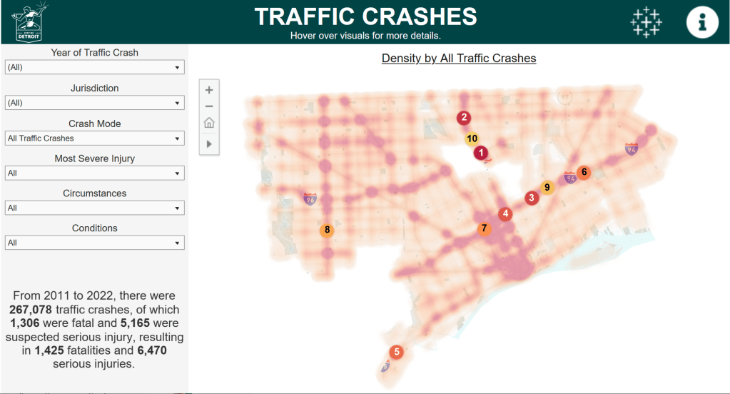
The City of Detroit has launched its Open Data Portal Analytics initiative in order to increase public access and understanding to valuable data and information that is posted on the Open Data Portal as raw datasets.To that end, the Traffic Crashes dashboard was built to visualize 267,078 traffic crashes that occurred in the city of Detroit from 2011 to 2022. The dashboard’s visual elements include a heatmap of traffic crashes with top 10 intersections, a highlight table of crashes by time and day of the week, and a histogram of crashes by type.Users can apply filters on the dashboard to explore deeper trends in the data. Drill-downs include the road jurisdiction, modes involved (e.g. automobile, pedestrian, bicycle, etc.), most severe injury to occur, circumstances involved in the crash (alcohol/drug use, red light running, speeding, etc.), and conditions at the time of the crash (rain/wet, snow/ice, dark-unlighted, etc.). The filters dynamically change all the elements on the dashboard, including written descriptions.The Traffic Crashes dashboard was built in Tableau Desktop and embedded in an ArcGIS Experience Builder application.
by Kelsey Maas & Megha Bamola – City of Detroit, Historic Designation Advisory Board (HDAB)
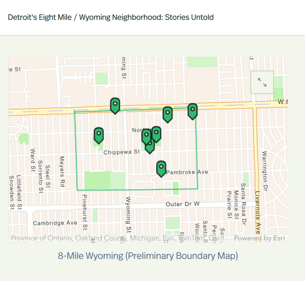
Detroit’s Eight Mile-Wyoming neighborhood is the oldest Black neighborhood in Northwest Detroit. The neighborhood signified a starting point for many working-class Black Detroiters; one of homeownership, hopeful revitalization, and a sense of community. Numerous resources remain in the community that highlight significant moments in African American and Civil Rights history. We invite you to explore these sites with us and learn more about the people and places of Eight Mile-Wyoming! This Story Map was a part of the Eight Mile-Wyoming Intensive-Level Survey project and was supported in part by an Underrepresented Communities grant from the Historic Preservation Fund administered by the National Park Service.
by: Yanyun Li – City of Detroit, Department of Public Works (DPW)
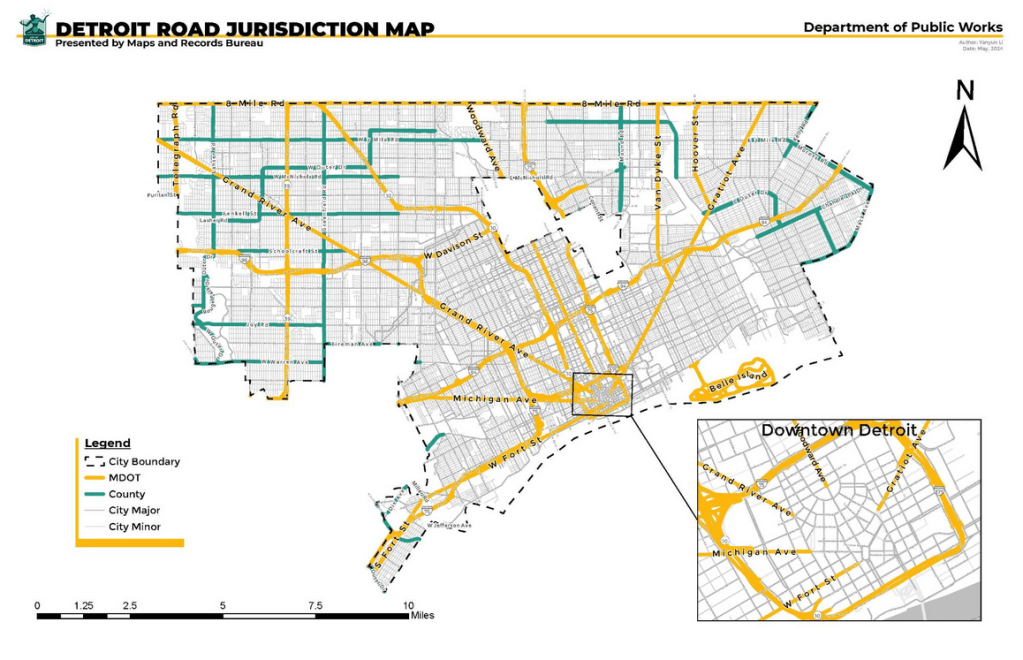
The jurisdiction map of Detroit delineates city, county, and MDOT territories. City-owned roads include city minor and city major. MDOT’s highways serve as vital conduits linking Detroit to broader networks. This map will serve as a valuable tool for promoting efficient city right-of-way governance, fostering collaboration, and guiding urban development.
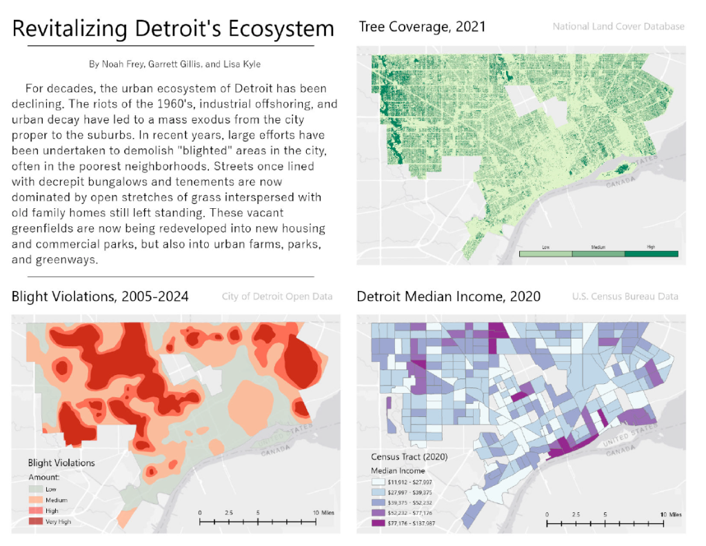
by: Lisa Kyle, Garrett Gillis, Noah Frey (Wayne State University)
We chose to focus on the present development of Detroit because, in our view, the city is at a crucial precipice. The latter half of the 20th century was not kind to our city — but recent blight removal projects give us a unique opportunity. That opportunity is, of course, to rebuild the city with modern values and sustainability in mind.
In terms of visual presentation, this project contains three maps representing different aspects of Detroit’s urban environment. We wanted the layout of the poster to be colorful, yet sleek and organized. Each map is laid out in an array so as to provide easy reference to the others. No dataset exists in a closed environment; trends, history, and real world knowledge can be obtained from a close look.
Other Research: – U.S. Census Data (2020) – Tree cover, National Land Cover Database (2021) – Detroit Daffodil Map – Bees in the D Map – City of Detroit Riverfront Trail Network Map
Detroit, once known as a tree-filled city before its urban decline starting in the 50s and the emerald ash borer invasion beginning in 2002, has experienced landscape change over the decades. Neighborhoods within a city can be defined by their people, setting, and character. Trees influence all three of these by improving the mood of residents, beautifying the landscape, and creating unique features. This map looks at neighborhoods with the highest tree canopy density (greater than or equal to 50%) and what we can learn about those areas because of their higher density.
Whether high tree density is lined on the streets of a neighborhood, occupy park space, or fill large backyards these areas can experience numerous benefits. From healthier environments to thermal control and from community cohesion to economic stability it is important for any urban environment to maintain and grow trees. Traveling in a neighborhood filled with sprawling sycamores and large oaks brings a feeling of tranquility and inspiration. Its clear the benefits of looming tree canopy in an area are extremely valuable. Let’s increase of tree planting efforts in Detroit for current and future generations to enjoy.
Detroit voters went to the polls (and ballot boxes) last Tuesday to decide on multiple ballot propositions and candidates for November’s general election. The unofficial results published by the city have the current turnout at 15.8% of registered voters, which matches primary turnout in past years.
This map includes Detroit precinct results for all races on Detroit ballots, but doesn’t include results for any precincts outside of the city. While incumbents and favored candidates generally won their elections, there’s some variation across neighborhoods for some of the more contested races including Democratic Senate and 13th District House Representatives.
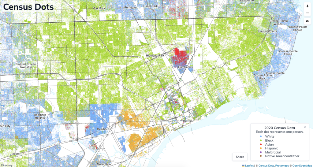
As a map nerd, I had loved Dustin Cable’s 2010 Racial Dot Map which he had created at UVA. I was saddened when this map left the internet, so as a way to get more comfortable using Census data and to learn some exciting new web map technologies, I decided to create an updated racial dot map using 2020 Census data.
Similar to previous dot maps, this map was created by combining two census data sources: the population counts published in the State Redistricting Data and the Shapefiles defining the census’s geographies. The decennial census provides population counts down to the census block level – an area roughly the size of a city block – enabling a fairly high degree of geographic accuracy. Dots are color coded based on the racial categories defined by the census. The dots within a given census block are placed randomly, which is why you might find some dots in unlikely places like parking lots or bodies of water.
The data comes together to create an extremely visually compelling map, both when viewed at the national scale and at the scale of individual regions like Metro Detroit. It often illustrates the stark divides that persist across much of the country.
The fictional Detroit Transit Authority rapid mass transit system consists of six (6) color-coded heavy rail rapid transit lines and 126 station stops that form a network of commuter routes connecting major points of interest in the city of Detroit with terminals in some nearby inner-ring suburbs and DTW airport. The majority of the system runs on two-track elevated concrete structures in the outer neighborhoods of Detroit with third rail power. In the more densely populated areas, commercial districts, downtown, and near major landmarks or freeway interchanges the routes descend into subway tunnels to bypass and avoid these things.
The DTA Rail System most closely resembles the newest parts of the Chicago ‘L’ both above and below ground. Resources from the Chicago Transit Authority (CTA) will be referenced in this brief. The track configuration expands from two tracks to three, four, or five tracks in some areas where routes run concurrently (to allow for bypassing), in areas where there is an extra siding track (for layups), and in the case of the Woodward subway, a fifth center track to provision for one-way peak direction express service. Switches are strategically located and periodically spaced to allow trains to change tracks.
The DTA Rail System is built completely independently of the existing transportation systems in Detroit: the People Mover and the M1 light rail system. The Detroit Transit Authority is a new state independent government agency established to succeed DDOT, unify Detroit’s transportation, and operate the flagship new rail system. It is largely subsidized by the state and Wayne County (but notably not Oakland or Macomb counties). DPM and M1 Rail come under this umbrella as does the DDOT bus system. The existing DDOT bus system routes are adjusted to better intersect the DTA Rail System and align with its departure schedules to make connections easy for riders. Bus Rapid Transit (BRT) lanes and stations will be added to Michigan, Grand River, and Gratiot where easy connections exist with the DTA Rail System like at Gratiot/Warren and Michigan Central. Some transfers exist between subway and elevated lines like at the Woodward/Warren station. The terminals are designed to be multi-modal with suburban SMART bus connections and provisions to connect to a future regional rail network.
Near the Yellow Line Terminal at Fairlane Dearborn. I imagine this 3-track terminal station making use of the vast property around Fairlane Town Center and adjacent to a park and ride lot. Maybe you see the mall or the old Hyatt in the background.
Where the Red and Blue Lines run concurrently in Southwest Detroit. This is a four-track elevated structure that runs just off of Fort St (along the north side of I-75). This view could include the Ambassador Bridge in the background. Junction is a transfer station with a double island platform arrangement. Clark and West Grand have single island platforms.
The Woodward Subway. I think it would be cool to show one or more underground stations on the Woodward Subway like District, Campus Martius, or Hart Plaza. Another view could include what the ground-level subway entrances on Woodward look like. Will have to discuss the platform arrangement at the transfer stations – perhaps they are double island or stacked side platforms.
Woodward/Warren area. The Red and Green lines run underground here and the Yellow Line runs above ground, making for an interesting view of the elevated-to-subway transfer. Maybe even a cutaway view. Notable Midtown buildings could be shown in the background here.
Outer Green Line. These views could present what the DTA system looks like running through a typical residential neighborhood. The curve between Dexter Linwood and McNichols could be cool to show. Another cool view could be the elevated structure passing over Oakman Blvd.
Alter Road Green and Pink Line Terminal. Right before this station on the Detroit side is one of the major rail yards which could be included in the view. This is another view where you could see what the system looks like traveling through a typical residential neighborhood.
This map imagines what a connected future of shared mobility and universal access could look like for Metro Detroit. It sets aside traditional assumptions and our current short-sighted approach to regional development and embraces a shift to a more sustainable, shared allocation of resources for transportation. It is lightly based on an earlier map I produced calling for a reduction in Detroit’s freeway system.
Paul Jones III is a Detroit native and graduate of University of Michigan’s Taubman College of Architecture & Urban Planning. He currently lives in Cambridge, MA where he works as a Community Planner for the U.S. DOT Volpe Center specializing in program development and capacity building. The ideas and views expressed are his own and reflect his ongoing passion for the intersection of history, urbanism, and transportation justice in Detroit.
I made this is fantasy transit map for Metro Detroit with a few goals in mind. My first step was to create a map that would both revolutionize transit in Metro Detroit while also being as realistic as possible given our state and region’s lack of investment and what current right-of-ways exist. This map is an attempt at a compromise between fantasy and realism. It also tries to challenge the idea that Detroit is too decentralized to have good regional transit by showing that a good system can be achieved by going through the heart of Detroit.
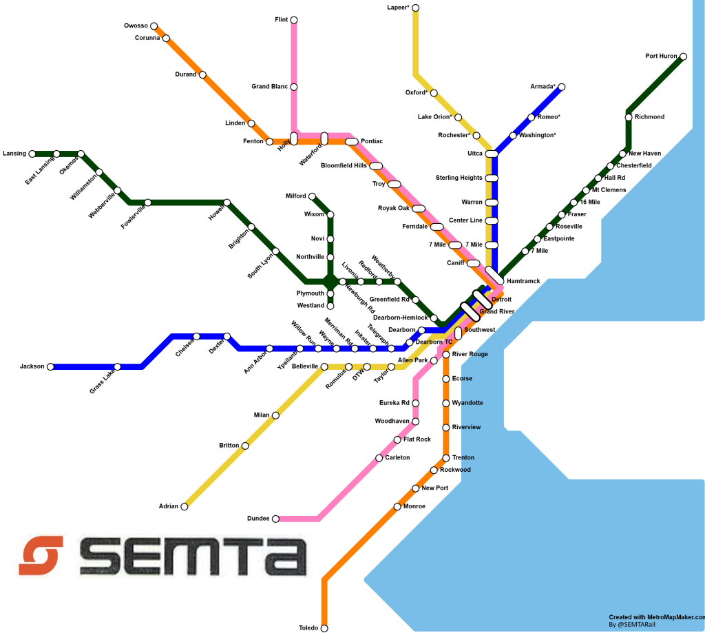
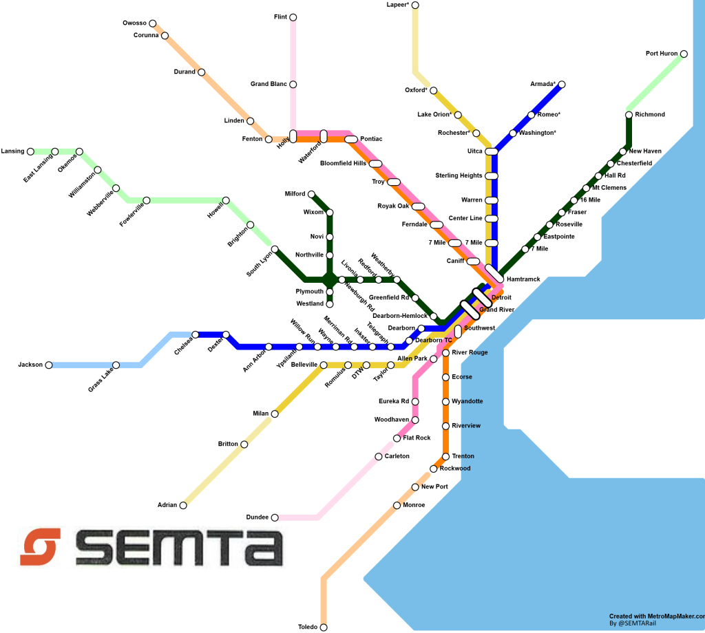
This map imagines the birth of the SEMTA Regional Rail, a callback to Detroit’s last regional rail service, the SEMTA commuter rail, which ran peak direction trains between Pontiac and a station outside the Renaissance Center. With the SEMTA Regional Rail above there were a couple goals. First and most notably, this map is based on existing infrastructure. Except for the stations marked with an asterisk (*), of which there are 7, in track alone these lines currently exist. Some of that track is either too old, disused, or single track and thus low capacity. But the fact that the right of way and much of the track for this project currently exists means that relative to other regional rail projects or ideas this project would be cheap to build.
This map also emphasizes cross region trips with large transfer stations in the city. This map attempts to answer the problem that Detroit is “too spread out” for regional transit. All the lines are on average as direct as they can be, and they all go through the heart of the city. While it may be faster to drive from each end of a line to the other, this directness makes the train competitive, especially when there is traffic or routes without a freeway. I also have noticed that many Detroit regional rail fantasy maps have trains dead ending in the city which in the modern era is more and more of an outdated use pattern. This map tries to emphasize regional trips while maintaining the same focus on Detroit.
The above version of the SEMTA map shows the same system but the lines are lighter when the system leaves RTA territory. RTA is the current 4-county regional transit authority, and if we wanted to fund this system without state help this is what that system would likely look like. The big thing this version of the map lacks is larger anchor cities on the ends of lines that would likely be drivers of ridership.
My hope with this post is to help people dream of a modern transit system for Detroit that would both serve the region well and feel realistic to dream about. I believe the system I have mapped is a realistic system to dream of given our region’s stubbornness with building regional transit. Future improvements could be:
Tunneling under downtown to move the transfer stations down from New Center
Expanding the Green Line branch to be its own line going from Flint to Monroe
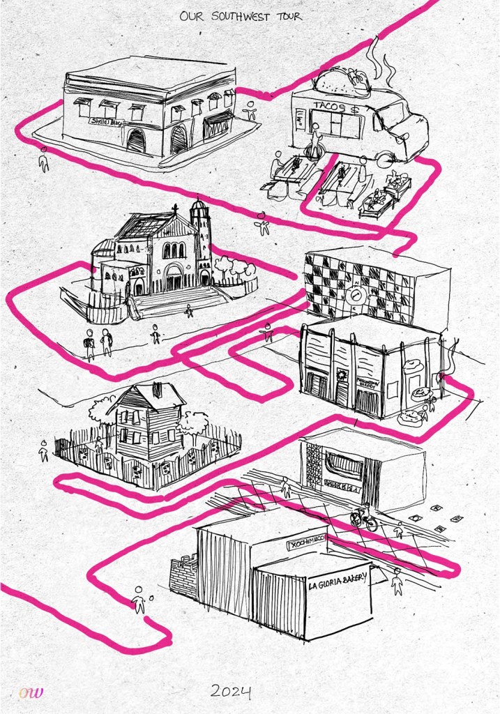
‘Our Southwest Tour’ map was initially created to explore new forms of graphic representation, but quickly turned into a piece that we incorporated into one of our current Southwest Detroit projects, a boba tea shop. As we began the process, we wanted to be intentional about how we blended the history of boba tea into the history of Southwest. In order to enrich our research and gather information to use in future projects, we spent a day on what we call, “Our Southwest Tour.”
This tour was done by other work designers Tian Li and Lauren Forgacs, and the map was digitally hand-drawn and created by Lauren. To begin our tour, we focused on some areas that we intentionally wanted to explore; Bagley, Vernor, and Springwells, in that order. We spent a day taking our time walking through each area, and noted architectural details and specific spots that really stood out to us. We paid attention to repetitive color schemes, murals, patterns, and constructional details. We took lots of photos of each area, and now have a large library of images from Southwest.
Concerning the details of the map itself, the pink line is loosely our path through the spots. Starting from the bottom, there is the Bagley Area. You can see where Lauren drew the pedestrian oriented streetscape, La Gloria Bakery, Xochimilco, and the building across the street that had notable ironwork in the window and on the wall. On the bottom left, there is a house depicted in the neighborhood on Bagley, and it has some of the ornate floral details we saw within the ironwork on the fences in that location. Moving further up the map is the Vernor area. You can see MexicanTown Bakery, and above that the mural with a compass is pointing to South West. On the right, there is Most Holy Redeemer Church, and some students coming out of class. Moving further up, you can see El Imperio taco truck, where Tian and Lauren enjoyed some delicious Birria tacos. To finish the map, on the top left is Sheila’s Bakery, which marked the last area Tian and Lauren explored.
by: Gene Estrada, Detroit River Story Lab, University of Michigan
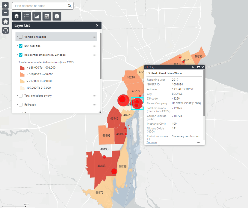
This map was created by the Detroit River Story Lab at the University of Michigan, Ann Arbor. Our goal is to estimate the total amount of greenhouse gas emissions (i.e., create an emissions inventory) for the Detroit River Corridor. We created this online, interactive map as an accessible tool for anyone interested in understanding carbon emissions at a local level. We are currently working with local educators in Detroit-area schools to include the use of this tool in school curricula.
To create this map, we collected carbon emissions data from a multitude of sources, including the U.S. Environmental Protection Agency’s Greenhouse Gas Reporting Program, the Database of Road Transportation Emissions, the U.S. Army Corp of Engineers, and more. Each carbon emissions source (facilities, vehicles, river cargo shipping, etc.) is displayed as its own map layer, which users can toggle on and off, and contains detailed information available the carbon and other greenhouse gas emissions associated with that layer and components within the layer. A full list of data sources, with links, used to create this map, and a summary of the approach we used to construct the map, can be found in the About tab.
We implore users to explore the map layers and look for patterns in the spatial distribution of emissions. We also provide layers showing major freeways, railroads, and U.S. Census data to encourage users to look for associations between infrastructure, demographics, and carbon emissions in the Detroit River area.
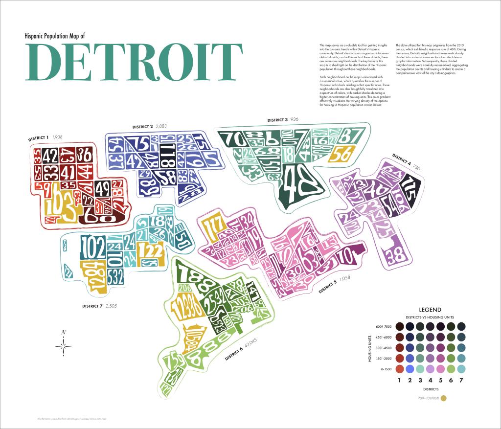
Embarking on this project has been a fascinating journey for me. As a Hispanic male from California, relocating has somewhat severed my connection to my roots. In my California days, I was surrounded by a community that shared my heritage, but in my new home, it’s a different story—Taco Bell and the occasional Hispanic food truck provide a glimpse of familiarity. This endeavor became an opportunity for me to delve into the intersection of my heritage and my current city. Opting for a minimalistic aesthetic was a conscious decision—I wanted the focus to remain on the data without overshadowing it. Navigating the color scheme posed its own challenge; I aimed for distinct colors to ensure each district stands out unmistakably. It’s been a project that not only explores demographics but also pushes my creative boundaries in unexpected ways.
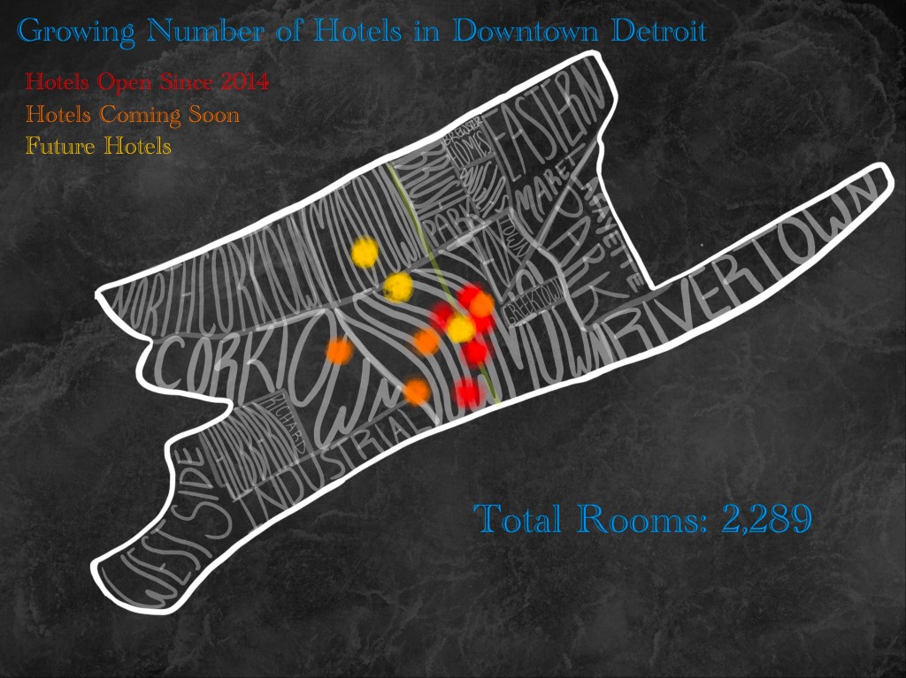
I chose this specific data since it can directly represent the growth the city of Detroit has gained through multiple factors, such as popular events, sights, food, and history. Detroit has so much character and has come a long way in just a matter of a decade. This data puts a smile to my face knowing people are visiting to appreciate the city just as much as we all do.
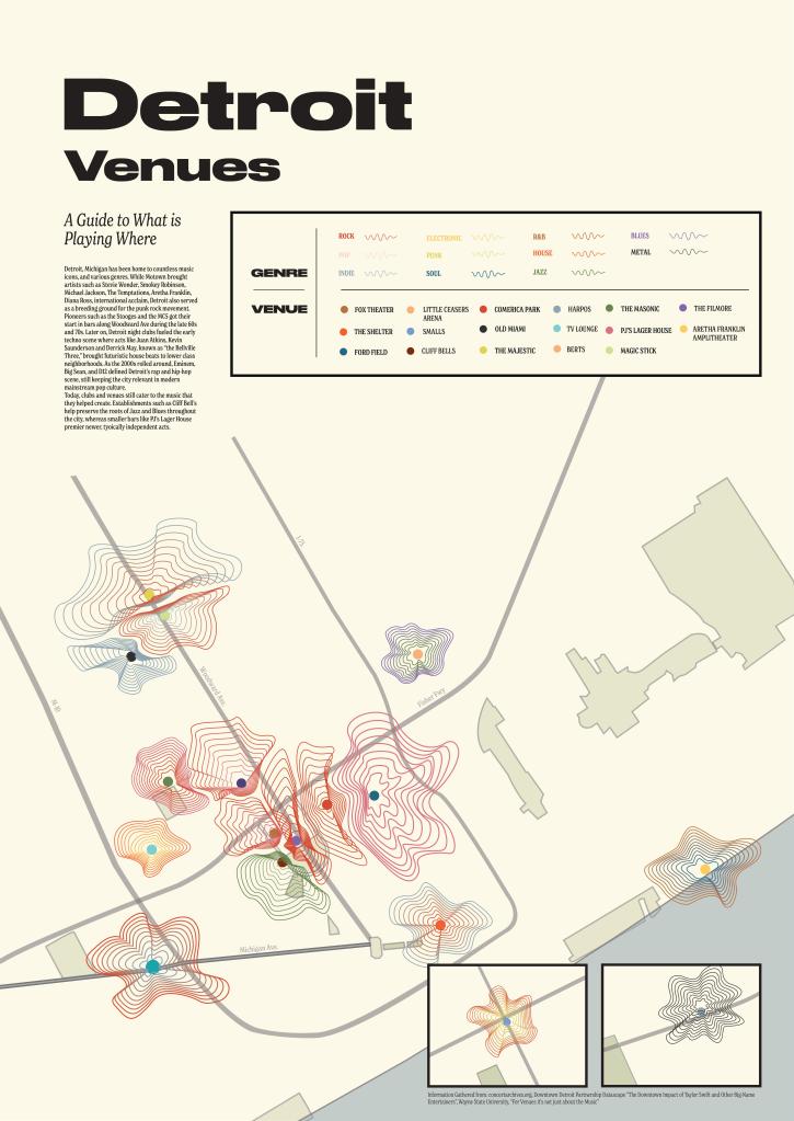
I was inspired to show the spread and growth of Detroit’s music scene. Detroit is home to countless music icons, and various genres. While Motown brought artists such as Stevie Wonder, Smokey Robinson, Michael Jackson, The Temptations, Aretha Franklin, and Diana Ross, international acclaim, Detroit also served as a breeding ground for the punk rock movement. Pioneers such as the Stooges and the MC5 got their start in bars along Woodward Ave during the late 60s and 70s. Later on, Detroit night clubs fueled the early techno scene where acts like Juan Atkins, Kevin Saunderson, and Derrick May, known as “the Bellville Three” brought futuristic house beats to lower-class neighborhoods. As the 2000s rolled around, Eminem, Big Sean, and D12 defined Detroit’s rap and hip-hop scene, still keeping the city relevant in modern mainstream pop culture. Today, clubs and venues still cater to the music that they helped create. Establishments such as Cliff Bell’s help preserve the roots of the Jazz and Blues throughout the city, whereas smaller bars like PJ’s Lager House premier newer, typically independent acts. I feel it is important to show the history and innovation that music has played in the city of Detroit. I wanted to show this movement of music through sound waves. These sound waves spread over the city to communicate how many shows play at each venue and what genre of music.
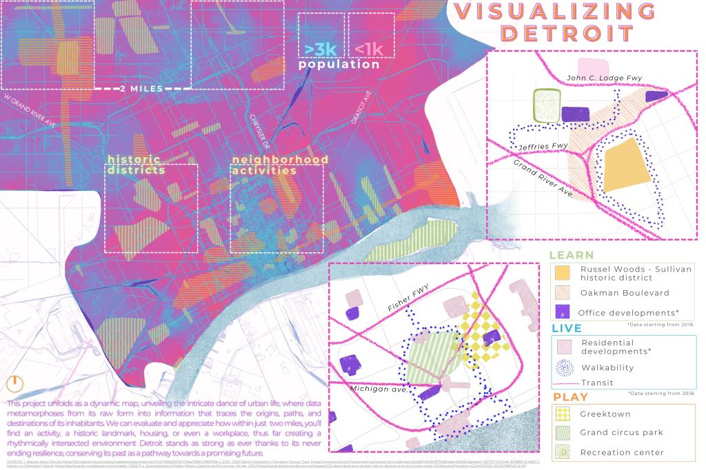
Exploring Detroit’s data set whilst taking into account its fascinating historical narrative, I knew I wanted to take these concepts hand in hand and present a project that had a compelling message. But there’s a crucial step in between—making sense of the data. This transformation is not just about presenting numbers and figures; it’s about crafting visual metaphors that resonate with our collective understanding. I delved into the dataset with a guided vision of how cities work, how and where its population tends to flourish, where essential services and parks thrive, and how these elements intertwine to impact the quality of life. These themes were carefully chosen to serve as the compass for my exploration of the data.
WORK: In this city, work and life are interwoven in a tapestry that celebrates and embraces diversity within its myriad activities, ultimately enhancing the quality of life.
PLAY: The city’s heartbeat pulses through the various activities that grace its streets, offering an insightful glimpse into its vibrant soul.
LEARN: By charting the historical districts, we embrace the past as a guide toward our future. A city’s strength etched by persevering its historical landmarks, parks, and constant evolution.
LIVE: Our lives are inextricably intertwined with the myriad offerings of this city, creating a rhythmic symphony of experiences and opportunities.
This project unfolds as a dynamic map, unveiling the intricate dance of urban life, where data metamorphoses from its raw form into information that traces the origins, paths, and destinations of its inhabitants. For urban planners and city leaders, these insights can reveal hidden structures, eventually finding a tool to shape and improve their communities. Some elements may remain open to interpretation, but therein lies the beauty and potential of art itself. In conclusion, data serves as the cornerstone upon which we construct our understanding of the world, a bridge between history and the present, a canvas for our artistic expressions, and a compass guiding us toward a brighter, more informed future.
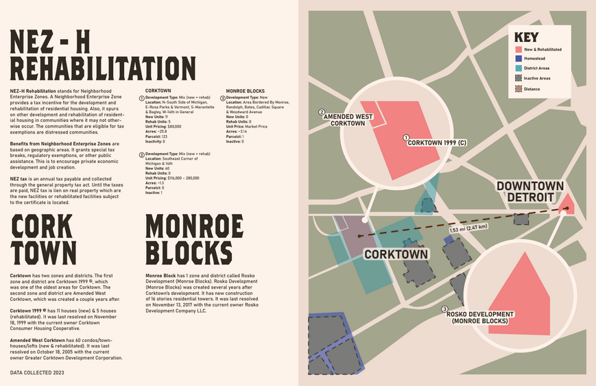
The dataset chosen was from the NEZ-H Rehabilitation and Homestead, specifically zones from Corktown and Monroe Blocks. Most younger people are not aware as to what neighborhood enterprise zones are in Michigan. This map is to educate the younger audience and anyone else who does not know what these zones are for. I compared an slightly older zone, old zone, and a zone more recent. I provided information from the City of Detroit Open Data Portal in the boundaries section of datasets. The illustrations are created by me with a help of the maps via Google. The colors are used to give a neutral setting with some pop of color depending on the importance of the map. The elements in my visual is to indicate any information provided about the tax property, borders, and more.
One of my biggest complaints about navigating Detroit is how disconnected the streets are. On foot, by bike, or in a car, getting around the city can be unnecessarily confusing because of the division caused by the freeways, the mash-up of different grid systems, and the inconsistent development patterns.
In addition to my personal experience, a lot of the inspiration for this project comes from Paul Sewick’s “Detroit Urbanism” blog and his series on the Woodward Plan, in particular. It was this blog that made me realize how incomplete the Woodward Plan really is. Much of the confusion of downtown is due to the inelegant way that the Woodward Plan is cut off and forced into a rectilinear plan west of Cass, east of Brush, and below Michigan and Monroe.
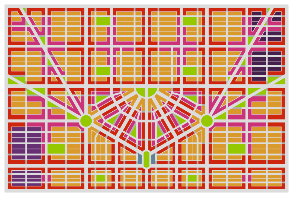
To visualize a more connected Detroit, I created two sets of maps that include road networks, transit networks, and zoning. There is one set of maps for downtown and one set of maps for a generic square mile of greater Detroit. I like to imagine that these two sets of maps could be used as templates to create a master plan of the city to redevelop its transportation system. In this fantasy master plan, downtown anchors the city while the square mile grid is repeated to the city limits, making occasional adjustments for spoke roads, freeways, railways, parks, and changing grid orientation. The goal is to have an easily navigable city with plenty of greenery, good public transit, and regularly spaced thoroughfares that don’t end abruptly.
Road Network
Downtown
To create my idealized map of downtown, I started by laying out the centerlines of the Woodward Plan in Fusion 360. I adjusted the plan so that the upper section is complete but the section below Michigan and Monroe is largely the same as it is currently. I also added a half mile to the West, North, and East to provide context of how downtown would fit into the larger city grid. I then used Inkscape to widen these centerlines to specific widths and color coded them by street type.
There are several major changes between this idealized map and what exists currently. One major change is that I have re-aligned a few of the spoke roads (and added a new one) to connect more directly with Campus Martius. Bagley and Grand River have been shifted to meet Michigan and 2nd Ave at a large roundabout. Similarly, Gratiot and Madison have been shifted and Mound Rd has been extended to meet Monroe and St Antoine at a large roundabout. These roundabouts are intended to provide park space as well as a safe intersection for the 7-way crossing. They are similar in size to Dupont and Logan circles in Washington, D.C. I also re-oriented Campus Martius to be more intuitive to navigate in the surrounding grid.
I applied road hierarchy concepts to further develop the grid. The 120ft avenues function as arterials, the collectors connect local streets to the avenues, and alleys provide service access to lots without clogging up traffic. To simplify intersections, local streets are converted to pedestrian streets where they meet 120ft avenues and at intersections with more than four legs. The 100ft avenues function somewhere between an arterial and a collector. Except for Woodward, tram lines are spaced roughly every mile.
Map by Dan Seiderman
Greater Detroit
The logic behind the rectilinear sections of the downtown network can be seen more easily in the square mile grid:
120ft Avenues are spaced every ½ mile.
Tram lines are spaced every mile.
Stops are spaced every ¼ mile.
90ft Collectors are spaced every ¼ mile.
60ft Local Streets are spaced every:
⅛ mile from west to east.
⅟16 mile from north to south.
60ft Pedestrian Streets are implemented where local streets meet avenues.
20ft Alleys only connect to local streets.
This setup ensures that a thoroughfare exists every ¼ mile. Additionally, these thoroughfares (90ft and wider) should all include dedicated bike lanes to provide a robust cycling network. Regarding the pedestrian streets, they allow permeability for pedestrians and cyclists while encouraging motor traffic to move through the city via the collectors and avenues. This incentivizes drivers to use local streets only for local traffic. It also provides pedestrians with an unbroken path along avenues for multiple blocks and gives corner businesses space for outdoor dining.
Map by Dan Seiderman
Subway Network
Downtown
Though Detroit’s population continues to decline, a future, thriving version of the city would need a robust public transit system. In addition to tram lines, my idealized plan calls for a subway system to fill this need. The spoke roads make an obvious starting point for a subway network since they radiate out from downtown and reach far into the suburbs. By adding a secondary grid network on top of this, an interwoven and well-connected system forms. Stops are spaced approximately every ½ mile for local service and every mile for express service.
With so many transit lines leading to Campus Martius, it would naturally make a great transit hub. In this plan, there are: five subway lines (Michigan, Grand River, Woodward, Mound, and Monroe) and 2 tram lines (Fort and Woodward) that all converge on the park. All this connectivity would make it a great location to add commuter and intercity rail. By branching off from existing rail lines around Fort St and Rosa Parks Blvd, a new line could be buried along Fort to bring these services to Campus Martius. Another line could branch off on the east side and connect to Campus Martius to form a passenger rail loop around downtown. The plots on both sides of the park could be used as stations, with the west station serving as a terminus for trips to the south and west and the east station serving as a terminus for trips to the north and east. Platforms for through-running tracks could be placed on a level below the terminus tracks to make this rail hub a real powerhouse.
In addition to many other intercity and regional rail connections, a link could be made between DTW Airport and Campus Martius that would take only 15-20 minutes. From Campus Martius, commuters and tourists could reach destinations such as:
The Fisher Building
Time: 10 minutes
Route: Woodward Express up to Grand Blvd then a 5-minute walk
The DIA
Time: 5 minutes
Route: Woodward Express to Warren then a short walk
Eastern Market
Time: 10 minutes
Route: Mound Local to Temple
The Renaissance Center
Time: 10-15 minutes
Route: Walk
Jefferson North Assembly Plant
Time: 15 minutes
Route: 5-minute walk to Hart Plaza then 10 minutes on Jefferson Express
Map by Dan Seiderman
Greater Detroit
Outside of downtown, subway lines are spaced every mile, alternating with tram lines so that there is rail transit every ½ mile. Local stops are spaced every ½ mile; express stops are spaced every mile.
Map by Dan Seiderman
Zoning
Downtown
With these idealized road and transit networks, a zoning pattern is needed to bring the streets to life so that people have destinations in this more connected city. To encourage a lively city with an easily repeatable development pattern, I created the following scheme:
Avenues are zoned for commercial.
Collectors are zoned for mixed use.
Local Streets are zoned for residential.
Small and oddly shaped blocks are zoned as parks.
Additional parks are spaced so that the closest one is no more than a five-minute walk away.
Local streets can also be zoned for industrial such as in Eastern Market and Corktown. This would create a similar environment to the business parks in the suburbs in the sense that industrial centers would be isolated from residential areas and through traffic would be restricted. Since they are surrounded by commercial along their thoroughfares, it would help to maintain a safe and friendly environment for pedestrians and cyclists even in an otherwise industrial area.
Map by Dan Seiderman
Greater Detroit
The zoning scheme can be more easily observed in the generic one-mile square grid outside of downtown. Pockets of housing are surrounded by commercial corridors and occasionally broken up by large parks.
Map by Dan Seiderman
Conclusion
To attract people to the city, redevelop empty blocks, and remove excessive surface parking from downtown, Detroit needs a solid transportation network that gives people options to easily navigate the many opportunities that the city provides. While rebuilding the city exactly according to these maps may be impossible, many of the concepts are relatively easy to apply. Concepts like multi-modal streets, mixed-use zoning, plenty of park space, and regularly spaced thoroughfares all lead to a more connected city.
A more connected city is one full of opportunities. A city with a coherent network of roads is one that makes it easy to develop public transit routes. A city with good public transit is one where people of all means can easily get around without sitting in traffic. A city where people spend less time sitting in traffic is one where people are happier and more productive. A more connected Detroit is a thriving Detroit.
Contact
Submit a map or just get in touch. Thanks for following!