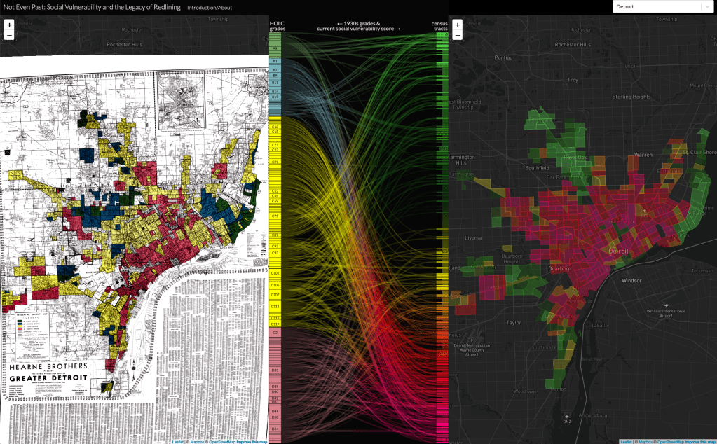
The Mapping Inequality project that has been cataloging “redlining” maps from the Home Owner’s Loan Corporation (HOLC) and completed this incredible project to match the mortgage security grading with the present day CDC Social Vulnerability Index (SVI).
The focus on redlining is often over emphasized and this analysis shows how the “yellow” graded areas (yellow-lined) experienced the most change. Many yellow areas (outside of Detroit) became green with very low SVI as well as the majority of yellow graded areas within Detroit became red with very high SVI.
