Map: Median Home Market Sales in Detroit 2020-2021

BY MARK JONES

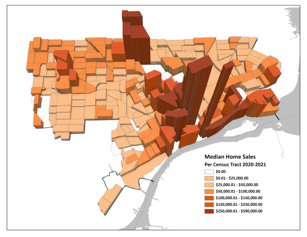
This week Detroit Future City (DFC) released two reports, one being “Home Sales in Detroit.” It explored how home sales have changed from 2012-2013 to 2020-2021. This map was created by using the tables at the end of the report. It is reported in 2020 Census Tracts and shows the median market sale price in 2020-2021 (in brown hue) and the change in median market price from 2012-2013 (height of tract).

However, while the report and subsequent Free Press articles cite percentage increase in median market sales prices, I was interested in which neighborhoods had the largest dollar increase. One takeaway that was not in the report was that the largest dollar increases in median sales were in already high value neighborhoods. The inverted T, Woodward corridor and riverfront, continue to lead the way, but the positive news is that the outlying neighborhoods saw increases.

The largest increase in median sales was on the 1300 Lafayette block. Oddly, it said there were zero market rate home sales in 2012-2013 and only one in 2020-2021, and it went for $505,000. That is the small, rectangle darting up east of downtown in the above map. Presumably, the one sale was the penthouse condo in 1300 Lafayette, but if so, the rest of the condo sales should have been included. The next largest increase was the Brush Neighborhood. It went from $130,000 to $590,000, mostly because of City Modern.

For more information on the methods DFC utilized, please read the report at:

Map: Intact Urban Fabric in Detroit Neighborhoods 2019

IntactUrbanFabric copy.png

by: Mark Jones

In Alan Mallach’s book The Divided City: Poverty and Prosperity in Urban America (2018) three features of neighborhood revitalization are described, one being intact urban fabric:

“Houses, small apartment buildings, and storefronts woven together create the built environment and revitalization will occur in areas where these are still standing and not where demolitions have occurred. Demolitions erode the urban fabric and ultimately discourage investment. These mixed-use, walkable neighborhoods were generally built before World War II, before cities were redesigned for the automobile”

In a paper published in the Michigan Journal of Business, I attempted to define and map the percent of intact urban fabric in each neighborhood. The SEMCOG Open Data Portal contains building footprints along with the building type and year built. All buildings, except accessory buildings, built 1940 or earlier were utilized. Each building footprint was assigned to a parcel and the percent of parcels containing a pre-WWII building was calculated. The results are in the map above.

Map: How Suburban is the City of Detroit?

urban-suburban-detroit.jpgby: Mark Jones

In 2015, FiveThirtyEight (538) and Trulia worked to define “suburban” and “urban.” They surveyed 2,008 adults from across the USA and asked them to describe where they live as either rural, suburban, or urban. They matched those results with the responder’s zip code and created a definition for each geographic term:

Urban: ≥2,213 households per square mile (mi2)

Suburban: 102 – 2,212 HH/mi2

Rural: <102 HH/mi2

Utilizing these definitions, 538 calculated the amount of urban within the top 10 most populated cities in the USA. Some, such as New York and Chicago, were completely urban; others, such as San Diego and Phoenix, were majority suburban. This type of analysis was duplicated for Southeast Michigan. Using 2010 census tracts, households per square mile was calculated. Detroit had 205 urban census tracts, 86 suburban, and 5 rural. By acreage, Detroit is 60% urban, tying Dallas from the 538 study. Clawson, Grosse Pointe, and Hamtramck are 100% urban, in contrast to Utica, Northville, Fraser, Rochester Hills, and Grosse Pointe Farms which are completely suburban.

Map: Avery Street in Detroit 1921 vs. 2010

Avery1921_2010Aerial

(Map by Mark Jones)

SEMCOG City Planner, Mark Jones, submitted this great map mashup of old and new conditions in Detroit:

From 1920 to 2000 Detroit’s neighborhoods have gone through a tremendous transformation. This map shows the change in the central Woodbridge Neighborhood. By overlapping 1921 Sanborn Fire Insurance map building footprints and parcel lines with 2010 aerial, the differences become apparent. Most notably, the high vacancies west of Avery St. and the removal of virtually all garages in the neighborhood.