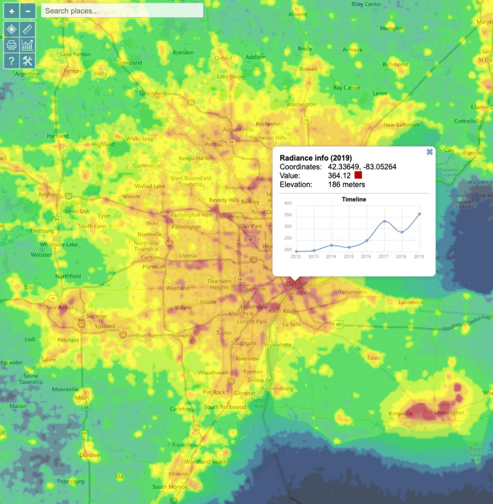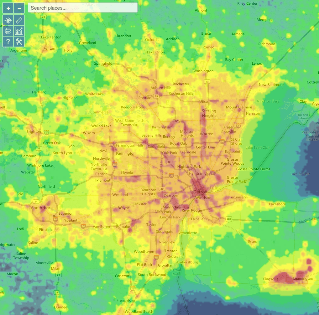
This map may better be called “the state of urban sprawl.” Commercial corridors readily highlight, but there is also a general level of light pollution across the region of sprawl. The data for this map comes from NASA’s
Visible Infrared Imaging Radiometer Suite (VIIRS). One interesting addition to the map is tracking of “radiance” over time. Downtown has been getting brighter over the years.