by: Libby McClure, UNC School of Public Health, Detroit Neighborhood Health Study
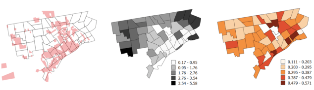
These maps show 1939 Home Owners Loan Corporation (HOLC) redlined areas on the left in red, 2008 foreclosure rates in the center in greys, and 2008 self-rated health on the right in oranges.
The redlined zones were identified by digitizing the HOLC map from 1939. Neighborhood foreclosure rates, were calculated using RealtyTrac’s count of foreclosed properties in 2009 in each census block group divided by the number of owner-occupied residences in 2009 in each census block group. Denominator information was obtained from American Community Survey data, collected by the United States Census. Home foreclosure rates are shown here aggregated to the 54 neighborhoods defined by the City of Detroit Planning and Development Department and operationalized in the Detroit Neighborhood Health Study. Rates are standardized to the number of foreclosures per 100 owner-occupied properties. Neighborhoods shaded darker had higher 2009 foreclosure rates.
The Detroit Neighborhood Health Study assessed self-rated general health on a five-point Likert scale in 2008. Here, the prevalence shown is the number of survey respondents reporting poor health divided by the total number of respondents in the neighborhood in 2008. Neighborhoods shaded darker had a higher prevalence of poor health.
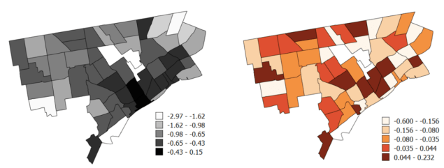
These maps show post-Great Recession foreclosure recovery on the left in greys and changes in self-rated health on the right in oranges. Here, foreclosure recovery is expressed as changes in rates between 2009 and 2011. Neighborhoods shaded lighter had steeper declines in foreclosure rates, representing faster recovery in the housing market. Neighborhood change in prevalence of poor self-rated health is shown from 2008 to 2013. Areas with darker shading experienced increases in poor health prevalence, while lighter shading indicates slower increases or decreases in poor health.
Neighborhood foreclosure rates, were calculated using RealtyTrac’s count of foreclosed properties in 2009 and 2011 in each census block group divided by the number of owner-occupied residences in 2009 and 2011 in each census block group. Denominator information was obtained from American Community Survey data, collected by the United States Census. Home foreclosure rates are shown here aggregated to the 54 neighborhoods defined by the City of Detroit Planning and Development Department and operationalized in the Detroit Neighborhood Health Study.
The Detroit Neighborhood Health Study assessed self-rated general health on a five-point Likert scale in 2008 and in 2013. Here, the change between 2008 and 2013 in the proportion of neighborhood residents reporting poor health is shown.
Areas with slower post-Recession recovery overlap with areas with worsening adult health. These areas had the lowest baseline (2009) foreclosure rates, and the rates did not dramatically reduce post-Recession (see previous figure). Home ownership is less common in these neighborhoods because of practices like redlining and imbalances in lending opportunity. Additionally, while the measure of foreclosure rate accounts for owner occupancy by only including owner-occupied properties in the denominator, it does not capture the impacts of other financial housing displacement practices more relevant to renters, like eviction.
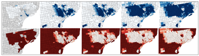
Here are maps of racial composition in the years 1930, 1970, 1980, 1990, and 2010. The top maps show the census tract percentage of residents identifying as minority race in blues, and the bottom maps show percent of residents identifying as white in reds. Census tracts shaded darker represent a higher percentage of each respective racial group.
Proportion white was coded as the proportion of census tract residents identified as “white” regardless of parental foreign-born status in 1930, 1970, 1980, 1990, and 2010. In the same years, proportion minority race was coded as the proportion of residents identified as any race other than “white”.
The strongest relationship between foreclosure rate recovery and declining health (see previous map) is largely driven by the Detroit neighborhoods that were heavily redlined and initially housed nearly the entire minority population. These residents were largely later displaced, which is reflected in the racial composition changes shown here.
Read more in the academic article: “The legacy of Redlining in the effort of foreclosures on Detroit residents’ self-rated health“

I appreciate this interesting and important work about Detroit.
Pingback: Map: Retail Redlining and COVID-19 Vaccine Availability | DETROITography