
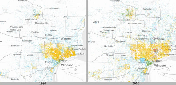
Urban Institute’s map database that shows comparisons of major metro areas in Michigan between 1980 and 2010. Each dot represents 20 people living under the poverty line. Colors represent ethnicity: Blue dots are White; yellow dots are Black; green dots are Latino; and red dots are Asian. It appears that Detroit’s poverty has spread over time as well as become concentrated among minority groups.

Pingback: Detroit Area Income by Census Tract 1970 | DETROITography