In 2021, the City of Detroit proposed a network of ‘slow streets’ in neighborhoods to enhance safety and allow residents to better enjoy local amenities such as parks and schools.
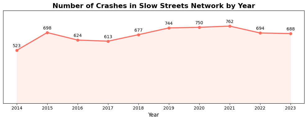
Analysis of the city’s crash dataset, a filtered version of SEMCOG’s ten year crash data going from 2014 to 2023, indicates little improvement in either the frequency or severity of crashes. Even after the decline of the COVID-associated spike, crash levels remain above previous lows. The chart below highlights crashes specifically along the proposed Slow Streets Network.
A note on the dataset visualized in this article: For this analysis, any crash occurring within a 5-meter radius of a slow street segment is included. Some crashes may be recorded on adjacent streets, but we consider them relevant since safety interventions should also address intersections
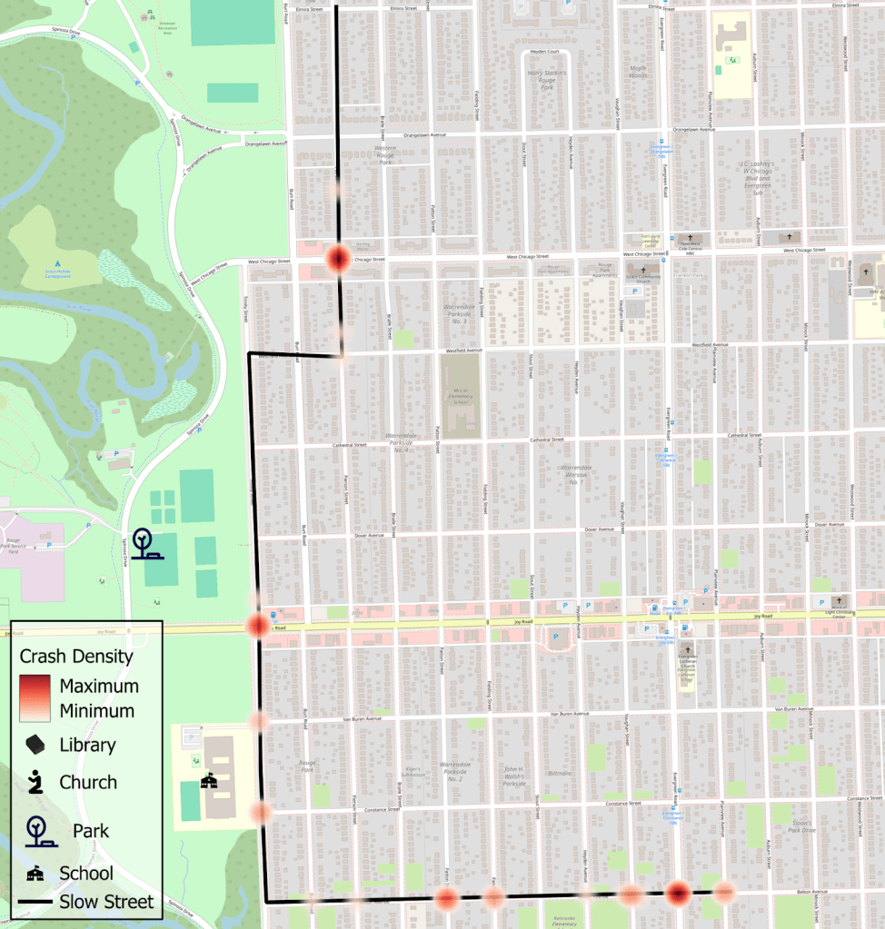
The proposed Slow Streets Network consists of 945 road segments, which may be full streets, partial streets, or combinations of multiple streets. This network has a mix of spaces that have had crashes in the period between 2014 and 2023 and spaces that haven’t had a crash in that ten year period.
Overlaying crash data on the network reveals hotspots where targeted interventions could significantly improve safety for all users.
Spaces like this one by Rouge Park are one of several that stand out in the number of crashes, injuries, and severe injuries. It has 50 crashes over the ten year period, 2 fatalities, and 3 serious injury crashes.
Martin street as it crosses I-94 and Michigan Avenue. This street connects or is near to at least three parks, two schools, three churches, and a public library. 97 Crashes1 Fatality3 Serious Injuries
Omira Street and part of 7-Mile alongside I-75. This is near Pingree Farms, a popular location for families and schools to visit an urban farm. 112 Crashes5 serious Injuries
I hope that by visualizing and sharing the data, we can see these areas with the higher numbers of crashes and injuries get more immediate and direct investment to make them safer and less crash-prone.
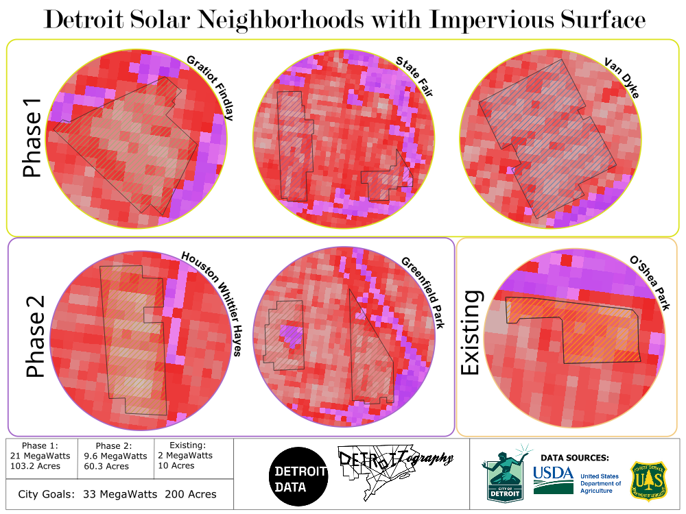
Detroit is working its way into making the largest investment in industrial solar that we’ve ever seen. The plan is to be able to power all 127 municipal buildings with solar energy, utilizing 200 acres of land to generate 33 megawatts. This is a win for the city’s sustainability efforts by reducing reliance on fossil fuels, encouraging local clean energy development, and getting our city closer to reaching carbon-reduction targets.
The current plan is to install solar arrays in two phases; the first phase in three neighborhoods covering 103.2 acres and producing 21 megawatts and the second in two neighborhoods covering 60.3 acres and producing 9.6 megawatts. By contrast, the 2017 O’Shea Park array covered just 10 acres and produced 2 megawatts — making the solar neighborhoods project more than 15X larger than our city’s only other solar investment.
To demonstrate the scale of this development, let’s look at the solar arrays laid over downtown and Belle Isle.
Given the size of these installations, understanding their environmental impact is crucial for the city to make equitable decisions that benefit residents and communities surrounding these installations, beyond the city’s clean energy goals. Previous studies indicate that the impact of solar arrays on ambient air temperature is highly nuanced, varying significantly based on factors such as installation type, solar panel construction, local climate conditions, geographic location, time of day, and the original ground cover, among others. This wide range of variables complicates definitive statements about their precise impact on ambient heat in their installation environment. What remains consistently understood, however, is that solar panels inherently absorb solar energy, and a significant portion of this absorbed energy dissipates as heat into the surrounding environment. The specific difference in impact largely stems from what is underneath the panels, as this dictates how much heat is comparatively absorbed by the underlying ground cover versus the solar panels themselves.
While increasing clean energy like this is a win for addressing municipal dependence on fossil fuels, it is worth continuing the discussion about how this investment will impact the communities in which they will be installed. I mapped out these solar installations and published them for public access. You can see details on each installation’s acreage usage, expected megawatt generation, and city-labelled neighborhood name by checking out the full dataset on the DetroitData open data portal.
I further reviewed the solar neighborhood locations based on afternoon heat index, tree canopy, and impervious surface to get a better understanding of these locations as it relates to the current environmental state while comparing it to the existing O’Shea Park solar installation. The maps reveal an alignment between existing heat, sparse tree canopy, and a high concentration of impervious surfaces. This helps us identify opportunity spots to mitigate heat through targeted intervention in these communities as the city proceeds with solar development.
Even though the heat generated by solar arrays is less significant than the urban heat island effect caused by parking lots, streets, and other impervious surfaces, it is important for the City of Detroit to monitor their impact. Proactive measures should be taken in the surrounding communities—not only to prevent any localized heat island effects from disproportionately affecting residents, but also to implement broader strategies that reduce the existing urban heat island effect of the built environment.
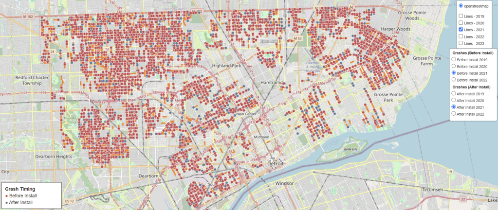
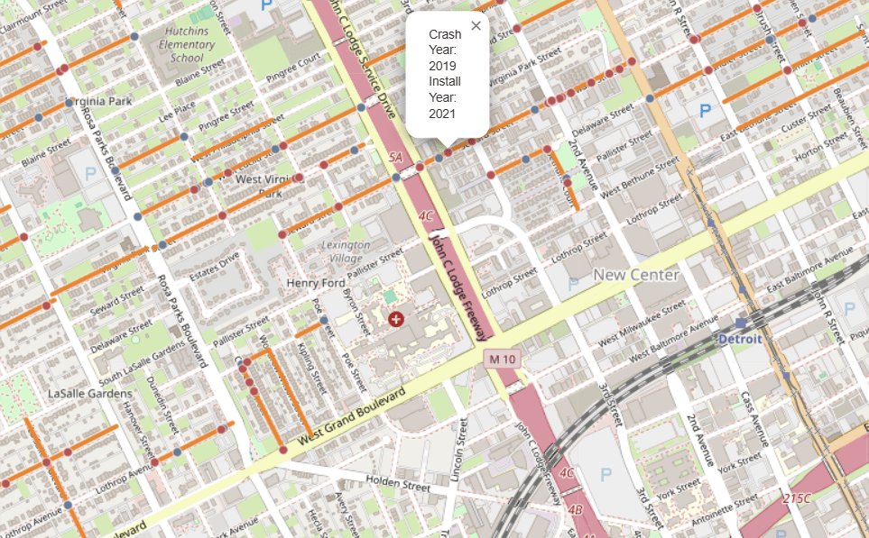
The city of Detroit has been installing thousands of speed humps all around the city in the last couple of years, but are they having any measured impact on the safety of our streets? To look, we took publicly available data of locations where speed humps were installed, combined it with SEMCOG’s crash data, and analyzed whether crashes increased or decreased after the installation of the speed humps.
Getting the Data:
The speed hump data we gathered needed some additional work to be usable. It didn’t natively have geography data when pulled via python, so we needed to run it through QGIS first. Additionally, there were a mix of indications as to whether the hump was installed and when. What we did was remove any speed humps that were marked as either a “poor candidate” or “rejected by residents”. We also created an approximate installation year column which takes the oldest year from the several columns that had years included. This was to keep cohorts together and to avoid a reinstallation or replacement speed hump being counted in a different year. Additionally, for values without years in any of the columns, we filled in with year 2019 as the vast majority were labelled “installed in previous years”.
What was left was a dataset consisting of linestrings, representing roads, where speed humps were likely to have been installed. There wasn’t enough available data to indicate just how many speed humps there were.
Install Year
Linestring Count
2019
459
2020
1063
2021
3663
2022
1952
2023
22
With the crash data, we filtered to just crashes labelled as having happened in the City of Detroit and also dropped values that didn’t have geography coordinates included in the pull. This did, however, lead to a slight difference in the total crash amounts (0.49% less than the original total).
Merging it Together
Then, we merged the datasets together with two major parameters to ensure that we’re attributing the right crashes to streets with installed speed humps.
Only included crashes that intersected within 5 meters of the linestring.
Only included crashes that also shared the same base street name as the linestring.
This was done to keep the crash data relevant to the location of where speed humps were installed and to reduce the influence of crashes that have happened at intersecting streets from being represented which would have been picked up with the buffer alone.
Crash Analysis
Now, to analyze the impact on crashes. To do this, we split up each installation year into their own performance cohort. With each installation year having a different spread of analyzed years to try and quantify the impact given the limitation of crash data years we have currently available. Year 2023 was excluded due to not having 2024 year crash data
year
N
total_before
total_after
t
p
2019
435
1267
1292
0.46
0.6478
2020
992
2242
2013
-3.23
0.0013
2021
3555
7178
2513
-17.27
0.0000
2022
1835
1542
1063
-8.81
0.0000
The analysis we ran indicates that the speed humps are impacting crash frequency in the locations of their installation. With most installation groupings showing declines in crashes and the 2021 cohort showing a very significant reduction in crashes in the areas of speed hump installation.
If we were to add up the count of crashes before and compared to the count of crashes after, we get a total percent reduction in crashes of 22.2%. A number that looks great, but could be misleading given that we’re not factoring in the crash decline trend after the surge in crashes during the COVID-19 pandemic and we don’t have more granular data due to speed humps not having a more precise date of installation. Overall, this is a good foundational analysis to have to be able to check and update as each data year in crash data comes through.
ANALYSIS CAVEATS:
Installation years are an approximation based on the lowest year found across several columns that included reference to an installation year. Instances without a year and were not filtered otherwise were given the year 2019.
SEMCOG’s crash data set for the city of Detroit was missing geography coordinates for ~1,100 values upon pulling the data from their server. These were removed from the analysis.
Crashes from the year of installation were excluded in the analysis of each cohort. This was due to not having an exact installation date and a desire to evaluate the before directly against the after installation years.
Since crashes need to line up by geo coordinates and by the street name, naming conventions of the street name across datasets could lead to a slight undercount for instances where the street name is sometimes prefaced by a cardinal direction label or other non-standard naming variations.
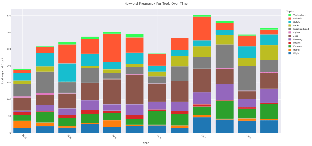
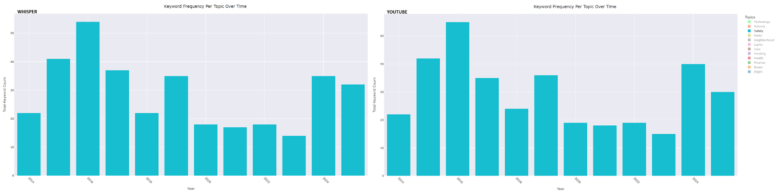
Mike Duggan’s tenure as Mayor of Detroit has been focused on data. The number of residents in the city, number of demolitions, number of jobs brought to the city, number of affordable housing built or preserved. All data points get brought up in his yearly State of the City address where he makes his case to the public that he and his team have been doing a good job as stewards of the city. What we wanted to do is to analyze the twelve speeches he made over the course of his mayoral career to see what, if any, patterns arose.
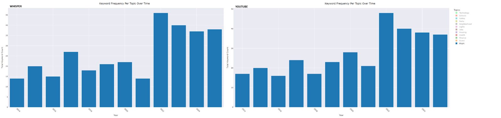
The first step was to get those speeches into a machine readable format. Now, the city only had one of Duggan’s speeches transcribed for public access, so we sought other methods. We landed on two transcription options that seemed most reliable. One, the built in YouTube transcription which we downloaded and converted to a text (.txt) file. The other, using a publicly available general-purpose speech recognition model from OpenAI, called Whisper, which allowed us to feed it audio files to transcribe them.
When it comes to the selection of our audio sources, there was a challenge we came across that is worth noting. For the year 2019, there were two videos of the speech. One, more complete, but did not have an available transcription. The other had a few moments of the start of the speech cut off, but had the built in YouTube transcription. When you see data presented, we will have both YouTube and Whisper alongside one another where YouTube has the slightly cut off transcription and Whisper includes the full audio.
With the transcriptions from both sources in hand, we had to make them machine readable and formatted for our needs. We took the following steps:
Put all the text into lower case
Removed punctuation
Tokenized the text. Meaning we split each file down into individual words.
Applied lemmatization on the tokens. Meaning we broke words down into their base forms. For example, a word like “jobs” would become “job”.
Doing this preprocessing work made the text machine readable and allowed us to run analysis on them. This effort is considered Natural Language Processing (NLP) which is a field of Artificial Intelligence (AI) . While there are lots of ways to process text and analyze the information in it, we performed exact keyword matching. This method takes a key/value pair and matches the keywords as they show up in the text. It also allows us to block the count of some keywords to prevent the overcounting in instances where it doesn’t make sense. For example, our category of “Parks”, we wanted to block place or street names like Asbury Park or Brush Park as they represent something other than the park mentions we were looking to capture.
Now, running an exact match keyword analysis has its strengths and weaknesses to it. The fact that it doesn’t partially match up on terms is great. Especially if you’re looking at a word like “bus”, for example. This method also allows for quick visualization and a straightforward count of the keyword value matched and associated topic key. Additionally, this process makes it accessible for interested individuals to develop their own key/value pairs to run analysis that fits their needs or interests. The weaknesses on this are that there is no semantic or contextual understanding of the matches. Phrases like “ they’re doing a good job” vs “ we’re getting more jobs to Detroiters” or “it is a great park” vs “where you go to park” will get counted the same. Additionally, there is some ambiguity that comes where a place is more than one thing. Palmer Park, for instance, is a neighborhood and a park. Knowing when to count or not count isn’t possible with this method. Lastly, we’re limited by the key/value pair dictionary. We can’t capture everything which can lead to some things being missed as a result. Notably absent is a topic on water. This can be challenging as water is a dynamic topic which could range from drinking water to flood water without a clear distinction of which.
What we can see are some interesting alignments between the topics mentioned in the State of the City speeches and events occurring in Detroit at the same time. In addition to the consistent growth in keyword counts for Housing, Parks, and Finance over the years, we observed the following trends:
Blight: The topic count reached its lowest point in 2021—the year Proposal N was enacted—followed by the highest recorded counts in subsequent years.
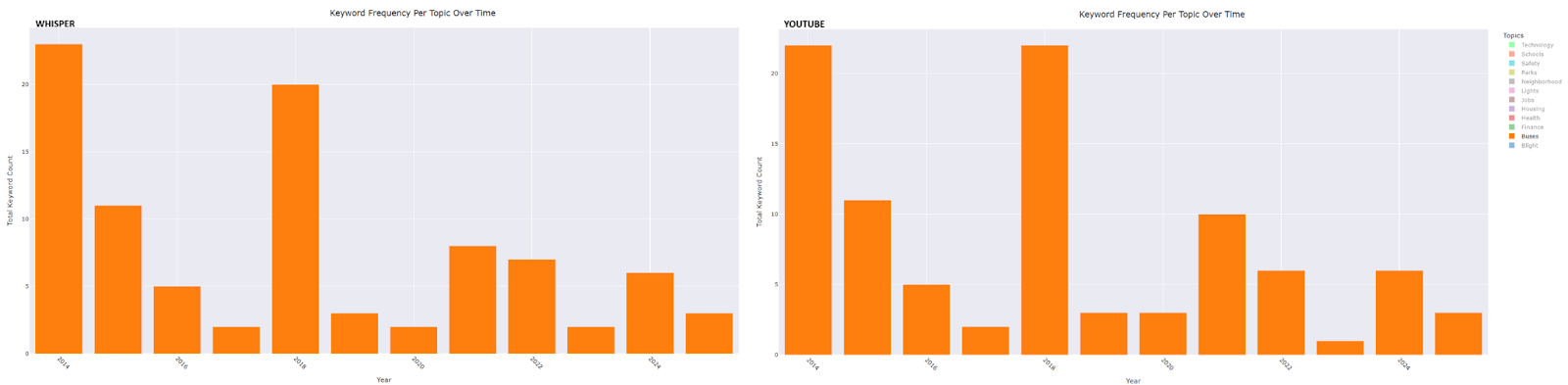
Buses: Peaks occurred in 2014, the year after the formation of the RTA, and again in 2018—the year the ConnectTen bus network was launched, DDOT underwent rebranding, and bus routes were renumbered.
Safety: A peak in 2016 aligns with the launch of Project Greenlight, another in 2019 corresponds with the expansion of the Real Time Crime Center, and a further peak in 2024 coincides with the achievement of response time goals for the Fire/EMT Department.
Neighborhoods: As a topic, it started out among the highest the first two years, then trended downward the following five years only to grow from its lowest point leading to his 2021 run of “every neighborhood has a future” , a seemingly direct response to criticism.
Our analysis reveals that Mayor Duggan’s emphasis on numerical metrics in his State of the City speeches is not merely a rhetorical device but forms the backbone of his public narrative. By systematically examining these speeches through exact keyword matching, we see how his presentation of data aligns with broader city events and initiatives. This numerical approach provides a quantifiable, yet mostly directional record of his tenure and invites further discussion on how data is employed to communicate policy achievements.
Discuss these data trends and more at our upcoming Data Forum!
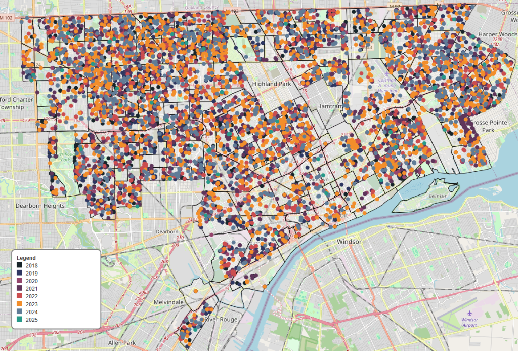
After mapping DDOT bus stop assets in Detroit, I revisited the sidewalk reporter data to see if there was a way to map it out too. I found that the web app had a parcel data layer that was separate from the reports itself. In looking at it closer, I found that the parcel layer was from 2018, but I figured that it would work for what I wanted to use it for.
I started by pulling the data and (for sanity’s sake) cleaning it of columns I didn’t really want to have. Then after grabbing the sidewalk reports data as before, I merged the data together based on the common ‘address’ column and retained the rows from the sidewalk reporter. This helped reduce my data set so I don’t have all the unused parcels sitting around conflicting with what I wanted to look at.
Once I had my full dataset together, it was a good time to take a look at any reports that were missing latitude and longitude data points from the merge. I found two missing locations and manually added their coordinates using Google Maps.
Troubleshooting the Mapping Issue 🐞
When I got to mapping this out, I found that my updated points were the only two that appeared to be mapped. Which I thought was a bit odd until I zoomed out and found all my points getting placed in Antarctica, which was very strange. So I spent the better part of an hour 💀 mucking around with the map over several iterations and checking that I put in my data correctly to clear the missing locations. Going nowhere there, I figured I should look over my parcel data which is where I found my issue.
Even though the city’s map viewer accepts the layer and correctly maps it I couldn’t shake how the dataset had four columns instead of just two for separate latitude and longitude information. Closer inspection shows that their “lon” column was empty and their “lat” column showed what was in the “LONGITUDE” column 😲. Leading me to think I should flip their latitude and longitude columns and remap it.
It worked! For some reason the city’s parcel data had mislabeled their longitude and latitude columns and must’ve been doing something on the backend to get it to visualize instead of having a clean dataset (maybe using the “LAT_LONG” column) 🤷♂️ .
In summary, Here is what I did to clean the data 😤:
Removed columns that I didn’t need or want from the parcel dataset and with the data merged, I dropped a duplicate CreationDate column and renamed the original from the reports dataset.
Identified rows where there were missing latitude and longitude data and then added the missing data into the set.
Flipped the data held in the LONGITUDE column with the data in the LATITUDE column.
Creating the Visualization 🌍
With all that cleared up, I built my map to show where each sidewalk report is located and colored (using the city’s brand guidelines again) by year with the oldest reports being dark colors and the newer reports being a blue or green. You can also select each year as a layer if you want to see any parts of the city reported on in a specific calendar year.
Created using the Folium Python package by converting longitude and latitude columns into a column of shapely Point objects and transformed into a GeoDataFrame.
Few places to sit and limited near term improvement awaits
As I’ve been a long-time public transportation advocate in the City of Detroit, myself and others have long advocated for service improvements like seating and shelters. Basic amenities that make using our transportation system more accessible for all of us. I remember sitting in monthly community input meetings with the former DDOT director, Mikel Oglesby, and hearing that the transit agency would like to invest in seating of some kind to many more stops throughout their network.
There were discussions about something like a simmie seat being utilized to quickly scale the seating availability throughout the network. An affordable solution to improve accessibility, especially for our aging population that often can’t wait standing for the extended periods of time we often face when riding the bus in Detroit.
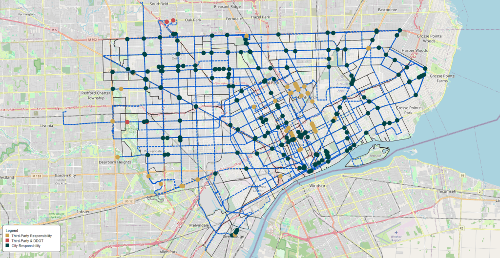
After Mr. Oglesby’s departure in 2023, I had not heard much about an investment into the bus stop infrastructure until I joined Transit Riders United for their Transit Talk Tuesday which hosted DDOT on October 1st, 2024. In that meeting (slides for the interested), we saw that the city was continuing with plans to replace old and install new bus shelters throughout the city. What grabbed my attention wasn’t that they wanted to get to nearly 300 shelters in the network by the end of 2027 but that only 4-5% of stops had shelters.
This was on my mind lately and since I found this dataset from the city’s ArcGIS REST Services Directory, I wanted to take a closer look at what is publicly available from DDOT. This dataset is an account of all DDOT bus stops (and their assets) as of September, 2024. I did, however, have to clean up the dataset a bit as when I reviewed for any odd or missing data, I found that there were 34 bus stop instances where there was no location or route information.
Afterwards, we’re left with 5091 bus stops (4 more than DDOT said they have in October’s meeting). Now, we can take a deeper dive into the data. My interest was in the assets at each bus stop. Does it have a trash can, a bench, or a shelter?
Assets at DDOT Stops:
Total Stops: 5,091
Stops with Assets: 964 (~19%)
Benches: 77 (1.51%)
Shelters: 228 (4.48%)
Trash Cans: 868 (17.05%)
When you include the benches, there is seating at just 5.26% of stops throughout their network.
Note, this is less than the combined total of seating and shelters due to some stops being labelled as having a bench and a shelter
Their plan is to reach 299 shelters in total over the next few years with the last being installed in 2027. Which will increase the seating percentage to 7.3% of all stops. Just 375 out of more than five thousand will have seating.
Limited seating in the network aside, the other thing I thought was fascinating was just how much of these assets were under the responsibility of a third party that was not DDOT nor the City of Detroit. About 55% of all benches, 20% of shelters, and 36% of trash cans were under a third party’s purview. With this in mind, I wanted to map out some of these to see if there were any obvious gaps or interesting insights to be gained.
To do this, I needed to transform the latitude and longitude data points from my Pandas dataframe into something that could be accessible to the Python package, GeoPandas. To visualize, I used Folium so I could craft interactive maps that let you see where assets are and who was responsible for them.
To make it easier, I made all city owned (City of Detroit & DDOT) a green color and all third party owned a yellow color. For assets that had two stated responsibility holders, I made a red.
Some of the immediate insights I could gleam were:
Nearly all of Jefferson Avenue has trash cans responsible to a third party. Which I know to be Jefferson East Inc.
All of downtown’s trash cans have a third party responsible for them.
In Hamtramck, Third parties have responsibility for all assets with the exception of three trash cans along Conant Street.
With the exception of a few along the northern part of Chene Street, the lower Eastside does not have benches.
Southwest Detroit neighborhoods don’t have seating nor shelters.
I could list out all the neighborhoods that are being underserved, but you can also take a look at the map and see the neighborhood boundaries and transit lines. If you find your neighborhood among those without any seating, I would urge you to take the quick action from Transit Riders United and email your city officials to double the investment into DDOT.
Contact
Submit a map or just get in touch. Thanks for following!