
by: Connor Pierce, Wayne State University (Intro to GIS, Fall 2023)
I believe transit frequency to be one of the best metrics for evaluating the success of a public transportation network. If a system has long wait-times between vehicles, it reduces the reliability of the system for the average rider. If a person is traveling on more than one transit line, the chance of making their transfer becomes increasingly lower as headways become higher. Long waits can manifest a decrease in overall ridership, as they turn away would-be passengers who require a high degree of
reliability for commuting to work or school. I also view frequency as an accessibility issue. Accessible spaces on buses and other non-paratransit vehicles is limited, and if all available spaces are taken, riders should only need to wait a short while for the next vehicle to arrive. Additionally, if a rider needs to exit the bus to take care of a medical issue before resuming their trip, it is important for them to be able to onboard the next vehicle within a reasonable amount of time. Therefore, when evaluating a city’s public transportation system, it is important to know where the high-frequency transit lines are
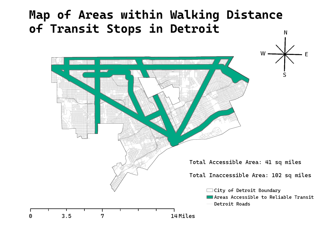
located and which areas fall within their catchment zones. The map above shows the location of these areas for the City of Detroit.
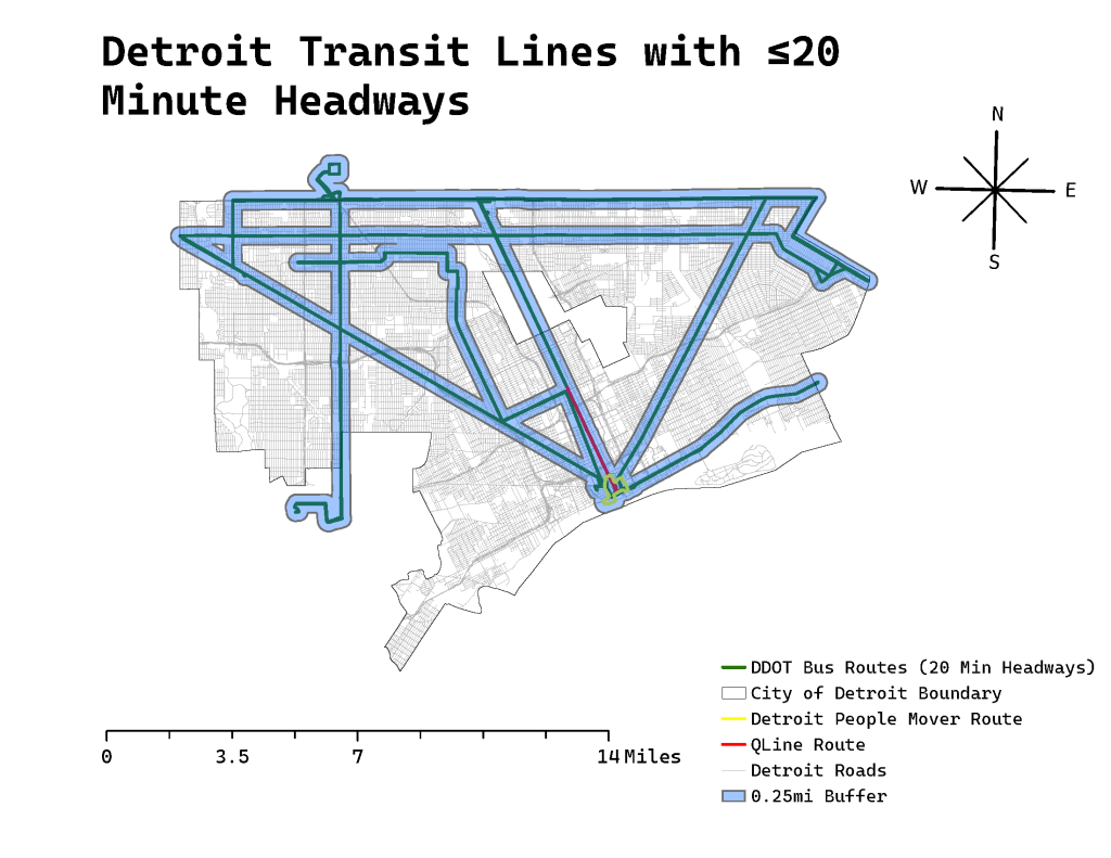
This was done by importing transit stop and route data for the QLine, People Mover, DDOT buses, and SMART buses (in addition to street and city boundary shapefiles) from data.detroitmi.gov. I then, capped the frequency at 20 minutes for peak times to show which routes operate with lower headways. These routes included the People Mover, QLine, and eight DDOT bus lines, including the: #3 Grand River, #4 Woodward, #6 Gratiot, #7 Seven Mile, #9 Jefferson, #10 Greenfield, #16 Dexter, and #17 Eight Mile routes. None of the SMART bus routes have headways of 20 minutes or less. Then, I created a quarter-mile buffer around these transit lines to show which parts of the city
fall within the catchment area of these stops.
The initial map of this post represents the results found in the second map. It includes the total calculated size of the catchment area for frequent transit lines in Detroit compared to the size of underserved areas. The underserved areas of the city make up almost 2.5x the area that is served by frequent transit. I see these shortcomings as a sign that the city should invest in improving the frequency of bus services on existing routes rather than attempting to create new infrastructure for other modes of transportation. If infrastructure improvements are made, they should be to improve bus services in the city (i.e. creating dedicated bus lanes, bus rapid transit upgrades to existing routes, improving bus stop shelters, etc).
