DETROITography

Menu

Skip to content
  • About
  • Our Maps
  • Events
  • Neighborhoods
  • Resources
  • Find Data
  • Learn
  • Participate

Map: Increases in High Poverty in Detroit 2013

May 25, 2016 By Alex B. Hill

Detroit_Segre-02

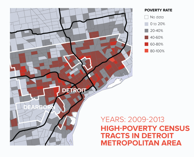
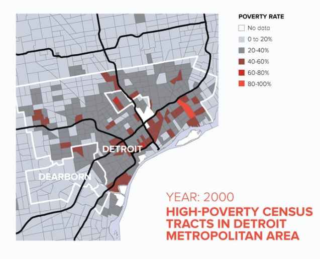
Poverty is a regular topic in Detroit, but there is much more to the data and narrative than an elevated rate of poverty. Since 2000, the Detroit metro area has seen some of the largest increases in racially concentrated poverty (see 2000 map below for comparison).

detroitsegr-1439235033-49


Share this:

  • Share on Bluesky (Opens in new window) Bluesky
  • Share on LinkedIn (Opens in new window) LinkedIn
  • Share on Nextdoor (Opens in new window) Nextdoor
  • Email a link to a friend (Opens in new window) Email
  • Share on Facebook (Opens in new window) Facebook
  • Share on X (Opens in new window) X
  • More
  • Print (Opens in new window) Print
  • Share on Reddit (Opens in new window) Reddit
  • Share on Pinterest (Opens in new window) Pinterest
Like Loading...

Related

Posted in Economic, Income, Race | Tagged 2000, 2013, architecture, data, Detroit, geography, high poverty, map, metro, poverty, race, The Century Foundation | 2 Comments |

Post navigation

← Map: Detroit Watershed Planning 2013
Map: New Detroit Regional Master Transit Plan 2016 →

2 thoughts on “Map: Increases in High Poverty in Detroit 2013”

  1. Pingback: Detroiters in poverty face nearly insurmountable obstacles - The Michigan Chronicle

  2. Pingback: Detroiters in poverty face nearly insurmountable obstacles | The Michigan Chronicle

Leave a comment Cancel reply

Around Art Buildings Crime Data Demographic Economic Education Employment Environment Events Food Health History Income Land Parking Podcast Politics Population Property Race Transit

Popular

  • Map: Detroit Regional Black Population 2020
    Map: Detroit Regional Black Population 2020
  • Map: Borders of Detroit
    Map: Borders of Detroit
  • Detroit Racial Dot Map 2020
    Detroit Racial Dot Map 2020
  • Map: Detroit Regional Population Change 2010 to 2020
    Map: Detroit Regional Population Change 2010 to 2020
  • Detroit Neighborhoods Guide
    Detroit Neighborhoods Guide

Enter your email address to follow this blog and receive notifications of new posts by email.

Join 6,808 other subscribers

Books!

Follow

Tweets by detroitography

Like

Like
Subscribe
Create a website or blog at WordPress.com

Contact

Submit a map or just get in touch. Thanks for following!
hello@detroitography.com
×
  • Comment
  • Reblog
  • Subscribe Subscribed
    • DETROITography
    • Join 631 other subscribers
    • Already have a WordPress.com account? Log in now.
    • DETROITography
    • Subscribe Subscribed
    • Sign up
    • Log in
    • Copy shortlink
    • Report this content
    • View post in Reader
    • Manage subscriptions
    • Collapse this bar
 

Loading Comments...
 

    %d