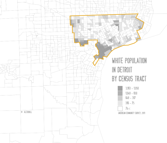
There have been maps of Detroit’s black population through every decade, but what about its white population? I decided to make this map after taking some friends around to a few hot spots in Detroit. We hit up Northern Lights before getting dinner at Green Dot Stables and then headed over the Sugar House for evening drinks. The venues progressively became less diverse. The Corktown area establishments seemed to be dominated by the young, hip, and white of Detroit.
This map demonstrates the divide in new neighborhood developments in the city: Hamtramck as a hip place to live, Downtown and Midtown bringing in students and young professionals, and Corktown/ Southwest as the coolest place to live in Detroit. It also represents the racial/ ethnic association with being “white.” Southwest Detroit appears to be a most densely white, but in reality many individuals of Latino heritage respond to the Census Bureau with “white” as their race/ethnicity. The numbers may be skewed, but there is no doubt that these areas do have growing young and white populations along with increased investment dollars.
Compare with Wayne County White Population


I’ve seen a few of your maps that have been posted to reddit. Coming from someone who frequently explores the Detroit area on google maps for fun, they’re pretty cool to look at.
Someone in the comments over there mentioned that the numbers are somewhat confusing. I’m guessing it’s per 10,000 residents, since if it was just the number of white residents in each district that wouldn’t be density. If this is the case, I personally think it’d be much more intuitive to give the percentage of residents who are white. But either way you should give the units so we can tell.
Do you have a link to the source for this data? I found the American Community Survey online, but after searching around for a couple minutes I wasn’t able to find the direct source of the data you mapped. It’d be nice if you linked it for easy reference.
Also, a higher-res version of the map would be cool. I remember noticing it more prominently on another of your posts, where the main image wasn’t really legible. I know a full-size version exists because you can right-click and open the image in a new tab, then chop off the dimension limits from the URL. It’d be cool if clicking on the image brought up a new tab with the full-size map straight away, but I admittedly don’t know anything about HTML or whatever you’d have to do to make that happen.
I really hope you keep posting sweet maps though!
Thanks!
The map has been edited and updated based on various comments. Sometimes after spending time wrangling data and designing the map I make some mistakes. It’s great to have people watching to help catch them.
The data is from the Census Bureau BO2008 “white alone” 2011 ACS 5-year estimates.